



Forms
The form schema, all 15 field kinds, validation, template variables, and reading the values back.
A kind: 'form' view renders a validated, versioned form from a schema you declare in code. This page covers the whole form story: how you declare a view, every field kind, multi-entry forms, validation, the {{ ... }} template tokens, and how to read the authored values back with getFormValues.
Declaring a form view
A form view is one entry in a feature's views array - the feature is what you register in the integration config (see Defining features). In context:
import { defineFeature } from '@alokai/connect-admin/server';

export const siteBanner = defineFeature({
  enabled: true,
  id: 'site-banner',
  name: 'Site banner',
  views: [
    {
      id: 'banner',
      kind: 'form',
      label: 'Banner',
      defaults: { banner: { headline: 'Hello', showBanner: true } },
      schemas: {
        banner: { fields: [ /* NativeFieldSchema[] - see Field kinds below */ ] },
      },
    },
  ],
});
The rest of this page is about the view object itself - everything it takes:
| Property | Required | What it does |
|---|---|---|
schemas | yes | One NativeFormSchema per key. The keys become the top-level keys of the stored values. |
defaults | yes | The code baseline, mirroring schemas - one entry per schema key. |
validate | no | Form-level validator for cross-field rules. See Validation. |
prepare | no | Runs every time the view is opened or reloaded; the result is cached for that view load and passed to every callback as editorContext.data. Use it to fetch shared reference data once. See Reference data and how it refreshes. |
templateVariables | no | Supplies the variables operators can reference as {{ ... }}. See Template variables. |
dictionary | no | Supplies {{@name}} tokens - a vocabulary the panel checks, highlights, and autocompletes. See Dictionary. |
dataInspector | no | Read-only reference data shown beside the form, for lookup only. See Data inspector. |
toolbarActions | no | Toolbar menu actions, including the shell-owned upload-json (import + merge) and reset-defaults. |
guide | no | In-panel instructions - see Defining features. |
The schema
interface NativeFormSchema {
  fields: NativeFieldSchema[];        // array order = display order
  multiplicity?: 'singleton' | 'multi';  // default 'singleton'
  entryList?: NativeEntryListMeta;    // multi only - see below
}
Every field shares a set of base properties:
| Property | What it does |
|---|---|
name | Required. The key the value is stored under. |
label | The visible label. |
description | Text under the label. |
help | The ? popover content. |
accordion | true renders the field as a collapsible section (default is inline). |
disabled | Grays the field out. On containers it propagates to all children. |
validate | A per-field validator - see Validation. |
Leaf fields additionally take required and defaultValue - except toggle, which takes only defaultValue. The three container kinds (object, map, array) take neither - a container is "present" by construction, and its content comes from its children. Putting required on a toggle or on a container is a type error.
Field kinds
There are fifteen kinds. Every field says which one it is with kind, so nothing is inferred. Each kind has its own section below - this table is the index:
kind | Control |
|---|---|
text | Single-line input |
textarea | Auto-growing multi-line input |
boolean | On/off switch |
number | Numeric input |
select | Dropdown, single value |
toggle | Segmented control, one of a few options |
multiSelect | Toggle chips, zero or more values |
multiSelectDropdown | Compact trigger + checkbox popover |
tagList | Wrapping chips with per-chip remove |
stringList | Reorderable rows, typed in or picked from a list |
sentenceRule | A rule read as one sentence, with chips you fill in |
object | A group with a fixed set of children |
map | Key-value rows with an open key set |
array | An ordered, repeatable list of objects |
The option-backed examples below share one fixed option set, so you can map each config to its screenshot:
const MODE_OPTIONS = [
  { label: 'Eco', value: 'eco' },
  { label: 'Normal', value: 'normal' },
  { label: 'Sport', value: 'sport' },
  { label: 'Custom', value: 'custom' },
];

// A larger set, for the multi-pick examples:
const FACET_OPTIONS = [
  { label: 'Brand', value: 'brand' },
  { label: 'Color', value: 'color' },
  { label: 'Size', value: 'size' },
  { label: 'Material', value: 'material' },
  // ...ten more attributes
];
text
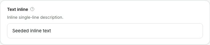
A single line of text - identifiers, headlines, URLs. When the view declares template variables, the input highlights {{ ... }} tokens as the operator types.
{
  kind: 'text',
  name: 'textInline',
  label: 'Text inline',
  description: 'Inline single-line description.',
  help: 'Inline single-line help.',
  placeholder: 'Inline text placeholder',
}
Kind-specific props: defaultValue?, placeholder?.
textarea
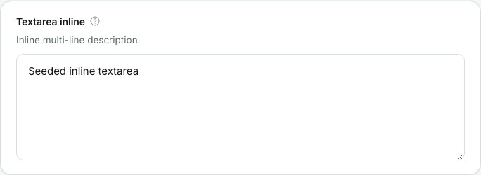
For anything a human writes in sentences - the box grows with the content. Takes the same props as text and highlights {{ ... }} tokens the same way.
{
  kind: 'textarea',
  name: 'textareaInline',
  label: 'Textarea inline',
  description: 'Inline multi-line description.',
  help: 'Inline multi-line help.',
  placeholder: 'Inline textarea placeholder',
}
boolean
An on/off switch, one click to flip.
{
  kind: 'boolean',
  name: 'booleanInline',
  label: 'Boolean inline',
  description: 'Inline boolean description.',
  help: 'Inline boolean help.',
}
Kind-specific props: defaultValue?: boolean.
number
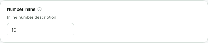
A numeric input - type a number or nudge it with the small arrows.
{
  kind: 'number',
  name: 'numberInline',
  label: 'Number inline',
  description: 'Inline number description.',
  help: 'Inline number help.',
}
Kind-specific props: defaultValue?: number.
select
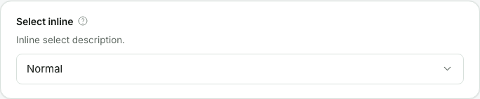
A dropdown holding exactly one value. The popover keeps an in-list search filter by default (searchable: false turns it off) - handy once the option set grows past a screenful.
{
  kind: 'select',
  name: 'selectInline',
  label: 'Select inline',
  description: 'Inline select description.',
  help: 'Inline select help.',
  options: () => MODE_OPTIONS,
}
Kind-specific props: options (required, see Options), defaultValue?, searchable? (default true), dependsOn? (see A list that comes from another field), maxOptionsPerGroup? (see Capping long lists).
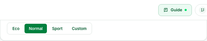
toggle
A segmented control - every option visible, exactly one selected. Prefer it over select when the set is small (two to four options) and worth seeing at a glance.
{
  kind: 'toggle',
  name: 'toggleInline',
  label: 'Toggle inline',
  description: 'Inline toggle description.',
  help: 'Inline toggle help.',
  options: () => MODE_OPTIONS,
}
Kind-specific props: options (required), defaultValue?. toggle is the one leaf kind that takes no required - that's enforced at the type level.
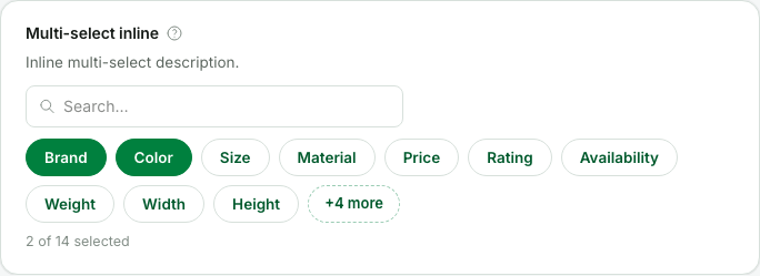
multiSelect
Zero or more values from a known set, shown as toggle chips - every choice stays visible. A large option set gets a search filter above the chips and folds the overflow behind a "+N more" toggle.
{
  kind: 'multiSelect',
  name: 'multiSelectInline',
  label: 'Multi-select inline',
  description: 'Inline multi-select description.',
  help: 'Inline multi-select help.',
  options: () => FACET_OPTIONS,
}
Kind-specific props: options (required), defaultValue?: string[], searchable? (default true), dependsOn?.
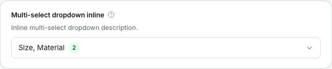
multiSelectDropdown
The compact cousin of multiSelect: one trigger showing how many values are selected, with a checkbox list in a popover. The escape hatch when the option set would wrap into a wall of chips.
{
  kind: 'multiSelectDropdown',
  name: 'multiSelectDropdownInline',
  label: 'Multi-select dropdown inline',
  description: 'Inline multi-select dropdown description.',
  help: 'Inline multi-select dropdown help.',
  options: () => FACET_OPTIONS,
}
Kind-specific props: same as multiSelect, plus maxOptionsPerGroup?.
Options for select, toggle, multiSelect, multiSelectDropdown
options is a callback that runs server-side, so the choices can come from a live API. It's resolved once per option-backed field, when the field appears on screen - a field inside a freshly added array row or map entry has its own path, so it fetches its own options at that moment. The answer is then kept for the rest of the view load, so a field that folds shut and opens again doesn't fetch twice. Nothing is re-resolved as the operator types, with one exception: a field that declares dependsOn builds its list from another field's value, and fetches it again whenever that value changes - see A list that comes from another field.
A callback returns plain strings, numbers, booleans, or { label, value } objects:
import type { FormView } from '@alokai/connect-admin/server';

interface FacetData {
  facets: { code: string; name: string }[];
}

const searchView: FormView<FacetData> = {
  defaults: { search: { defaultFacet: 'brand' } },
  id: 'search',
  kind: 'form',
  label: 'Search',
  // `loadFacets` is your own function. `prepare` runs once per view load and
  // its result reaches every callback as `data`.
  prepare: async (context) => ({ facets: await loadFacets(context) }),
  schemas: {
    search: {
      fields: [
        {
          kind: 'select',
          label: 'Default facet',
          name: 'defaultFacet',
          options: (_context, { data }) =>
            data.facets.map((facet) => ({ label: facet.name, value: facet.code })),
        },
        {
          defaultValue: 'relevance',
          kind: 'toggle',
          label: 'Sorting',
          name: 'sorting',
          // A fixed list needs no fetch at all.
          options: () => [
            { label: 'Relevance', value: 'relevance' },
            { label: 'Newest first', value: 'newest' },
          ],
        },
      ],
    },
  },
};
The object form takes two optional extras:
| Extra | What it does |
|---|---|
group | Puts the option under a heading. Options with no group come first. |
count | A number shown on the right of the row, for example how many products match. |
Both are shown by the shared picker popover, which is what multiSelectDropdown, an options-backed stringList and every sentenceRule chip open. select, toggle and multiSelect draw their own controls and simply ignore the two extras, so it's safe to send them everywhere. That popover lists every option, in a box that scrolls - see Capping long lists for a source with hundreds of them.
Opened, that popover is a search box over a checkbox list. This is the multiSelectDropdown from the section above with its list expanded and two options ticked:
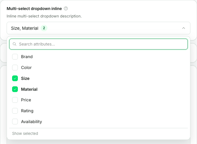
Keep the callback cheap: the field shows a loading state until it answers. A slow or failing callback degrades that one field, not the whole form - when the call fails, that field simply renders with no options.
Capping long lists
Every dropdown lists all of its options, in a box that scrolls. For a source with hundreds of options, drawing every row makes the list slow to open, so a field can cap it with maxOptionsPerGroup:
{
  kind: 'select',
  name: 'category',
  label: 'Category',
  maxOptionsPerGroup: 30,
  options: (_context, { data }) => data.categories,
}
Each group then shows its first 30 options, followed by a +N more, narrow the search note, and typing in the search box reaches the rest. A list with no groups counts as one group. Options that are already picked always stay in view, even past the cap. The cap is ignored when searchable is false, because without a search box the hidden options couldn't be reached at all.
maxOptionsPerGroup works the same on select, a map's select key, multiSelectDropdown, an options-backed stringList, and a sentenceRule chip. Leave it off unless a list is genuinely slow: a capped list is harder to scan.
A dropdown that takes several values also gets a Show selected button at the bottom once its list has more than ten options and something is picked. It narrows the list to the picked rows, and Show all brings the rest back, so the operator can check their picks without scrolling.
A list that comes from another field
select, multiSelect, multiSelectDropdown, and an options-backed stringList can build their list from another field's current value, the same way a sentence chip can. Name the fields in dependsOn, and your options callback receives their values as dependsOnValues, keyed by the name exactly as you wrote it:
| Name | Reads |
|---|---|
$key | The key of the map entry the field sits in. |
attribute | A field next to this one, in the same object. |
/attribute | A field anywhere in the form, counted from its top. |
The common case is a map keyed by an attribute, where each entry picks values of that attribute:
{
  kind: 'map',
  name: 'excludedFacetValues',
  label: 'Excluded facet values',
  key: { kind: 'select', options: (_context, { data }) => data.attributes },
  value: {
    kind: 'multiSelectDropdown',
    dependsOn: ['$key'],
    options: (_context, { data, dependsOnValues }) =>
      data.valuesByAttribute[dependsOnValues.$key] ?? [],
  },
}
Each entry asks with its own key, so the Colour entry offers colours and the Type entry offers types:
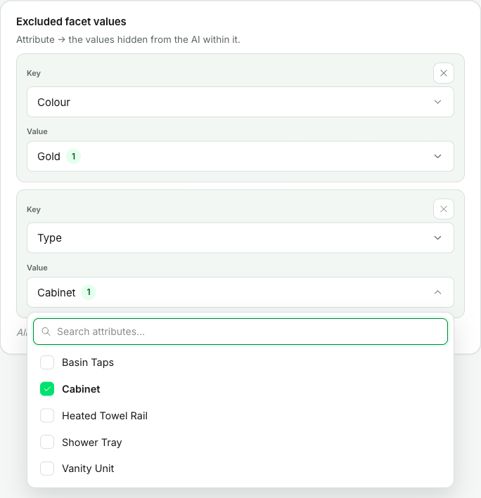
While a field it depends on is empty, the dropdown asks the server for nothing, stays disabled, and tells the operator what to pick first - Pick attribute first: this list comes from it. When that field changes, the list is fetched again. A value picked earlier that the new list doesn't hold isn't dropped: it's shown as unavailable, as described in the next section.
Values reach your callback as strings. Only the names the field declares reach it, and it's never called while one of them is missing. For a field without dependsOn, dependsOnValues is an empty object.
Values that are no longer on the list
An option list can change after a value was picked from it - a category gets deleted, a grouping is renamed. The panel keeps such a value in the saved data and shows it as unavailable: it reads accessories (unavailable) in amber, and it's listed first and ticked in the field's dropdown, so the operator can untick it.
Nothing is removed on the operator's behalf, and opening a form never saves anything. That's deliberate: a list that comes back short by mistake - a value with no products at this moment, a fetch that returned only part of the data - would otherwise delete real configuration just because somebody looked at the page. The panel also only judges a value against a list it can trust: while the list is loading, when the call failed, or when it came back empty, nothing is marked.
This has one consequence for your storefront code. getFormValues returns the saved values as they are, so a value can refer to something your catalogue no longer has. Treat an unknown id as "nothing to do" rather than as an error.
tagList
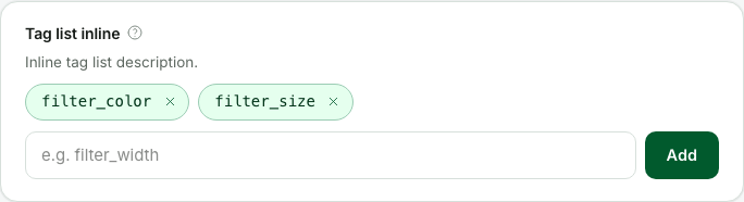
Free-form, short, orderless tokens - the operator types a value and presses Enter, and it becomes a chip with its own remove button. Use it when the values are made up on the spot; when they come from a known set, use multiSelect instead.
{
  kind: 'tagList',
  name: 'tagListInline',
  label: 'Tag list inline',
  description: 'Inline tag list description.',
  help: 'Inline tag list help.',
  placeholder: 'e.g. filter_width',
}
Kind-specific props: defaultValue?: string[], placeholder?, maxItems?, allowDuplicates? (default false - repeated values are rejected).
stringList
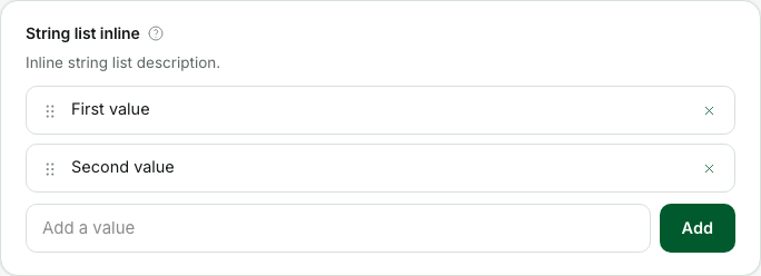
Lines of text where order matters - each value is a row the operator can reorder and remove. Reach for tagList when values are short orderless tokens; reach for stringList when they read like sentences or their order carries meaning.
{
  kind: 'stringList',
  name: 'stringListInline',
  label: 'String list inline',
  description: 'Inline string list description.',
  help: 'Inline string list help.',
  placeholder: 'Add a value',
}
Kind-specific props: the same four as tagList, plus options?, dependsOn?, and maxOptionsPerGroup?.
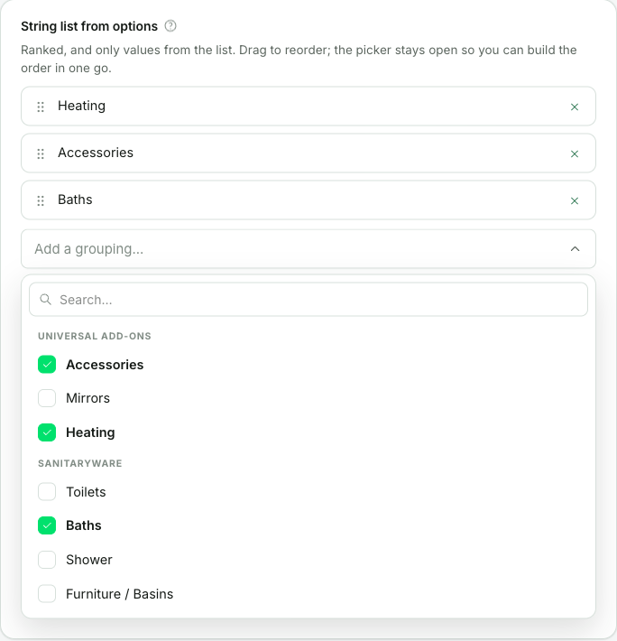
A ranked list of known values. Declare options and the row where the operator typed becomes a picker, so the list can only ever hold values you offered:
{
  kind: 'stringList',
  name: 'fallbackRanking',
  label: 'Fallback ranking',
  placeholder: 'Add a grouping...',
  options: () => [
    { group: 'Universal add-ons', label: 'Accessories', value: 'accessories' },
    { group: 'Sanitaryware', label: 'Baths', value: 'baths' },
  ],
}
The stored value is still a plain string[], in the order the operator arranged it:
["accessories", "baths"]This is the one combination the other kinds can't express. stringList and tagList keep the order but take any text; multiSelect and multiSelectDropdown limit the values but treat them as a set, and the dropdown rewrites the stored order to match the option list. So a ranking of known values, like "the order these carousels are offered in", had no control that fit.
What changes when you declare it:
- The rows stop taking text. The operator picks, drags to reorder, and removes. Otherwise the limit would hold when adding a value and leak on the next edit.
- The picker stays open and each pick adds to the end. You're building a list, and picking eight things shouldn't mean opening the picker eight times.
- A value already in the list shows a tick, and clicking it takes it out again, the same as the multi-select dropdown. With
allowDuplicatesnothing is ticked, because "is it in the list already" no longer decides what a click should do. maxItemscloses the picker at the cap. Removal stays on each row, so nobody gets stuck at the cap with no way back.
Omit options and the field is free text exactly as before. tagList has no options at all - it's an orderless bag, so a curated one is a multiSelect.
sentenceRule
A rule the operator reads as one plain sentence, where every variable part is a chip they fill in. sentence is that sentence, written as an ordered list of segments: static words, chips they pick from a list or type into, and a repeat for a run of chips they can add more copies of.
// The two runs below hold the same chips, so declare them once.
// `loadValues` and the `data` lookups are your own code.
const condition = [
  {
    kind: 'optionsInput',
    name: 'attribute',
    placeholder: 'pick an attribute',
    searchPlaceholder: 'Search attributes...',
    options: (context, { data }) => data.attributes,
  },
  { kind: 'words', text: 'is' },
  {
    kind: 'optionsInput',
    name: 'values',
    placeholder: 'pick values',
    searchPlaceholder: 'Search values...',
    multiple: true,
    dependsOn: ['category', 'attribute'],
    options: (context, { dependsOnValues }) => loadValues(dependsOnValues),
  },
];

// ...and the field itself, one entry of the schema's `fields`:
{
  kind: 'sentenceRule',
  name: 'carouselRule',
  label: 'Sentence rule',
  description: 'A sentence this config writes, with chips you fill from the catalogue. The rule fires only when every part is filled.',
  help: 'Sentence rule: the feature writes the sentence; you fill in the chips.',
  sentence: [
    { kind: 'words', text: 'When the cart has a' },
    {
      kind: 'optionsInput',
      name: 'category',
      placeholder: 'pick a category',
      searchPlaceholder: 'Search categories...',
      // `data` is whatever this view's `prepare` returned.
      options: (context, { data }) => data.categories,
    },
    { kind: 'words', text: 'item whose' },
    {
      kind: 'repeat',
      name: 'cart',
      separator: 'and',
      addLabel: 'Add another cart-side condition',
      parts: condition,
    },
    { kind: 'words', text: '→ fetch the' },
    {
      kind: 'optionsInput',
      name: 'carousel',
      placeholder: 'pick a carousel',
      searchable: false,
      options: (context, { data }) => data.carousels,
    },
    { kind: 'words', text: 'carousel where' },
    {
      kind: 'repeat',
      name: 'output',
      separator: 'and',
      addLabel: 'Add another carousel-side condition',
      parts: condition,
    },
    { kind: 'words', text: '.' },
  ],
}
Rendered, with somebody part-way through filling it in. Taps and pick a carousel are the chips that stand alone; the numbered pair joined by and is the cart run holding two copies, each with its own ×, and the + after them adds a third:
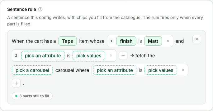
A chip always stays on one line, so a rule keeps reading as a sentence. With more than three values picked it names the first three and the count - Showers, Baths, Toilets (17) - and a value too long for the chip ends in "…". Pointing at the chip shows the whole text.
Kind-specific props: sentence (required), defaultValue?.
The segments
Your feature writes the sentence, so two fields of this kind need have nothing in common. The one above reads as the first line here; a second could just as well read as the other:
When the cart has a [category] item whose [attribute] is [values] (+) then fetch the [carousel] carousel.
Notify [team] by [channel] when [signal] goes past [threshold] (+).
Each segment's kind says exactly what it is:
Segment kind | What it is |
|---|---|
words | Static words. |
optionsInput | A chip the operator picks from a list. |
textInput | A chip they type a string into. |
numberInput | A chip they type a number into. |
repeat | Words and chips that repeat together, with a (+) to add another copy. |
repeat is the only container, and it never holds another repeat.
Props every chip takes (optionsInput, textInput, numberInput):
| Property | What it does |
|---|---|
name | Required. The key the chip's value is stored under - unique in the field for a chip that stands alone, unique inside its repeat for one that doesn't. |
placeholder | Required. What the empty chip reads, for example pick a category. |
optional | The chip may be left empty. It still draws and still fills in the normal way; it's simply never counted as a part still to fill. For the chip that refines a rule rather than making it. |
when | A server-side gate - see Hiding part of a sentence. |
Extra props on optionsInput:
| Property | What it does |
|---|---|
options | Required. The same callback contract as select, and it runs server-side too. |
multiple | The chip holds several values, so its value is a string[]. The picker then stays open and each pick adds or removes one. Default false. |
dependsOn | Names the chips this one's list is built from - see A list that comes from another chip. |
searchable | Show the in-popover search filter. Default true. |
searchPlaceholder | Placeholder for that search filter. |
optionsInput also takes maxOptionsPerGroup - see Capping long lists.
Props on a repeat:
| Property | What it does |
|---|---|
name | Required. The key the array of copies is stored under. |
parts | Required. The chips and the words between them, in reading order. |
separator | Words printed between copies, for example and. |
addLabel | Tooltip and aria-label on the (+). |
maxItems | Cap the copies. The (+) disappears at the cap. |
optional | The run may hold no copies at all and still read as complete. Without it a run always keeps one copy, so "no conditions at all" would be a rule you can store but can't author. |
when | A server-side gate - see below. |
The stored value
The value follows the declaration. A chip that stands alone stores under its own name; a repeat stores an array with one record per copy. So the rule in the screenshot above is stored as:
{
  "category": "Taps",
  "cart": [
    { "attribute": "finish", "values": ["Matt"] },
    { "attribute": null, "values": [] }
  ],
  "carousel": null,
  "output": [{ "attribute": null, "values": [] }]
}
An unfilled chip is null, or [] on a multiple one, so the shape of a rule is the same whether it's finished or not.
A list that comes from another chip
Name the chips a list is built from in dependsOn, and the panel hands their current values to your options callback as dependsOnValues. A name is looked up in the same copy first and then among the chips that stand alone, so a chip inside a repeat can depend on one outside it.
{
  kind: 'optionsInput',
  name: 'values',
  placeholder: 'pick values',
  multiple: true,
  dependsOn: ['category', 'attribute'],
  options: (context, { dependsOnValues }) =>
    loadValues(dependsOnValues.category, dependsOnValues.attribute),
}
The chip's popover names where its list came from, so the operator can see the connection rather than having to remember it. Here the heading reads FINISH IN TAPS, because attribute is finish and category is Taps, and each row carries the count the callback sent:
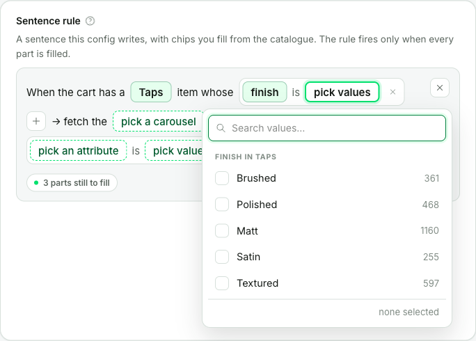
While any dependency is still empty the chip asks the server for nothing and tells the operator which parts to fill first, instead of opening an empty list. Changing a dependency clears the chip, because its value came from a list that no longer applies.
Fields outside a sentence can do the same - see A list that comes from another field. Every other options answer is kept for the whole view load - see Reference data and how it refreshes.
Hiding part of a sentence
Any segment can carry a when callback. Return false and the segment isn't drawn, isn't counted as a part still to fill, and loses whatever value it held. It runs on the server like options, so it can read prepare's data:
{
  kind: 'words',
  text: 'escalating to',
  when: (context, { values }) => values.channel === 'PagerDuty',
}
The second argument holds three things:
| Property | What it holds |
|---|---|
data | prepare's cached result, as everywhere else. |
values | Every chip's current value, resolved from this copy first and then from the chips that stand alone - the same lookup dependsOn uses, so there's one rule to remember for both. |
rule | The whole rule, shape and all. values flattens the sentence to one value per chip, so rule.cart.length is how you ask "does this run hold any conditions?". |
Gate the words around a chip together with the chip itself, or the sentence reads broken when the chip goes away. A gate that throws leaves its segment visible: a callback reaching a system that's briefly down shouldn't make a chip vanish from a rule somebody is reading, and an operator must never be blocked by a part they can't see.
Finished, or not
Under the sentence the field keeps score: N parts still to fill, or This rule can fire. A half-filled copy of a repeat counts once, not once per empty chip, because it's one thing for the operator to go and finish.
Leave required off and an unfinished rule saves exactly as it is, which is what you want while somebody is still building it. Set required: true and validation reports the same count the field shows, so the two can never disagree.
Two things a sentence rule is not
There's no "any value" option on a chip. If a rule should apply to everything, add that as an option of your own - an "any category" entry your own code knows how to read.
separator prints a word and nothing more. Copies of a repeat are always read together; setting the separator to or changes the wording, not the meaning.
object
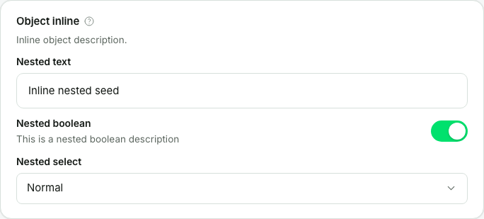
A group with a fixed set of children, declared in fields - any field kind, recursively. It stores a nested object, { parent: { child: … } }, and children are addressed as parent.child. Groups can nest several levels deep; each level renders indented under its parent's heading. disabled on an object propagates to every child.
{
  kind: 'object',
  name: 'objectInline',
  label: 'Object inline',
  description: 'Inline object description.',
  help: 'Inline object help.',
  fields: [
    { kind: 'text', label: 'Nested text', name: 'nestedText' },
    { kind: 'boolean', label: 'Nested boolean', name: 'nestedBoolean', description: 'This is a nested boolean description' },
    { kind: 'select', label: 'Nested select', name: 'nestedSelect', options: () => MODE_OPTIONS },
  ],
}
Kind-specific props: fields (required).
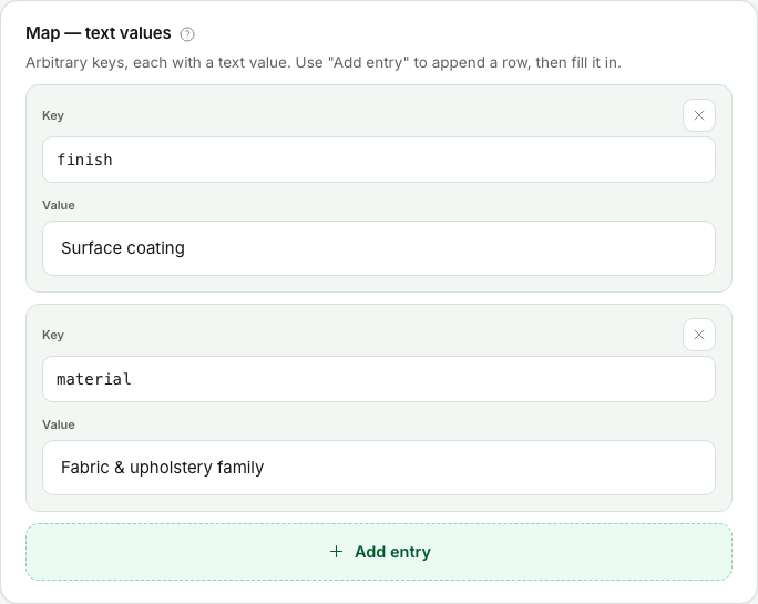
map
Key-value rows where the operator invents the keys - stored as Record<string, V>. The value is any field template, from a plain text up to a whole object group; the key is free text by default, or a select with its own options when the keys must come from a known set (it takes maxOptionsPerGroup too, and a field inside the value can build its list from the entry's key with dependsOn: ['$key'] - see A list that comes from another field). Validation errors from a key validator land on the key itself.
{
  kind: 'map',
  name: 'mapText',
  label: 'Map - text values',
  description: 'Arbitrary keys, each with a text value. Use "Add entry" to append a row, then fill it in.',
  help: 'Free-text keys mapped to text values.',
  key: { kind: 'text', placeholder: 'attribute_code' },
  value: { kind: 'text' },
}
Kind-specific props: value (required), key?, maxItems?, rowsCollapsible? (folds tall value groups). A new entry's value isn't taken from defaults - it's composed from the value template's defaultValues.
array
An ordered, repeatable list. Its item is always an object template, so an array stores a list of objects - one uniform shape, addressed by index. Rows reorder with up/down buttons.
{
  kind: 'array',
  name: 'arrayInline',
  label: 'Array - object items',
  description: 'An ordered, repeatable list of object items - reorder with the up/down arrows.',
  help: 'Index-addressed items of one uniform shape.',
  item: {
    kind: 'object',
    fields: [
      { kind: 'text', label: 'Label', name: 'label' },
      { defaultValue: true, kind: 'boolean', label: 'Enabled', name: 'enabled' },
      { defaultValue: 0, kind: 'number', label: 'Weight', name: 'weight' },
    ],
  },
  maxItems: 6,
  rowsCollapsible: true,
  titleField: 'label',
}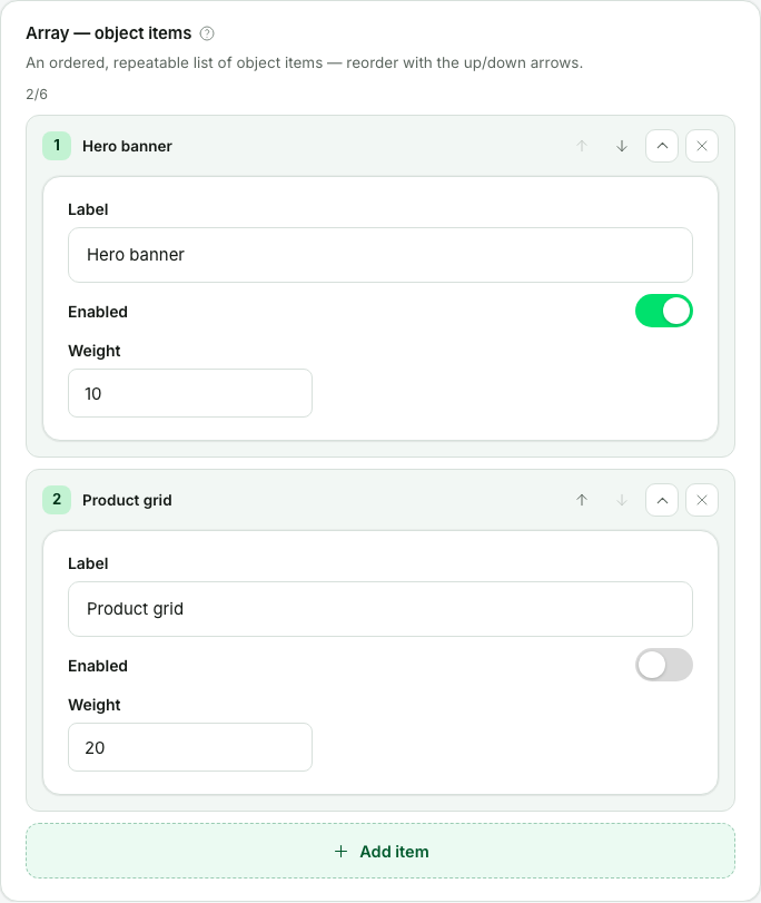
Kind-specific props: item (required), maxItems?, rowsCollapsible?, titleField? - the child whose value labels each row; without it rows show as "Item N". Like a map entry, a brand-new item is composed from the item children's defaultValues, so give a child a defaultValue when a fresh row shouldn't start empty.
Two things that do not exist
There is no conditional field visibility between fields - a field cannot appear or disappear based on another field's value. Model the rule as a form-level validator ("B is required when A is on"), or split the views. (Inside a single sentenceRule, a when gate does hide parts of that one sentence - but it can't reach any other field.) And there is no file-upload field kind - file input exists only as an action (upload / upload-json), not as a field. Store text or a URL instead.
Reference data and how it refreshes
prepare runs when the operator opens the view, and again every time they reload it. The result is cached for the rest of that view load and handed to every callback as editorContext.data, so one view load makes one fetch no matter how many fields, panels and validators read it.
Nothing changes in how you write it - the signature and the cache are the same as they always were:
prepare: async (context) => ({ facets: await loadFacets(context) }),What's worth knowing:
- A view held open doesn't refetch. Reloading the page is the refresh. That's deliberate: option lists changing under somebody's cursor halfway through an edit is worse than data that's slightly out of date.
- Opening a view costs the
preparefetch every time, not just the first time after a deploy. Everything on the page waits for it, so a slowprepareis a slow view open. - Option lists refresh on the same beat. An
optionsanswer is kept for the whole view load too, so a reload is what gets the operator fresher choices. The only lists that react sooner are the ones declaringdependsOn- asentenceRulechip or an ordinary field - which are refetched when what they depend on changes. - The cache is per store. One middleware can serve several stores, and which one a request is for is decided per request, so each store gets its own copy rather than inheriting whichever store asked first.
Freshness on the storefront
prepare also runs outside the panel, on the replicas that serve getFormValues, because a view declaring template variables resolves its {{ ... }} tokens against that data on every read.
Those replicas have nobody to reload anything, so they refresh on a clock instead. A read that finds a copy older than a minute starts a refill behind it. The read itself doesn't wait: the copy on hand is returned straight away, so a shopper's page never sits behind a prepare call that happened to come due. Only one refill runs however many requests arrive, and a refill that fails leaves the old copy in place and is retried on the next interval rather than on every request.
CONNECT_ADMIN_PREPARE_MAX_AGE_MS changes that interval, with a floor of 5 seconds. It deliberately does nothing to the panel, where a timer would swap an option list under an operator mid-edit.
Two limits of the per-store cache
If your project uses a custom switchStrategy that resolves the store from something the panel can't see, a cookie for example, those stores share one cached copy. Attach the config switcher to the connect-admin integration as well and the panel uses the id the switcher stamps instead.
The split can also be finer than your store count: requests that differ in host or origin are kept apart even when they resolve to the same store. That costs a repeat prepare fetch, never wrong data.
Multi-entry forms
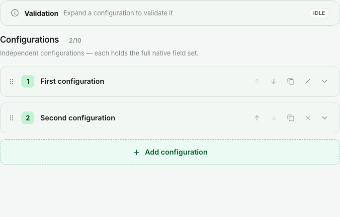
multiplicity: 'multi' turns the schema into a list of independent entries, each holding the full field set - for example one configuration per campaign. The entryList object drives the chrome around the list:
| Property | What it does |
|---|---|
heading | Heading above the entry list. |
description | Sub-note rendered under that heading. |
entryNoun | The word used for one entry - the add button says "Add {entryNoun}", lowercased. Defaults to "entry". |
titleField | The field whose value labels each entry row - without it, rows show as "{entryNoun} N". Display only. |
keyField | The field that identifies an entry when merging an uploaded file. Two entries match when their key fields serialize to the same stable key; an entry with no usable key never matches. |
maxEntries | Cap on the number of entries. Defaults to 20 when omitted. |
emptyMessage | Shown when the list is empty. |
Rendered, the form becomes a list of collapsible rows - each row is one full entry, titled by its titleField, with reorder, duplicate, and remove controls, and the add button below:
The stored value shape changes with multiplicity - a consumer of getFormValues must know which one it reads:
// singleton:  values.banner is an object
{ banner: { headline: 'Hello' } }

// multi:  values.campaigns is an array of objects
{ campaigns: [{ name: 'Summer' }, { name: 'Back to school' }] }
Prefer multiplicity: 'multi' when the entries are independent records with their own identity; prefer an array field when a repeating group lives inside one record.
Validation
Three layers, from cheapest to most expressive:
required: trueon any leaf. A value is "missing" when it'sundefined,null, an empty (trimmed) string, or an empty array -falseand0count as present.- Per-field
validateon a field - the field's own value in scope. - Form-level
validateon the view - the whole draft in scope, for cross-field rules.
The two validate callbacks are the same thing at two scopes: same signature, same returned errors, and both may be async. A field validator reads its own value; the form-level one starts from the whole draft (formData):
// On a field - `value` is that field's current value:
validate: (context, { value }) => {
  if (typeof value === 'string' && value.length > 80) {
    return [{ message: 'Keep the headline under 80 characters.', severity: 'warning' }];
  }
  return [];
},

// On the view - a cross-field rule over the whole draft:
validate: (context, { formData }) => {
  const banner = (formData as { banner: { headline?: string; showBanner?: boolean } }).banner;
  if (banner.showBanner && !banner.headline?.trim()) {
    return [{ instancePath: '/banner/headline', message: 'A visible banner needs a headline.' }];
  }
  return [];
},
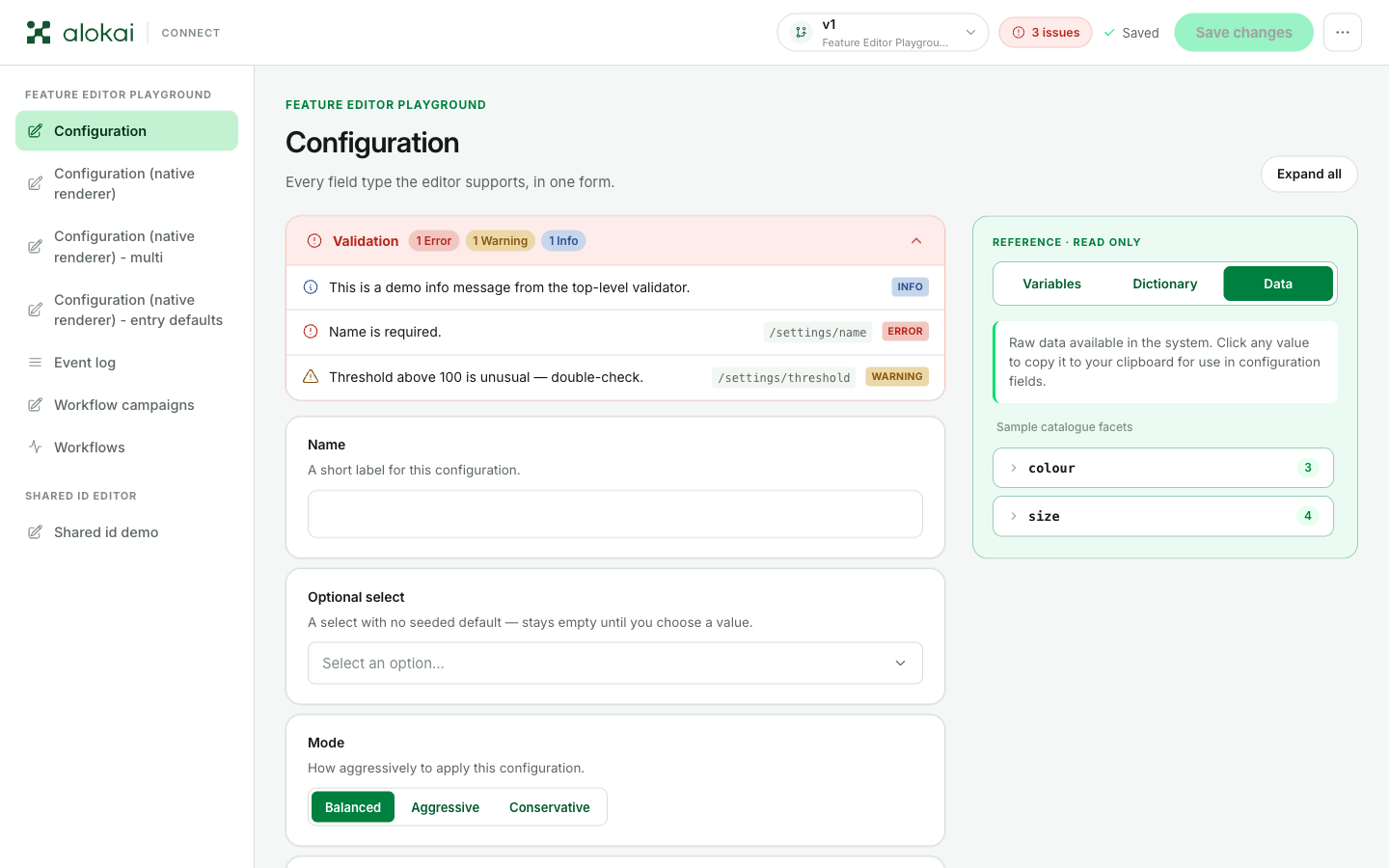
Every message from every layer lands in one place: the Validation card on top of the form. The card counts the messages by kind, takes the color of the most serious one, and clicking a message jumps to the field it points at:
All three layers produce the same error shape:
ValidationError field | Meaning |
|---|---|
message | The text shown in the Validation card at the top of the form. |
severity | 'error' | 'warning' | 'info'. Default 'error'. Picks the icon and color of the message in the Validation card, and colors the header chip by the worst message on screen. |
instancePath | JSON pointer to the value the message points at. Default "". |
keyword | Optional machine-readable rule name. Default 'custom'. |
Severity is a signal, not a gate. Nothing stops a save - not a missing required value, not an 'error'. Use 'error' for what somebody must fix before the version goes live for everyone, 'warning' for what they should look at, and 'info' for a hint.
instancePath is relative - it's joined onto the path of the thing that produced it. A field validator on excludedFacets returning { instancePath: '/3' } points at /excludedFacets/3 (the fourth item); an empty path points at the field itself. A form-level validator's path starts at the form root. In a multi schema, each entry is validated under /<schemaKey>/<index>, and the per-entry validators don't run at all on an empty entry list - the view-level validate still does.
Validation runs on the server about 300 ms after the user stops typing, on every change. Keep validators fast and never call a slow external API from one - that's what prepare is for.
The reference dock
A form view can put a read-only reference panel beside the form - a sticky dock that follows the operator as they scroll. It has up to three tabs, and a tab exists only when the view declares its data source. Declare none, and there's no dock at all.
| Tab | Declared with | What it holds |
|---|---|---|
| Variables | templateVariables | The dynamic values operators can reference as {{ ... }} in text fields. |
| Dictionary | dictionary | A vocabulary of known values, written as {{@name}} - checked, highlighted, and autocompleted. |
| Data | dataInspector | Reference data for looking things up while filling the form. |
All three are callbacks with the same shape as the other view callbacks - (context, editorContext), sync or async, with prepare's result available as editorContext.data.
Template variables
Template variables let operators write dynamic placeholders inside text and textarea fields: {{ product.name }} is resolved against the view's templateVariables and replaced with the value when your application reads the form. The Variables tab shows operators what they can reference.
The simplest declaration is a callback returning the variables:
templateVariables: async (context, { data }) => ({
  variables: {
    product: { name: 'Nevis backpack', sku: 'NV-01' },
    session: { locale: 'en-US' },
  },
}),
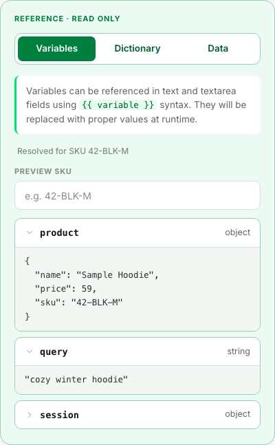
When the variables depend on a lookup, use the object form with inputs and fetch instead. inputs declares fields rendered at the top of the tab, and what the operator types there reaches fetch as its third argument:
templateVariables: {
  inputs: [{ id: 'sku', label: 'Preview SKU', placeholder: 'e.g. 42-BLK-M' }],
  fetch: async (context, editorContext, inputs) => {
    // `loadProduct` is your own code.
    const product = await loadProduct(context, inputs.sku?.trim() || '42-BLK-M');
    return {
      caption: `Resolved for SKU ${product.sku}`,
      variables: {
        product: { name: product.name, price: product.price, sku: product.sku },
        session: { locale: 'en-GB' },
      },
    };
  },
},
Here's that config in the dock - the input at the top, the caption under it, and the variables as a foldable tree:
Resolution is pure path lookup - property access, numeric indexes, and quoted keys only. There's no expression language and nothing is executed:
| Written in the field | Result |
|---|---|
{{ product.name }} | Nevis backpack |
{{ session["locale"] }} | en-US |
{{ items[0].id }} | the value at that path |
{{ price * 2 }} | left in the output literally - operators are not paths |
{{ missing.path }} | left in the output literally |
Objects and arrays resolve to pretty-printed JSON; null resolves to the string "null".
By default getFormValues returns the values with tokens resolved. Pass interpolate: false to read the raw authored strings - for example when you store a template that your own code renders later with per-request data. And when the view declares inputs, pass the operator-style values through the inputs parameter of getFormValues - see Reading values.
Dictionary
A dictionary token is different: in {{@Black Nevis}}, the name is the value. Nothing is substituted - the panel checks the token against the view's dictionary, highlights it when it's known, and offers the vocabulary in @ autocomplete while the operator types. The Dictionary tab lists the whole vocabulary, in groups:
dictionary: async (context, { data }) => [
  {
    key: 'colour_filter',
    label: 'Colour Filter',
    badge: 'V',
    items: [
      { value: 'Black Nevis', info: '46' },
      { value: 'Lime Lychee', info: '12' },
    ],
  },
  {
    key: 'aliases',
    label: 'Aliases',
    badge: 'Alias',
    items: [{ value: 'Dark', info: 'group' }],
  },
],
Each group is one foldable row. badge is the small tag next to the group name, and an item's info is a short note shown next to the value - a count, a category, whatever helps the operator pick:
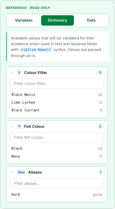
What your code receives for a dictionary token depends on the view. When the view declares templateVariables, reading the values strips the braces and the @, so {{@Black Nevis}} arrives as Black Nevis. When the view has no templateVariables, nothing is interpolated at all and the literal {{@Black Nevis}} reaches your code - the same text you get by passing interpolate: false.
Data inspector
The Data tab is the simplest of the three: read-only reference data for looking things up while filling the form. It never touches the form's values - but clicking any value copies it to the clipboard, ready to paste into a field:
dataInspector: async (context, { data }) => ({
  caption: 'Sample catalogue facets',
  sections: [
    { key: 'colour', label: 'colour', items: [{ label: 'black' }, { label: 'navy' }, { label: 'white' }] },
    { key: 'size', label: 'size', items: [{ label: 'S' }, { label: 'M' }, { label: 'L' }, { label: 'XL' }] },
  ],
}),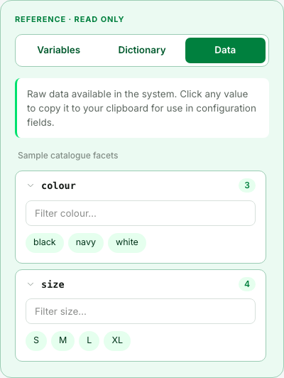
When the Data tab is present, it's the one the dock opens with.
Reading values
getFormValues is how your application reads what was authored in the panel. It works in production, on every storefront replica - it's the one Connect Admin endpoint that isn't part of the authoring surface.
Both call sites below return the same shape: the values wrapped in { values }, or null when nothing matches - an unknown feature, an unknown form view, or a view of another kind. "Not found" is never an exception. One failure does throw, though: when the view's own templateVariables resolver fails, the read raises that error instead of hiding it.
From the storefront, through the SDK (see Getting started for the module wiring):
const response = await sdk.connectAdmin.getFormValues({ viewId: 'banner' });
const banner = response?.values.banner;
From the middleware - inside a custom method, an extension, or a workflow step - go through the API client, the same way you call any other integration:
import type { ConnectAdminEndpoints } from '@/types';

const { api: connectAdmin } = await context.getApiClient<ConnectAdminEndpoints>('connect-admin');
const response = await connectAdmin.getFormValues({ viewId: 'banner' });
const banner = response?.values.banner;
Keeping a view off the internet
getFormValues is a public endpoint: anyone who can reach your middleware can call it and read any form view. That's fine for a banner the storefront shows anyway, but not for a view that holds internal knowledge - merchandising rules, boost weights, margin thresholds. Mark such a view serverOnly:
{
  id: 'merchandising-rules',
  kind: 'form',
  label: 'Merchandising rules',
  serverOnly: true,
  schemas: { /* ... */ },
  defaults: { /* ... */ },
}
A server-only view can then be read only by code running inside the middleware:
| Who asks | What they get |
|---|---|
A request from outside to /connect-admin/getFormValues - a browser, curl, Postman, or the storefront SDK | null |
Your middleware code, through context.getApiClient('connect-admin') - a custom method or an extension | The values |
A callback of another view, such as its templateVariables or prepare, that reads the server-only view | The values |
| A workflow step | The values |
The null an outside caller gets is exactly what a view that doesn't exist answers - the same status, headers and body - so from outside you can't even tell that the view is there. Each refused request is logged as a warning, which makes a storefront that still reads the view the old way easy to spot.
The storefront SDK counts as "outside". sdk.connectAdmin.getFormValues always goes over HTTP to the public endpoint - also when it runs on the server, in a Next.js server component or a Nuxt server route. To use a server-only view on a page, add a custom method in the middleware that reads the view and returns only what the page needs:
import type { ConnectAdminEndpoints } from '@/types';

export async function getCartCrossSell(context, { cartId }) {
  const { api: connectAdmin } = await context.getApiClient<ConnectAdminEndpoints>('connect-admin');
  const response = await connectAdmin.getFormValues({ viewId: 'merchandising-rules' });
  const rules = response?.values.rules;

  // Use the rules to pick the products, and return only the products -
  // never the rules themselves.
  return pickCrossSellProducts({ cartId, rules });
}
Your own code can still leak it
A server-only view stays private only as long as your code keeps it private. If a public view's templateVariables reads a server-only view and puts the value into its own text, everyone who reads the public view sees that value. The same goes for a custom method that returns the values as they are.
Parameters
| Parameter | What it does |
|---|---|
viewId | Required. Must name a kind: 'form' view - for any other kind the call answers null. |
featureId | Only needed when two features declare the same viewId. Without it, the first feature answers and a warning is logged. |
versionId | Read one specific version instead of the live one. |
inputs | Values handed to the view's templateVariables fetch as its third argument, keyed by input id. Only meaningful when the view declares templateVariables and interpolation is on. |
interpolate | Default true. Pass false to get the raw authored strings with {{ ... }} tokens unresolved. |
The result is keyed by the view's schema keys. Remember the shape depends on the schema's multiplicity - an object for singleton, an array for multi (see Multi-entry forms).
Which version answers
For an enabled feature, the data source is resolved in this order:
- An explicit
versionIdparameter, when passed. - The preview marker - a version someone switched on with Live only for me. This only applies in local development, where the panel and the read share one process - a preview never steers production reads.
- The live version.
For a disabled feature (its enabled resolved to false), saved versions are ignored entirely and the call returns the code baseline - the live entry of initialVersions, or the merged defaults. The answer is always the same, and it's never an error.
One silent fallback is worth knowing when the values look wrong: nothing saved yet also answers with the code baseline. So does a storage misconfiguration between the panel and the storefront - and from the storefront the two look identical. If values someone made live don't arrive, ask the Alokai team to check the storage setup.