Frontend components
Our CMS modules come with an out-of-the-box set of frontend components. In your Storefront, they will be divided into two groups: page and wrapper components.
These components work with all Alokai CMS integrations. You can customize and theme them as you like. If you want to be prepared for changing the CMS in the future, you shouldn't modify the component props, as it may break the integration with other CMS platforms.
Page components
Module-agnostic components serving as the main building blocks of your dynamic CMS pages. Built with Storefront UI and styled with Tailwind CSS. They are compatibile with the predefined Content Types we deliver for every CMS.
In your Storefront, page components are located in the /apps/storefront-unified-<nextjs|nuxt>/components/cms/page directory.
Check the Theming your Storefront page to learn how to customize the appearance of the components.
Accordion
Accordion allows you to display collapsible and expandable sections of content. It consists of a vertical stack of panels or sections, where each section has a header and associated content. The headers serve as clickable elements that allow the user to expand or collapse the associated content.
Under the hood, it uses the Accordion Item Base Component. Refer to the Storefront UI documentation for an interactive live preview with code examples and accessibility notes.
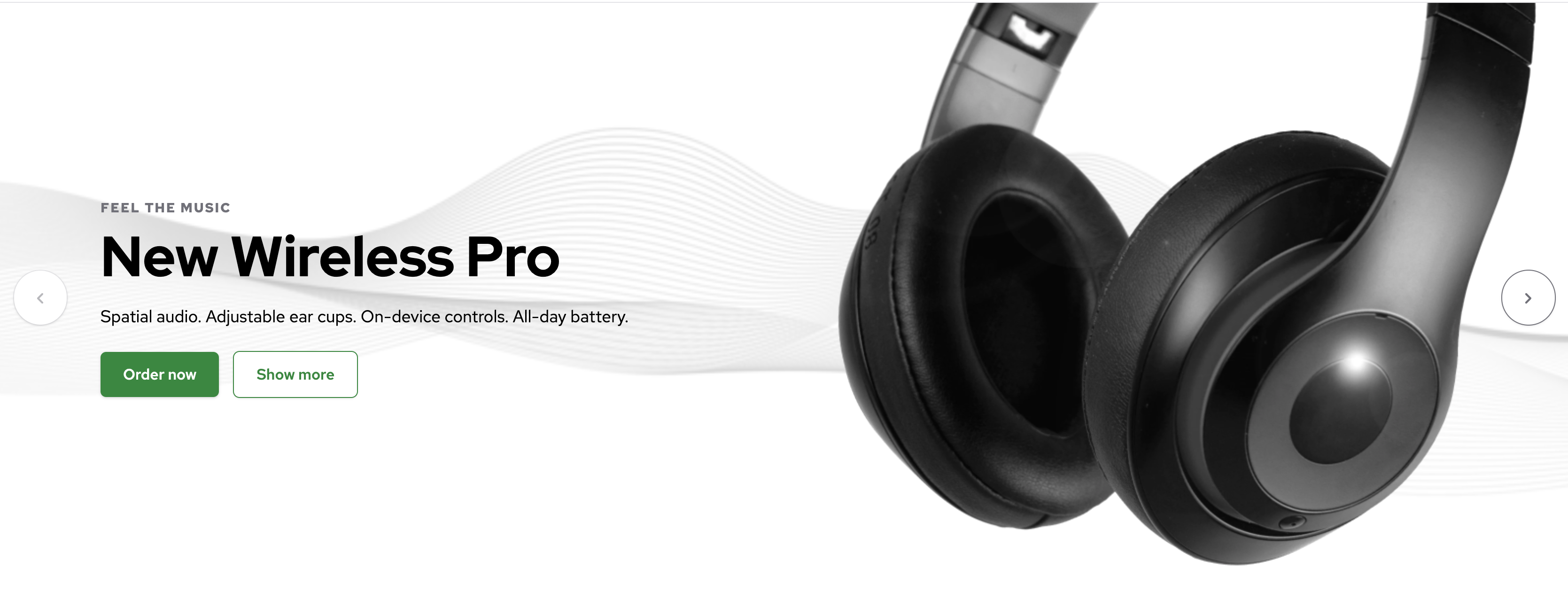
Banner
Banner features an attention-grabbing image, configurable background color and text fields allowing you to deliver important messages to the users. It also has a call-to-action button inviting users to visit specific pages (e.g. a product page or a promo page).
It's built using the Banners Block. Refer to the Storefront UI documentation for an interactive live preview with code examples and accessibility notes.

Card
Card component is ideal for displaying concise information or a summary of a larger content piece. It features an image, a title, a description and a call-to-action button.
It's built using the Card Block. Refer to the Storefront UI documentation for an interactive live preview with code examples and accessibility notes.

Category Card
Category Card component is ideal for displaying product categories. It features an image and a title which are clickable.
It's built using the Card Block. Refer to the Storefront UI documentation for an interactive live preview with code examples and accessibility notes.

Editorial
Rich Text editors available in Content Management Systems allow editors to create text content with extended formatting capabilities (i.e. applying styles such as bold, italics, headings, bullet points, hyperlinks, and more).
The Editorial component takes the raw HTML generated by the editor and renders it on a page. It also applies project-specific CSS classes to customize the look & feel of elements such as headings, paragraphs, tables and links.
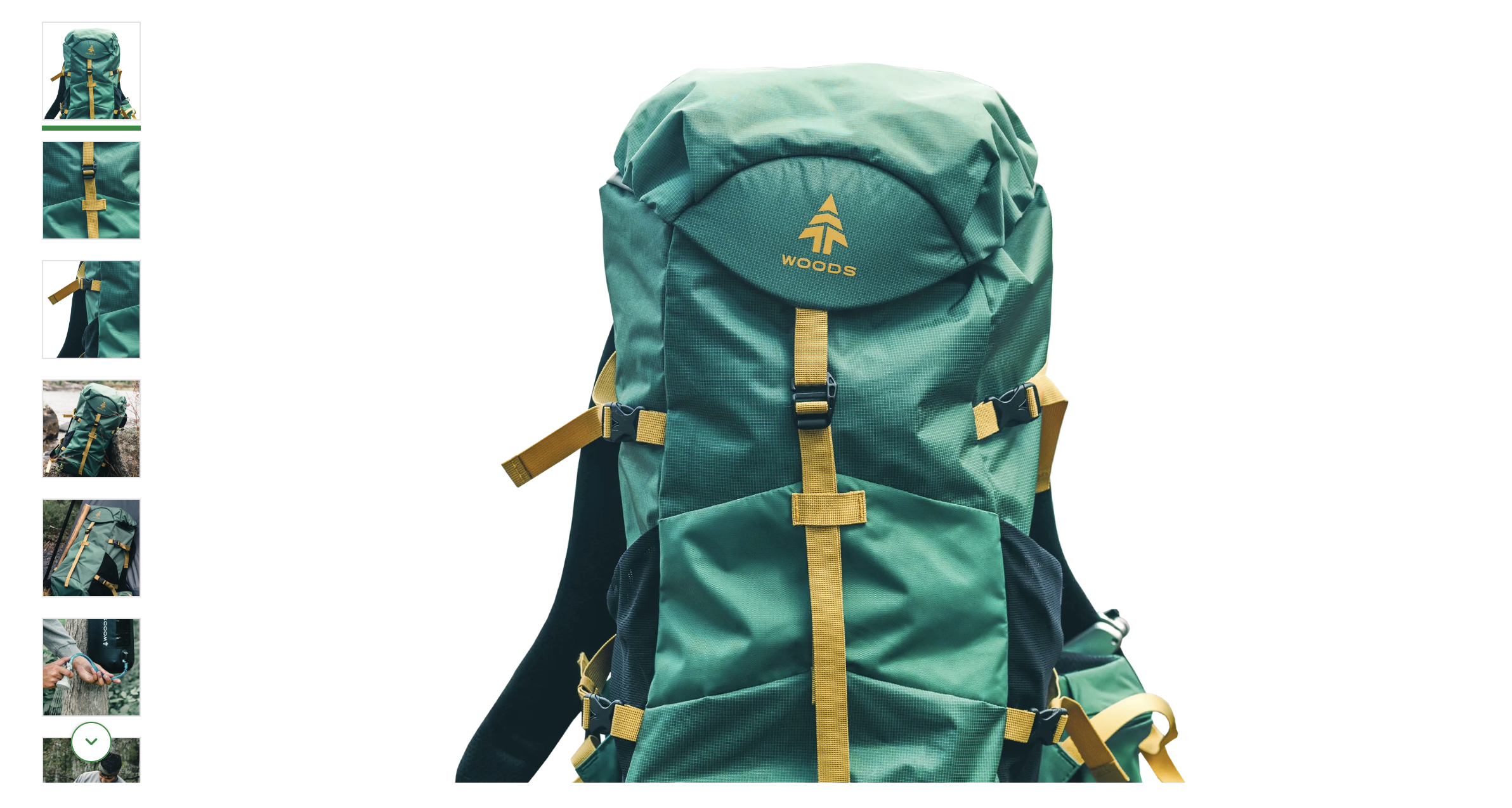
Gallery
Gallery allows you to display a collection of images with a single large image and a row of scrollable and clickable thumbnails. It is primarily intended for use on product pages, where it serves as an effective tool for showcasing product images.
It's built using the Gallery Block. Refer to the Storefront UI documentation for an interactive live preview with code examples and accessibility notes.
Grid
Grid is a powerful component which takes in other page components (e.g. Banner) and displays them in a structured grid layout. It operates on the CSS grid-template-areas property, giving content editors a descriptive syntax for achieving their desired configurations of rows and columns.
Every grid item is assigned a letter from the alphabet which can be used to define its placement in the grid.
Single row
Three items in a single-row, three-column layout.
"a b c"
2x2
Four grid items in a classic 2x2 grid.
"a b"
"c d"
2x1
Three items where the first one has been moved to the bottom of the grid and spans the entire row.
"b c"
"a a"
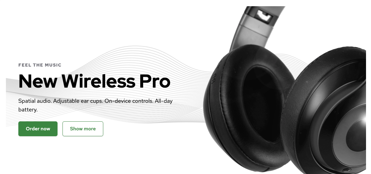
Hero
Hero is very similar to the Banner component but it is meant to be used on top of the page to create an impactful first impression. It features a background image or color, an image, various text fields and call-to-action buttons.
It's built using the Hero Block. Refer to the Storefront UI documentation for an interactive live preview with code examples and accessibility notes.
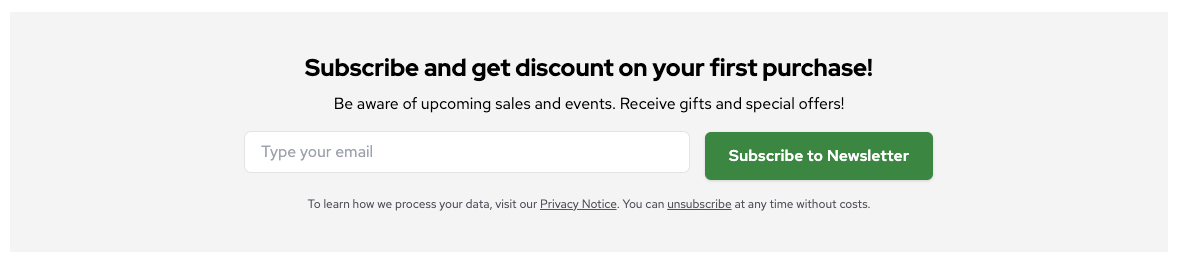
Newsletter Box
Newsletter Box engages users and allows them to subscribe to the Newsletter offered by the website owner. It features an email input field and customizable background, button text and heading and description. It is usually placed near the bottom of the page. The logic behind sending the inputted email address to the database has to be defined on the frontend component level - CMS is capable of customizing the visual layer only.
It's built using the NewsletterBox Block. Refer to the Storefront UI documentation for an interactive live preview with code examples and accessibility notes.
Product List
Product List uses Product Card under the hood but was designed to work with the real eCommerce data. Within the content for that component in your CMS, you can define a list of product SKUs. The list is then passed to the Product List component as a prop and used to fetch the corresponding product data from your eCommerce backend.

Scrollable
Scrollable takes in other components (e.g. ProductCard and Hero) and displays them as an interactive slider. Useful as the main building block for product carousels and hero sliders.
It's built using the Scrollable Base Component. Refer to the Storefront UI documentation for an interactive live preview with code examples and accessibility notes.
Wrapper Components
Module-specific components that prepare Storefront pages for dynamic CMS data fetching, page components rendering and live preview capabilities.
Wrapper components are located in the /apps/storefront-unified-<nextjs|nuxt>/sf-modules/<module_name>/components directory.
ConnectCmsPage
A main wrapper component that prepares Storefront pages for dynamic CMS data rendering. It fetches content from the CMS based on the provided route path and exposes it to child components — typically RenderCmsContent. This component also enables live preview capabilities when the Storefront is rendered within a CMS live preview iframe.
RenderCmsContent
A component that renders page components in your Storefront. It acts as a wrapper that receives component data from the CMS and renders the corresponding page components. Additionally, it applies dynamic CSS styles to components based on CMS specifications.