



Creating CMS components
This guide will show you how you could approach adding new components to your Alokai & CMS setup. The described steps will also come in handy while editing the existing components.
Creating a frontend component
In this section, you're going to create a basic frontend Picture component that displays an image and its caption. The content for the component will be dynamic and delivered by a CMS.

Code examples in this guide refer to the /apps/storefront-unified-nextjs directory of your Next Storefront.
Create a component
Create a new picture.tsx file with the following content:
import { PropsWithStyle } from '@storefront-ui/react';
import { AgnosticCmsImage } from '@vsf-enterprise/cms-components-utils';
import classNames from 'classnames';
import { PropsWithChildren, ReactNode } from 'react';

export interface PictureProps extends PropsWithStyle, PropsWithChildren {
  caption: ReactNode;
  image?: AgnosticCmsImage;
}

export default function Picture({ children, caption = children, className, image, ...rest }: PictureProps) {
  const { alt, desktop, mobile } = image ?? {};

  return (
    <figure className={classNames('flex flex-col items-center', className)} {...rest}>
      {image && (
        <picture>
          {mobile && <source media="(max-width: 768px)" srcSet={mobile} />}
          {desktop && <img alt={alt} className="rounded-md" src={desktop} />}
        </picture>
      )}
      {caption && <figcaption className="text-center">{caption}</figcaption>}
    </figure>
  );
}
Register the component
If you are using our Builder.io integration, you have to register the Custom Component in the schemas.tsx file:
import { RegisteredComponent } from '@builder.io/sdk-react';
import Picture from '@/components/cms/page/picture';

export const customComponents: RegisteredComponent[] = [
  // ... other components schemas
  {
    component: Picture,
    defaultChildren: [
      {
        '@type': '@builder.io/sdk:Element',
        component: {
          name: 'Editorial',
          options: {
            content: 'Image caption',
          },
        },
      },
    ],
    image: 'https://alokai.com/favicon.svg',
    inputs: [
      {
        ...baseImageInput,
        name: 'image',
        required: true,
      },
    ],
    name: 'Picture',
  },
];
If you are using our other integrations, import the component in the render-cms-content.tsx wrapper:
import type { ComponentType } from 'react';
import Picture from '@/components/cms/page/picture';

const components: Record<string, CmsComponent> = {
  // ... other components
  Picture,
};
Code examples in this guide refer to the /apps/storefront-unified-nuxt directory of your Nuxt Storefront.
Create a component
Create a new Picture.vue file with the following content:
<template>
  <figure class="flex flex-col items-center">
    <picture v-if="image">
      <source v-if="image.mobile" media="(max-width: 768px)" :srcset="image.mobile" />
      <img v-if="image.desktop" :src="image.desktop" :alt="image.alt" class="rounded-md" />
    </picture>
    <figcaption class="text-center">
      <slot name="caption" />
      <slot />
    </figcaption>
  </figure>
</template>

<script lang="ts" setup>
import type { AgnosticCmsImage } from '@vsf-enterprise/cms-components-utils';

type PictureProps = {
  image?: AgnosticCmsImage;
};

defineProps<PictureProps>();
</script>
Register the component
If you are using our Builder.io integration, you have to register the Custom Component in the schemas.ts file:
import { RegisteredComponent } from '@builder.io/sdk-react';

// ... other components imports
const ProductList = defineAsyncComponent(() => import('~/components/cms/page/ProductList.vue'));
const Picture = defineAsyncComponent(() => import('~/components/cms/page/Picture.vue'));

export const components: RegisteredComponent[] = [
  // ... other components schemas
  {
    component: Picture,
    defaultChildren: [
      {
        '@type': '@builder.io/sdk:Element',
        component: {
          name: 'Editorial',
          options: {
            content: 'Image caption',
          },
        },
      },
    ],
    image: 'https://alokai.com/favicon.svg',
    inputs: [
      {
        ...baseImageInput,
        name: 'image',
        required: true,
      },
    ],
    name: 'Picture',
  },
];
If you are using our other integrations, import the component in the RenderCmsContent.vue wrapper:
<script lang="ts" setup>
const components = {
  // ...
  Picture: defineAsyncComponent(() => import('~/components/cms/page/Picture.vue')),
};
</script>
Creating a CMS component
The process of creating a structure for a custom component differs in every CMS. Select your platform from the tabs below and follow the associated guide.
In this section, you're going to create a new, custom Content Type in Amplience. It will act as a scaffolding for entries which will be rendered by your new frontend component. Remember that by default you'll be equipped with couple predefined Alokai components (content models/types).
Read more about creating Content Types in the Amplience documentation.
Create Content Type
Open up your Amplience Dynamic Content panel, navigate to the Development dropdown and choose Content Type schemas. Once a popup appears on the screen, choose "code from scratch".
In the following screen, give your schema an id (in the URI format, e.g. https://www.vuestorefront.io/picture.json) and set Content Type as the validation level. Hit the Create schema button to confirm.
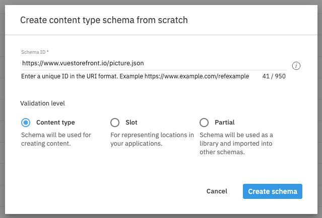
A schema editor window should pop up. Now you can create your own schema based on pre-configured properties listed in add property dropdown.
Add the component field
In the schema, add the component field of type string. It is mandatory for all Content Types which act as components (e.g. Banner, Hero). Its value should represent the name of the frontend component which will be used to render it.
Use the const property to hardcode that value so that content editors do not have to type it manually every time they create a new Picture entry.
{
  "properties": {
    "component": {
      "title": "Component",
      "type": "string",
      "const": "Picture"
    }
  }
}
Add image field
You can add any field you want, for our Picture Content Type we will need a image field.
{
  "properties": {
    "image": {
      "type": "object",
      "allOf": [
        {
          "$ref": "http://bigcontent.io/cms/schema/v1/core#/definitions/image-link"
        }
      ]
    }
  }
}
If you want to make the field localizable, it has to be wrapped in the localized-value. For instance the localized image would look as follows:
{
  "properties": {
    "image": {
			"allOf":[
				{
					"$ref":"http://bigcontent.io/cms/schema/v1/core#/definitions/localized-value"
				}
			],
			"properties": {
				"values": {
					"items": {
						"properties": {
							"value": {
								"title": "Image",
								"allOf": [
									{ "$ref": "http://bigcontent.io/cms/schema/v1/core#/definitions/image-link" }
								]
							}
						}
					}
				}
			}
		},
  }
}
You can read more about the localization in the Amplience docs. We recommend also to analyze the schema for the Alokai's content types which we provide out of the box for you. You can find them in apps/storefront-middleware/sf-modules/cms-amplience/content-type-schemas/schemas directory.
Add caption content link field
To make the caption flexible, we can set a caption as Editorial Content Type, which will allow you to use rich text features. Create the caption field of type content-link. As the only possible type to be chosen pick the https://www.vuestorefront.io/editorial.json schema which allows you to add rich text.
{
  "properties": {
    "caption": {
      "type": "object",
      "allOf": [
        {
          "$ref": "http://bigcontent.io/cms/schema/v1/core#/definitions/content-link"
        },
        {
          "properties": {
            "contentType": {
              "enum": ["https://www.vuestorefront.io/editorial.json"]
            }
          }
        }
      ]
    }
  }
}
It is worth to mention that you can share different kind of references between schemas as described here.
Make the component stylable
Additionally, you can make your component stylable by adding another field of type Content link to it. Name it styles and let it only accept schema of the styles (https://www.alokai.com/styles_partial.json).
{
  "properties": {
    "styles": {
      "type": "array",
      "items": {
        "type": "object",
        "allOf": [
          {
            "$ref": "https://www.alokai.com/styles_partial.json#/definitions/styles"
          }
        ]
      }
    }
  }
}
styles field has to be of type array to allow setting multiple styles based on media queries.
Once done, save your Picture Content Type schema. Now it should look like this:
{
  "$id": "https://www.vuestorefront.io/picture.json",
  "$schema": "http://json-schema.org/draft-07/schema#",
  "allOf": [
    {
      "$ref": "http://bigcontent.io/cms/schema/v1/core#/definitions/content"
    }
  ],
  "title": "Picture",
  "description": "Picture Content Type schema",
  "type": "object",
  "properties": {
    "component": {
      "const": "Picture",
      "title": "Component",
      "type": "string"
    },
    "image": {
      "type": "object",
      "allOf": [
        {
          "$ref": "http://bigcontent.io/cms/schema/v1/core#/definitions/image-link"
        }
      ]
    },
    "caption": {
      "type": "object",
      "allOf": [
        {
          "$ref": "http://bigcontent.io/cms/schema/v1/core#/definitions/content-link"
        },
        {
          "properties": {
            "contentType": {
              "enum": ["https://www.vuestorefront.io/editorial.json"]
            }
          }
        }
      ]
    },
    "styles": {
      "items": {
        "allOf": [
          {
            "$ref": "https://www.vuestorefront.io/styles_partial.json#/definitions/styles"
          }
        ],
        "type": "object"
      },
      "type": "array"
    }
  }
}
Register schema
In order to use your schema, it needs to be registered, so click on the Save and register as content type option from Save dropdown in upper right corner of the screen.
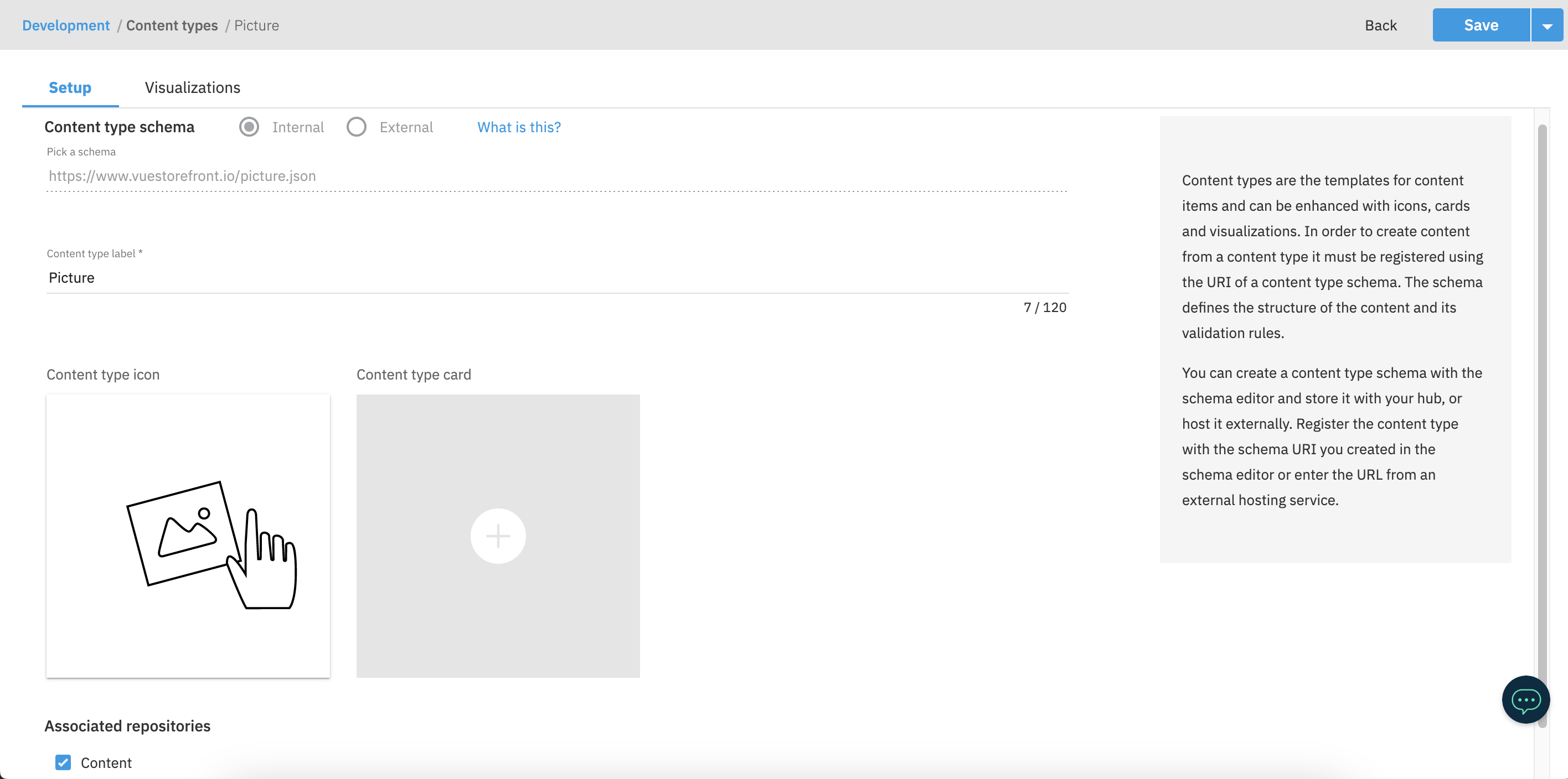
In the following screen set the Content type label to Picture and set associated repository to Content. Optionally you can also add the icon and card for better recognition of the Content Type for final users.
Add Visualization
To be able to preview the Picture Content Type, go to the Visualizations tab and create a new visualization. Our module provides a /amplience-visualization Storefront route which allows you to preview a single component in isolation. We can use this page to set up the Localhost visualization. To to identify the component, make sure that the tokens are passed as query params, so the Visualization URL should look like this http://localhost:3000/amplience-visualization?hubName={{hub.name}}&contentItemId={{content.sys.id}}&deliveryKey={{delivery.key}}&snapshotId={{snapshot.id}}&vseDomain={{vse.domain}}&locales={{locales}}.
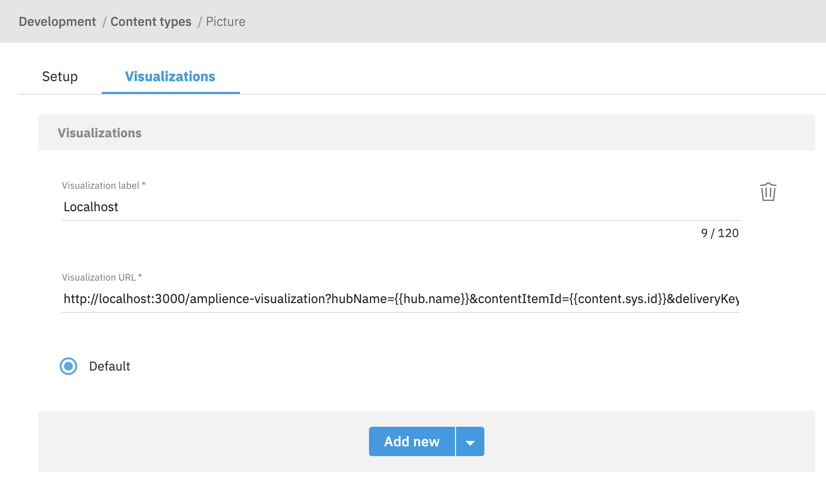
Once done, click the Save button to confirm.
You can read more about the Amplience visualizations in the official documentation.
Register the new component in the Page
To be able to use the new Picture component in the Page Content Type, you need to include it in the componentsAboveFold and componentsBelowFold fields.
Go to Development > Content Type schemas and search for the Page Content Type schema (https://www.vuestorefront.io/page.json). Open it in the editor and scroll down to the properties section. Include the ID of your Picture component in both componentsAboveFold and componentsBelowFold.
{
  "properties": {
    "componentsAboveFold": {
      "items": {
        "allOf": [
          {
            "$ref": "http://bigcontent.io/cms/schema/v1/core#/definitions/content-link"
          },
          {
            "properties": {
              "contentType": {
                "enum": [
                  "https://www.vuestorefront.io/picture.json"
                ]
              }
            }
          }
        ]
      }
    },
    "componentsBelowFold": {
      "items": {
        "allOf": [
          {
            "$ref": "http://bigcontent.io/cms/schema/v1/core#/definitions/content-link"
          },
          {
            "properties": {
              "contentType": {
                "enum": [
                  "https://www.vuestorefront.io/picture.json"
                ]
              }
            }
          }
        ]
      }
    }
  }
}
As a last step, click the blue dropdown arrow in the top-right corner and choose Save and sync Content Type option from the list.
Create a new entry
Now you can create a new entry based on the Picture Content Type. Go to the Content tab and click the Create content button. Choose the Picture Content Type from the list and fill in the fields with the desired values. Once done, click the Save button to confirm. After that, the visualization of the new entry should appear on the right side of the screen.
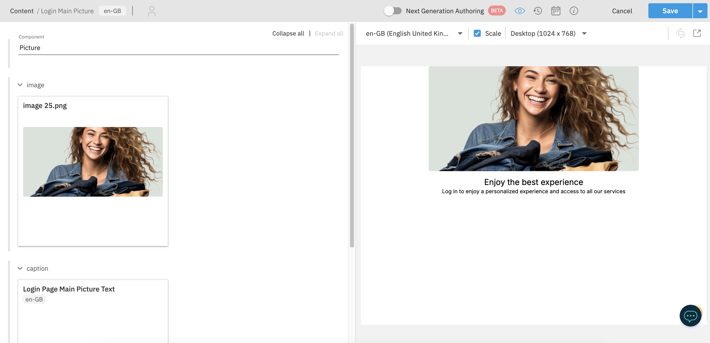
In this section, you are going to create a new, custom, and content-driven Component in Bloomreach. Remember that by default you'll be equipped with couple predefined Alokai components (content models/types).
The process involves the following steps:
- creating a content type,
- creating a folder for documents,
- creating the actual component.
Read more
We strongly recommend you supplement following this guide by reading the official Bloomreach tutorials on content modeling.
Create a Content Type
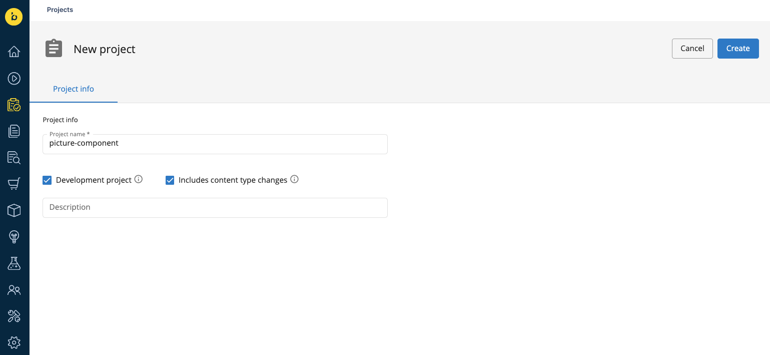
To create a Content Type in Bloomreach, you have to create a development project with Content Type changes first. Using the left-hand-side menu, navigate to the Projects tab and click the blue + Project button. Give your project some arbitrary name, tick the Development project and Includes content type changes boxes and click the Create button.
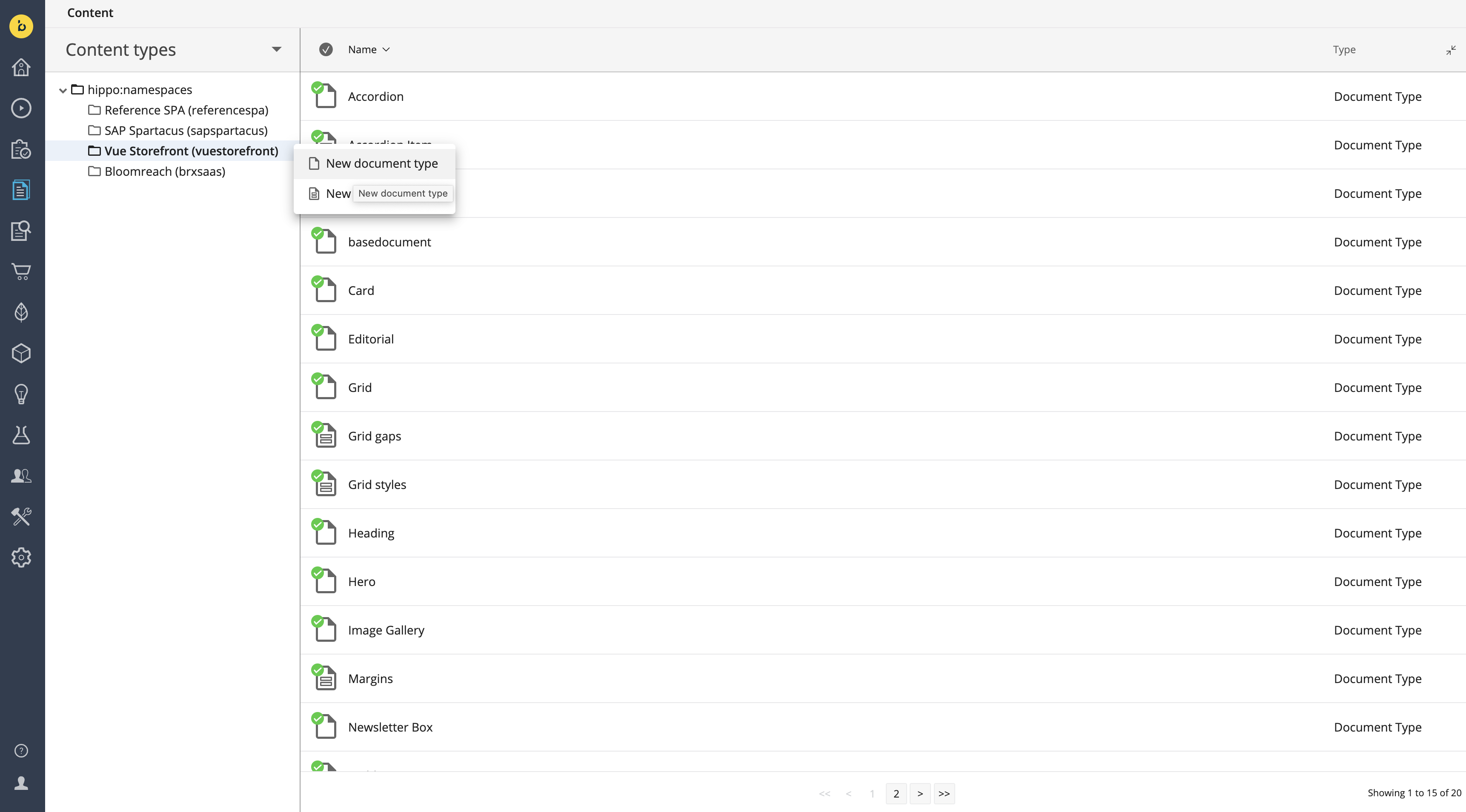
Once the development project has been created, use the left-hand-side menu to navigate to the Content Application. From the dropdown in the top-left corner, select content types and open the Vue Storefront (vuestorefront) folder. You will see all the default Content Types provided by Alokai as part of the integration. Move the cursor over the folder name, click the three dots and select the New document type option.
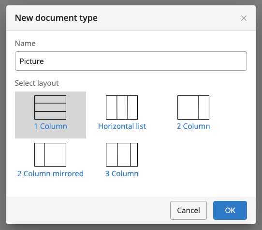
In the dialog box that appears, name your new Content Type Picture and select the one-column layout. Click OK to confirm.
In the Content Type editor, start with creating a component string field with "Picture" as the default value. This field is mandatory for all Content Types which act as components, to be able to recognize them on the frontend.
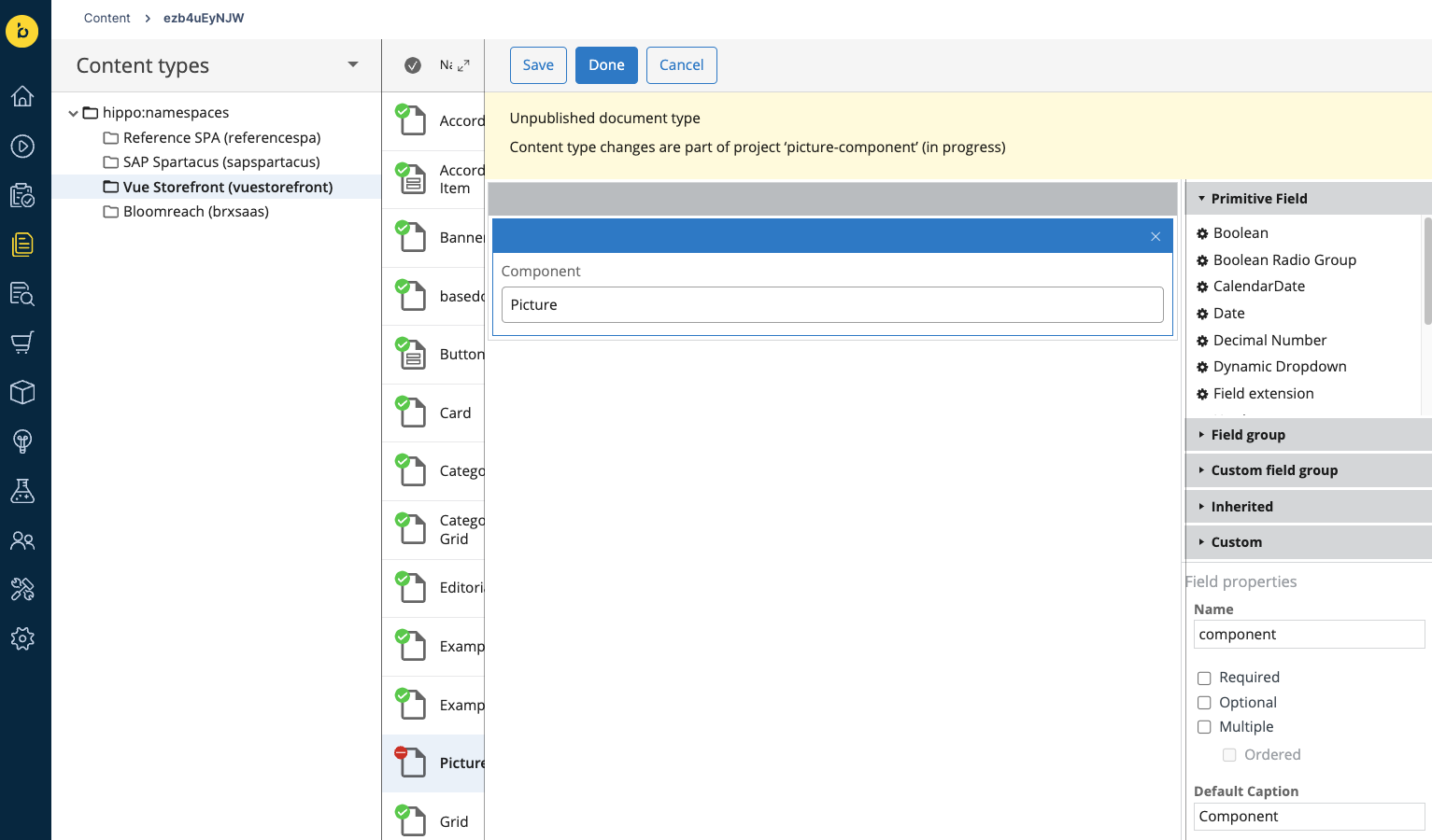
Next, you can add any fields whose values will be passed as a dynamic props to your frontend component. Start with adding an image field. From the Field group menu on the right, choose the Image Link and name it image.
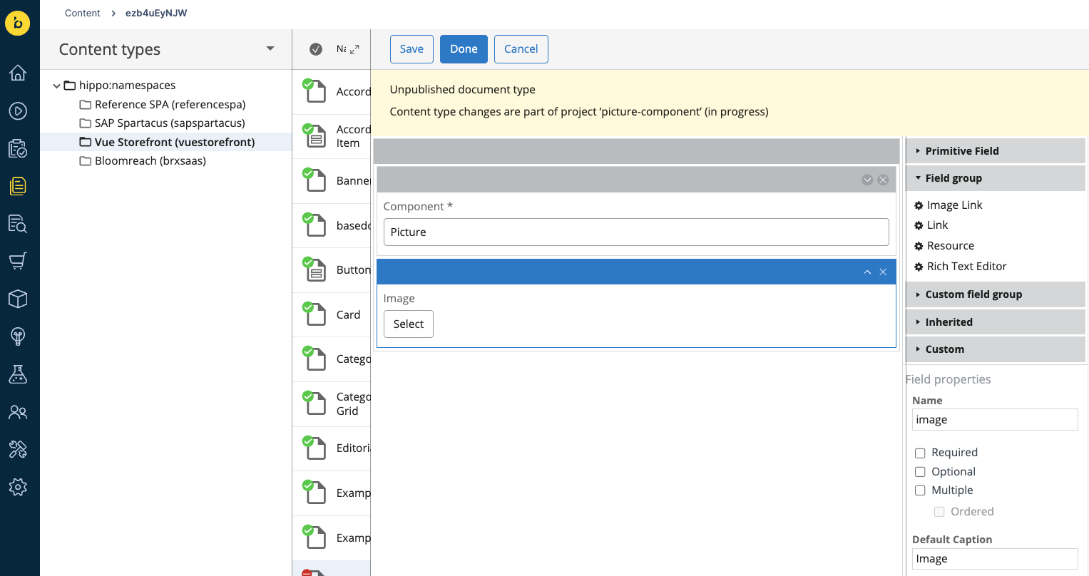
Then, create the caption field by choosing the Link field group and naming it caption. Set the cluster.name field to cms-pickers/documents.
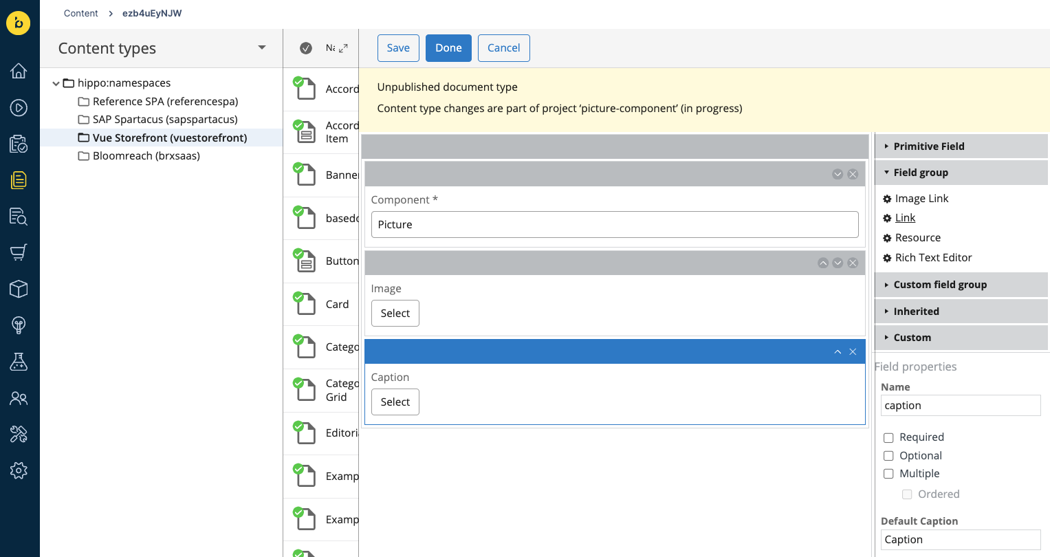
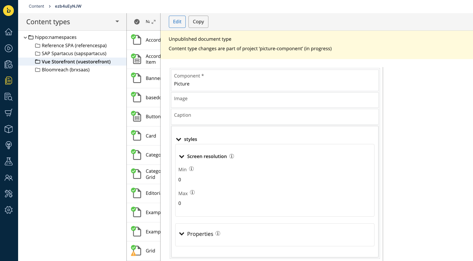
As a bonus, you can make your component stylizable by adding the Styles custom field group to it, naming it styles and marking it as Multiple. Once done, save your Example Content Type schema by clicking the blue Done button. Now it should look like this:
Create a folder for documents
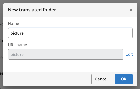
With the Content Type in place, let's create a folder for storing our documents. Staying within the Content Application, select Documents from the dropdown in the top-left corner. Hover over the name of your channel's folder, click the three dots and select the New translated folder... option.
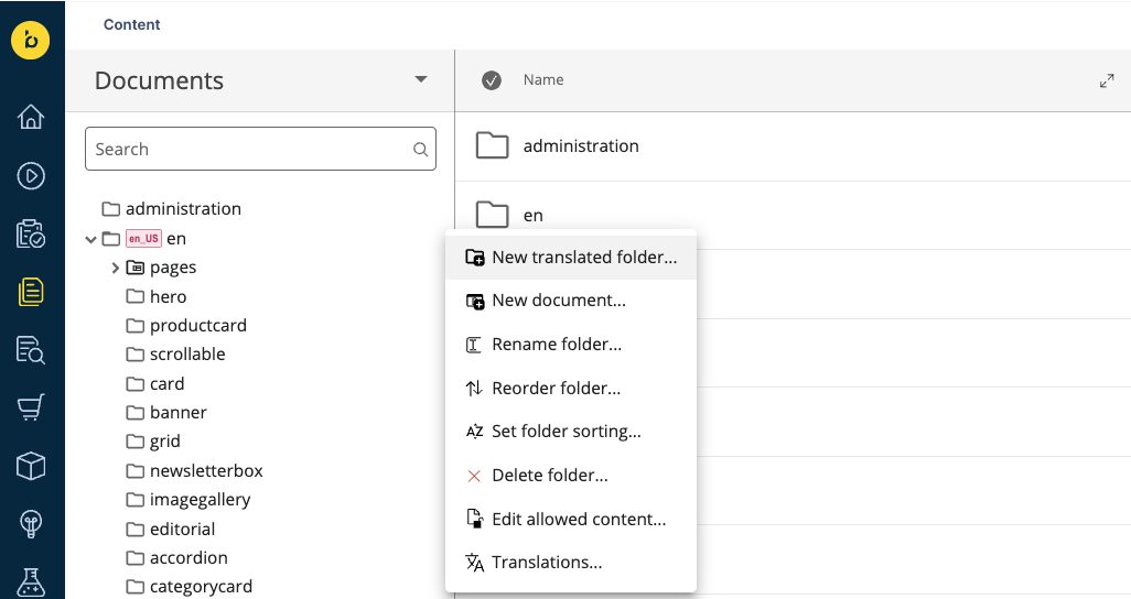
Give your folder the name picture and click OK.
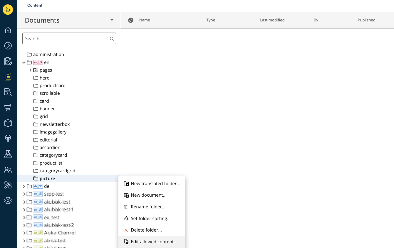
Once your new folder appears on the list, hover over it, click the three dots and select Edit allowed content....
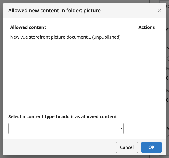
In the Select a content type to add it as allowed content dropdown, find the name of the newly-created Content Type and pick it. Click OK to save.
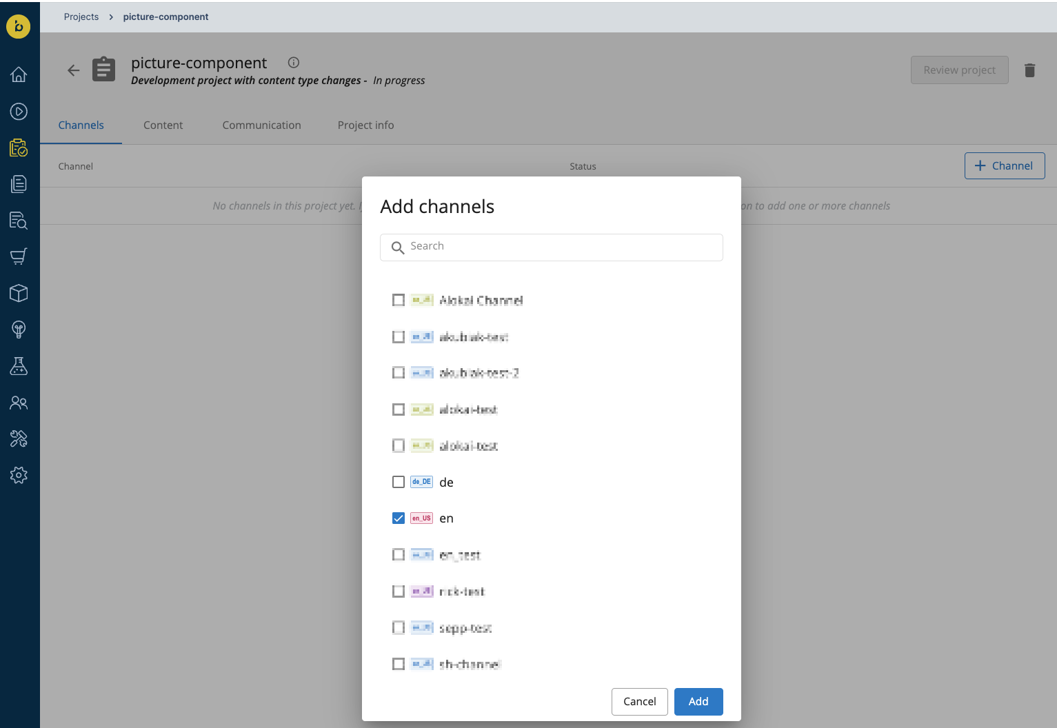
With the Content Type and folder in place, go back to the Projects tab. Select your active project, click the + Channel button on the right and select the desired channel from the list. We've added the example folder to the en channel directory so we are going to choose that one. Once done, click the blue Add button.
After adding the channel to the project, click the blue Review project button in the top-right corner. On the channel list, accept the changes by clicking the tick ✔️ symbol on the right. Confirm by clicking the blue Merge button which should appear in the top-right corner.
If the Merge button does not appear, it probably means you need more than 1 acceptance to merge your project. You can contact the Bloomreach team to lift the requirement.
Create a component
To create the actual component, you must once again create a new project but - this time - without Content Type changes. Once the project is created, add the desired channel to it - just like you did at the end of the previous section.
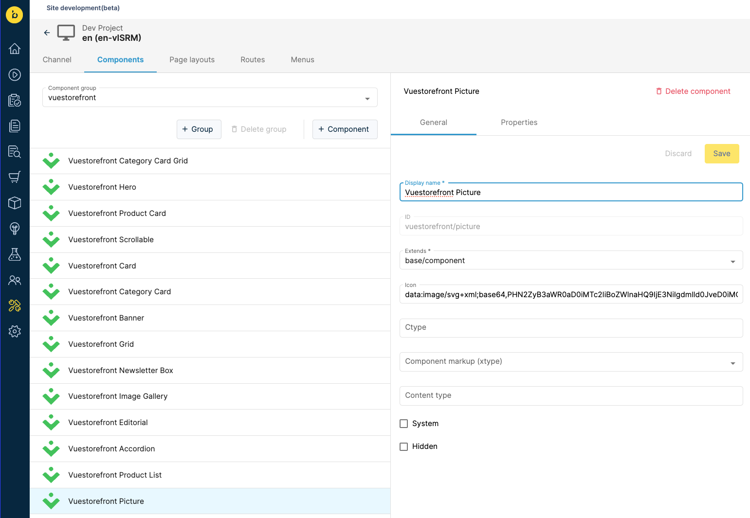
As a next step, navigate to the Site Development App and select your project from the list. Go to the Components tab and select the vuestorefront component group from the dropdown below. Then click the + Component button and fill the form with the properties listed below.
| Property | Value |
|---|---|
| Display name | Vuestorefront Picture |
| ID | vuestorefront/picture |
| Extends | base/component |
You can also add a path to the Alokai logo in the Icon field:
data:image/svg+xml;base64,PHN2ZyB3aWR0aD0iMTc2IiBoZWlnaHQ9IjE3NiIgdmlld0JveD0iMCAwIDE3NiAxNzYiIGZpbGw9Im5vbmUiIHhtbG5zPSJodHRwOi8vd3d3LnczLm9yZy8yMDAwL3N2ZyI+CjxwYXRoIGQ9Ik03OS4yMTY1IDUuOTI0MDFDNzcuNjQ2MiA2LjkwMDUzIDc2LjEwNTIgOC40NDE0NyA3My4wMjM0IDExLjUyMzRDNjkuOTQxOCAxNC42MDQ4IDY4LjQwMDQgMTYuMTQ2MyA2Ny40MjQgMTcuNzE2NUM2NC4xOTIgMjIuOTE0IDY0LjE5MiAyOS40OTYgNjcuNDI0IDM0LjY5MzVDNjguNDAwMyAzNi4yNjM1IDY5Ljk0MDkgMzcuODA0MSA3My4wMjE1IDQwLjg4NDhMNzMuMDIzIDQwLjg4NjRDNzYuMTA0OSA0My45NjgyIDc3LjY0NjIgNDUuNTA5NSA3OS4yMTY1IDQ2LjQ4NkM4NC40MTQgNDkuNzE4IDkwLjk5NiA0OS43MTggOTYuMTkzNSA0Ni40ODZDOTcuNzYzOCA0NS41MDk1IDk5LjMwNDggNDMuOTY4NSAxMDIuMzg3IDQwLjg4NjdDMTA1LjQ2OSAzNy44MDQ4IDEwNy4wMDkgMzYuMjYzOCAxMDcuOTg2IDM0LjY5MzVDMTExLjIxOCAyOS40OTYgMTExLjIxOCAyMi45MTQgMTA3Ljk4NiAxNy43MTY1QzEwNy4wMDkgMTYuMTQ2MiAxMDUuNDY5IDE0LjYwNTMgMTAyLjM4NyAxMS41MjM0Qzk5LjMwNDggOC40NDE1NCA5Ny43NjM4IDYuOTAwNTMgOTYuMTkzNSA1LjkyNDAxQzkwLjk5NiAyLjY5MjAyIDg0LjQxNCAyLjY5MTk4IDc5LjIxNjUgNS45MjQwMVoiIGZpbGw9IiMwMkM2NTIiLz4KPHBhdGggZD0iTTk5LjQ5MjggMTAyLjM0MUwxMzUuMzUzIDY2LjQ4MDRDMTM2LjgzOSA2NC45OTQ2IDEzOC42MDMgNjMuODE2MSAxNDAuNTQ0IDYzLjAxMkMxNDIuNDg1IDYyLjIwNzkgMTQ0LjU2NiA2MS43OTQxIDE0Ni42NjcgNjEuNzk0MUMxNDguNzY4IDYxLjc5NDEgMTUwLjg0OCA2Mi4yMDc5IDE1Mi43OSA2My4wMTJDMTU0LjczMSA2My44MTYxIDE1Ni40OTUgNjQuOTk0NiAxNTcuOTggNjYuNDgwM0wxNzYgODQuNDk5OEMxNzUuODkxIDg0LjYwOCA4OCAxNzIuNSA4OCAxNzIuNUwwIDg0LjQ5OTlDMC4yMzg3NDUgODQuMjYxOCA5Ljk4MTYgNzQuNTE4OCAxOC4yMDkyIDY2LjI5MUMxOS42OTQxIDY0LjgwNTkgMjEuNDU3MSA2My42Mjc5IDIzLjM5NzMgNjIuODI0MkMyNS4zMzc2IDYyLjAyMDUgMjcuNDE3MiA2MS42MDcgMjkuNTE3MyA2MS42MDcxQzMxLjYxNzQgNjEuNjA3MyAzMy42OTY5IDYyLjAyMTIgMzUuNjM3MSA2Mi44MjUyQzM3LjU3NzIgNjMuNjI5MiAzOS4zMzk5IDY0LjgwNzUgNDAuODI0NiA2Ni4yOTI4TDc2Ljg3NDMgMTAyLjM0MkM3OC4zNTk1IDEwMy44MjcgODAuMTIyNyAxMDUuMDA1IDgyLjA2MzIgMTA1LjgwOUM4NC4wMDM3IDEwNi42MTMgODYuMDgzNSAxMDcuMDI2IDg4LjE4MzggMTA3LjAyNkM5MC4yODQyIDEwNy4wMjYgOTIuMzYzOSAxMDYuNjEyIDk0LjMwNDMgMTA1LjgwOEM5Ni4yNDQ3IDEwNS4wMDQgOTguMDA3NyAxMDMuODI2IDk5LjQ5MjggMTAyLjM0MVoiIGZpbGw9IiMwMkM2NTIiLz4KPC9zdmc+Cg==Once done, click the blue Create button and the Vuestorefront Example component will appear on the list.
Next, navigate to the Properties tab in the newly created component. Click the + Property button and select New content path property. Fill out the form with the properties listed below. Once done, click the Save button.
| Property | Value |
|---|---|
| name | document |
| label | Document |
| value type | string |
| picker configuration | cms-pickers/documents-only |
| selectable node types | vuestorefront:Picture |
After that, create 3 more simple properties with the following configurations:
| Property | Value |
|---|---|
| name | document-template-query |
| displayName | Document template query |
| value type | string |
| default value | new-vuestorefront-Picture-document |
| hidden | true |
| Property | Value |
|---|---|
| name | root |
| displayName | Root document folder |
| value type | string |
| default value | picture |
| hidden | true |
| Property | Value |
|---|---|
| name | parameter |
| displayName | Document parameter |
| value type | string |
| default value | document |
| hidden | true |
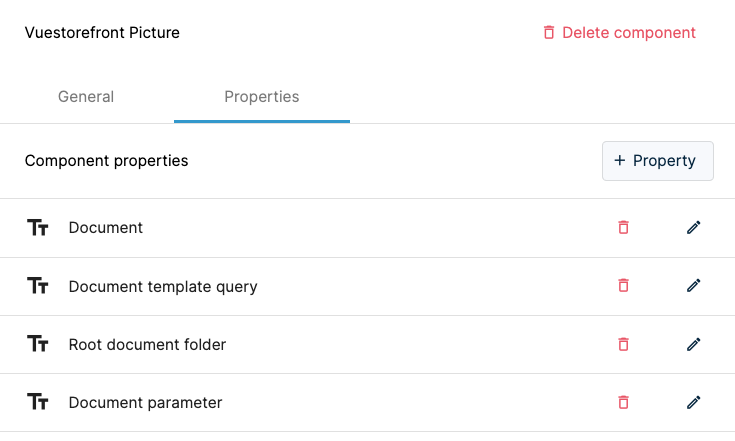
After you save all of them, the properties of your Vuestorefront Picture component should look like this:
Now you can go back to the Projects tab and merge your project.
Create a new document
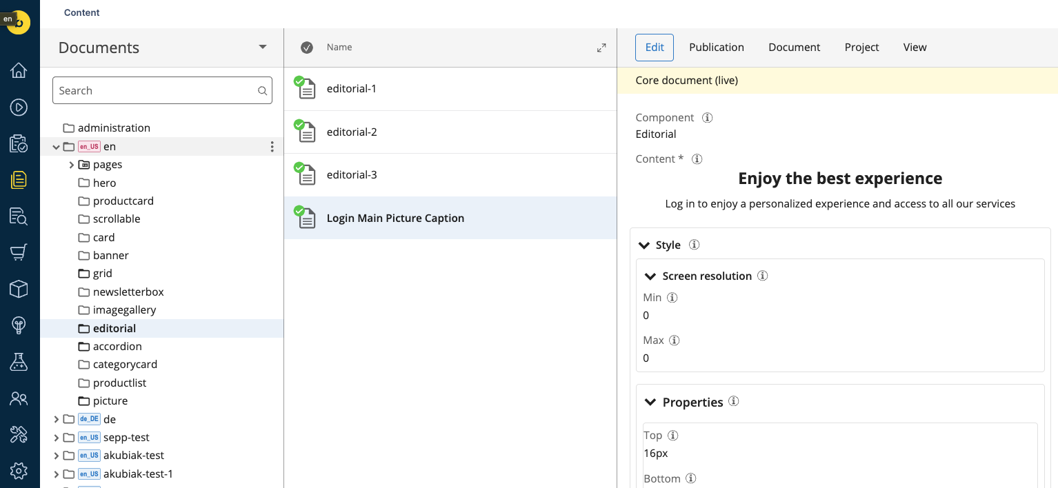
To create a new document, navigate to the Documents tab in the Content Application. In your channel's folder open editorial folder, choose the three dots and select the New vue storefront editorial document option. Fill it with the caption which will be displayed below the image and after saving it publish the document.
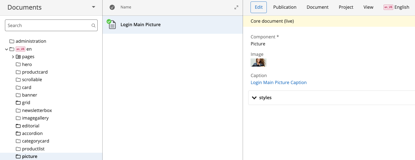
After that open the picture folder, choose the three dots and select the New vue storefront picture document option. Fill it with the image and the caption you've created in the previous step. Once done, publish the document.
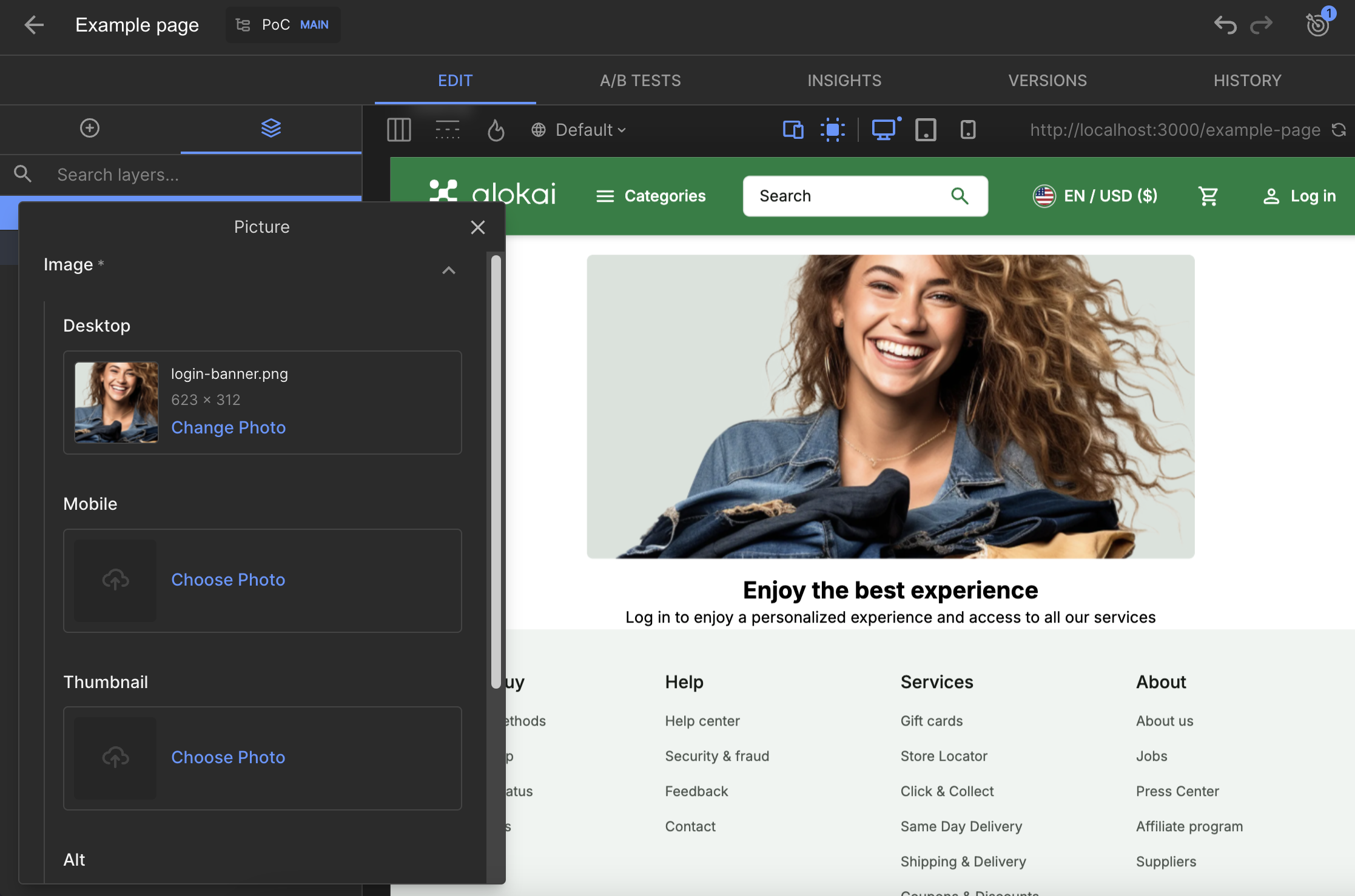
In Builder.io, creating a new, custom component and registering it in the schemas file is all it takes. It should now be available in the Visual Editor. To create a new Picture component, create a new Page entry and add the Picture component to it.
In this section, you're going to create a new, custom Content Type in Contentful. It will act as a scaffolding for entries which will be rendered by your new frontend component.
Create a Content Type
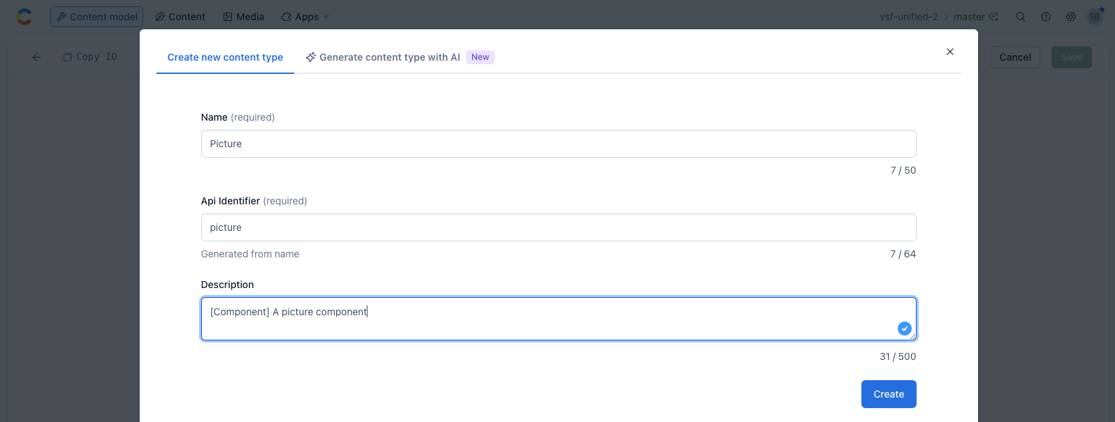
Open up your Contentful Web App and navigate to the Content model tab. In the top-right corner, click the + Add Content Type button. Once a new editor appears on the screen, fill it with the following data and confirm by clicking the Create button:
Add the Component field
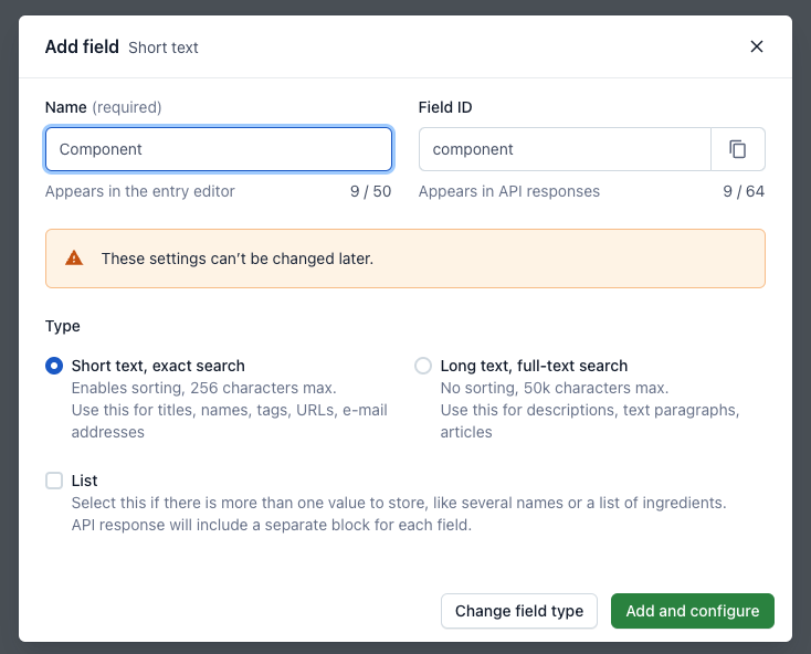
Create a Component text field. This field is mandatory to for all Content Types which act as components, to be able to recognize them on the frontend. Confirm by clicking the Add and configure button.
In the next editor, scroll down to the Default value section. Populate the input with the name of the corresponding frontend component - Example. Click Confirm to save your changes.
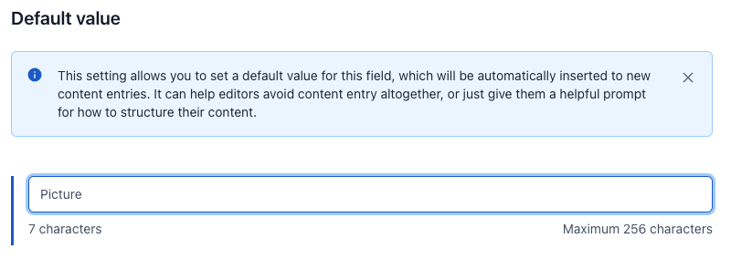
Once the field is saved, you can also hide the field while editing since its value should be the same for all entries of this Content Type.
To hide the Component field, you have to uncheck This field represents the Entry title, and choose another field as the Entry title. If you don't have any candidate, you can create a new text field which will be used only in the CMS (call it Title), and set it as the Entry title.
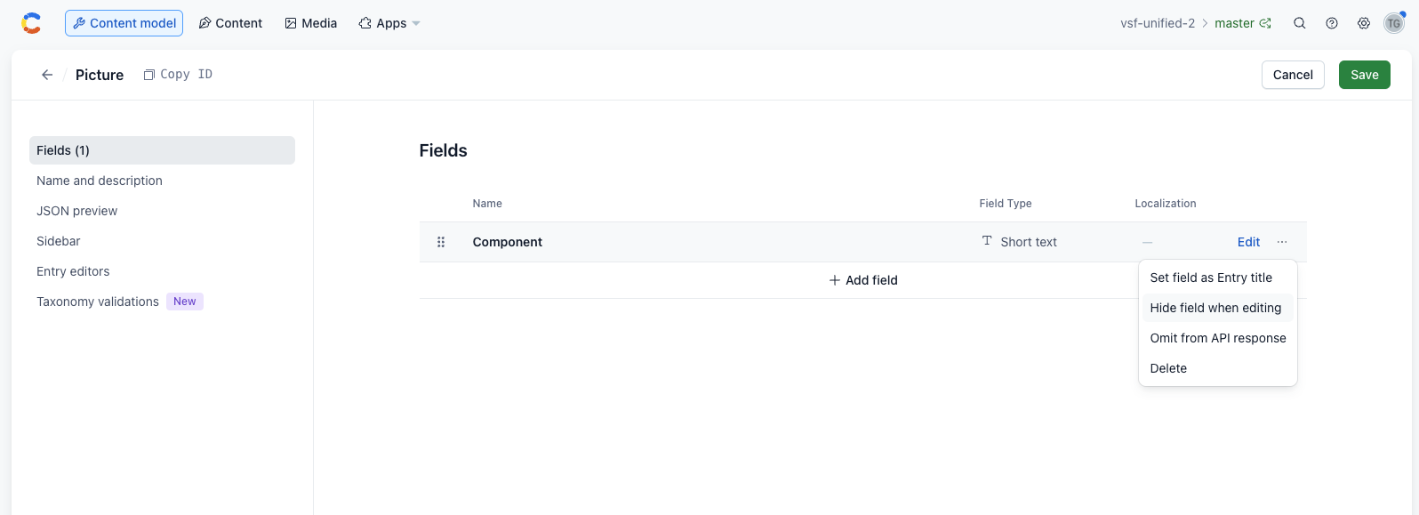
Add Image media field
Next, add the fields whose values will be passed as dynamic props to your frontend component. Start with adding a media field called Image.
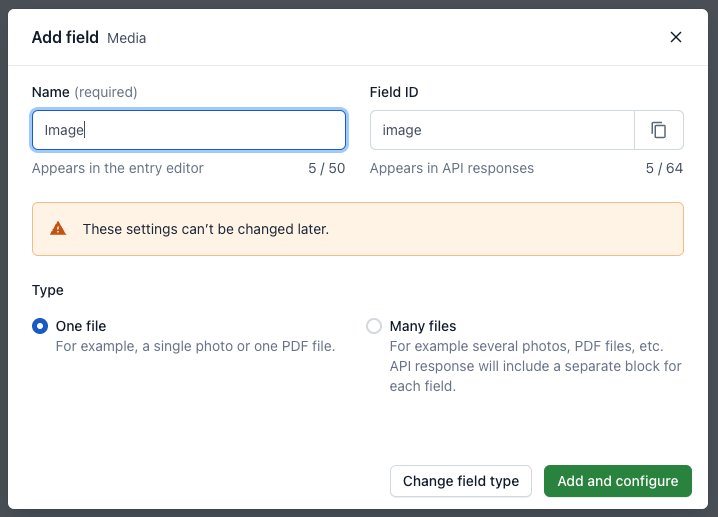
You can mark this field as required, and in Accept only specified file types choose Image. Then click on Confirm.
Add Caption reference field
To make the caption flexible, we can set it as Editorial Content Type, which will allow you to use rich text features. Create a new field of type Reference and name it Caption.
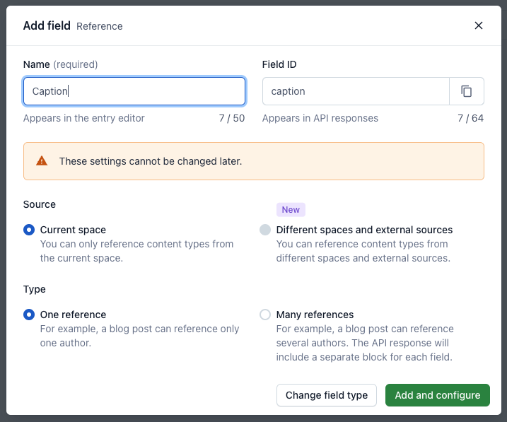
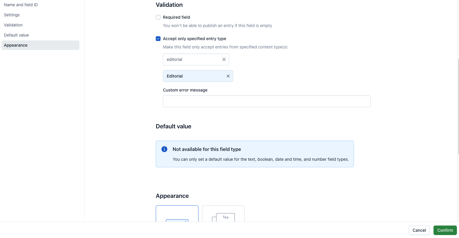
Make the field only accept entries of the Editorial Content Type. Proceed by clicking Confirm.
Make the component stylable
As a bonus, you can make your component stylable by performing the exact same steps and adding another field of type Reference to it. Name it Styles and set type to Many references, as it will allow you to add multiple styles based on media queries.
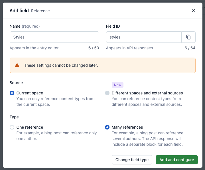
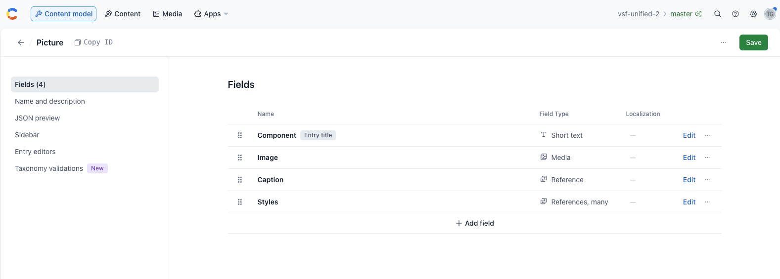
Accept only Styles entry type. Once done, save your Picture Content Type schema. Now it should look like this:
Add the new component to the Page
As the final step, you need to make the new Content Type selectable while creating new Page entries. On the Content model page, find the type called Page and start editing its schema.
Click the Edit button for the Components above the fold field and scroll down to the Validation section. Under Accept only specified entry type, make sure Page is whitelisted.
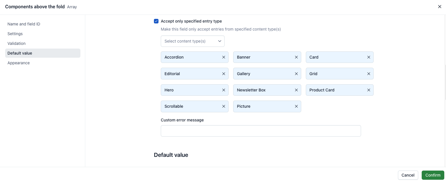
Hit Confirm and repeat the step for the Components below the fold field. Once done, save the updated schema.
Create a new entry
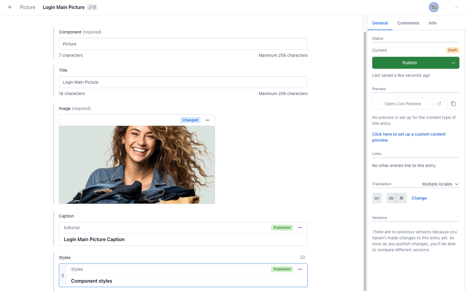
Navigate to the Content page. Click on the Add Entry button and choose Picture Content Type from the dropdown. From the list that will pop up pick a newly created Picture Content Type, and Hit Proceed button. Fill-in your component data. For the Caption field, you can create a new entry. Once done, hit the Save button.
In this section, you're going to create a new, custom Content Type in the Contentstack panel. It will act as a scaffolding for entries which will be rendered by your new frontend component. Remember that by default you'll be equipped with couple predefined Alokai components (content models/types).
Create a Content Type
Go to your stack where you want to create a Content Type, and click on the Content Models icon on the left navigation panel.
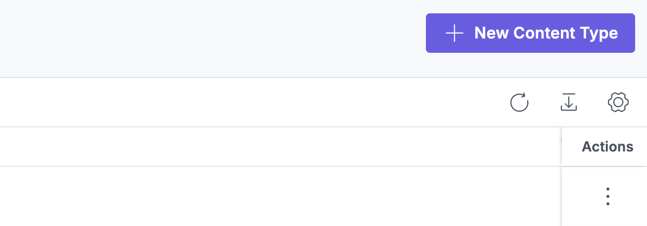
Click on the + New Content Type button in the top right corner of your panel.
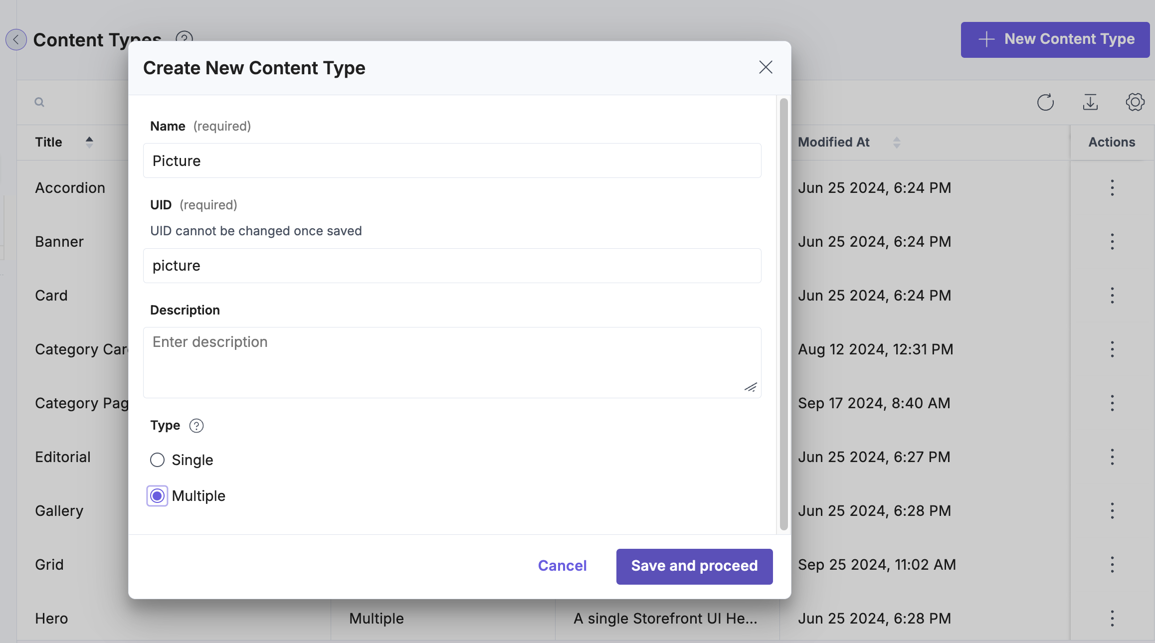
Name your new Content Type Picture, and set its type to Multiple.
Add the Component field
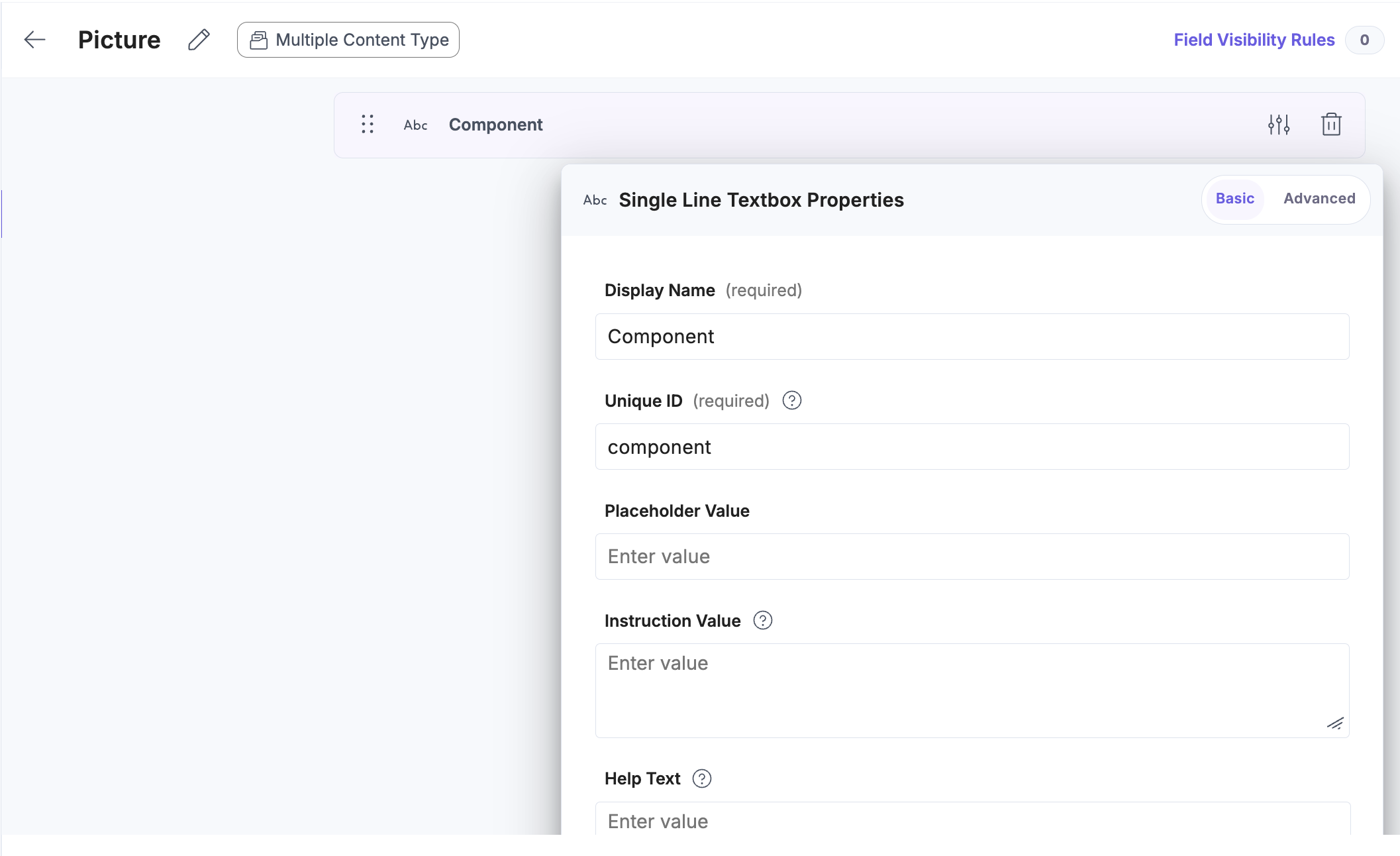
Create a Component text field. This field is mandatory to for all Content Types which act as components, to be able to recognize them on the frontend.
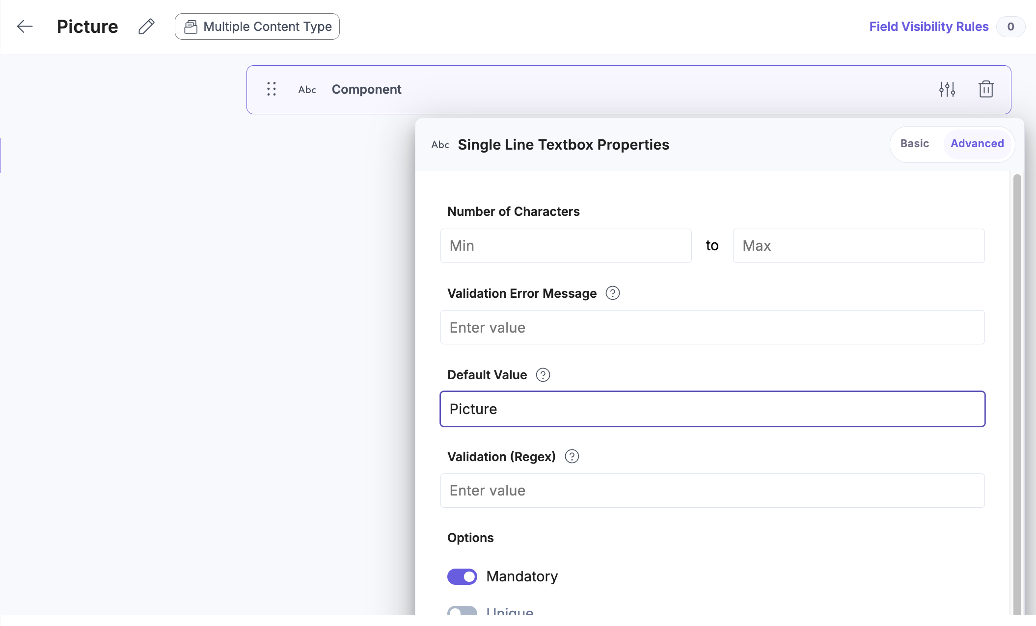
In Advanced tab, set the Default value to the name of the corresponding frontend component - Picture, and make this field required.
Add Image file field
You can add any field you want, for our Picture Content Type we will need a Image file field.
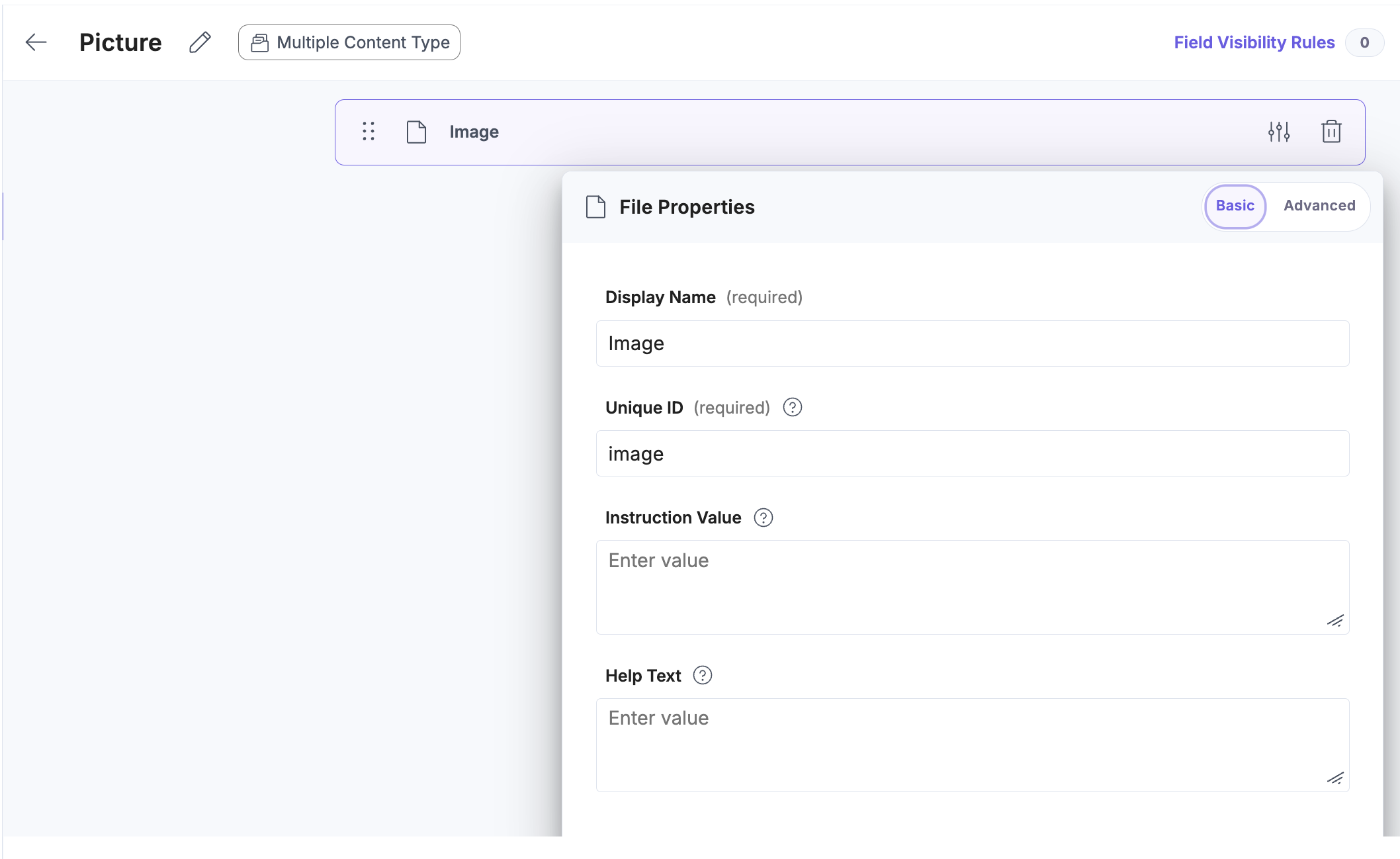
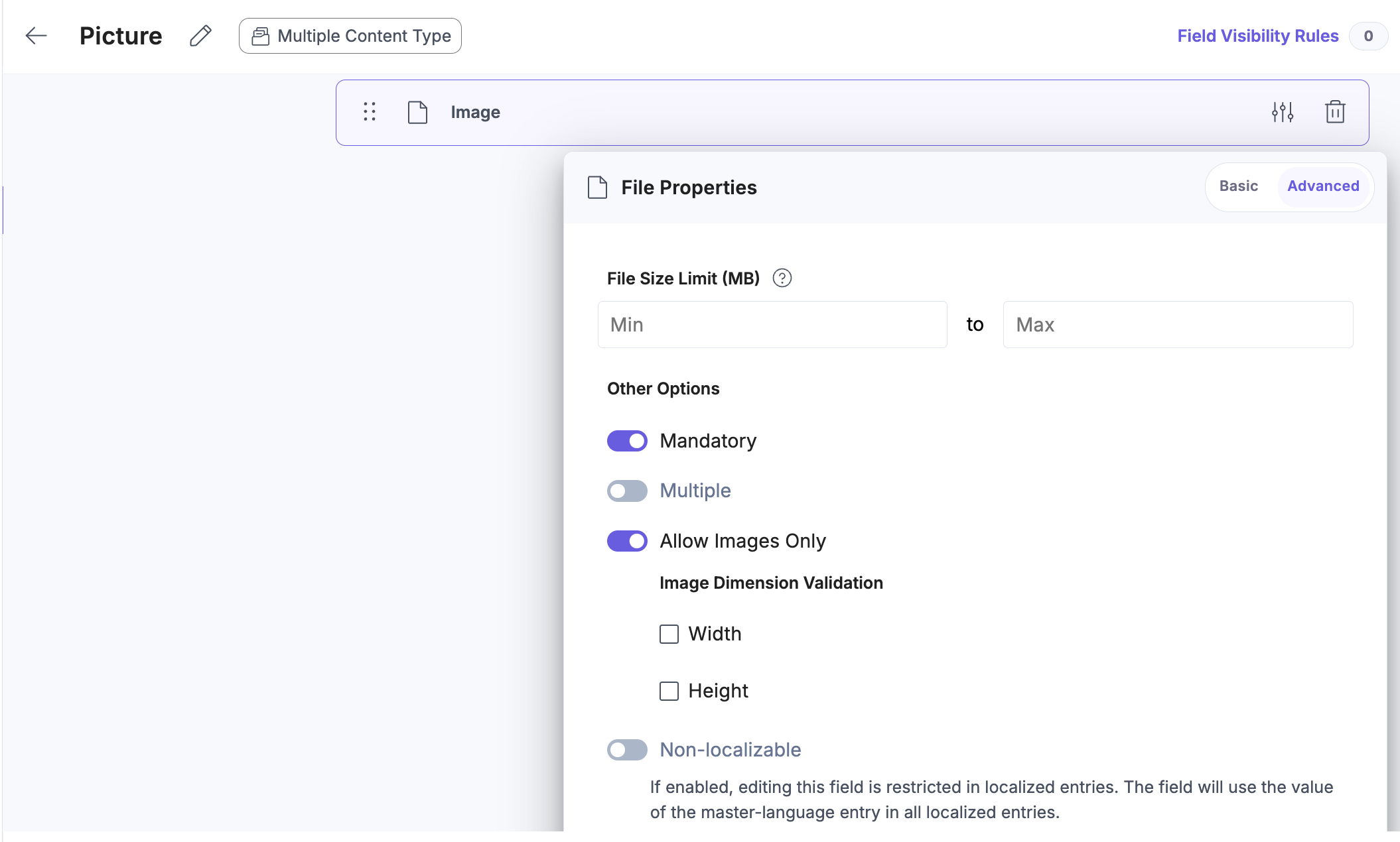
In the Advanced tab, set it to mandatory and Allow Images Only.
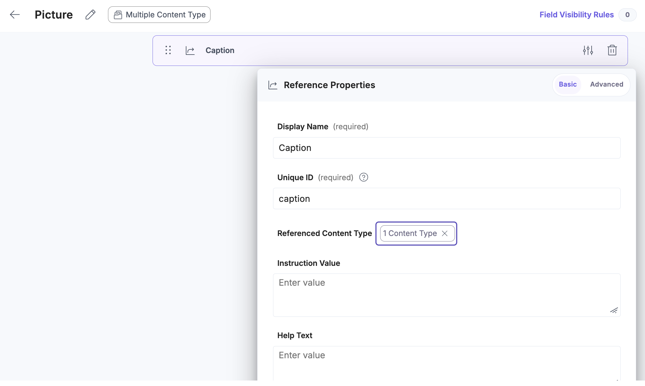
Add Caption Reference field
To make the caption flexible, we can set it as Editorial Content Type, which will allow you to use rich text features. Create a new field of type Reference and name it Caption. Then, point it in Referenced Content Type to the Editorial Content Type.
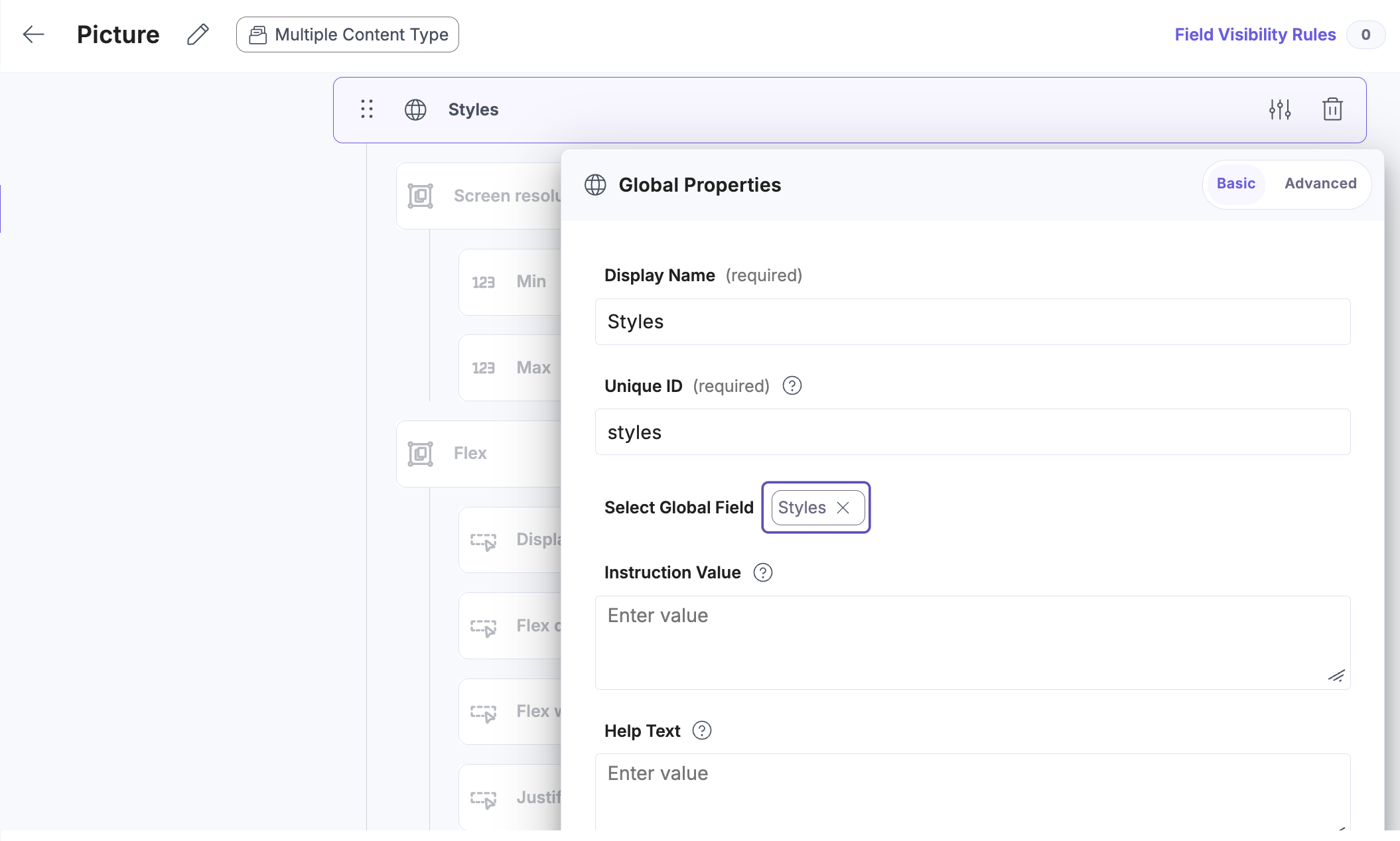
Make the component stylable
As a bonus, you can make your component stylable by adding a field of type Reference to it. Name it Styles and in Select Global Field choose Styles.
And in the Advanced tab, set it to Multiple. This is required and will allow you to add multiple styles based on media queries.
Once done, save your Picture Content Type schema.
Add the new component to the Page
Next, to be able to use the new component in your pages, you have to add it to the Referenced Content Type in the same way as you did with the Editorial Content Type. So, to make the new Content Type selectable while creating new Page entries, navigate back to the Content Models tab, find the Page Content Type and add Picture Content Type to the Referenced Content Type for Components above fold field.
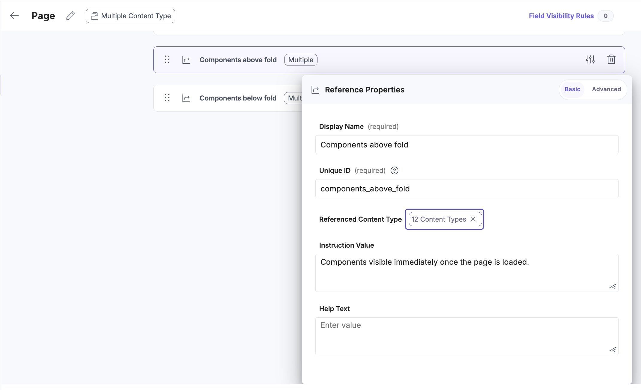
Then repeat the step for the Components below fold field. Once done, save the updated schema.
Create a new entry
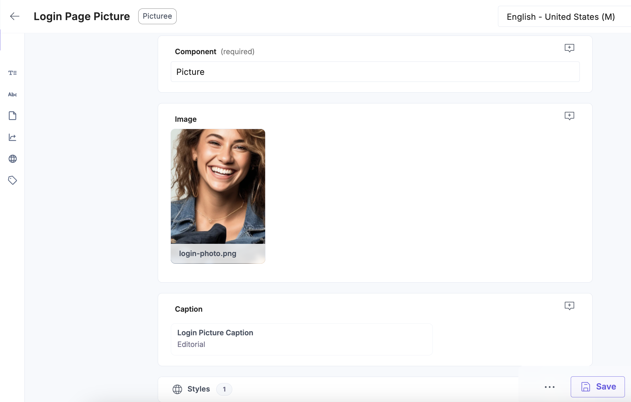
Navigate to the Entries tab. Click on the + New Entry button. From the list that will pop up pick a newly created Picture Content Type, and Hit Proceed button. Fill-in your component data. For the Caption field, you can create a new entry. Once done, hit the Save button.
Create a custom Component Type
Follow the official SmartEdit Trail guide on Creating a custom Component Type. Use the following .xml file to create a Picture component structure in SmartEdit.
<?xml version="1.0" encoding="ISO-8859-1"?>
<!--  Copyright (c) 2022 SAP SE or an SAP affiliate company. All rights reserved. -->
<!-- ATTENTION: This is just an example file. You have to edit it according to your needs. -->
<items
  xmlns:xsi="http://www.w3.org/2001/XMLSchema-instance"
  xsi:noNamespaceSchemaLocation="items.xsd"
>
  <itemtypes>
      <itemtype code="AlokaiPictureComponent" generate="true" extends="SimpleCMSComponent" autocreate="true" jaloclass="com.alokai.smartedit.jalo.PictureComponent">
          <attributes>

              <attribute
                qualifier="image"
                type="localized:Media"
              >
                  <persistence type="property"/>
                  <description>Localized image for the component.</description>
              </attribute>

              <attribute
                qualifier="caption"
                type="java.lang.String"
              >
                  <persistence type="property">
                      <columntype>
                          <value>HYBRIS.LONG_STRING</value>
                      </columntype>
                  </persistence>
              </attribute>

              <attribute
                qualifier="styles"
                type="java.lang.String"
              >
                  <persistence type="property">
                      <columntype>
                          <value>HYBRIS.LONG_STRING</value>
                      </columntype>
                  </persistence>
              </attribute>

          </attributes>
      </itemtype>

  </itemtypes>
</items>
Define reference fields for the component
In Alokai integration for SmartEdit, we suggest referencing nested components as a whitespace-separated list of IDs in parent components (e.g. items in a Grid):
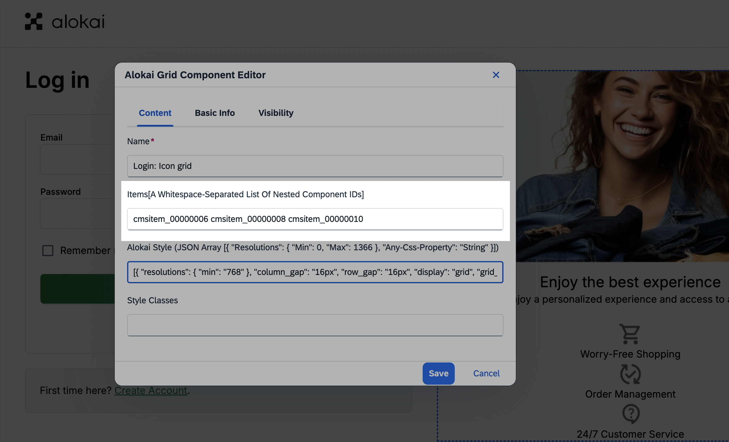
After fetching page data from SmartEdit, the unified getPage() method:
- checks parent components for nested components fields,
- reads nested components IDs,
- fetches nested components data from SmartEdit and augments the page object with it.
Unfortunately, since the nested components fields are simple strings with no distinguishable attributes, you have to explicitly define their names for each type of parent component. You can do it in the unified config of the integration.
In the Picture component, there is a single nested component field named caption. It allows for referencing the Editorial component which supports rich text editing and styling. To resolve it correctly, add the following code to the getReferenceFieldsForComponent() callback:
import type { MiddlewareConfig } from "@vsf-enterprise/smartedit-api";
import type { Integration } from "@alokai/connect/middleware";

export const config = {
  location: "@vsf-enterprise/smartedit-api/server",
  configuration: {
    // ...object truncated for brevity
    unified: {
      getReferenceFieldsForComponent: (component) => {
        const componentType = component.typeCode;
        if (component.container === "true") {
          return ["components"];
        } else if (componentType === "AlokaiGridComponent") {
          return ["items"];
        } else if (componentType === "AlokaiScrollableComponent") {
          return ["items"];
        } else if (componentType === "AlokaiProductListComponent") {
          return ["items"];
        } else if (componentType === "AlokaiPictureComponent") {
          return ["caption"];
        }
        return [];
      },
    },
  },
} satisfies Integration<MiddlewareConfig>;
Create a new block
In your Storyblok space dashboard, navigate to the Block Library tab. Click the + New Block button in the top-right corner. Set your block's:
- Technical name to Picture,
- Block type to Nestable block
and confirm by clicking Add Block in the bottom-right corner.
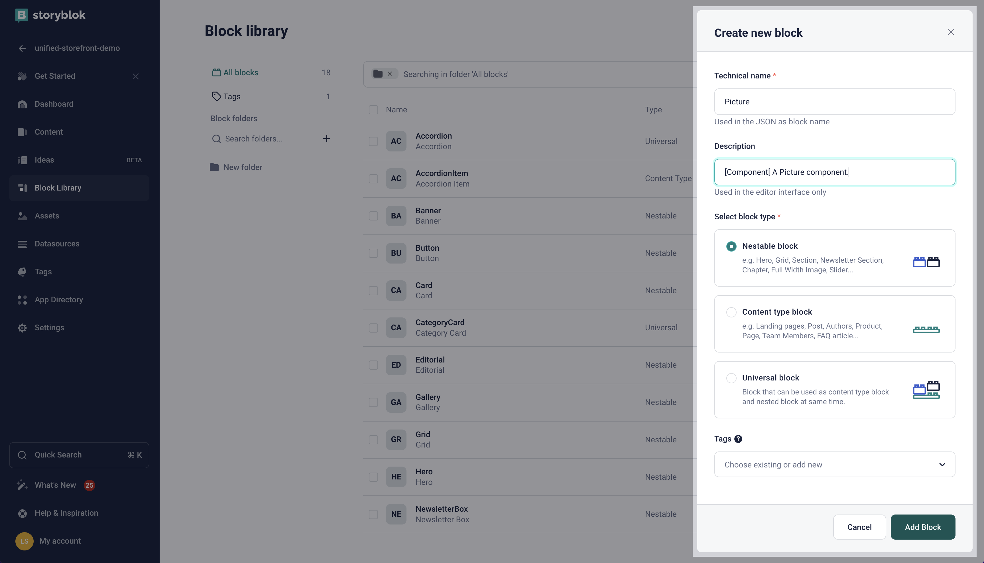
Make sure your block's Technical name is always aligned with the key you used to register the corresponding frontend component in the <RenderCmsContent /> wrapper.
Add Image asset field
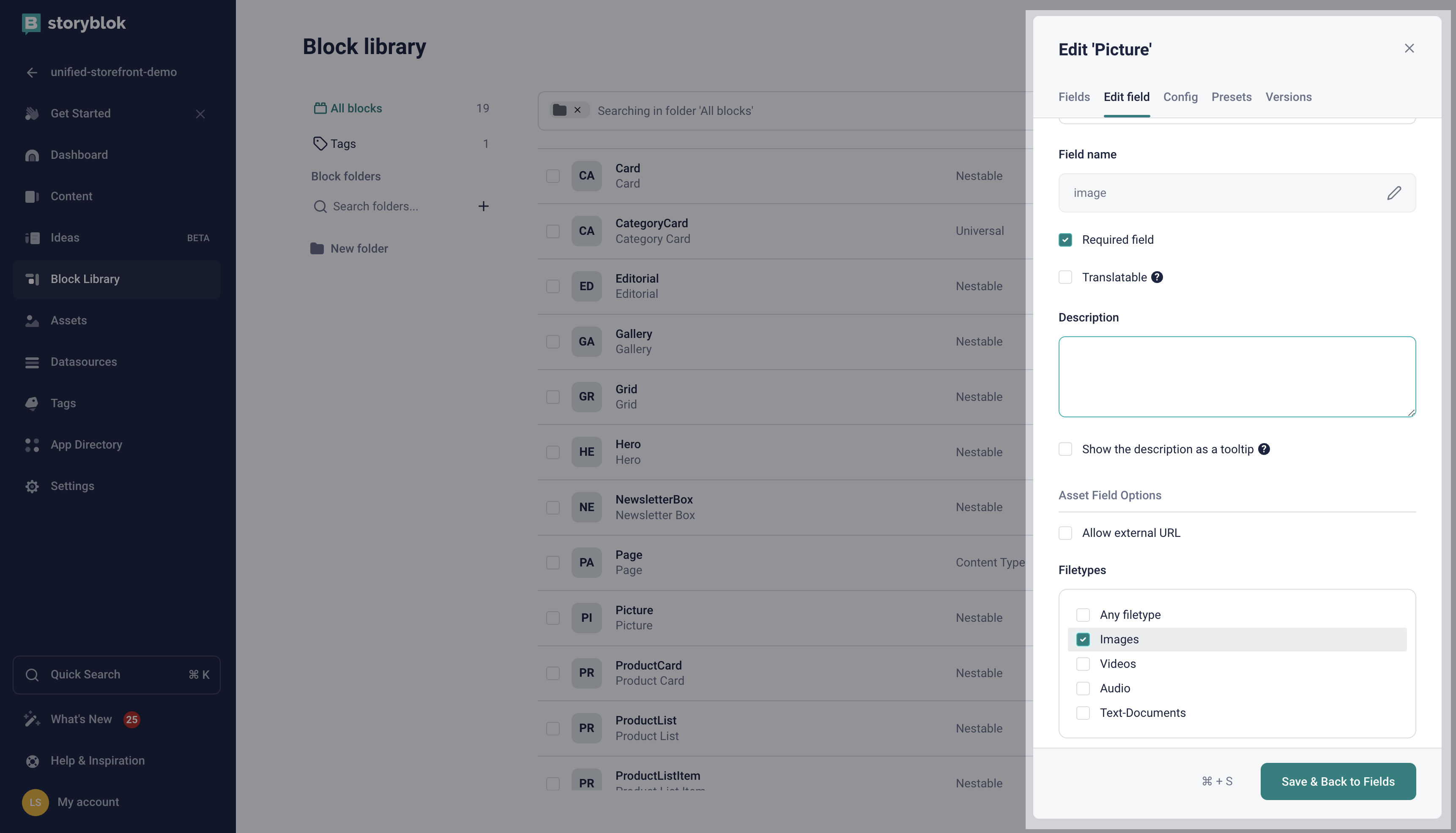
After you had created the new block, the Edit Picture pan should appear on the right. In the Fields tab, add a new image field of type Asset. When the field appears on the list, click it to bring up the Edit field tab. In the Filetypes section, select Images. Optionally, you can also mark the field as required. When done, click the Save & Back to Fields button in the bottom-right corner.
Add Caption blocks field
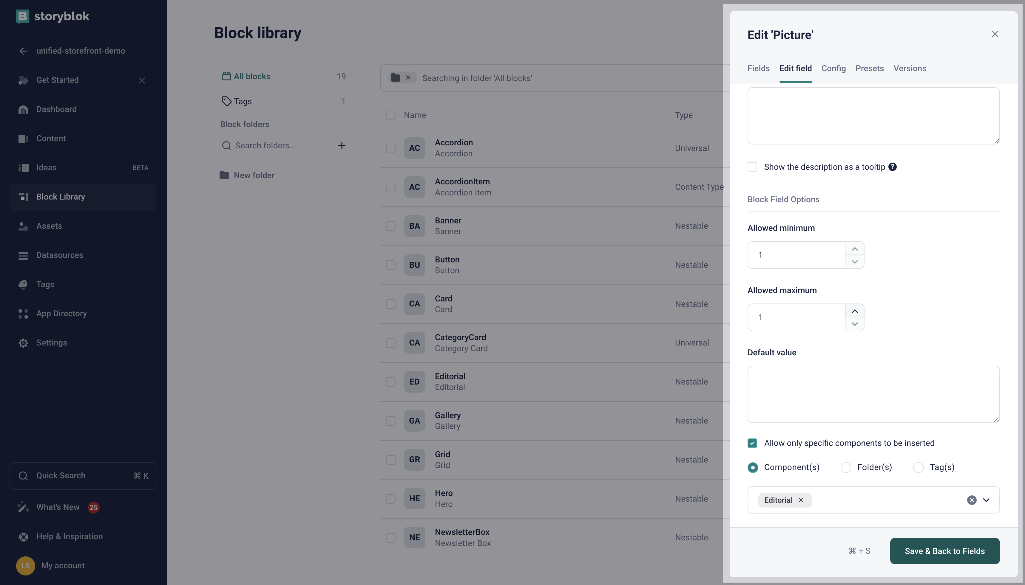
Next, create a caption field of type Blocks. In the Edit field tab, scroll down to the Allow only specific components to be inserted section and whitelist the Editorial component. You can also set the Allowed maximum setting to 1. When done, click the Save & Back to Fields button in the bottom-right corner.
Add the Styles blocks field
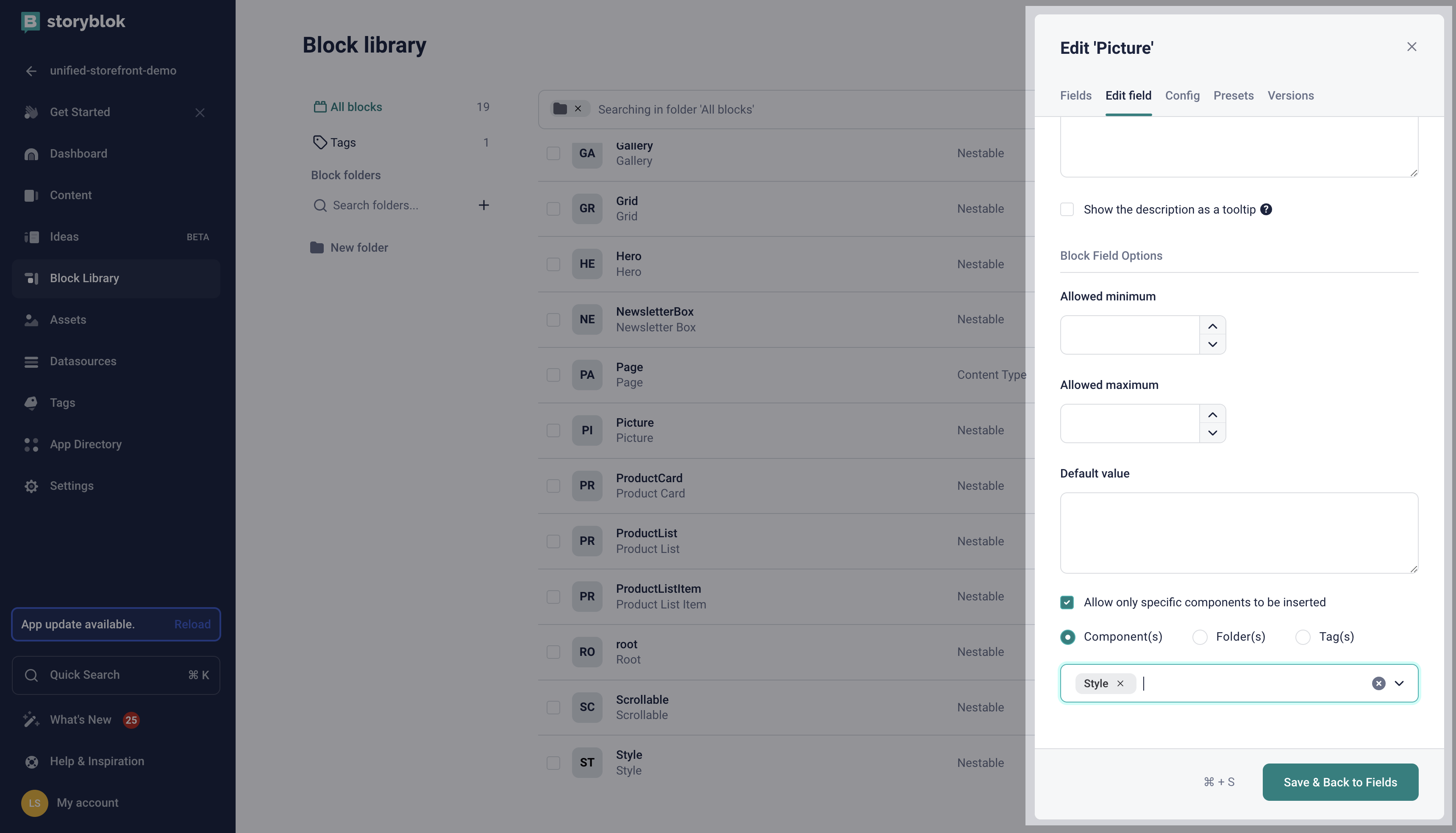
Next, make your component stylable by adding the styles field of type Blocks to it. In the Edit field tab, scroll down to the Allow only specific components to be inserted section and whitelist the Style component. When done, click the Save & Back to Fields button in the bottom-right corner.
Save the Picture block
Finally, save the newly-created block by clicking the green Save button in the bottom-right corner.
Whitelist the Picture block in the Grid block
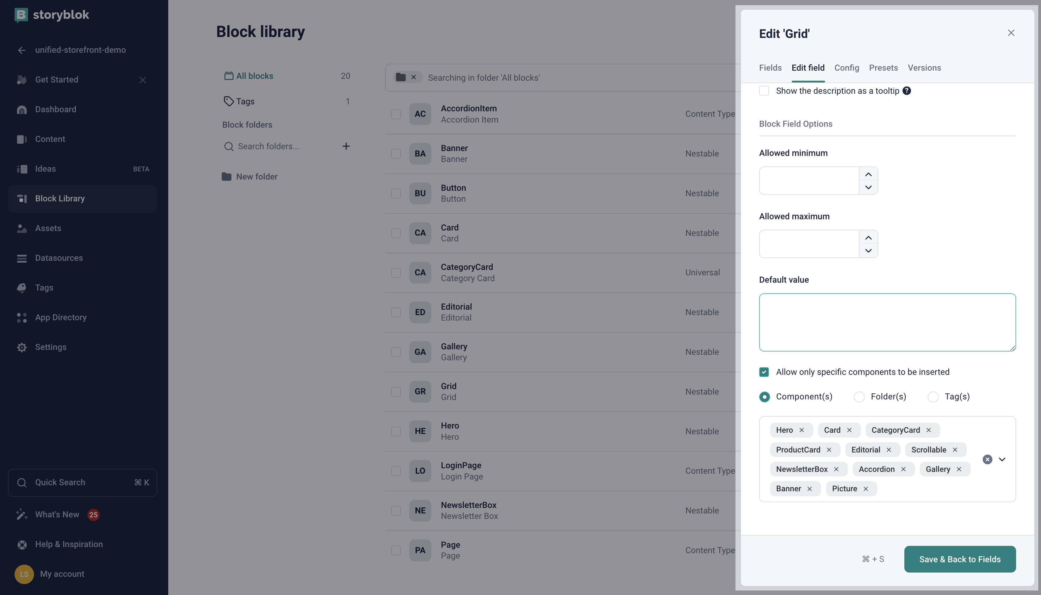
Before following the guide on Creating CMS pages, make sure you whitelist the newly-created Picture component in the items field of the Grid block.
Read also
Congratulations! You've just created your first CMS component. Now it's time you added it to a page that can be rendered by your Storefront. Follow the guide on Creating CMS pages to see how it's done or read our other guides.