SmartEdit
SmartEdit is a content management system that facilitates the creation and management of content within the SAP Commerce Cloud environment. It was once hailed as a versatile tool capable of handling various content-related tasks. Its strengths lay in its tight integration with SAP's data model, allowing users to effortlessly access product data, images, and categories to enrich their content. This seamless connection reduced the need for complex data feeds throughout the architecture.
Read more
Check the Content Management System Overview to learn more about the features of the SmartEdit module.
Bootstrapping SmartEdit with Alokai Storefront
To get access to this module and installation assistance, please contact the Alokai sales team or reach out to your Customer Support Manager.
Bootstrapping SmartEdit
Before you start using our SmartEdit integration, you need to install Alokai extension into your SAP Commerce Cloud. The extension will install component types for our out-of-the-box frontend components.
Installing extension
Requirements:
- SAP Commerce (Hybris) version 2211.24 or later
- SmartEdit using Angular version 17
- Deployment type codes available with the number 19968 Data Types
Copy extension files to the bin/custom directory.
Add the alokaismartedit extension to config/localextensions.xml:
<extension dir="${HYBRIS_BIN_DIR}/custom/alokaismartedit"/>Build
cd bin/platform
. ./setantenv.sh
ant clean all
ant updatesystem
Enabling Live Preview
Alokai module for SmartEdit ships with an out-of-the-box support for the Live Preview feature. The moment you start editing a page in SmartEdit, the following happens:
Loading the preview route
SmartEdit loads your Storefront within an iframe. The loaded URL consists of:
- the WCMS > Website > Website-ID > WCMS Properties > WCMS Cockpit Preview URL setting in Backoffice,
- the storefrontPreviewRoute setting in SmartEdit,
- a preview token passed as the cmsTicketId query param
Configuration required
We recommend setting WCMS Cockpit Preview URL to either http://localhost:3000 (Next) or http://localhost:3333 (Nuxt) and storefrontPreviewRoute to cx-preview (default).
As a result, example loaded URL looks like this:
http://localhost:3000/cx-preview?cmsTicketId=<preview-token>Redirecting to a proper Storefront route
The cx-preview page component extracts value of the preview token from the cmsTicketId query param and uses it to fetch the currently edited page data from SmartEdit. Then it uses the label property to redirect to a correct Storefront page.
For example, when the currently edited SmartEdit page has label equal to test, the /test Storefront route will be loaded.
Nested page labels (e.g. /example/nested/label) are supported as well.
Rendering the currently edited page
The loaded Storefront route handler fetches the page data from SmartEdit and renders it using the RenderCmsContent wrapper. It fulfills the HTML Markup Contract by adding properties recognized by SmartEdit to HTML elements representing slots and components.
<div
  class="smartEditComponent"
  data-smartedit-component-type="SimpleResponsiveBannerComponent"
  data-smartedit-component-id="ApparelUKHompageSplashBannerComponent"
  data-smartedit-component-uuid="somecompositekeyserialization"
  data-smartedit-catalog-version-uuid="apparel-deContentCatalog/Staged"
>
	<!-- component code -->
</div>
Initializing the Live Preview
Finally, the loaded Storefront route calls the initLivePreview() utility provided by our SmartEdit SDK module. As a result, the webApplicationInjector.js script is loaded and the page becomes editable.
sdk.smartedit.utils.initLivePreview({
  page,
  allowedOrigins: ['your-sap-environment-uri-and-port'],
});
Configuration required
Make sure you are calling initLivePreview() with correct allowedOrigins to avoid CORS issues. If the webApplicationInjector.js script provided by Alokai does not work with your SmartEdit environment, replace it with your version. If you moved the script outside of the /public directory, call initLivePreview() with correct scriptSrc.
Setting up Page Templates
Storefront code is designed to work out-of-the-box with three custom Page Templates:
- a dynamic page template for fully-dynamic CMS pages,
- a category page template for category pages enhanced with CMS content,
- a product page template for product pages enhanced with CMS content.
To use these templates, you need to create them in your SmartEdit environment:
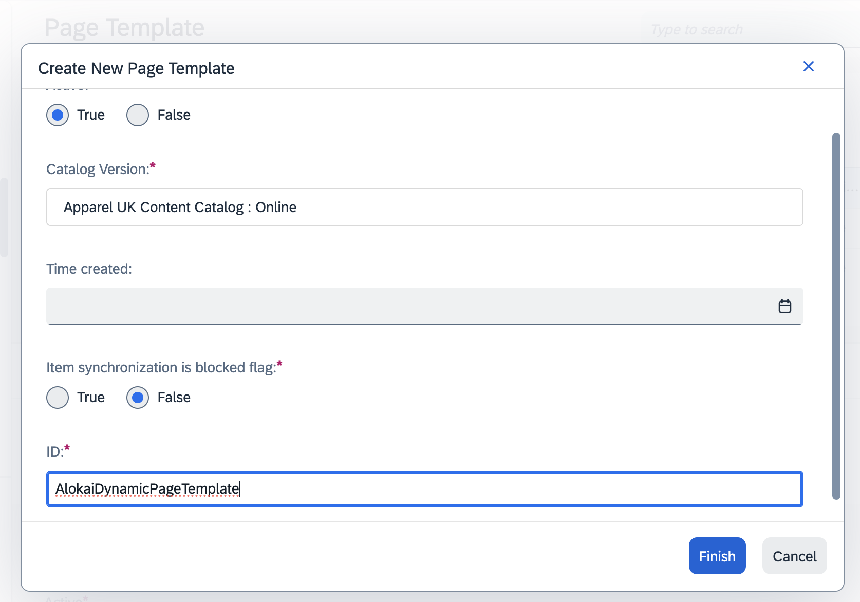
Create a new page template in SmartEdit
In the SAP Commerce Cloud Back office, navigate to the Page Template page. Then click a + button to create a new page template.
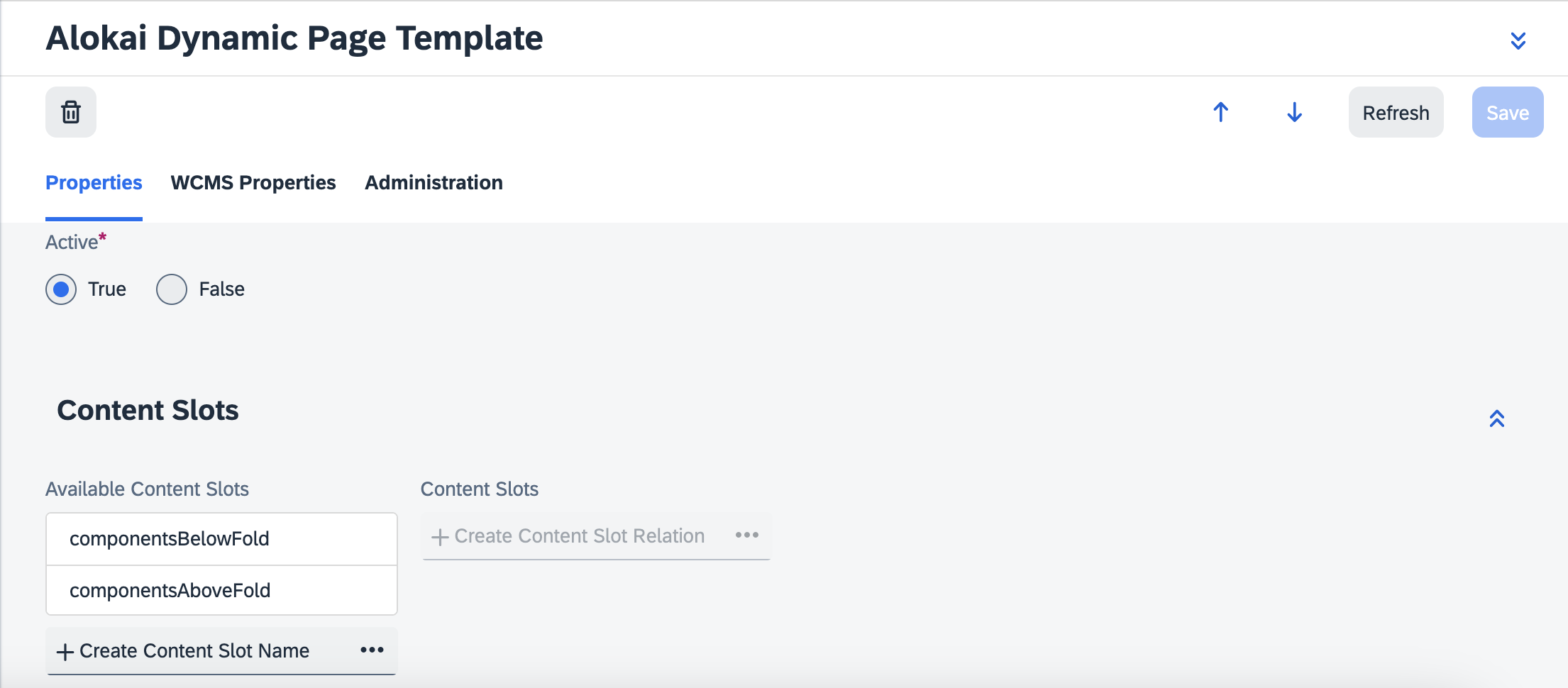
Define the slots
In the newly created page template, specify the slots where you can add components. For dynamic page, you should add:
componentsAboveFoldfor components above the fold,componentsBelowFoldfor components which should be lazy-loaded.
For category page, you should add:
componentsTopfor components above the product list,componentsBottomfor components below the product list.
For product page, you should add:
componentsBottomfor components below the main product data.
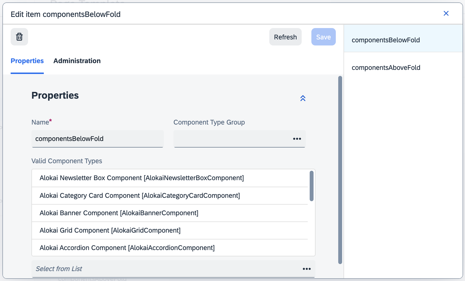
Add valid component types
For each slot, add all the Alokai component types in Valid Component Types field.
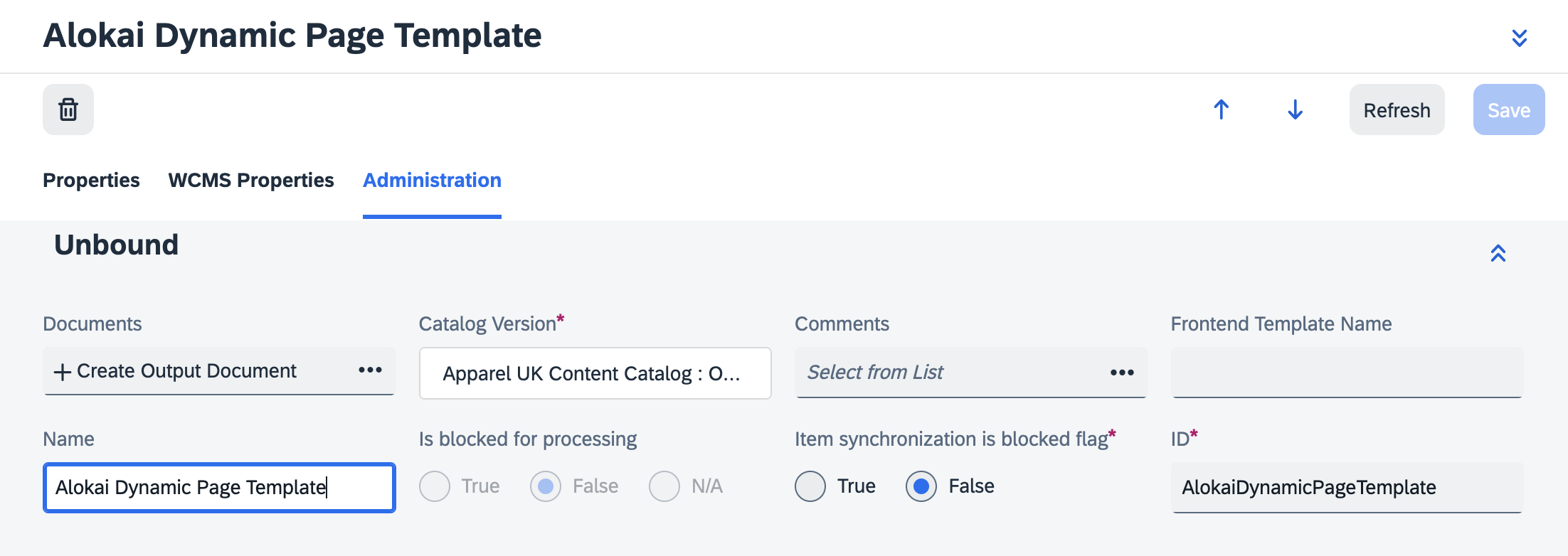
Change the template name
As all the page templates are named Page Template by default, you should change the name in the Administration tab to be able to distinguish them in the SmartEdit.
Add the template to the page type
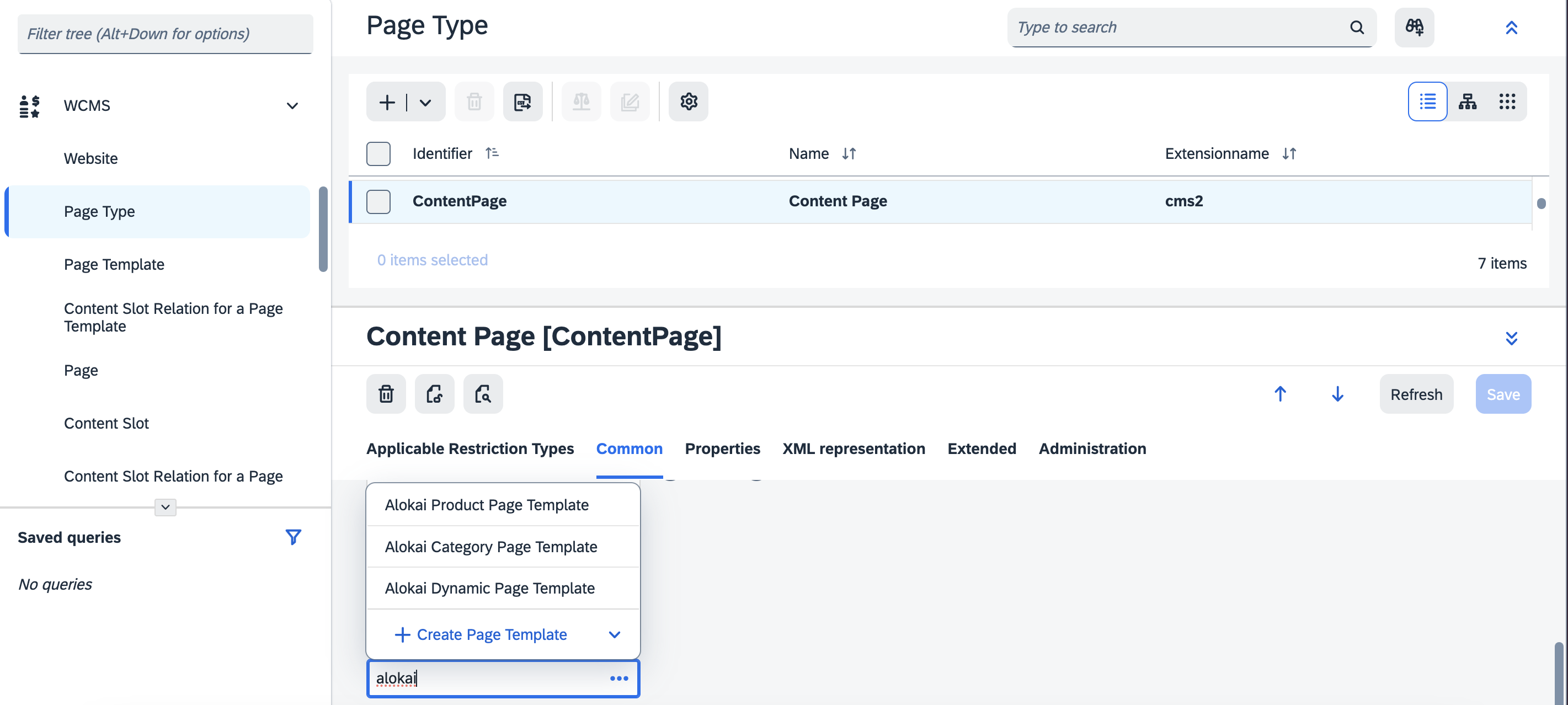
In the Page Type page, add the newly created template to the Content Page in Common -> Restricted Page Templates field.
Migrating from existing SmartEdit content
If you already have defined content in your SmartEdit environment, you can migrate it to the Alokai Storefront.
Each of the content pages will be fetched on top of our DynamicPage components and SDK getPage unified method.
As mentioned earlier, we use predefined slot names (componentsAboveFold, componentsBelowFold). This might cause your content to not render as intended because your custom content pages might contain different slot names. To address this, you need to implement correct slot resolution within the DynamicPage components.
Here's how it should be done:
/* app/[locale]/(cms)/[[...slug]]/page.tsx */

return (
  <>
    {/* Default slots */}
    <RenderCmsContent item={componentsAboveFold} />
    <RenderCmsContent item={componentsBelowFold} />
    {/* Native slots */}
    <RenderCmsContent item={customPageSlot} />
  </>
);
<!-- sf-modules/cms-smartedit/components/DynamicPage.vue -->
<!-- Default slots -->
<RenderCmsContent v-if="page && page.componentsAboveFold" :item="page.componentsAboveFold" />
<RenderCmsContent v-if="page && page.componentsBelowFold" :item="page.componentsBelowFold" />
<!-- Custom slots -->
<RenderCmsContent v-if="page && page.customPageSlot" :item="page.customPageSlot" />Thanks to that your components, located in the custom slots, will be rendered as intended. Although, please note that some of the native components might not be rendered as expected, to learn more about them read the section below.
Using SmartEdit Native Components
With newly installed SmartEdit module you'll get the following native components:
- ImageMap
- Link
- Paragraph
- SimpleBanner
- VideoBanner
- MiniCart
- RotatingImages
- SearchBox
- SimpleResponsiveBanner
- CategoryNavigation
- FooterNavigation
- AccountNavigation
- ProductReferences
Native components will be located in the modules components/native directory. To integrate them into your page templates, import them from the directory and pass props as a component data. To access native components elsewhere in your codebase, use the getComponentsByIdsAndUser method through the sdk.smartedit property. In the response of that SDK request you will get the data.components array with all the components you've requested.
import SimpleBanner from '@/sf-modules/cms-smartedit/components/native/se-simple-banner';

const { data } = await sdk.smartedit.getComponentsByIdsAndUser({
  componentIds: ['MyCustomSimpleBannerComponent', ...],
});

return <SimpleBanner ...data.components[0] />;
More about the native components can be found in the SmartEdit documentation.
Fetching Individual Components
The getComponents method lets you fetch specific components by their IDs without requesting a full page. This is useful for shared layout components that don't change across page navigations — e.g. a sidebar, navigation bar, or footer.
import { sdk } from '~/sdk.config';

const components = await sdk.unifiedSmartedit.getComponents({
  componentIds: ['account-sidebar', 'main-navigation'],
  locale: 'en',
});
Performance
By default, the SmartEdit middleware resolves all nested component references eagerly. When a page contains deeply nested component trees (e.g. navigations, tab containers, or complex layouts), each level of nesting triggers additional API calls to SAP Commerce Cloud. This creates a request waterfall that can significantly increase response times.
Two middleware configuration options help you optimize this behavior: depth limiting and component caching.
Limiting resolution depth
SmartEdit stores component references as IDs, which are resolved recursively. Instead of resolving the entire tree upfront, you can cap how deep the middleware goes using the getDepthLevelForComponent callback. When the depth limit is reached, unresolved references keep their original string content (component IDs). The frontend can then lazily fetch those components via getComponents only when they are actually needed - for example, when a user expands an accordion or scrolls to a section below the fold.
unified: {
  getDepthLevelForComponent: ({ component }) => {
    // Resolve top-level navigation but stop after 2 levels
    if (component.component === "CategoryNavigationComponent") return 2;
    return undefined; // no limit for other components
  },
}
This trades a single large waterfall for smaller, on-demand requests - improving initial page load without losing any content.
Using parent context
The callback also receives the parentComponent, allowing conditional limits based on where a component is nested:
getDepthLevelForComponent: ({ component, parentComponent }) => {
  // Only limit navigation links when nested inside a footer
  if (
    component.component === "CMSLinkComponent" &&
    parentComponent?.component === "FooterComponent"
  ) {
    return 1;
  }
  return undefined;
},
Page-specific limits
The methodParams argument contains the original parameters passed to getPage or getComponents, enabling page-specific depth strategies:
getDepthLevelForComponent: ({ component, methodParams }) => {
  // Only limit navigation depth on the homepage
  if (
    "path" in methodParams &&
    methodParams.path === "/" &&
    component.component === "CategoryNavigationComponent"
  ) {
    return 1;
  }
  return undefined;
},
Caching components
The componentCache option enables Redis-backed caching of resolved components. Once a component is fetched and cached, subsequent requests for the same component ID skip the SAP Commerce Cloud API call entirely until the cache entry expires.
unified: {
  componentCache: {
    ttl: 900, // cache every component for 15 minutes
  },
}
You can also use a function to set per-component TTL. The function receives the resolved component (or null for IDs that did not match any component):
unified: {
  componentCache: {
    ttl: (component) => {
      // Cache navigation for 5 minutes
      if (component?.typeCode === 'CategoryNavigationComponent') return 300;
      // Cache other components for 1 minute
      return 60;
    },
  },
}
Avoid caching personalized components
Do not cache personalized or user-specific components. If a component renders different content based on the logged-in user (e.g. a personalized banner or recommendations carousel), caching it will serve stale content belonging to one user to all subsequent visitors. Ancestor components that contain personalized children do not need special treatment - components are cached flat (before child resolution), so the ancestor's cached version only holds child IDs, not inlined content.
Use the ttl function to return 0 for components that shouldn't be cached:
const PERSONALIZED_TYPES = [
  'PersonalizedBannerComponent',
  'RecommendationsCarouselComponent',
];

unified: {
  componentCache: {
    ttl: (component) => {
      if (!component) return 60;

      if (PERSONALIZED_TYPES.includes(component.typeCode ?? '')) return 0;

      return 900;
    },
  },
}
Redis requirement
The component cache uses Redis as the storage backend. The SmartEdit middleware connects to Redis automatically on startup - no additional setup is required on your side.
If no Redis instance is available, the middleware falls back to an in-memory mock. Using the mock in production is at your own risk. The cache won't be shared between pods, meaning the same component may be fetched from the SAP Commerce Cloud API multiple times across different replicas. On top of that, the cache is lost on every deployment because the mock stores data in process memory.
Rendering placeholder components
In SmartEdit, you can use the CMSFlexComponent in your pages as placeholders. In Alokai Storefront, you can replace these placeholders with custom React components using a flexible Context-based system.
Understanding Flex Components
Flex components are SmartEdit placeholder components that can be dynamically replaced with custom React components. For example, your SmartEdit product page data might feature a Tabs slot with the CMSTabParagraphContainer component containing a CMSFlexComponent placeholder:
[
  {
    uid: <component_uid>,
    uuid: <component_uuid>,
    typeCode: 'CMSFlexComponent',
    modifiedtime: <component_modified_time>,
    name: 'Product Specification Tab',
    container: false,
    flexType: 'ProductSpecsTabComponent',
    synchronizationBlocked: false
  }
]
Customize Default Implementations
The first step is to modify the default flex component implementations in apps/storefront-unified-nextjs/sf-modules/cms-smartedit/components/native/se-flex.tsx. These defaults will be used across your entire application:
function DefaultProductDetailsTabComponent(_props: FlexComponentProps) {
  return (
    <div className="p-4">
      <h3 className="text-lg font-semibold mb-3">Product Details</h3>
      <div className="space-y-2">
        <p>Detailed product information goes here</p>
        <p>This will be shown by default on all pages</p>
      </div>
    </div>
  );
}

const defaultFlexState: FlexComponentState = {
  ProductDetailsTabComponent: {
    Component: DefaultProductDetailsTabComponent,
    title: 'Product Details',
  },
  // ... other flex types
};
Advanced use case: custom appearance based on page
When specific templates need customized flex components, create a template-specific Provider component:
apps/storefront-unified-nextjs/sf-modules/cms-smartedit/components/templates/product-details-flex-provider.tsx
'use client';

import { PropsWithChildren } from 'react';
import { FlexComponentsContext } from '@/sf-modules/cms-smartedit/components/native/se-flex';

export default function ProductDetailsFlexProvider({ children }: PropsWithChildren) {
  return (
    <FlexComponentsContext.Provider
      value={{
        // Customize flex components specifically for product detail pages
        ProductDetailsTabComponent: {
          Component: ProductPageDetailsComponent,
          title: 'Product Information',
        },
        ProductSpecsTabComponent: {
          Component: ProductPageSpecsComponent,
          title: 'Technical Specifications',
        },
      }}
    >
      {children}
    </FlexComponentsContext.Provider>
  );
}

function ProductPageDetailsComponent() {
  // You can fetch the product details using `useSdk`
  return (
    <div className="p-6 bg-gradient-to-r from-blue-50 to-indigo-50">
      <h3 className="text-xl font-bold mb-4 text-indigo-900">
        Enhanced Product Details
      </h3>
      <div className="grid grid-cols-2 gap-4">
        <div>
          <h4 className="font-semibold text-indigo-700">Key Features</h4>
          <ul className="list-disc list-inside text-sm">
            <li>Premium quality materials</li>
            <li>Sustainable manufacturing</li>
            <li>30-day return policy</li>
          </ul>
        </div>
        <div>
          <h4 className="font-semibold text-indigo-700">Benefits</h4>
          <p className="text-sm">Why this product is perfect for you</p>
        </div>
      </div>
    </div>
  );
}
apps/storefront-unified-nextjs/sf-modules/cms-smartedit/components/templates/landing-page-flex-provider.tsx
'use client';

import { PropsWithChildren } from 'react';
import { FlexComponentsContext } from '@/sf-modules/cms-smartedit/components/native/se-flex';

export default function LandingPageFlexProvider({ children }: PropsWithChildren) {
  return (
    <FlexComponentsContext.Provider
      value={{
        // Customize flex components specifically for landing pages
        ProductDetailsTabComponent: {
          Component: LandingPagePromotionalComponent,
          title: 'Why Choose Us',
        },
      }}
    >
      {children}
    </FlexComponentsContext.Provider>
  );
}

function LandingPagePromotionalComponent() {
  return (
    <div className="p-8 bg-gradient-to-r from-green-50 to-emerald-50 text-center">
      <h3 className="text-2xl font-bold mb-4 text-emerald-900">
        Why Choose Our Products?
      </h3>
      <div className="grid grid-cols-3 gap-6">
        <div>
          <div className="text-3xl mb-2">🌱</div>
          <h4 className="font-semibold">Eco-Friendly</h4>
          <p className="text-sm">Sustainably sourced materials</p>
        </div>
        <div>
          <div className="text-3xl mb-2">⚡</div>
          <h4 className="font-semibold">Fast Delivery</h4>
          <p className="text-sm">Free shipping in 2-3 days</p>
        </div>
        <div>
          <div className="text-3xl mb-2">💝</div>
          <h4 className="font-semibold">Premium Quality</h4>
          <p className="text-sm">Crafted with attention to detail</p>
        </div>
      </div>
    </div>
  );
}
Integrating Template-Specific Providers
Apply the appropriate provider in each template:
apps/storefront-unified-nextjs/sf-modules/cms-smartedit/components/templates/product-details-page-template.tsx
import RenderCmsContent from '@/sf-modules/cms-smartedit/components/render-cms-content';
import { createPageTemplate } from '@/sf-modules/cms-smartedit/components/templates/create-page-template';
import ProductDetailsFlexProvider from '@/sf-modules/cms-smartedit/components/templates/product-details-flex-provider';

export default createPageTemplate(['UpSelling', 'Tabs'], ({ slots }) => {
  return (
    <ProductDetailsFlexProvider>
      {/* Existing content */}
    </ProductDetailsFlexProvider>
  );
});
apps/storefront-unified-nextjs/sf-modules/cms-smartedit/components/templates/landing-page-2.tsx
import RenderCmsContent from '@/sf-modules/cms-smartedit/components/render-cms-content';
import { createPageTemplate } from '@/sf-modules/cms-smartedit/components/templates/create-page-template';
import LandingPageFlexProvider from '@/sf-modules/cms-smartedit/components/templates/landing-page-flex-provider';

export default createPageTemplate(['Section1', 'Section2'], ({ slots }) => {
  return (
    <LandingPageFlexProvider>
      <RenderCmsContent item={slots.Section1} />
      <RenderCmsContent item={slots.Section2} />
    </LandingPageFlexProvider>
  );
});
Benefits of Template-Specific Providers
- Clear separation: Each template has its own flex component customizations
- No conflicts: Different templates can customize the same flex types differently
- Easy maintenance: Changes to one template don't affect others
- Better organization: Provider files are clearly associated with their templates
- Scalable: Easy to add new templates with their own flex customizations
This approach ensures that each template can have its own specific flex component implementations without interfering with other templates.