



Creating CMS pages
In the Quick start guide, you've created a simple CMS page using the readily-available Content Types provided by Alokai. Now it is time for you to dive deeper and learn how to create CMS pages almost from scratch.
In this guide, you will work with the Login page of the Alokai Storefront which - by default - only features a login form. Your task will be to enhance it with dynamic CMS-managed marketing content.
Before
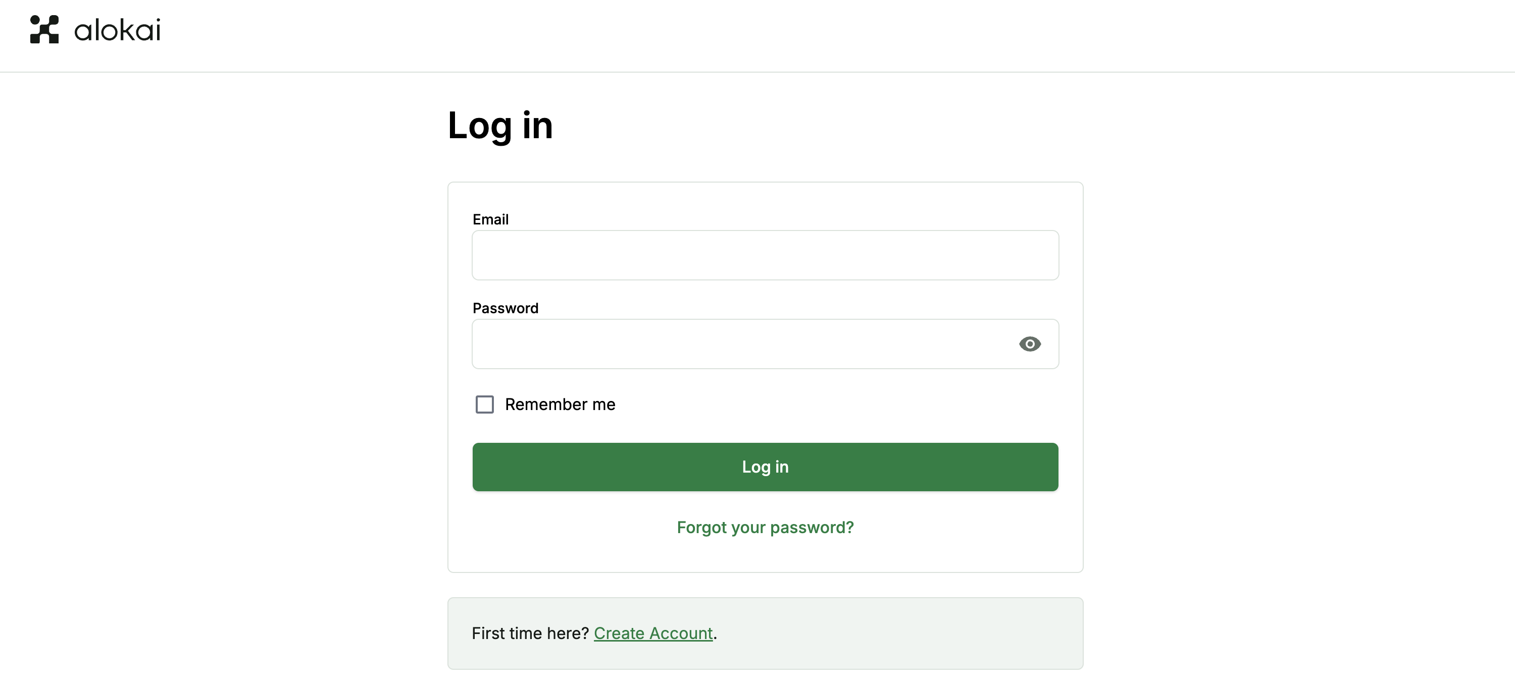
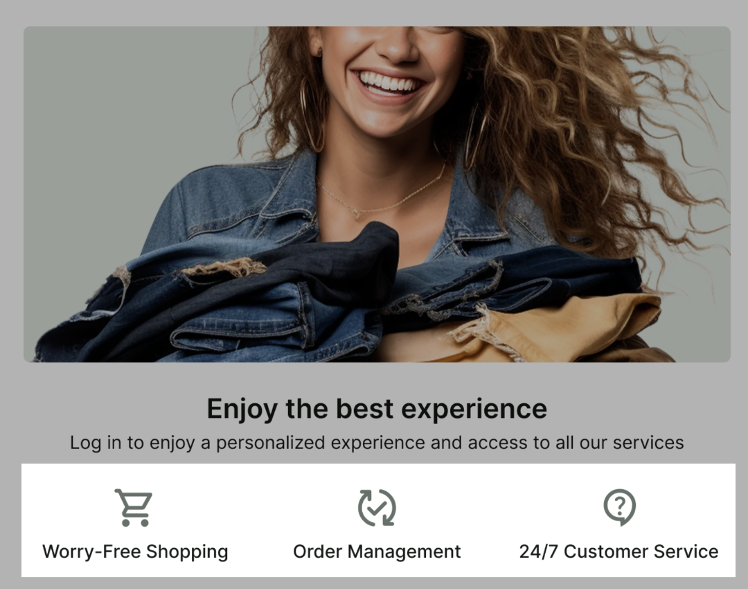
After
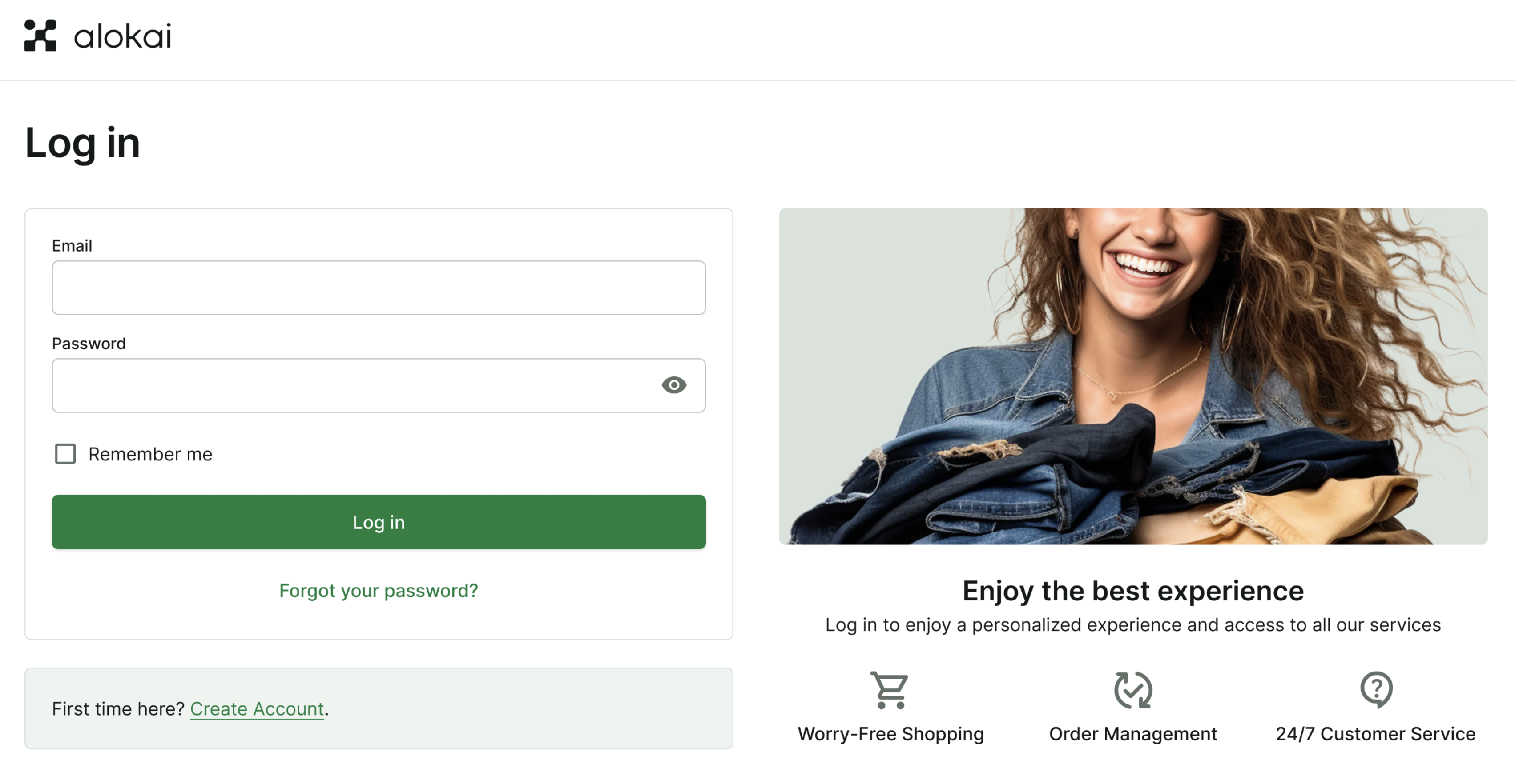
In the process, you will:
- prepare your Storefront page component for dynamic CMS content fetching & rendering,
- create a Content Type for a page in your CMS,
- create a page entry in your CMS and add a custom Picture component to it.
This guide assumes you have already followed this guide and created your custom Picture component.
Prepare the Storefront page
By default, the Login page in our Storefront only contains a simple authentication form. In this section, we will adjust its code so that it fetches dynamic data from the CMS and renders it in the desired location.
Code examples in these steps refer to the frontend part of your project: /apps/storefront-unified-nextjs/app/[locale].
Divide the Login Page into two sections
The page itself currently consists of a single section with the login form centered. Let's modify the layout to include two sections side by side.
export async function LoginPage() {
  const t = useTranslations('LoginPage');
  const messages = useMessages();

  return (
    <div className="pb-10 md:pb-6">
      <div className="grid gap-10 md:grid-cols-2">
        <section>
          {/* Login Form, it remains unchanged */}
        </section>
        <section>
          {/* CMS Content will go here */}
        </section>
      </div>
    </div>
  );
}
Fetch data from the CMS
Our login page will have just one slot for CMS content named components. To connect the page with the CMS, we need to wrap it with the connectCmsPage higher-order component. connectCmsPage requires a CMS page path, which will be just /login in our case. It will handle the CMS data fetching and pass it as a page prop into the LoginPage component.
import { connectCmsPage } from '@/components/cms/wrappers';
import type { PropsWithCmsPage } from '@/types/cms';

interface LoginPage {
  components: any;
}

type LoginPageProps = PropsWithCmsPage<LoginPage>;

export async function LoginPage() {
async function LoginPage({ page }: LoginPageProps) {
  const t = useTranslations('LoginPage');
  const messages = useMessages();

  return (
    <div className="pb-10 md:pb-6">
      {/* ... */}
    </div>
  );
}

export default connectCmsPage(LoginPage, {
  getCmsPagePath: () => '/login',
});
So far we didn't create the Login page in the CMS, so the page prop will be null. We'll create the page in the CMS in the next steps.
Render CMS components
To render the CMS content, we need to pass it to the RenderCmsContent component that will render the corresponding frontend components. Let's add it to the LoginPage component.
import { connectCmsPage } from '@/components/cms/wrappers';
import { connectCmsPage, RenderCmsContent } from '@/components/cms/wrappers';

async function LoginPage({ page }: LoginPageProps) {
  // ...
  return (
    // ...
    <section>
      {/* CMS Content will go here */}
      {page?.components && <RenderCmsContent item={page.components} />}
    </section>
    // ...
  );
}
Expand the Auth Layout container
The default Auth Layout container is too narrow to accommodate two sections side by side. Let's adjust the layout to make it wider.
import type { PropsWithChildren } from 'react';

import Footer from '@/components/navigations/footer';
import NavbarTop from '@/components/navigations/navbar-top';

interface AuthLayoutProps extends PropsWithChildren {}

export default async function AuthLayout({ children }: AuthLayoutProps) {
  return (
    <>
      <NavbarTop />
      <main>
        <div className="mx-auto max-w-[630px] px-4 pb-10 pt-4 md:px-0 md:pb-14 md:pt-9">
        <div className="mx-auto max-w-screen-3-extra-large px-6 pb-10 pt-4 md:px-10 md:pb-14 md:pt-9">
          {children}
        </div>
      </main>
      <Footer className="mb-[58px] md:mb-0" />
    </>
  );
}
This change will affect all pages using the Auth Layout. Make sure to test other pages to ensure they still look as expected.
Code examples in these steps refer to the frontend part of your project: /apps/storefront-unified-nuxt/.
Divide the Login Page into two sections
The page itself currently consists of a single section with the login form centered. Let's modify the layout to include two sections side by side.
<template>
  <div>
    <NuxtLayout name="auth" :heading="$t('auth.login.heading')">
      <div class="grid md:grid-cols-2 gap-10">
        <section>
          <!-- Login Form, it remains unchanged -->
        </section>
        <section>
          <!-- CMS Content will go here -->
        </section>
      </div>
    </NuxtLayout>
  </div>
</template>
Fetch data from the CMS
Our login page will have just one slot for CMS content named components. To connect the page with the CMS, we need to wrap it with the ConnectCmsPage higher-order component. It will fetch the CMS data and expose it as a slot prop to child components.
<template>
  <div>
  <!-- @vue-generic {LoginPage} -->
  <ConnectCmsPage v-slot={ page }>
    <NuxtLayout name="auth" :heading="$t('auth.login.heading')">
      <!-- ... -->
    </NuxtLayout>
  </div>
  </ConnectCmsPage>
</template>

<script setup lang="ts">
import { ConnectCmsPage } from '@/components/cms/wrappers';

export interface LoginPage {
  components: any;
}
// ...
</script>
So far we didn't create the Login page in the CMS, so the page slot prop will be null. We'll create the page in the CMS in the next steps.
Add RenderCmsContent component
To render the CMS content, we need to pass it to the RenderCmsContent component that will render the corresponding frontend components. Let's add it to the LoginPage component.
<template>
  <!-- @vue-generic {LoginPage} -->
  <ConnectCmsPage v-slot={ page }>
    <NuxtLayout name="auth" :heading="$t('auth.login.heading')">
      <div class="grid md:grid-cols-2 gap-10">
        <section>
          <!-- Login Form, it remains unchanged -->
        </section>
        <section>
          <!-- CMS Content will go here -->
          <RenderCmsContent v-if="page" :item="page.components" />
        </section>
      </div>
    </NuxtLayout>
  </ConnectCmsPage>
</template>

<script setup lang="ts">
import { ConnectCmsPage } from '@/components/cms/wrappers';
import { ConnectCmsPage, RenderCmsContent } from '@/components/cms/wrappers';
// ...
</script>
Expand the Auth Layout container
The default Auth Layout container is too narrow to accommodate two sections side by side. Let's adjust the layout to make it wider.
<template>
  <div>
    <UiNavbarTop />
    <NarrowContainer>
      <main
        :class="[
          'mx-auto px-4 pt-4 pb-20 md:px-0 md:mt-4',
          { 'md:mb-8': heading },
          heading ? 'md:max-w-[630px]' : 'md:max-w-[677px]',
        ]"
      >
      <main :class="['mx-auto px-4 pt-4 pb-20 md:px-0 md:mt-4', { 'md:mb-8': heading }]">
        <h1 v-if="heading" class="font-semibold mb-10 typography-headline-3 md:typography-headline-2">{{ heading }}</h1>
        <slot />
      </main>
    </NarrowContainer>
    <UiFooter />
  </div>
</template>
This change will affect all pages using the Auth Layout. Make sure to test other pages to ensure they still look as expected.
Create CMS Content Type
With our Storefront ready to display CMS content on the Login page, the next task it to create a corresponding Content Type in the CMS.
Create a new Content Type
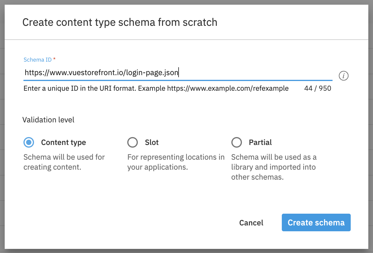
From to the Development dropdown choose Content Type schemas. Once a popup appears on the screen, choose "code from scratch". Set https://www.vuestorefront.io/login-page.json as schema id and set Content Type as the validation level. Hit the Create schema button to confirm.
You might consider making this Content Type more reusable, by naming it Single Slot Page which will allow you to use it in the future for other pages with a single slot for CMS content.
Complete the schema
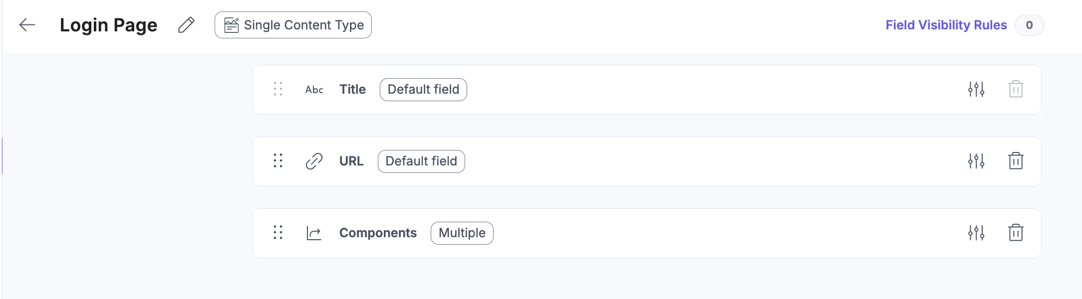
Next step is to add the required fields to the Content Type schema. The schema will be similar to the schemas for the other page types. This time we need just a components field, which will be a reference to the components we want to use on the Login Page - in our case Grid and Picture components.
{
  "$schema": "http://json-schema.org/draft-07/schema#",
  "$id": "https://www.vuestorefront.io/login-page.json",
  "title": "Login Page",
  "description": "Content for Login Page",
  "allOf": [
    {
      "$ref": "http://bigcontent.io/cms/schema/v1/core#/definitions/content"
    }
  ],
  "type": "object",
  "properties": {
    "components": {
      "type": "array",
      "title": "Components",
      "description": "Components rendered in right section of the Login Page",
      "items": {
        "allOf": [
          {
            "$ref": "http://bigcontent.io/cms/schema/v1/core#/definitions/content-link"
          },
          {
            "properties": {
              "contentType": {
                "enum": [
                  "https://www.vuestorefront.io/grid.json",
                  "https://www.vuestorefront.io/picture.json"
                ]
              }
            }
          }
        ]
      }
    }
  },
  "propertyOrder": []
}
Register the Content Type
Once the schema is ready, you can choose from the Save dropdown Save and register as content type option.
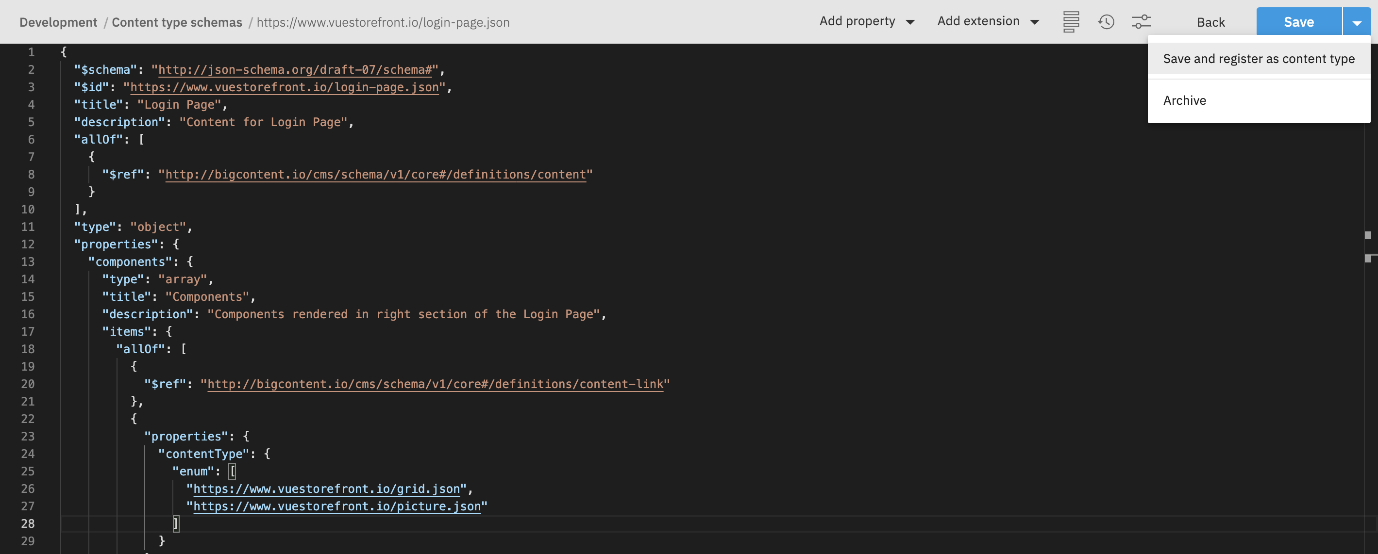
In the following screen set the Content type label to Login Page and set associated repository to Content. Optionally you can also add the icon and card for better recognition of the Content Type for final users.
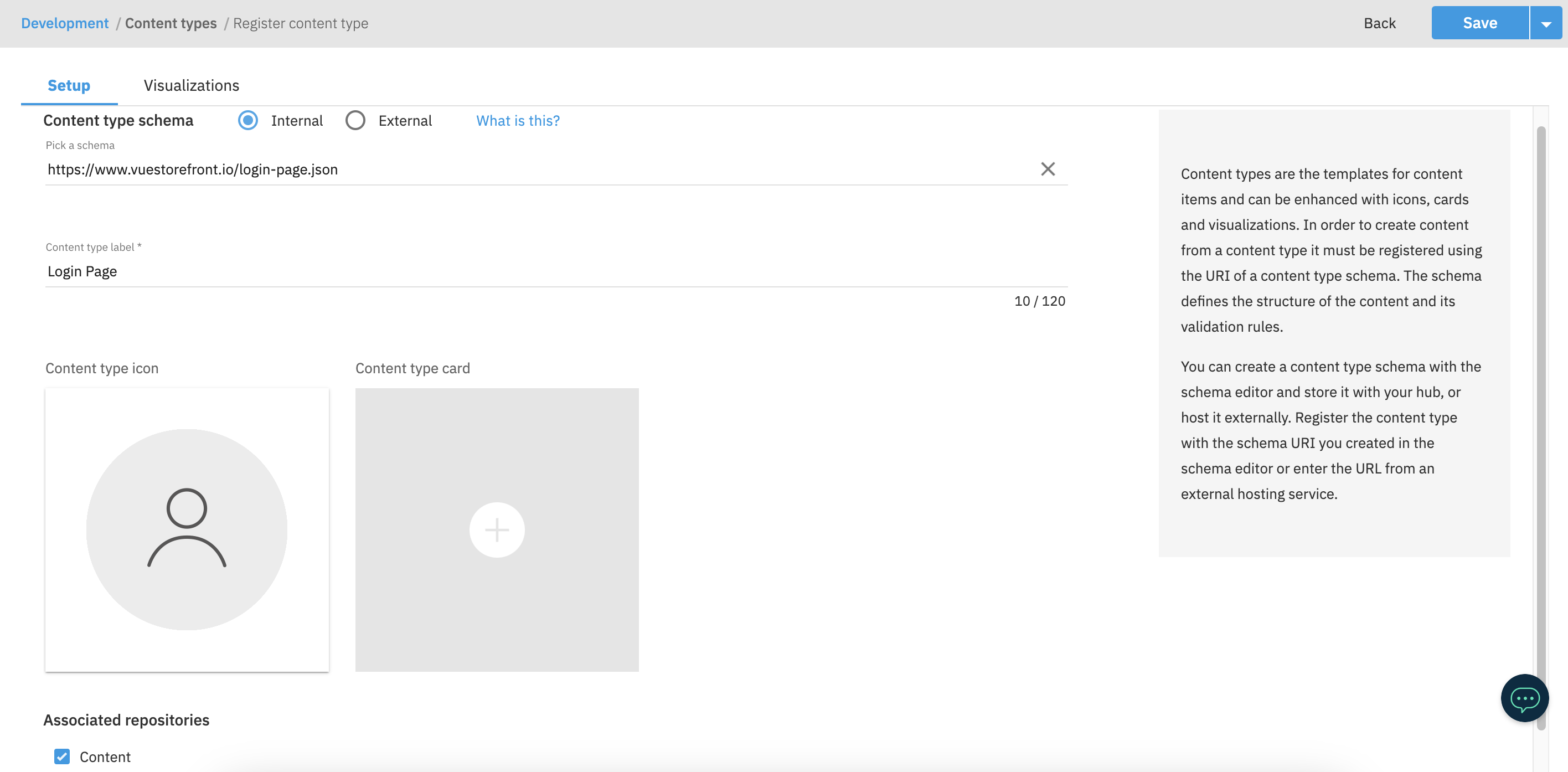
Now we have to adjust the config on the middleware side to match the /login path with the login_page Content Type.
Add Visualization
To be able to preview the Picture Content Type, go to the Visualizations tab and create a new visualization. The Visualization URL should point to the /login page and include all the tokens in search parameters. For example: http://localhost:3000/login?hubName={{hub.name}}&contentItemId={{content.sys.id}}&deliveryKey={{delivery.key}}&snapshotId={{snapshot.id}}&vseDomain={{vse.domain}}&locales={{locales}}.
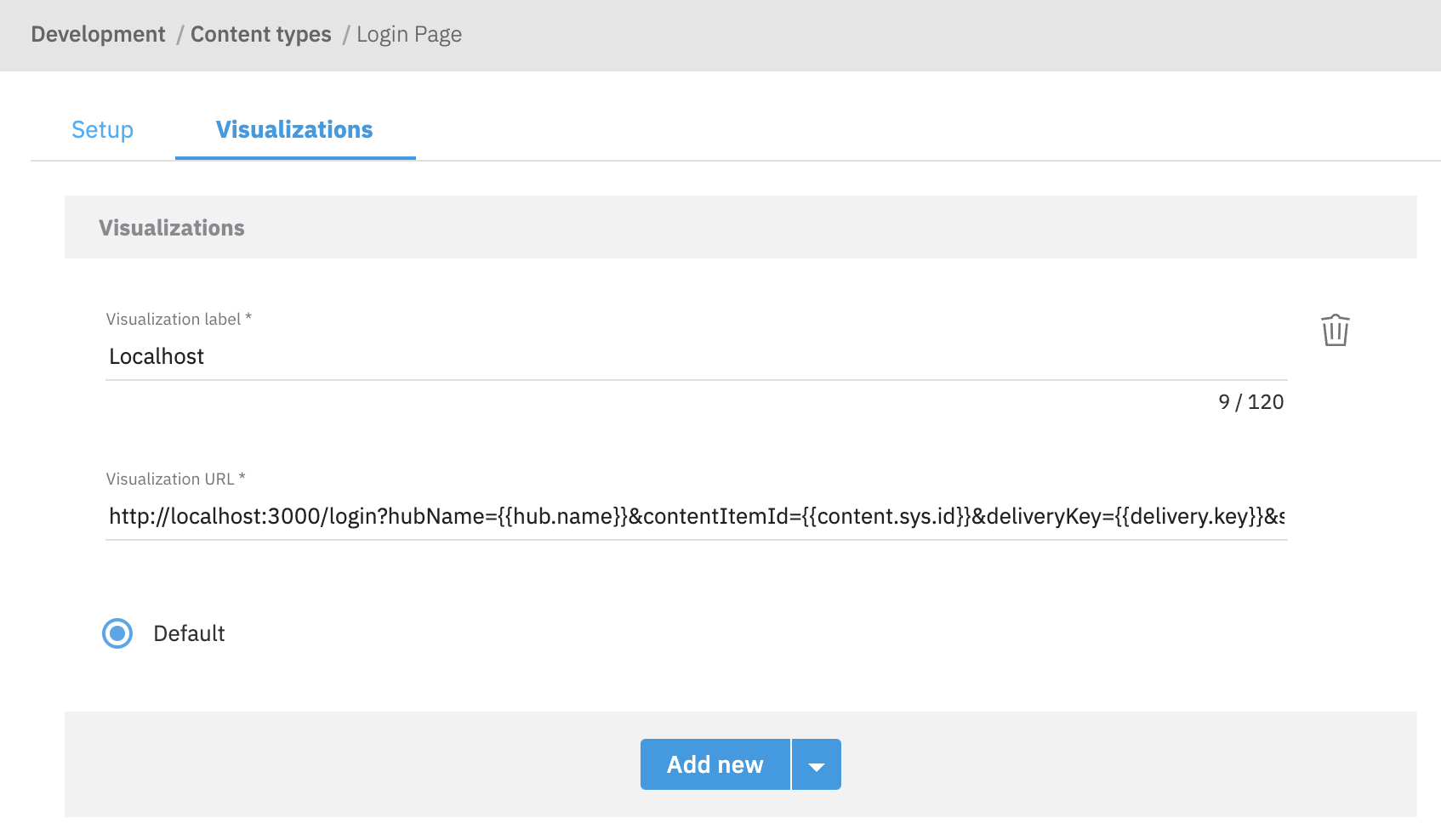
Once done, click the Save button to confirm.
Next.js has an issue with displaying authenticated pages in Visualizations. A workaround is to update the Next.js middleware.ts to catch error in getCustomer method.
async function getAuthRedirectPath(request: NextRequest) {
  const sdk = await getSdk();
  const checkIsLoggedIn = () => sdk.unified.getCustomer().then(({ customer }) => !!customer);
  const checkIsLoggedIn = () =>
    sdk.unified
      .getCustomer()
      .then(({ customer }) => !!customer)
      .catch(() => false);

  //...
}
Create a new project
To create a new page in Bloomreach Content, you first have to create a new project. In order to do so:
- navigate to the Projects application and click the blue
+ Projectbutton, - give your project an arbitrary name,
- check the
Development projectcheckbox, - once done, hit the blue Create button in the top right corner.
Once the project had been created:
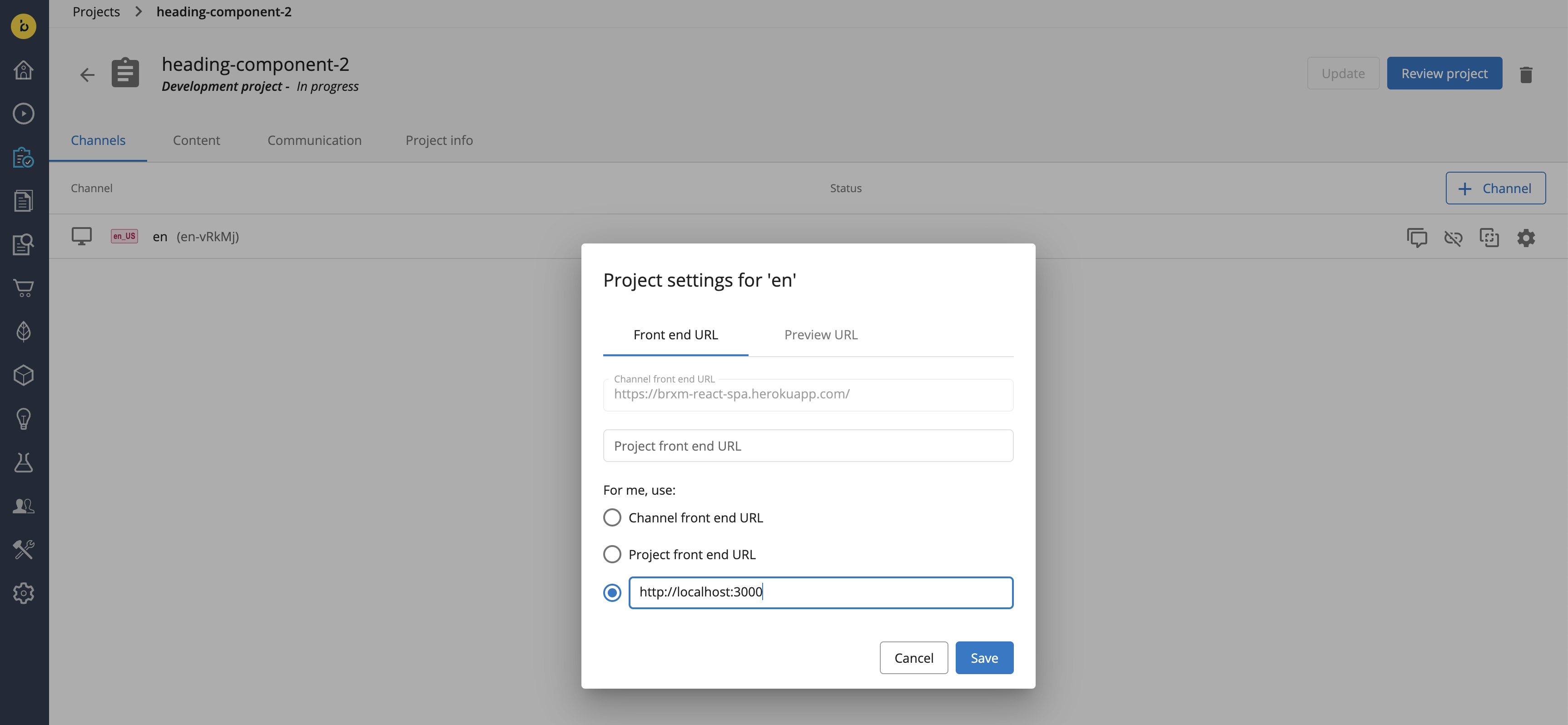
- add a development channel to it (e.g.
en), - click on the cog icon to set the preview URL for the channel (e.g. http://localhost:3000 if that's where your Storefront is running locally),
- once done, click
Saveto confirm.
Create a new route
Bloomreach Content utilizes the concept of routes to create a mapping between your frontend URLs and your Page documents. They have to be configured properly so that - in your Storefront - you can fetch the pages you create.
For the Login page - available under /login in your Storefront - you are going to need an _any_ wildcard route. If your environment was bootstrapped using Alokai's default schemas, the route should already be in place. However, if you need to create it from scratch, read the Bloomreach Content section in our guide on resolving pages.
Create a new layout
Every page in Bloomreach has to be assigned a layout. It defines a structure of components and containers which can be added to the page in the Experience Manager.
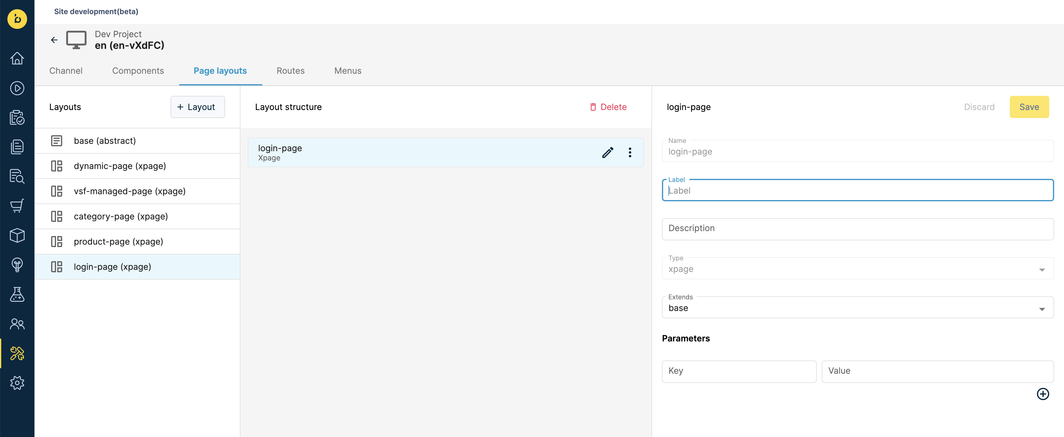
To create a new layout for the Login page:
- navigate to the Site Development app,
- click the Page layouts tab,
- click the + Layout button,
- set your layout's name to
login-page, - set your layout's type to
xpage, - optionally, choose the layout you want to extend (e.g. the default
baselayout provided by Alokai's default schemas), - once done, hit the yellow Create button in the top right corner.
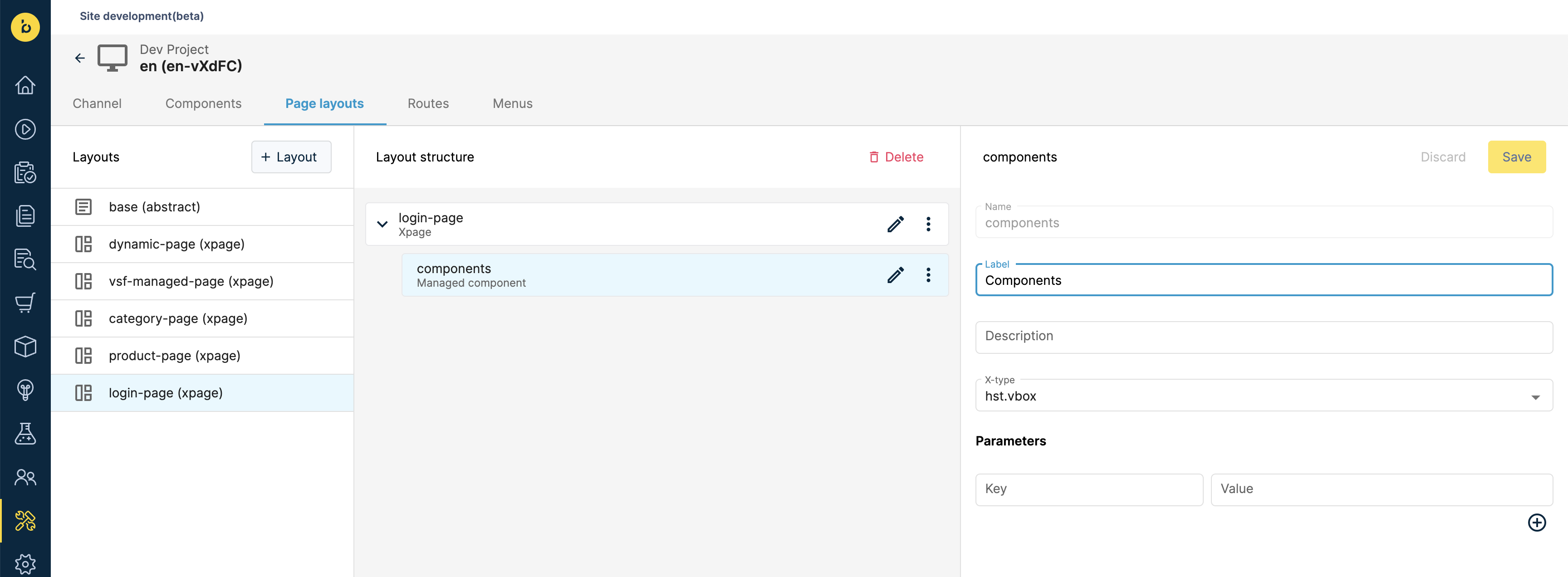
To define containers for Experience Manager components in the newly-created layout:
- move your mouse over the three dots of the
login-pageelement in the layout structure and click the Add managed component button, - set the container's name to
components, - set the container's label to
Components, - set the container's X-type to
hst.vbox, - once done, hit the yellow Save button in the top right corner.
With your route and layout in place and the development project still open, proceed to the Create CMS content section.
Create a new Model
Navigate to the Models tab and click the + Create Model button in the top right corner. Choose Section from the dropdown.
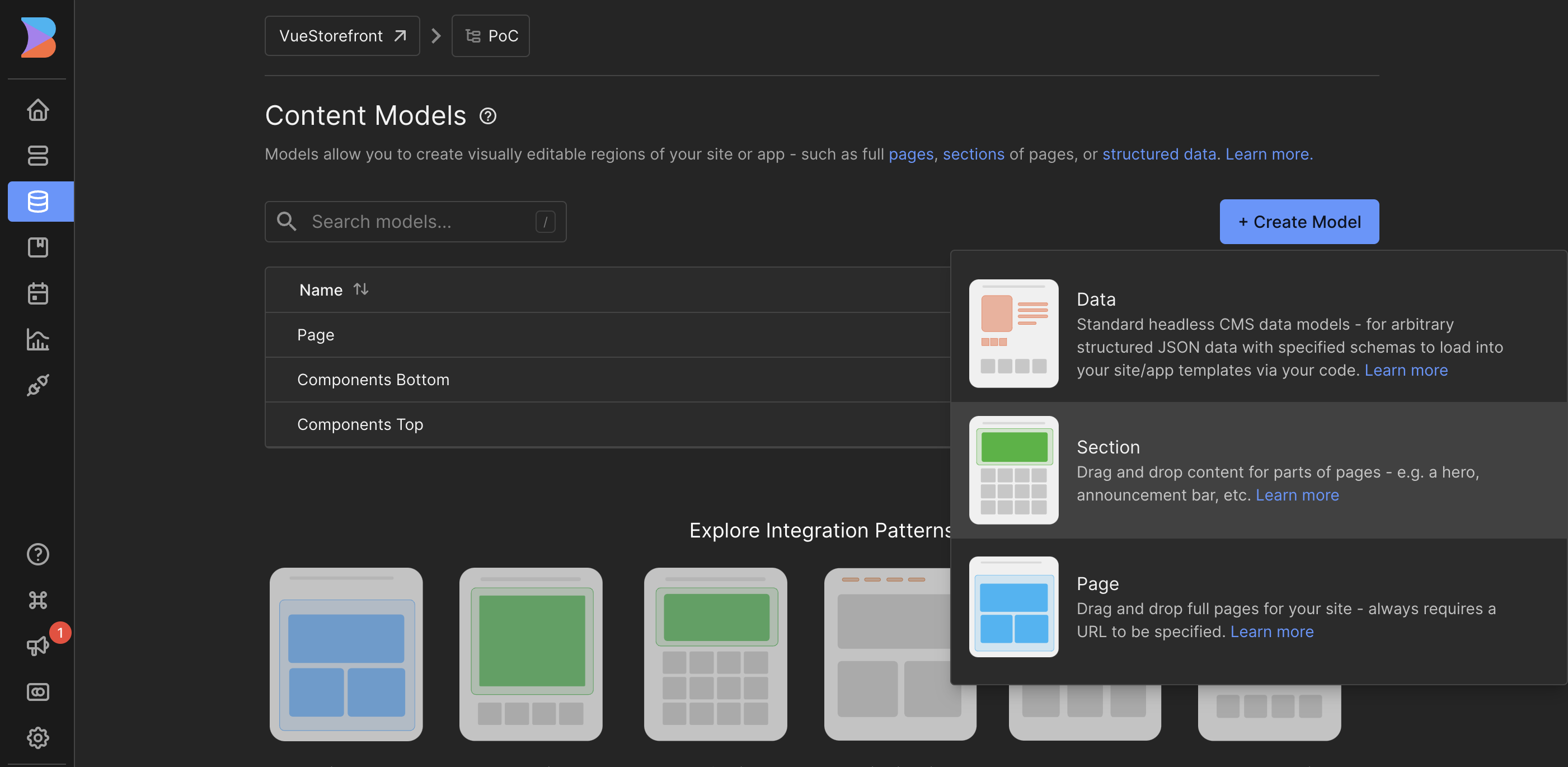
Give the model a Components name and click Create.
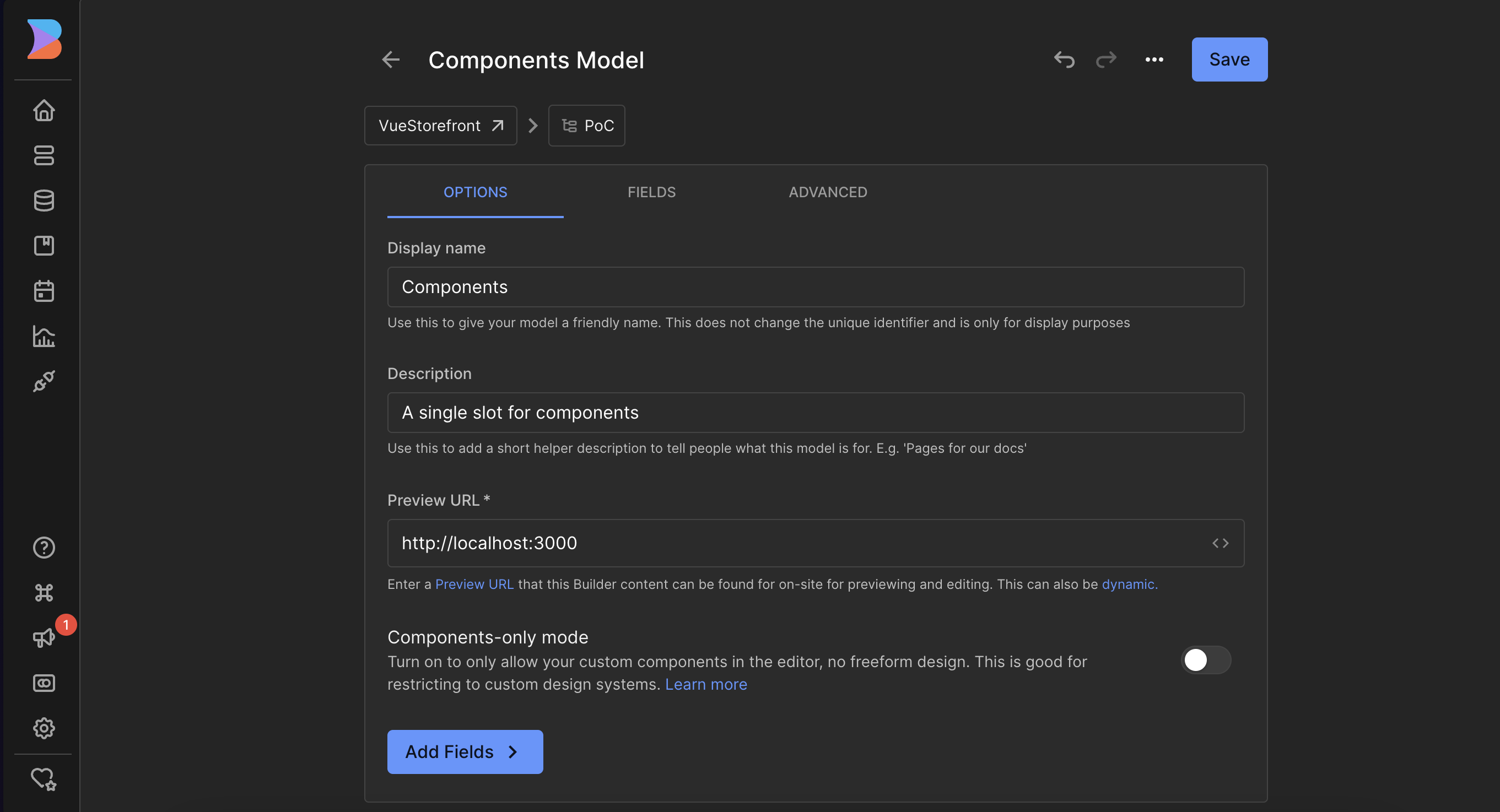
Set the Preview URL
In the next form, set the Preview URL to http://localhost:<port>. The /login path is not needed, as it will be automatically set later. Click Save.
Resolve the Login page on the Server Middleware side
Now we have to adjust the config on the middleware side to match the /login path with the newly created Section model.
Reading the Builder.io section in our guide on resolving pages to learn more about mappings between Storefront paths and Builder.io entries.
export const config = {
  location: "@vsf-enterprise/builderio-api/server",
  configuration: {
    apiKey: BUILDERIO_API_KEY,
    unified: {
      resolvePages: () =>
        Promise.resolve({
          "/category{/*slug}": {
            type: "sections",
            model: [
              { name: "components-top", key: "componentsTop" },
              { name: "components-bottom", key: "componentsBottom" },
            ],
          },
          "/product{/*slug}": {
            type: "sections",
            model: [{ name: "components-bottom", key: "componentsBottom" }],
          },
          "/login": {
            type: "sections",
            model: [{ name: "components", key: "components" }],
          },
          "/*slug": {
            type: "page",
            model: "page",
          },
        }),
      resolveFallbackPage: () =>
        Promise.resolve({
          type: "page",
          model: "page",
        }),
    },
  },
} satisfies Integration<MiddlewareConfig>;
If you would like to use the components model for other pages, you can add a new resolving to the list. For example:
//...
export const config = {
  location: "@vsf-enterprise/builderio-api/server",
  configuration: {
    //...
    unified: {
      resolvePages: () =>
        Promise.resolve({
          //...
          "/login": {
            type: "sections",
            model: [{ name: "components", key: "components" }],
          },
          "/about": {
            type: "sections",
            model: [{ name: "components", key: "components" }],
          },
          //...
        }),
      //...
    },
  },
} satisfies Integration<MiddlewareConfig>;
Create a new Content Type
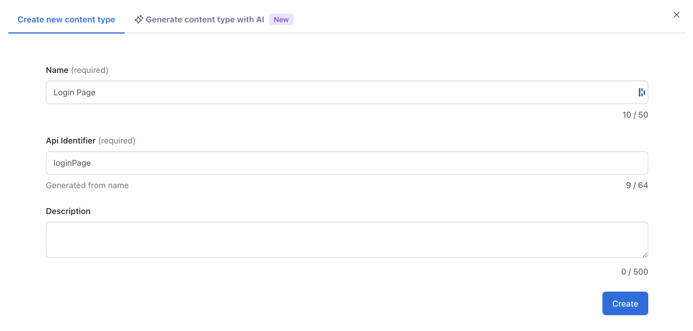
Navigate to the Content Model tab and click the + Create Content Type button in the top right corner. Fill the Name field with Login Page and click the Create button.
Define Content Type fields
Click on the + Add field button and add following fields to the Content Type:
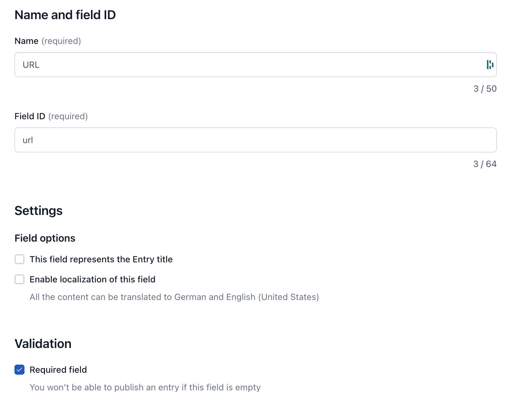
- URL: a short text field, required for Live Preview
- Components: a Reference (many) field
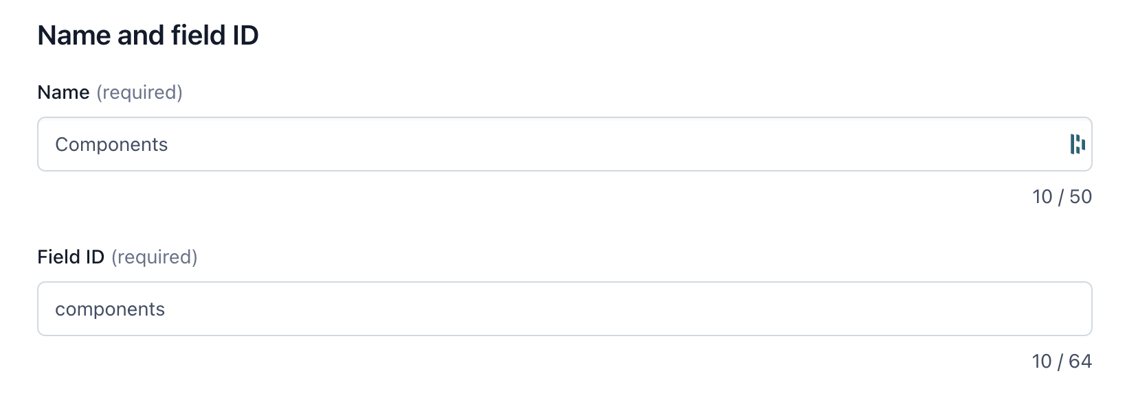
You can select required field in the Validation section. Once done, hit the Save button.
Resolve the Login Page on the Server Middleware side
Next, we need to update the Server Middleware configuration to associate the /login path with the loginPage Content Type.
//...

export const config = {
  location: "@vsf-enterprise/contentful-api/server",
  configuration: {
    //...
    unified: {
      resolvePages: () => ({
        "/category{/*slug}": {
          content_type: "categoryPage",
          url: "/category",
        },
        "/product/*slug": {
          content_type: "productPage",
          url: "/product",
        },
        "/login": {
          content_type: "loginPage",
        },
        "/{*slug}": {
          content_type: "page",
        },
      }),
      resolveFallbackPage: () => ({
        content_type: "page",
        model: "page",
      }),
    },
  },
} satisfies Integration<MiddlewareConfig>;
Create a new Content Type
Navigate to the Content Models tab and click the + New Content Type button in the top right corner. Fill the Name field with Login Page, select type to Single and click the Save and proceed button.
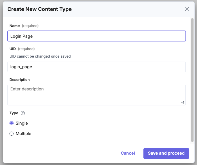
You might consider making this Content Type more reusable, by naming it Single Slot Page and setting it type to Multiple. This way, you can use it in the future for other pages with a single slot for CMS content.
Complete the Content Type fields
Add following fields to the Content Type:
- URL: field, it's required for Live Preview,
- and Components: field with the Reference type and Multiple option enabled.
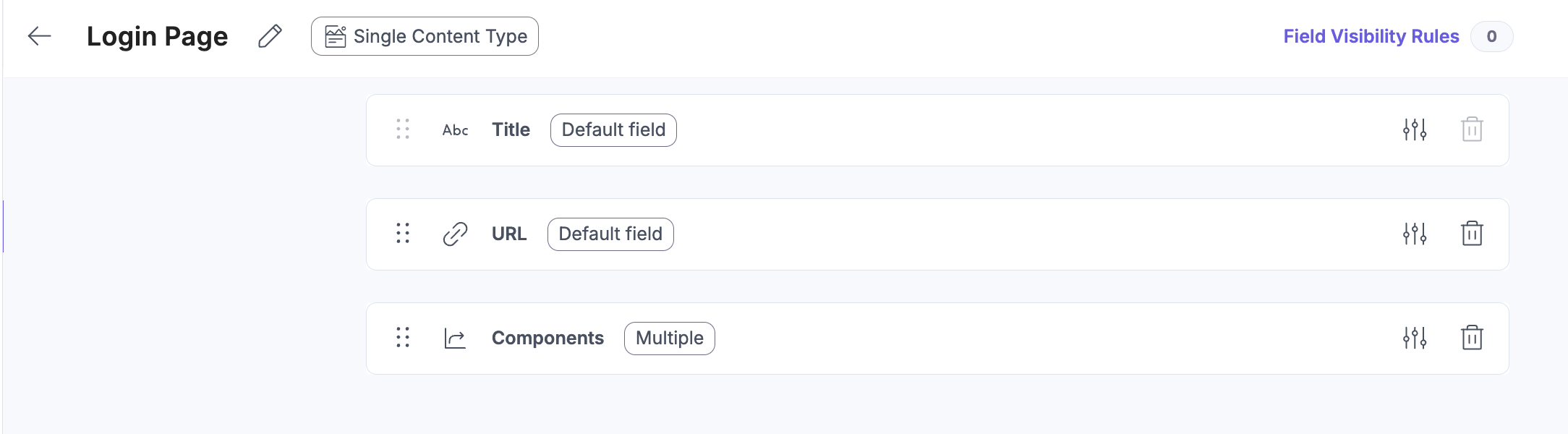
Remember to include in the Components field the components you want to use on the Login Page in Referenced Content Type field. In our case it will be a Grid and Picture components. Once done, Save and Close the Content Type.
Resolve the Login Page on Middleware side
Now we have to adjust the config on the middleware side to match the /login path with the login_page Content Type.
//...

export const config = {
  location: "@vsf-enterprise/contentstack-api/server",
  configuration: {
    //...
    unified: {
      resolvePages: () => ({
        "/category{/*slug}": {
          type: "category_page",
          includeReference: ["components_top.items", "components_bottom.items"],
          url: "/category",
        },
        "/product/*slug": {
          type: "product_page",
          includeReference: ["components_bottom.items"],
          url: "/product",
        },
        "/login": {
          type: "login_page",
          includeReference: [
            "components.items",
            "components.caption",
            "components.items.caption",
          ],
        },
        "/{*slug}": {
          type: "page",
          includeReference: [
            "components_above_fold.items",
            "components_below_fold.items",
          ],
        },
      }),
      resolveFallbackPage: () => ({
        type: "page",
        model: "page",
      }),
    },
  },
} satisfies Integration<MiddlewareConfig>;
You can see that we added also a includeReference field. It's necessary to fetch the deeper nested components from the CMS. For instance, the Grid component contains nested components field, called items. To fetch it, we need to include it in the includeReference field, otherwise just a reference for the item will be fetched. Similarly, we need to include the caption field for the Picture component.
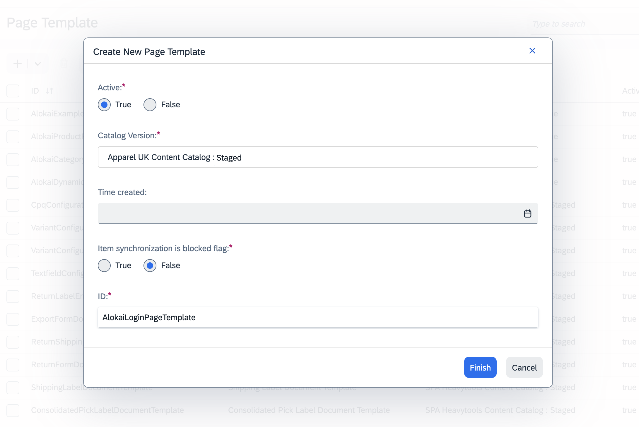
Create a new Page Template
In your Backoffice, go to WCMS > Page Template and create a new Page Template. Set:
- Active to
true, - CatalogVersion to the
Stagedversion of your preferred catalog, - ID to
AlokaiLoginPageTemplateor any other arbitrary value you will remember.
Define slots
Click the newly-created Page Template to bring up the editor. Open the Properties tab. Under Content Slots > Available Content Slots, click the Create Content Slot Name input. Set your slot's:
- Name to
components, - Page Template to
Alokai Login Page Template.
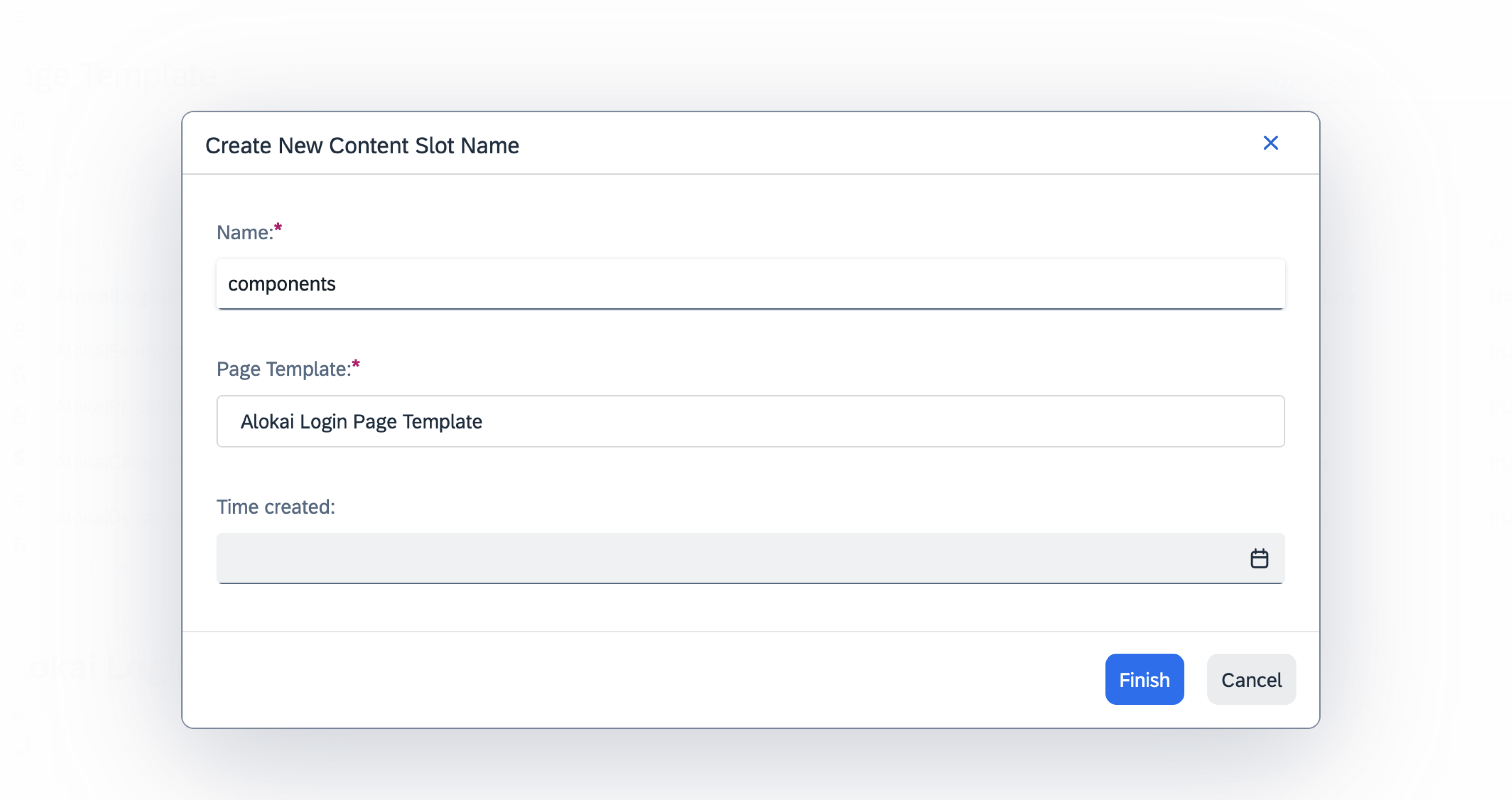
Once done, click Finish.
Define valid components
With the new slot in place, you can edit it further. Select it from the Available Content Slots list . In its Properties tab, click the Valid Component Types input. From the list, select:
- Alokai Picture Component,
- Alokai Editorial Component,
- Alokai Grid Component.
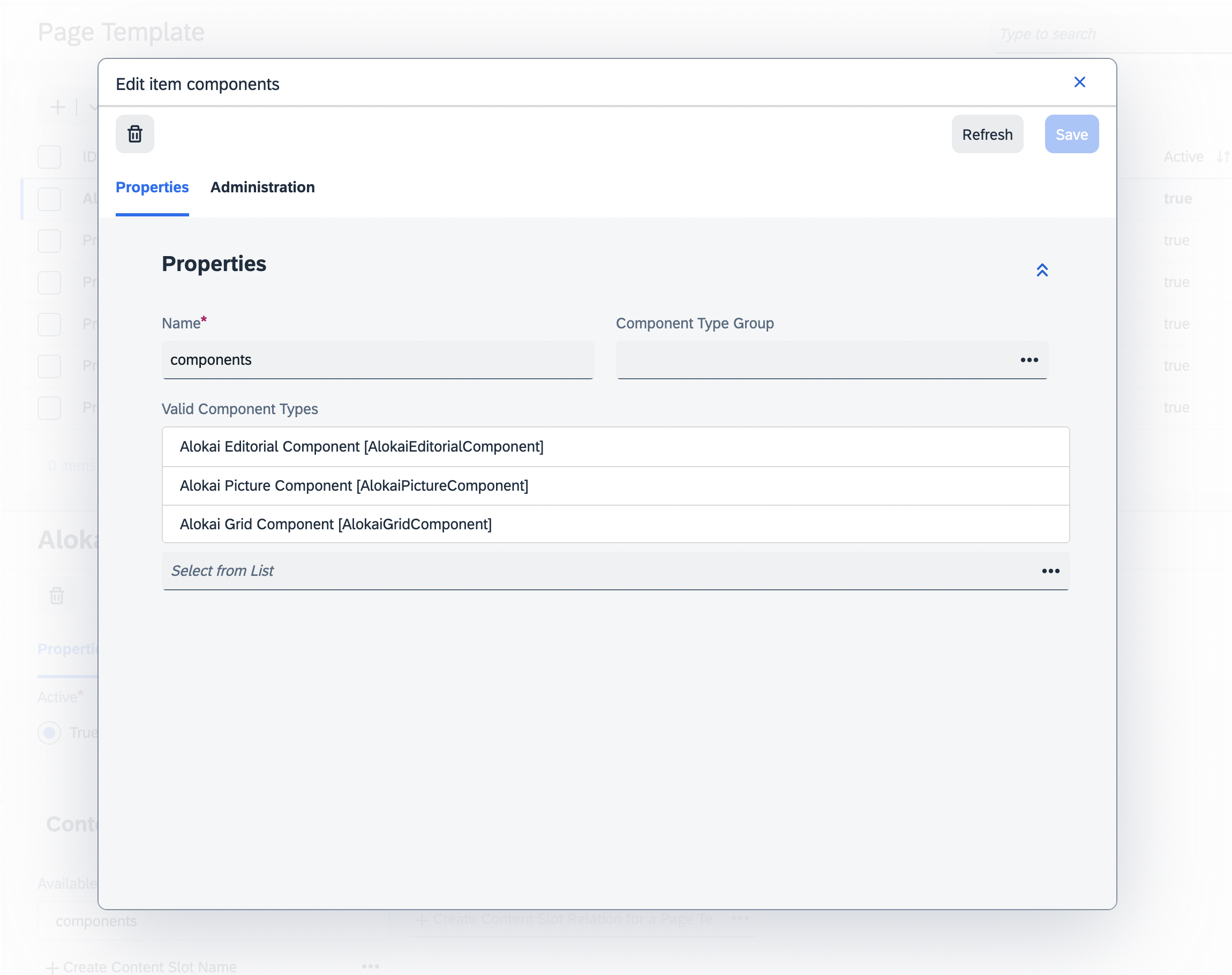
Once done, click Save.
Save the Page Template
When the slot modal disappears and you are navigated back to the main Page Template editor, finalize your changes by clicking the blue Save button in the top-right corner.
Add the Page Template to a Page Type
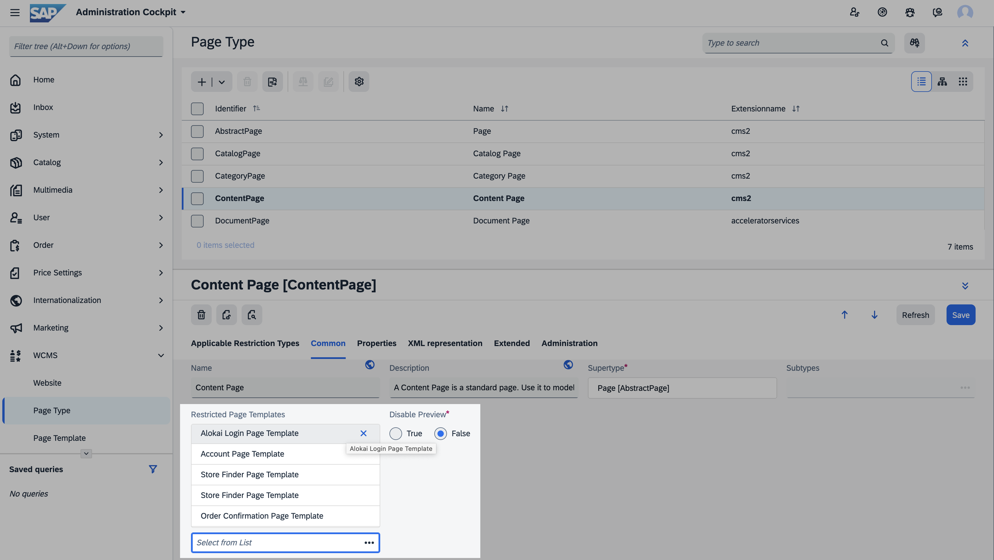
Go to WCMS > Page Type. Select Content Page from the list. In the Common tab, add the newly-created AlokaiLoginPageTemplate to Restricted Page Templates. Once done, click the blue Save button in the top-right corner.
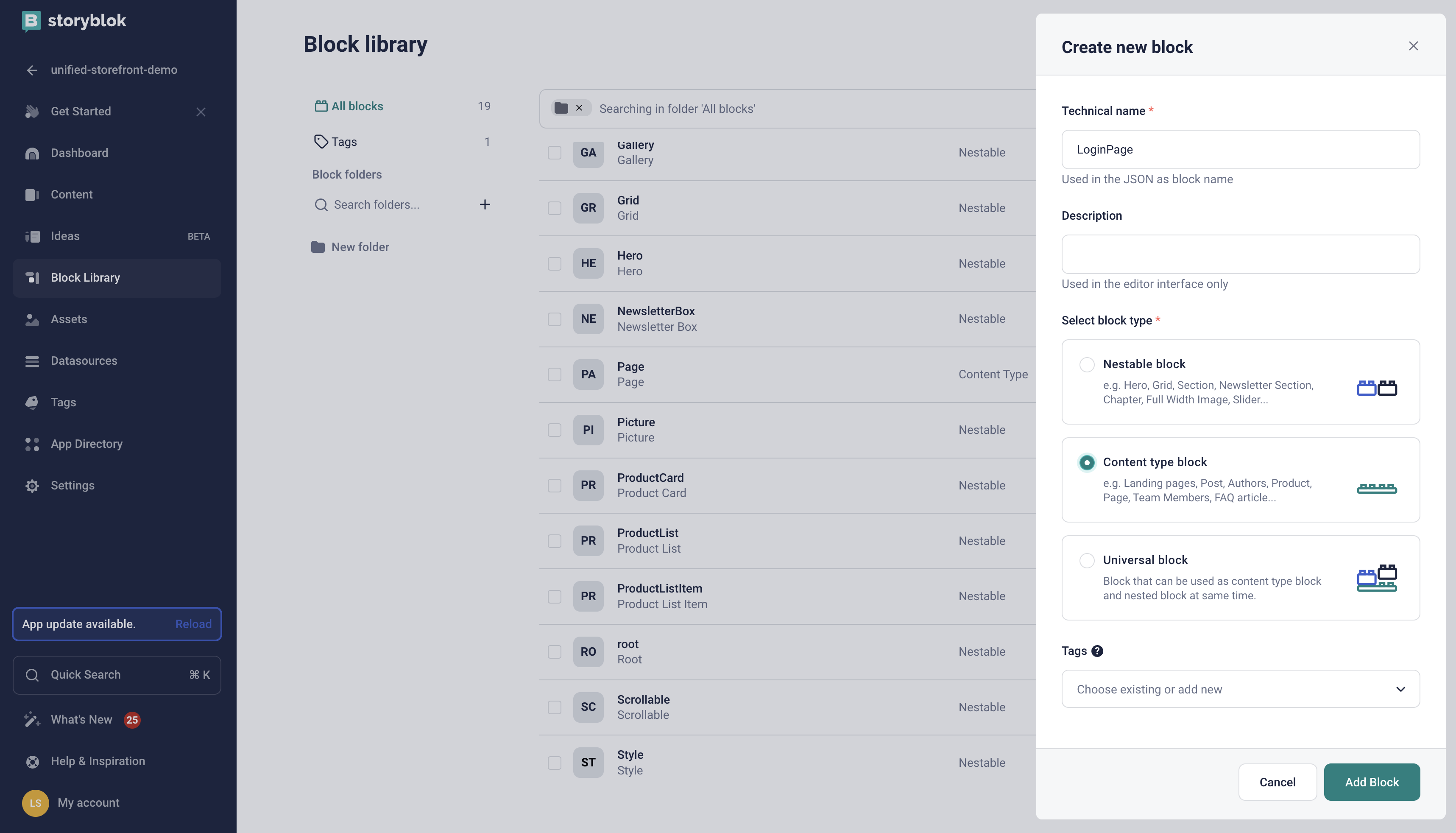
Create a new block
In your Storyblok space dashboard, navigate to the Block Library tab. Click the + New Block button in the top-right corner. Set your block's:
- Technical name to LoginPage,
- Block type to Content type block
and confirm by clicking Add Block in the bottom-right corner.
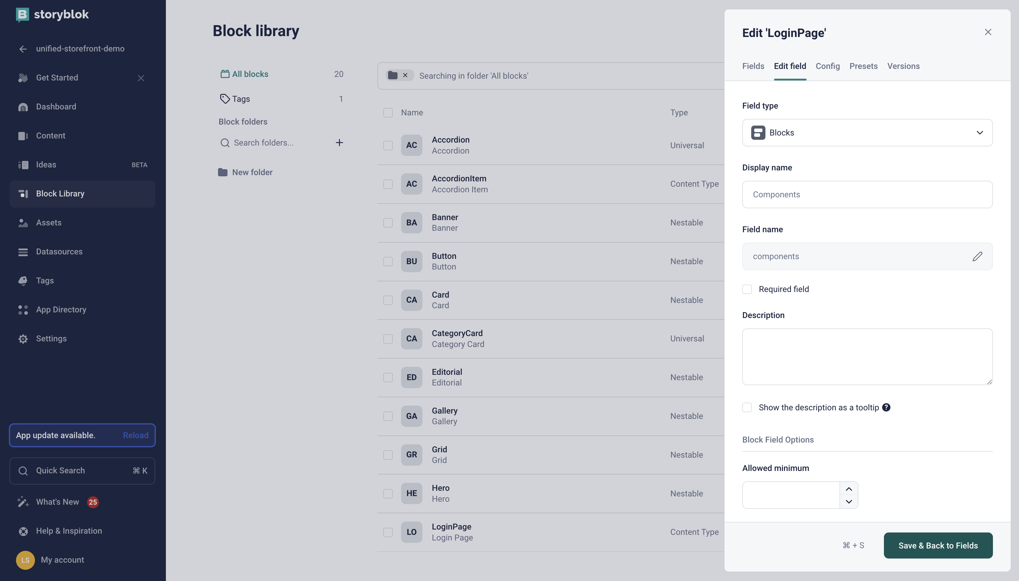
Add the Components field
After you had created the new block, the Edit Picture pan should appear on the right. In the Fields tab, add a new components field of type Blocks. When done, click the Save & Back to Fields button in the bottom-right corner.
Our set of Content Types for Storyblok includes a special Global component. It allows for creating stories containing components shared across multiple pages (such as the Newsletter Box). To leverage the concept of global components in your newly-created LoginPage block, set the components field type to References instead of Blocks. For further instructions, read this blog post from the Storyblok team.
Save the block
Finally, save the newly-created block by clicking the green Save button in the bottom-right corner.
Create CMS content
Now that we have a Content Type for the Login Page, we can create content for it. The content will be displayed on the Login Page in the CMS-managed section.
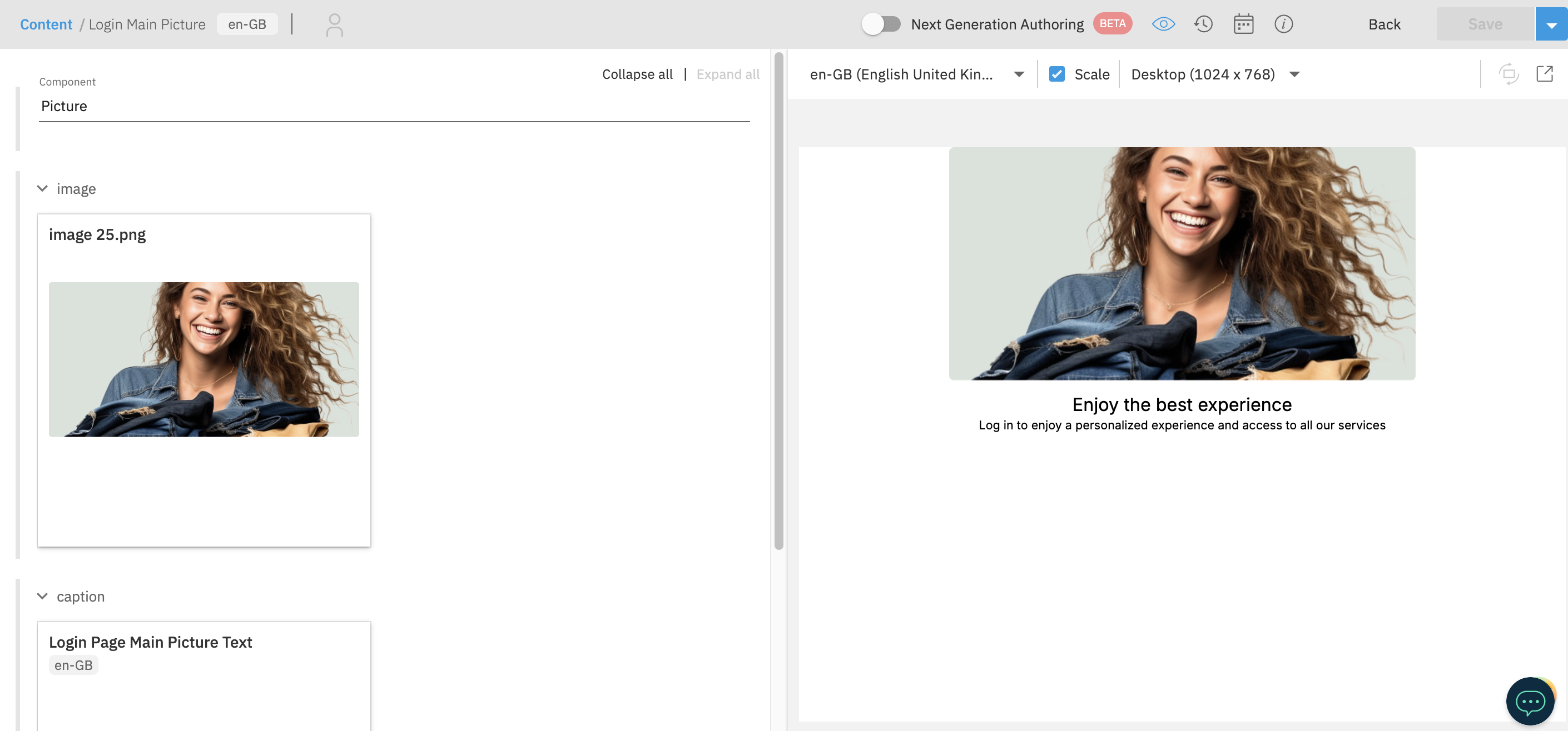
Add a main Picture component
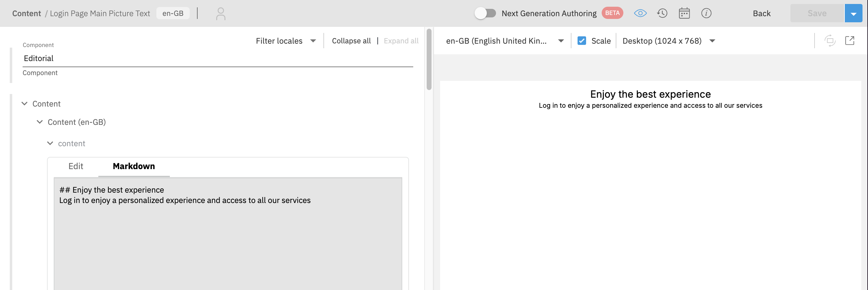
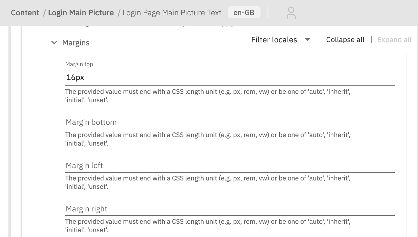
First we'll create a caption for our main Picture component. Navigate to the Content page and click the Create content button in the top right corner. Choose Editorial from the list. Then fill the content and click Save. Additionally, you can add a margin top to the caption to make it look better. To do this, add a group entry in the Styles field.
Then create a new Picture entry. Upload an image and choose the previously created Caption entry in the Caption field. Once done, save the entry.
Add an icon
Below the main Picture, there is a grid of icons. To create a first icon, create a new Editorial entry for caption, and then a new Picture entry for the icon. Upload the icon image and choose the caption entry in the Caption field.
Publish the icon entry and repeat the process for the remaining icons.
Place the icons in a grid
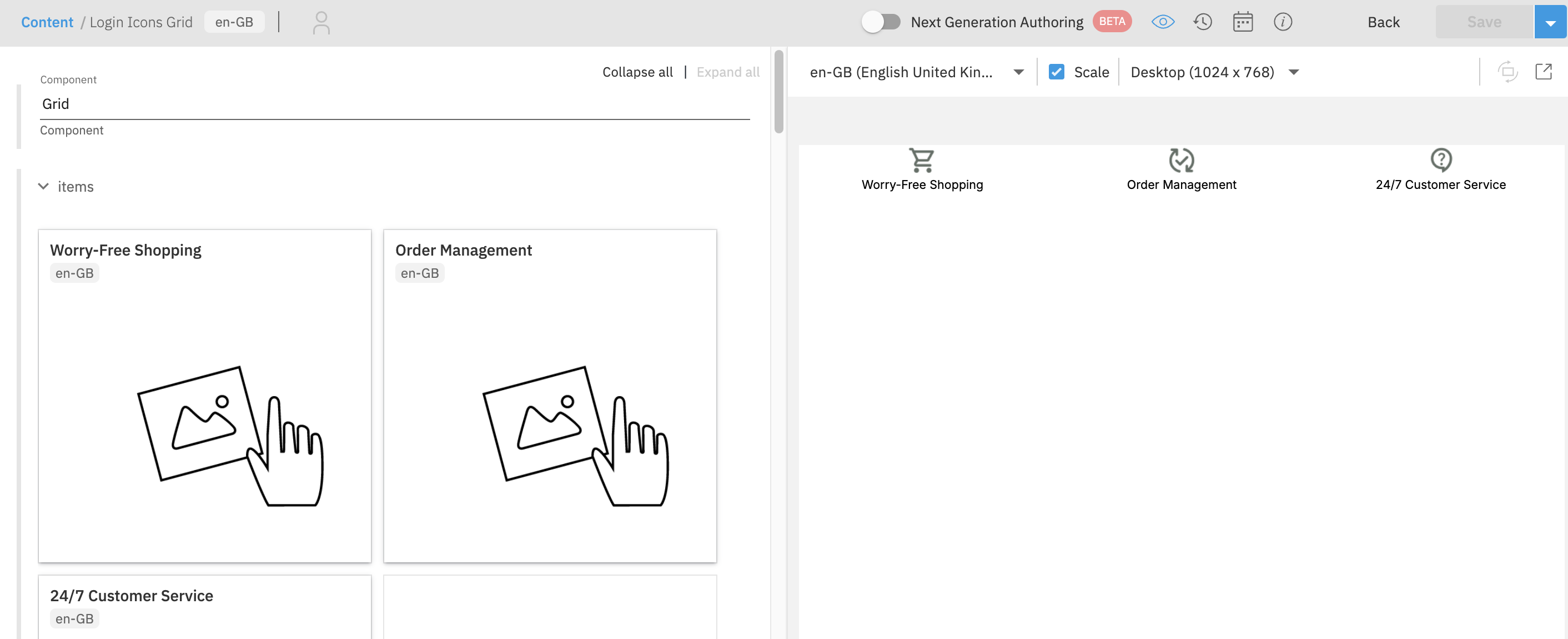
To display the icons in a grid, create a new Grid entry. To be able to add a Picture component into the Grid, you need to add a Picture Content Type as allowed in Grid schema. Go to Content type schemas page and find https://www.vuestorefront.io/grid.json schema. Then update the items property and choose Save and sync content type from the Save dropdown.
{
  "properties": {
    "items": {
      "type": "array",
      "items": {
        "type": "object",
        "allOf": [
          {
            "$ref": "http://bigcontent.io/cms/schema/v1/core#/definitions/content-link"
          },
          {
            "properties": {
              "contentType": {
                "enum": [
                  "https://www.vuestorefront.io/banner.json",
                  "https://www.vuestorefront.io/hero.json",
                  "https://www.vuestorefront.io/card.json",
                  "https://www.vuestorefront.io/category-card.json",
                  "https://www.vuestorefront.io/product-card.json",
                  "https://www.vuestorefront.io/editorial.json",
                  "https://www.vuestorefront.io/scrollable.json",
                  "https://www.vuestorefront.io/newsletter-box.json",
                  "https://www.vuestorefront.io/accordion.json",
                  "https://www.vuestorefront.io/gallery.json",
                  "https://www.vuestorefront.io/picture.json"
                ]
              }
            }
          }
        ]
      }
    }
  }
}
After that, you can create a new Grid entry on the Content page. Add the icons to the grid by in the Items field.
In Styles field, add two styles. One for the mobile, to display the icons in a column. For mobile set:
| Group | Field | Value |
|---|---|---|
| Resolutions | Max | 767px |
| Gaps | Row gap | 16px |
| Grid | Display | grid |
| Grid | Grid template areas | "a" "b" "c" |
And for desktop set:
| Group | Field | Value |
|---|---|---|
| Resolutions | Min | 768px |
| Gaps | Column gap | 16px |
| Grid | Display | grid |
| Grid | Grid template areas | "a b c" |
You can also add Margin -> Margin top to make some space between the main Picture and the icons grid. After that, save the grid entry and it should look like this:
Create a Login Page entry
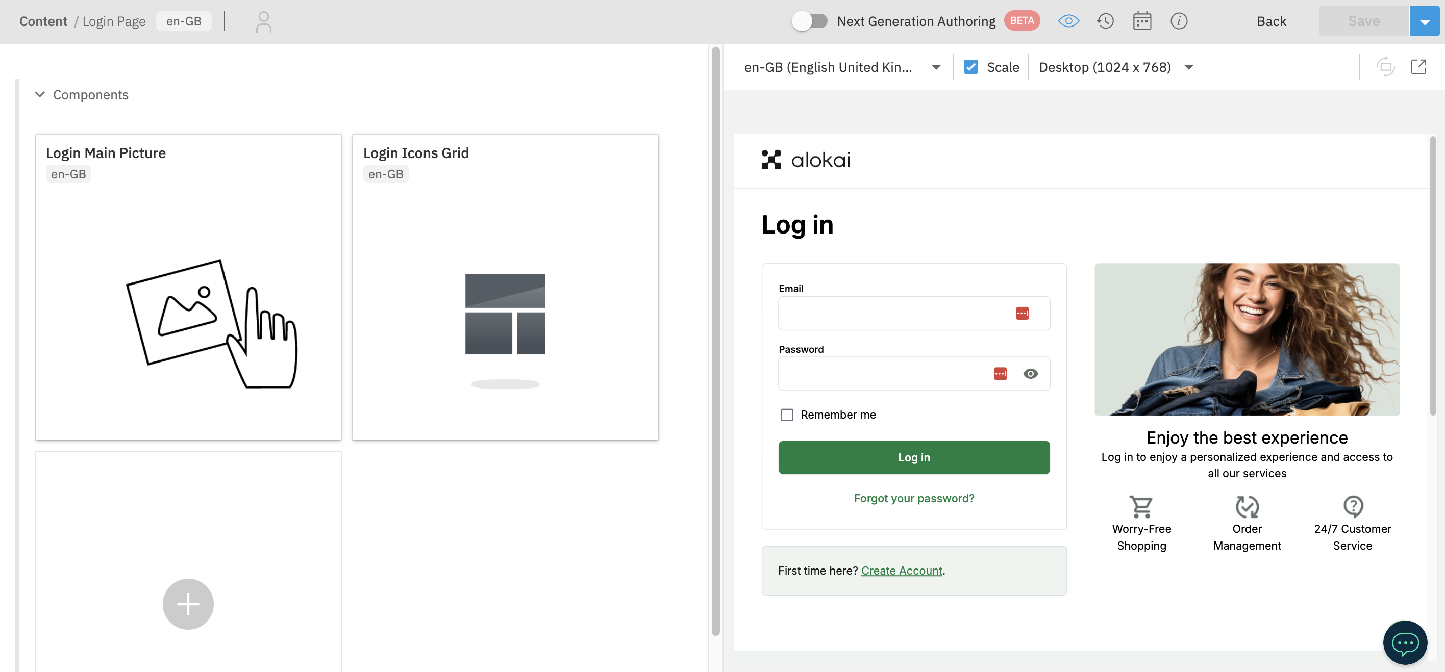
Finally, create a new Login Page entry. Add the main Picture and the grid of icons to the Components field, and save the entry.
Create a new page
Go to the Experience Manager and locate the blue + Page button. On its left, there is a button which allows you to toggle component & container outlines, making them editable - make sure it is active. Next, further to the left, there is the For project dropdown - make sure your newly-created project is the selected one.
Once ready, add a new page by clicking the + Page button.

In a form that appears, set your page's:
- name to login,
- URL to login,
- document type to Bloomreach Content,
- layout to hst:pages/login-page,
- location to /content/documents/en/pages
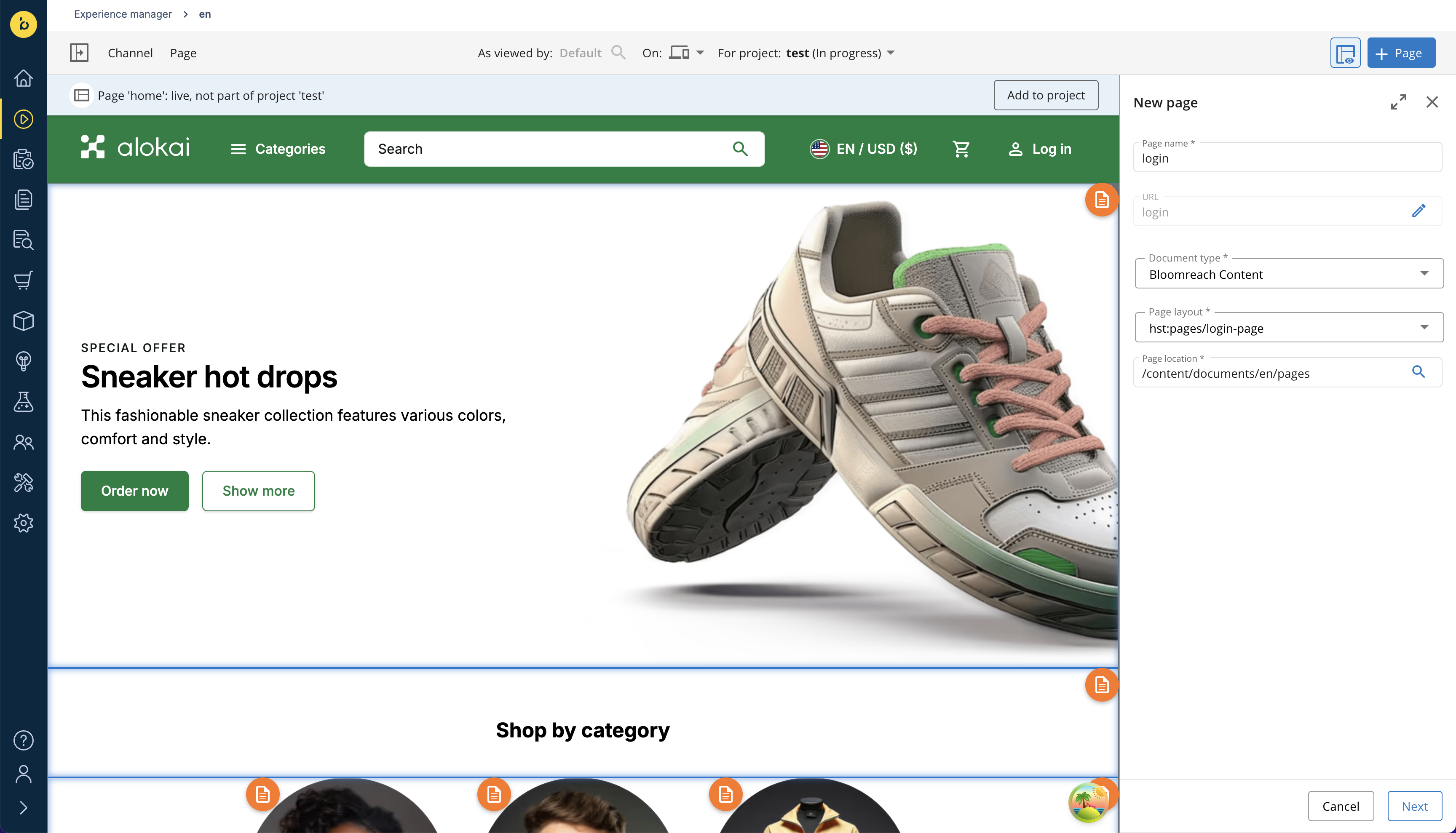
Click the Next button and - right after that - the Create button to save your new page. It should now be loaded in the preview window, featuring a single components container you had defined in the login-page layout.
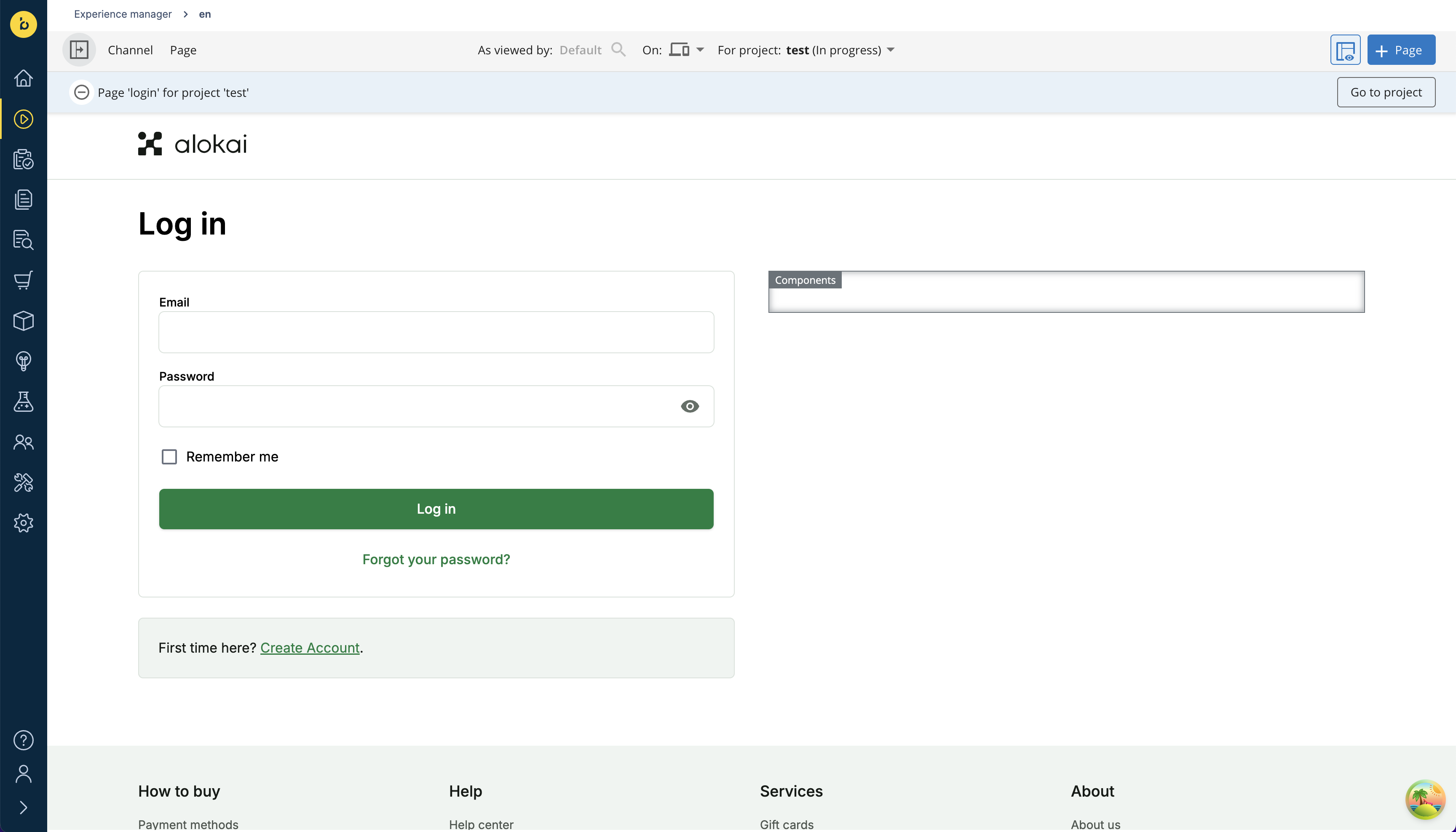
Create caption for the main Picture component
In the next step, you are going to add a Picture component to the newly-created Login page. It features a caption which you have to create beforehand as a separate Editorial document. In order to do it:
- navigate to the Content Application,
- select
Documentsfrom the dropdown in the top-left corner, - toggle the
enroot folder, find theeditorialdirectory, move your mouse over the three dots and clickNew vue storefront editorial document... - give your document an arbitrary name (e.g.
Login Picture Caption), - assign your document to your currently open development project,
- once done, confirm by clicking the blue OK button.
In the document form that appears, define your editorial's Content:
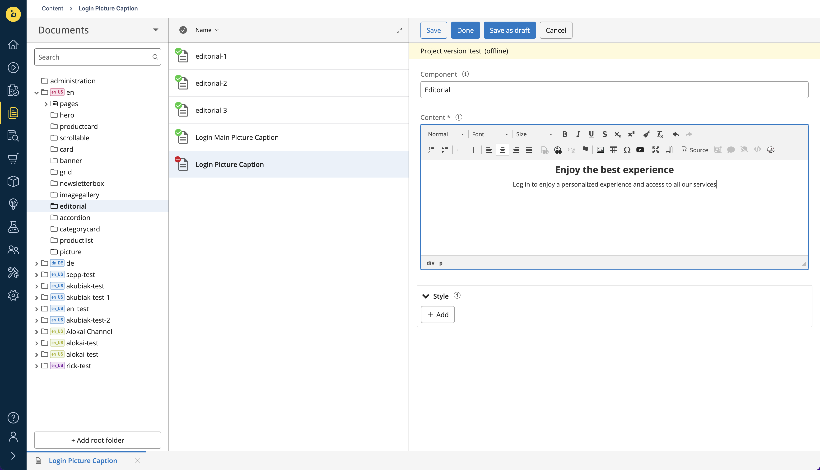
To add a vertical space between the Picture and the caption, apply a top margin in the Style section:
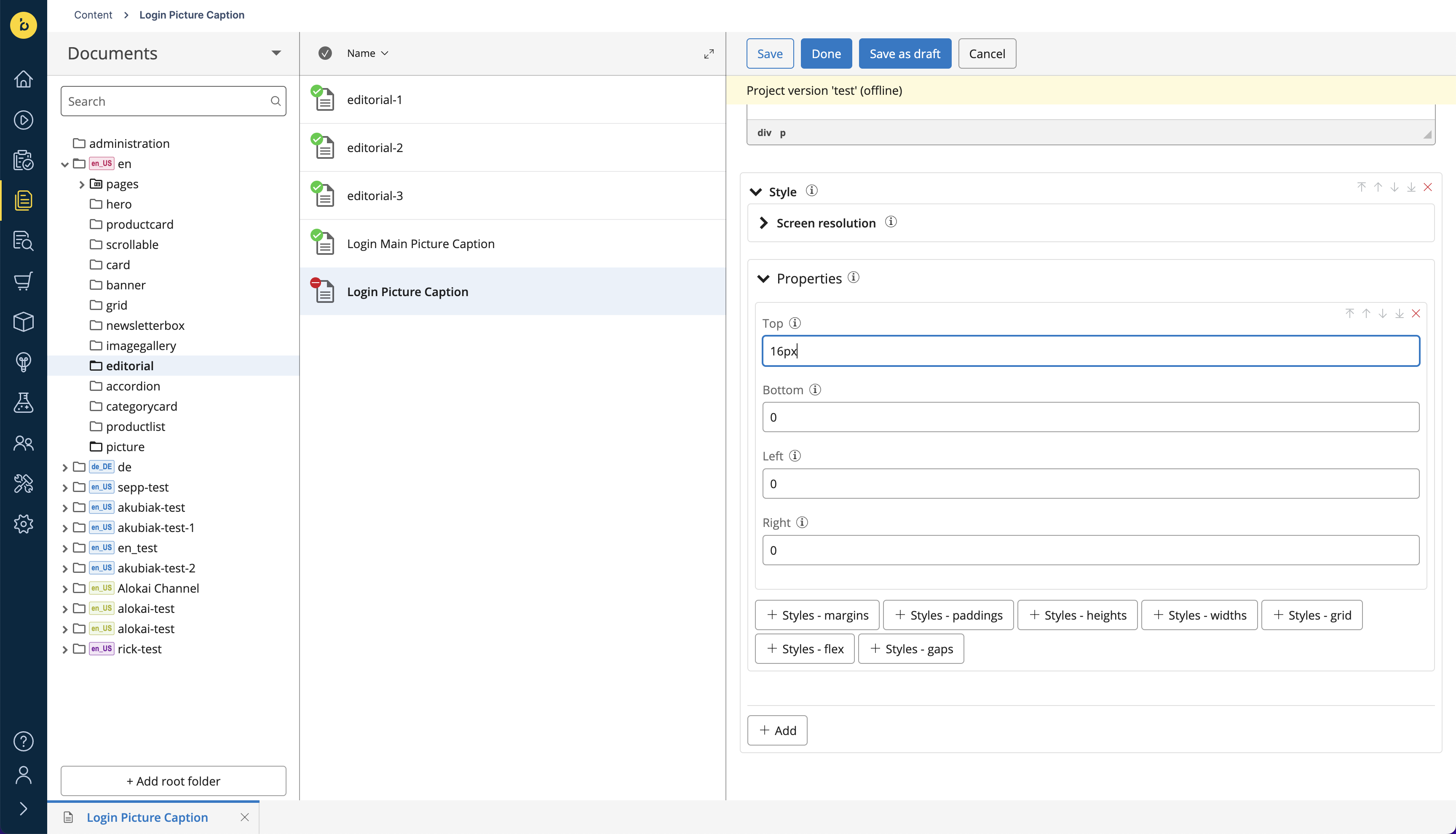
Once finished, click the blue Done button to save your changes.
Add the main Picture component
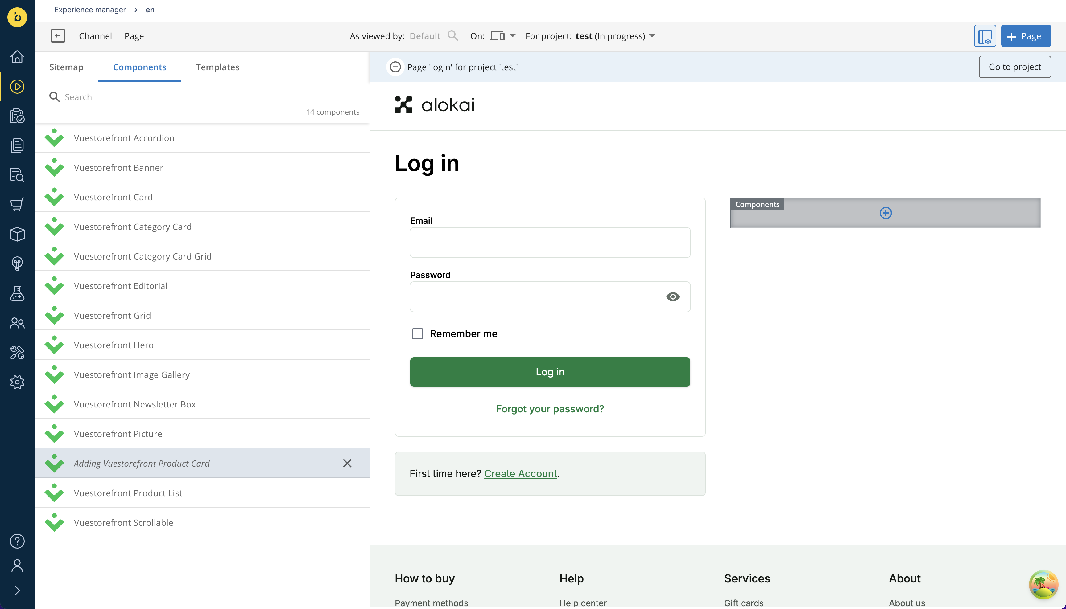
Go back to the Experience Manager. Make sure the Login page is loaded in the preview window. If necessary, toggle the left sidebar and select it from the Sitemap. Then, in the Components tab, select Vuestorefront Picture. Hover your mouse over the components container in the page preview and click the blue + icon.
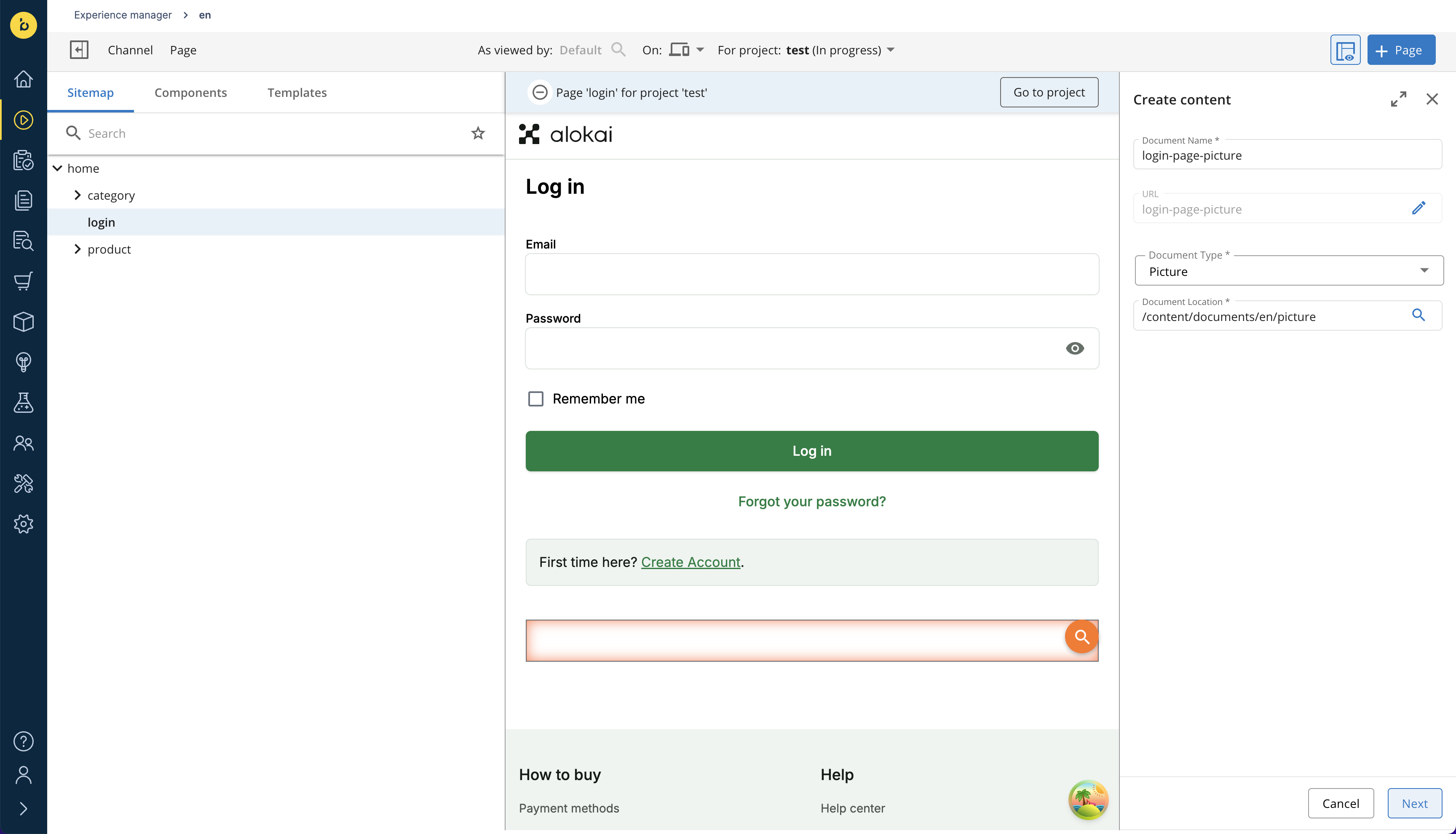
Once the Vuestorefront Picture component is added to the container, hover over its orange magnifying glass icon. A plus button should appear below it. Click it to bring up the form for creating a new document. Give it an arbitrary name and click Next.
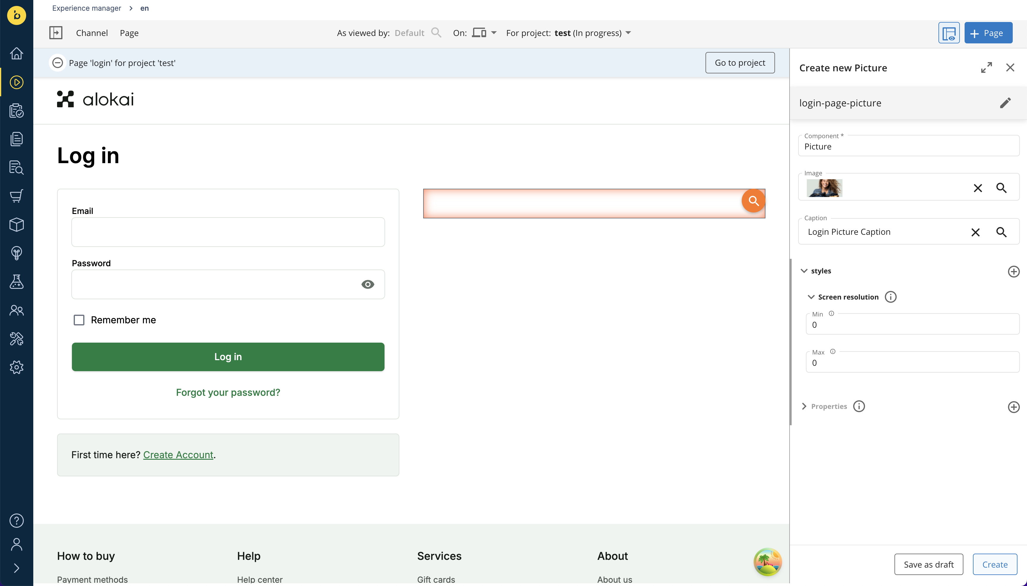
Alternatively, you could create a document for the Picture component through the Content Application and then select it in the Experience Manager by clicking the magnifying glass icon.
In the next form:
- leave the Component field set to
Picture, - select your component's image,
- find the
Editorialcreated in the previous step and use it as component's caption, - once done, click the Create button.
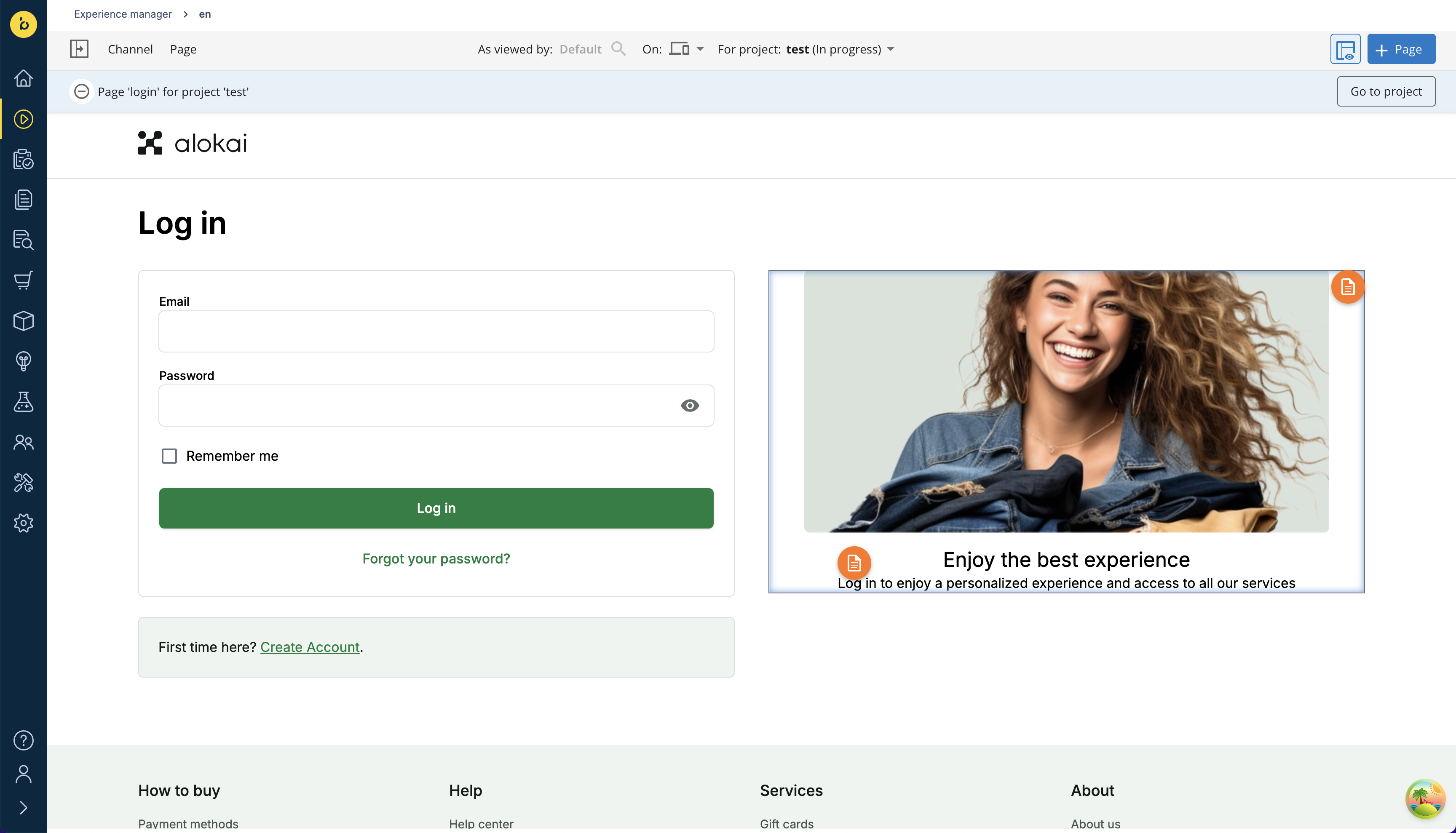
In the preview window, the newly-created Picture component instance should appear next to the login form.
There is a known issue with the Alokai-Bloomreach Content integration where newly added components might not immediately appear in the Experience Manager. As a workaround, you can detach the document from the component, attach it again and refresh the page. We are actively working on a permanent fix.
Create icons for the grid
With the main Picture component in place, you can now focus on the grid of captioned icons underneath:
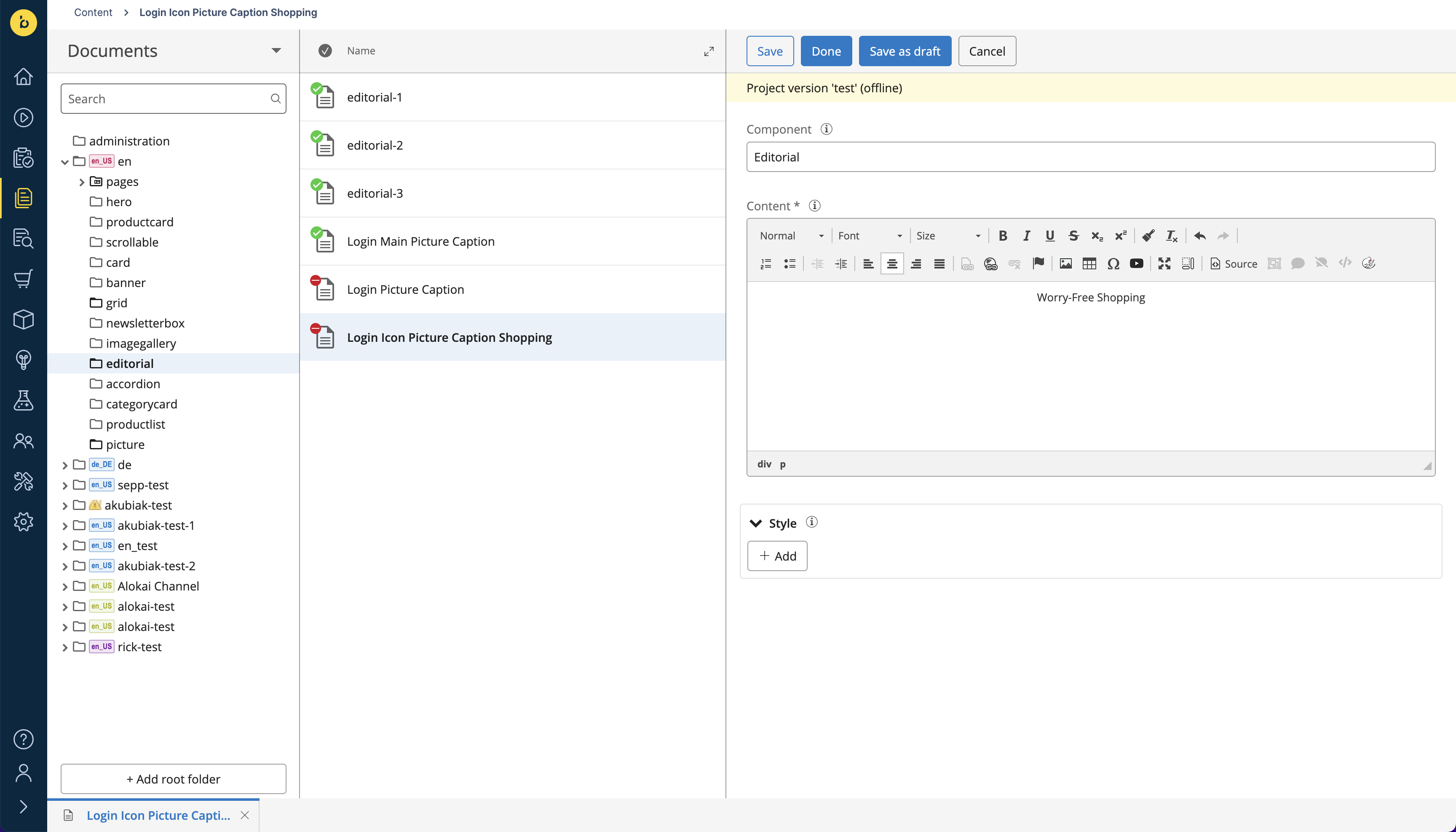
To create such a captioned icon, you need to create two documents: an Editorial containing the caption and a Picture combining the caption with an icon. Just like you did in step 2, create a new Editorial document:
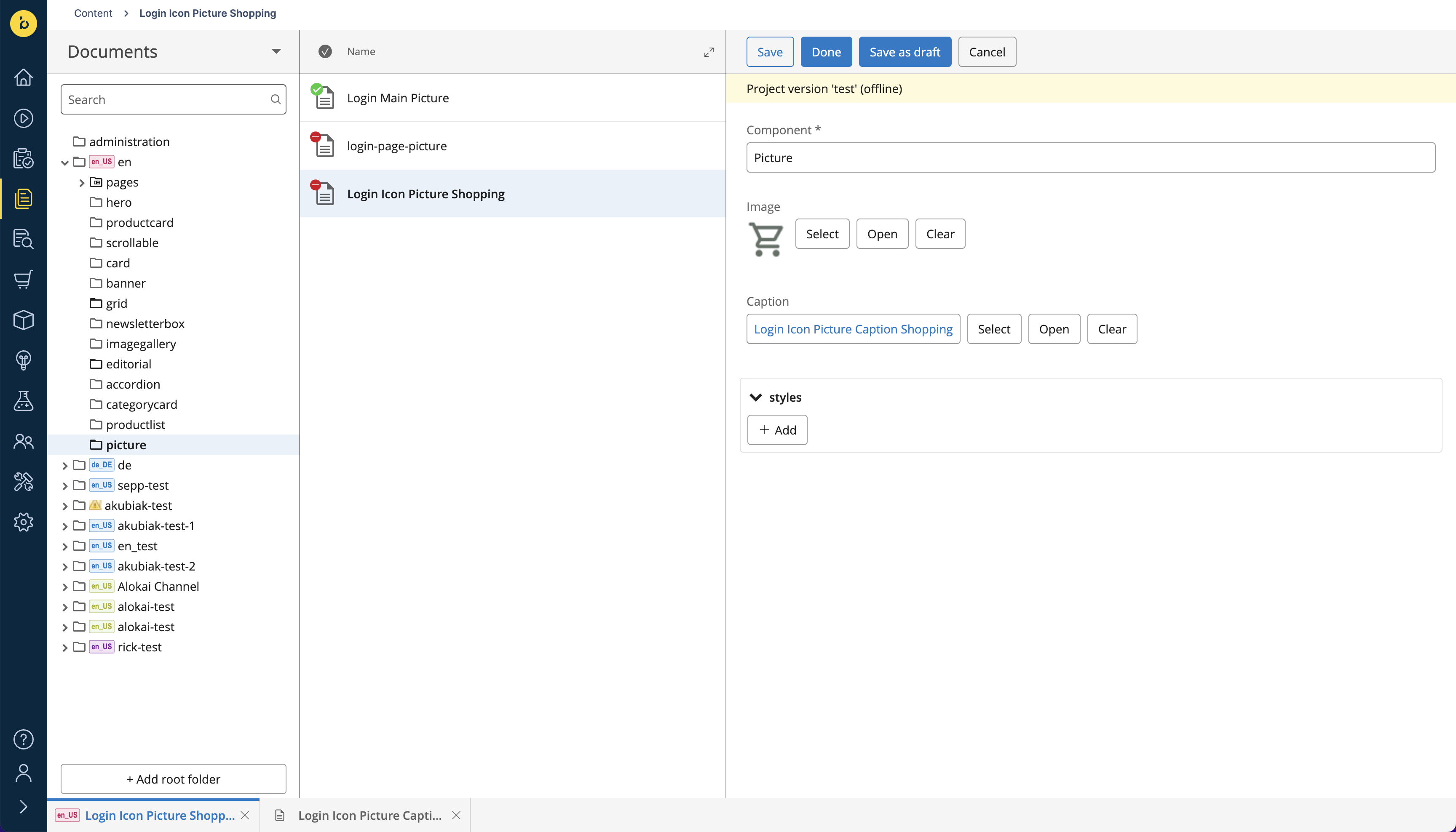
and a new Picture document:
This is how you create a single icon. Once done, repeat the process for the remaining two icons.
Increase the item reference depth level
The structure of the icons grid component you are about to create contains multiple deeply nested documents.
└── Grid Experience Component
    └── Grid document
        ├── Picture document A
        │   └── Editorial document A
        ├── Picture document B
        │   └── Editorial document B
        └── Picture document C
            └── Editorial document C
Unfortunately, when you fetch your Login page from Bloomreach, you will notice that the response does not include resolved references for the deeply nested Editorial documents. That's due to the default depth level setting supported by Bloomreach Delivery API.
To increase that level, pass maxRefLevel within searchParams when calling the unified getPage() method in your Storefront (examples simplified for brevity):
import { getSdk } from '@/sdk';

const sdk = await getSdk();

await sdk.unifiedCms.getPage({
  locale: 'en',
  path: '/login',
  searchParams: {
    maxRefLevel: 2, // defaults to 1
  }
})const sdk = useSdk();
await sdk.unifiedCms.getPage({
locale: 'en',
path: '/login',
searchParams: {
maxRefLevel: 2, // defaults to 1
}
})Place icons in the grid
With the three icons in place, you can go back to the Experience Manager. Below the Picture component you have created in step 3, add a new Grid component.
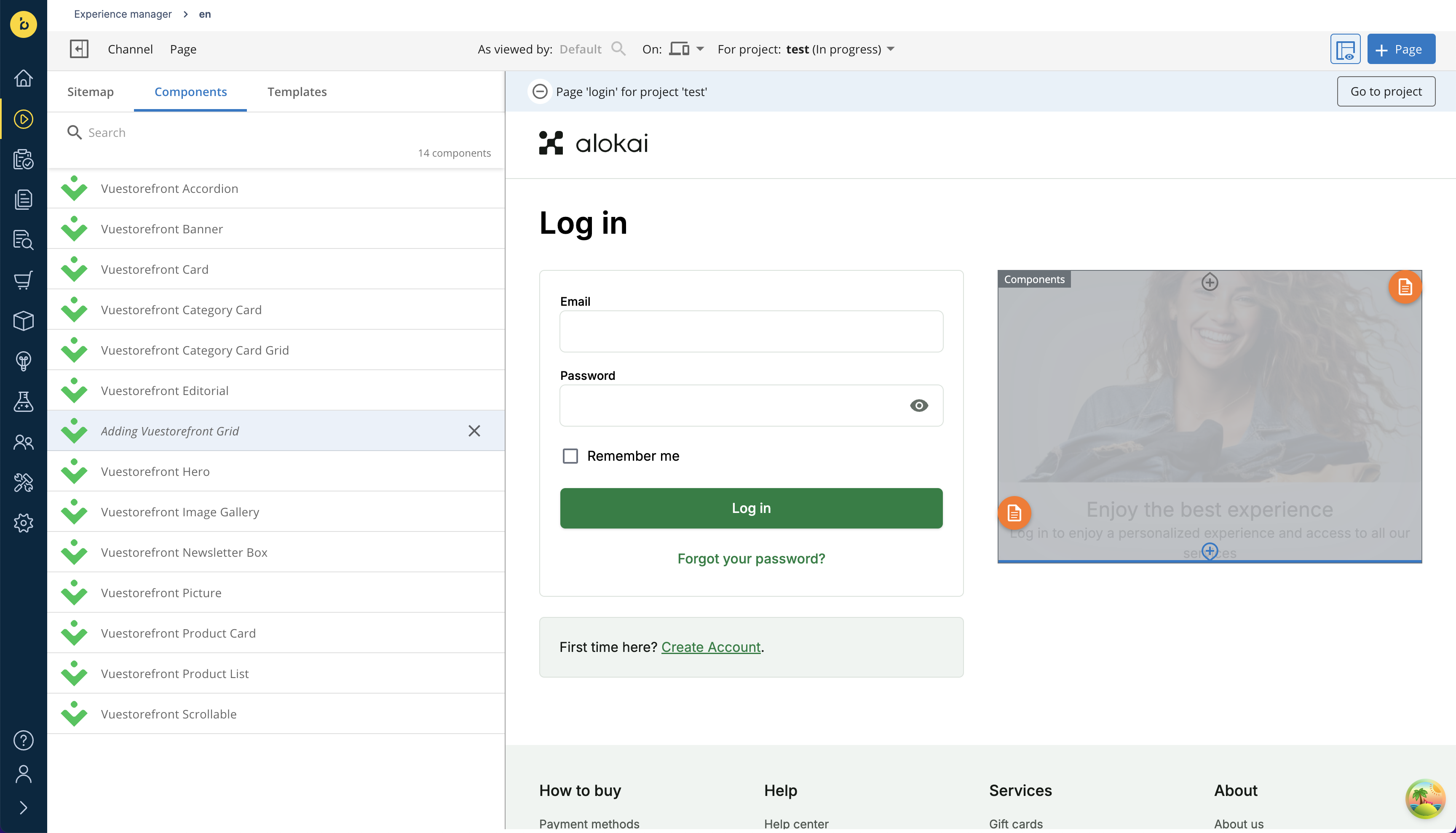
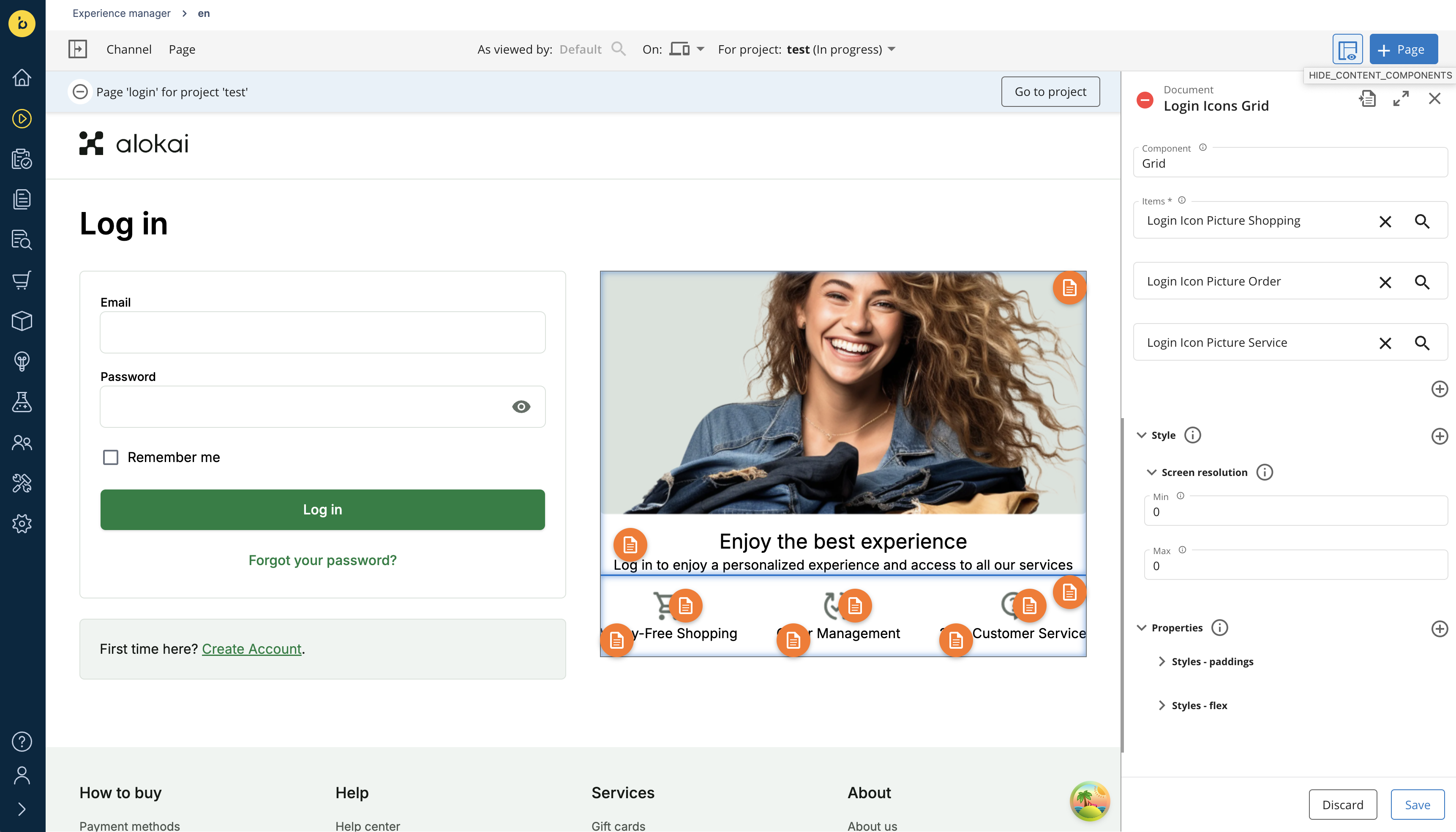
Once the Vuestorefront Grid component is in place, create a document for it the same way you did for the Picture component. In the document form:
- leave the Component field set to
Grid, - find the three
Picturedocuments created in the previous step and select them as component's items, - to align icons in a row, add a new value for the Style field with flex properties:
display: flexandjustify-content: space-between, - optionally, to improve the spacing between elements, set top and bottom paddings to
16px, - once done, click the Save button.
Create a new Entry
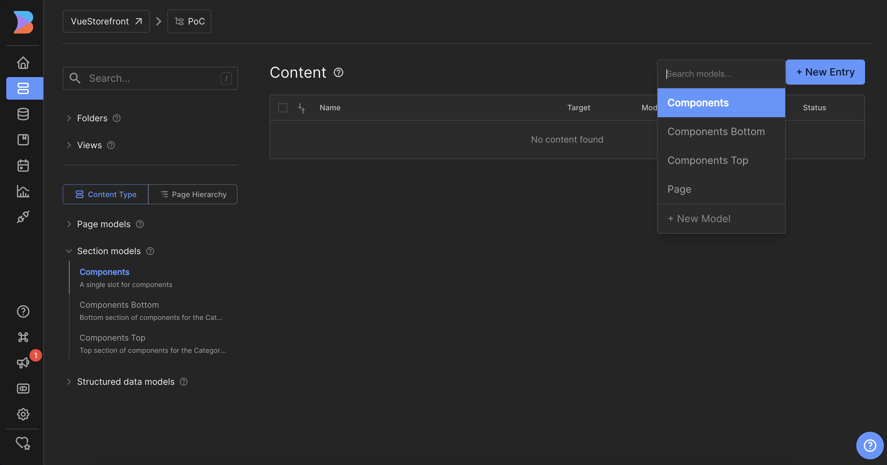
Navigate to the Content tab and choose the Components Section model. Then click the + New Entry button in the top right corner, and choose Components from the dropdown.
Set Targeting
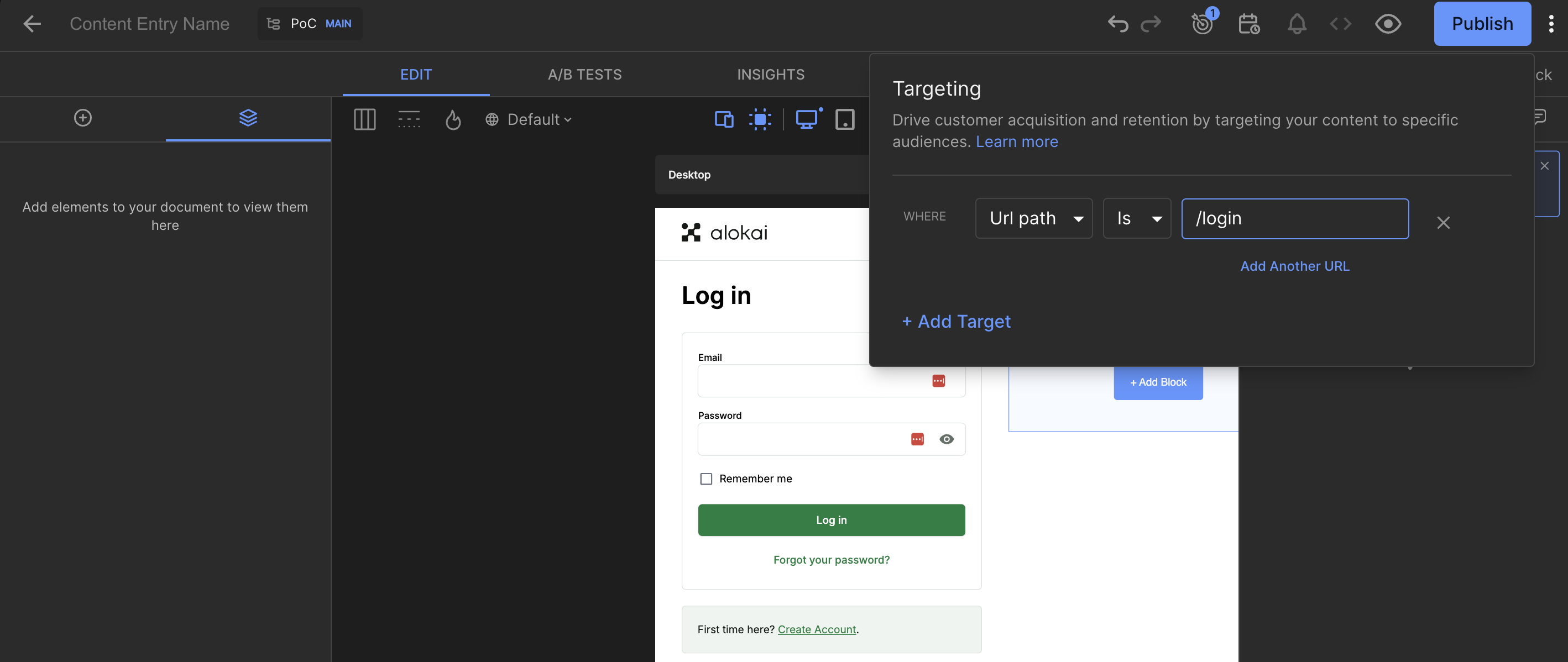
To bind the Entry with the Login page, set the Targeting rules. Click the dart shield icon in the top right corner and add the targeting for the /login URL path.
After that, you should see the Login page in the Visual Editor.
Add a main Picture component
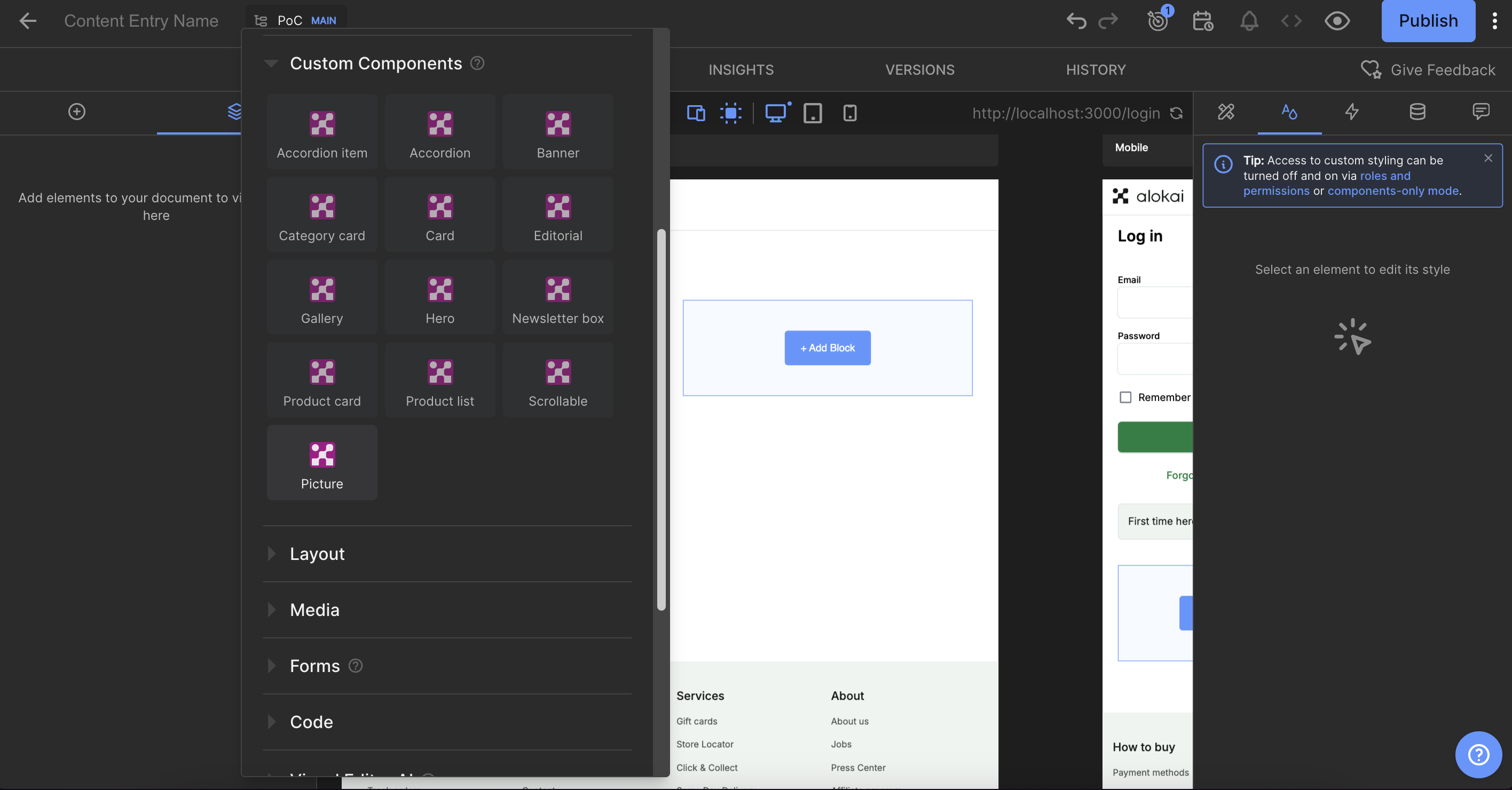
Now you can start adding content to the Login page. First, add a main Picture component. Click the + Add Block button and from the Custom Components list choose the Picture component.
Upload an image and set the caption.
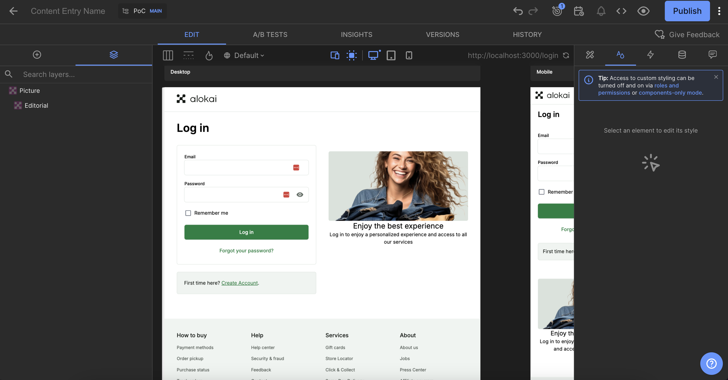
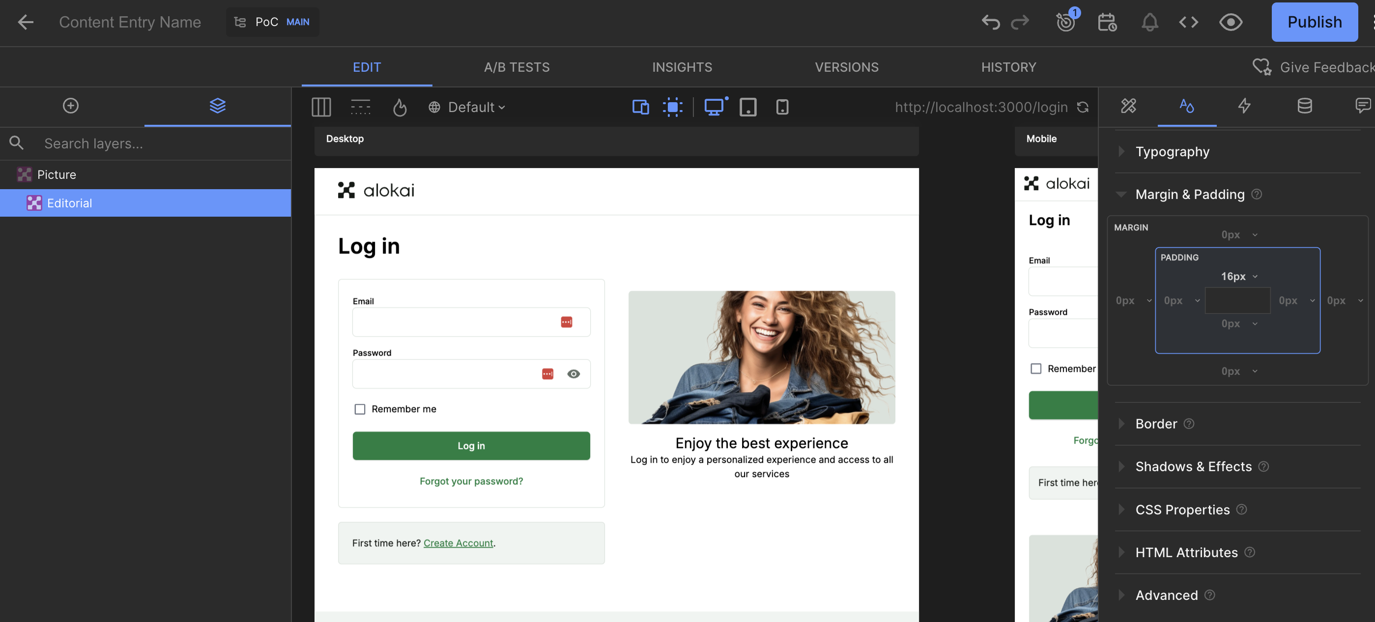
To add a vertical space between the Picture and the caption, you can update the gaps in the Margin & Padding styles section of the Editorial component.
Create a grid of icons
Next, we'll add a grid of icons. Click the Add block after button below the main Picture, and choose the Builder.io's built-in Columns component. Set the Columns Layout to Three columns.
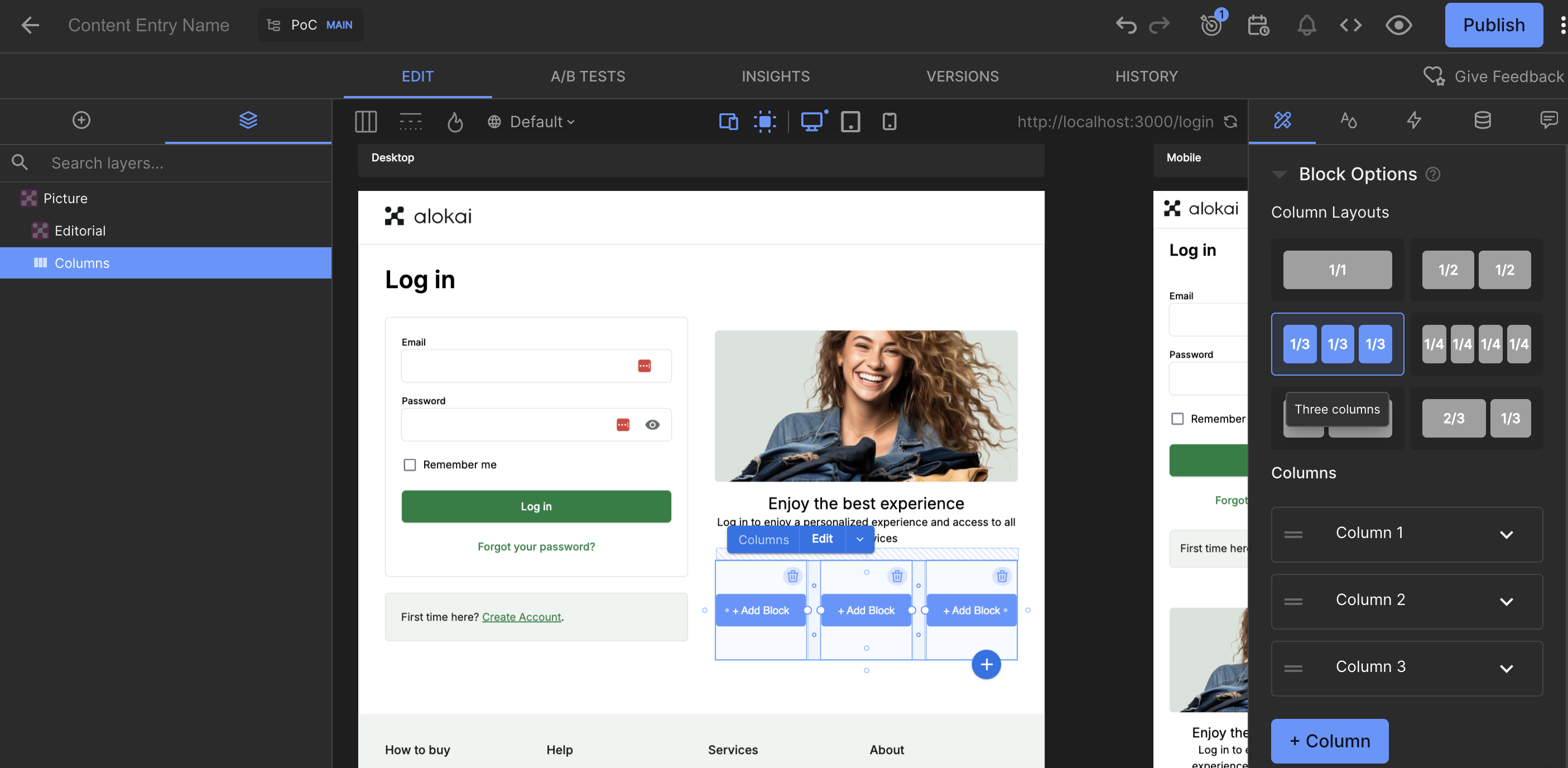
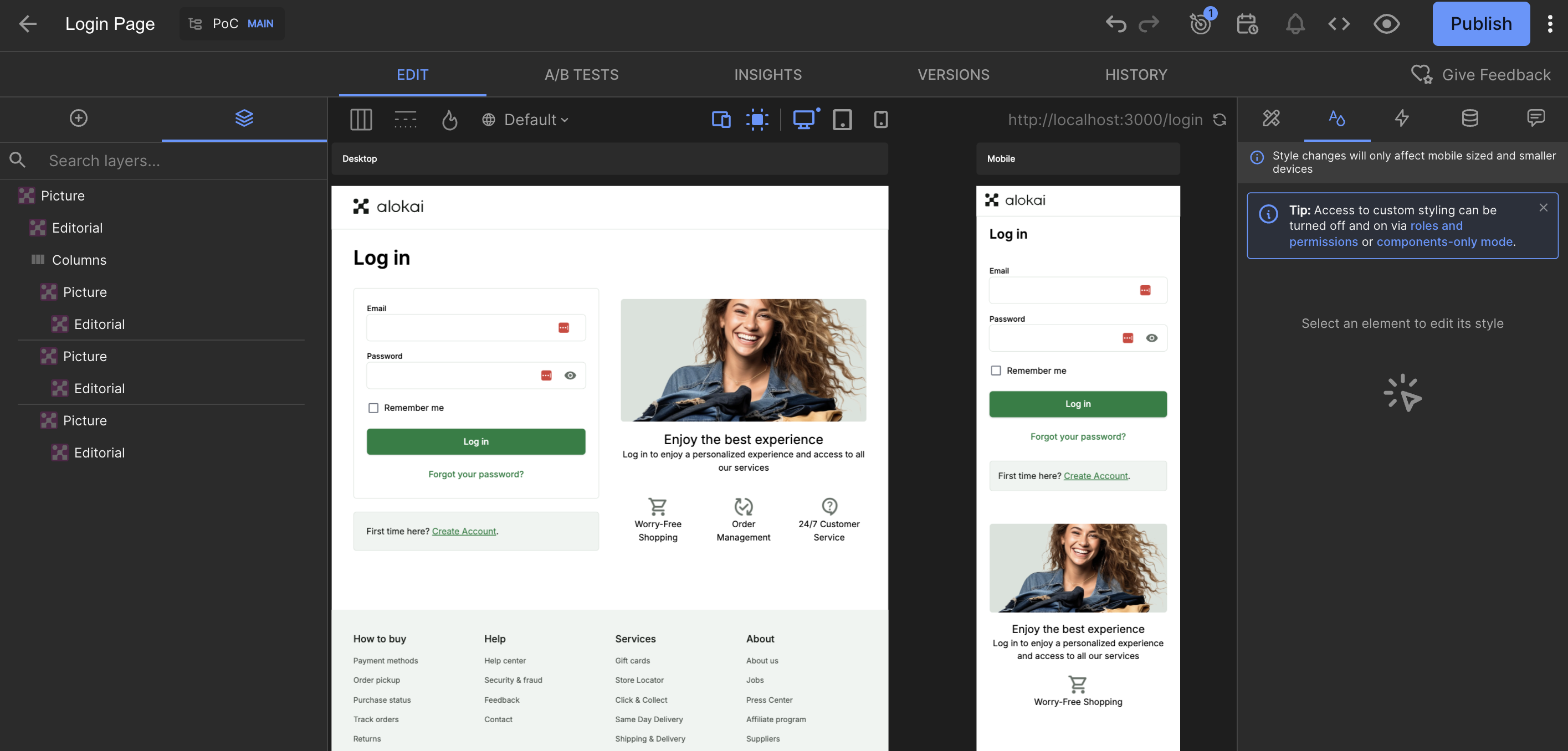
Click the + Add Block button inside every column and choose the Picture component. Fill in the images and captions for each icon.
Add a main Picture component
Navigate to the Content tab and click the + Add Entry button in the top right corner. Choose Picture from the list. In the content form that appears, define your page's Title, Image and Caption (editorial) entry. Once done, click Save.
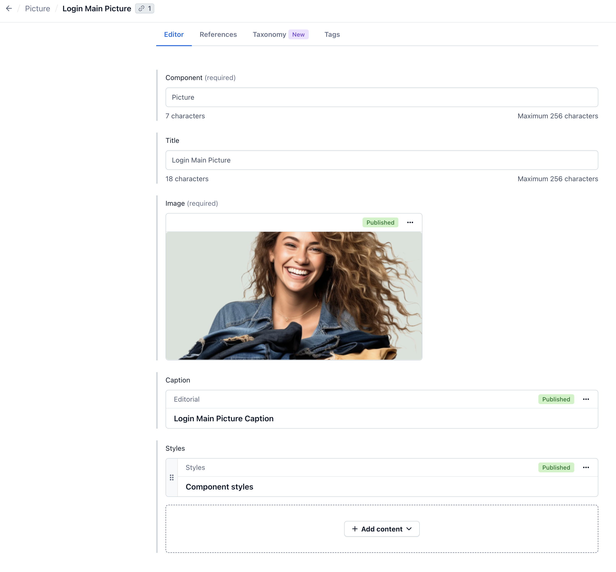
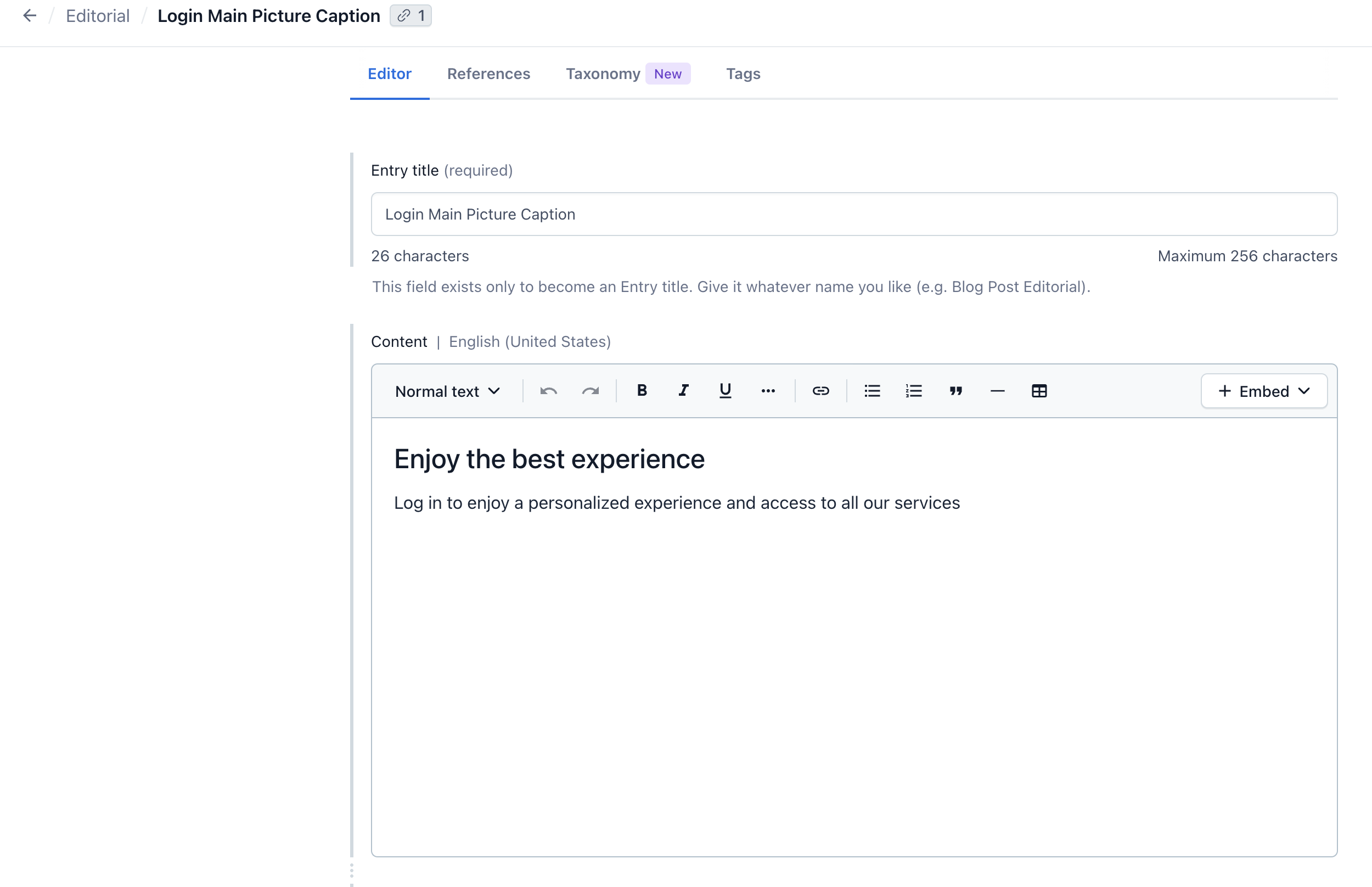
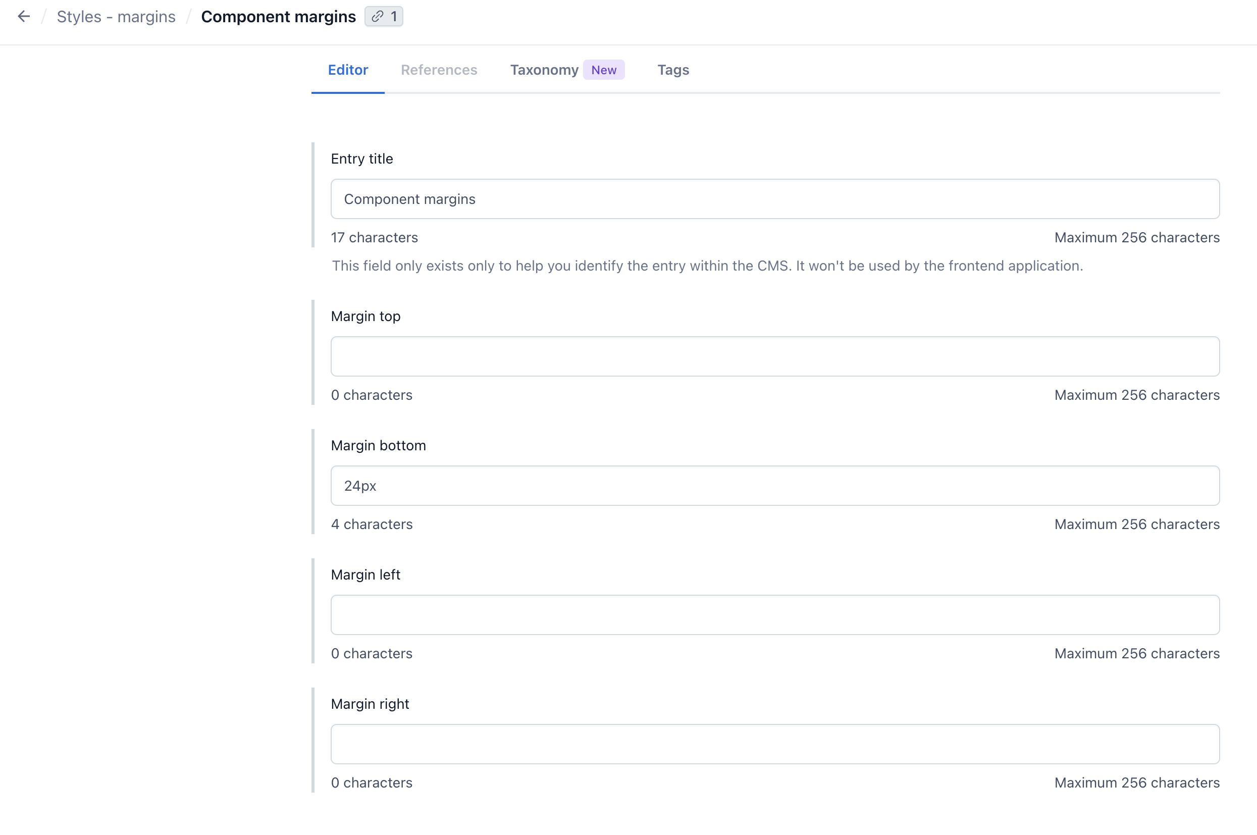
By defining Styles, you can adjust picture placement on your page. We're adding here some margin to give the picture some space.
Once done, you can publish the Picture entry.
Add an icon
Remember that in our design - below the main Picture - there is a grid of icons? We will add them now.
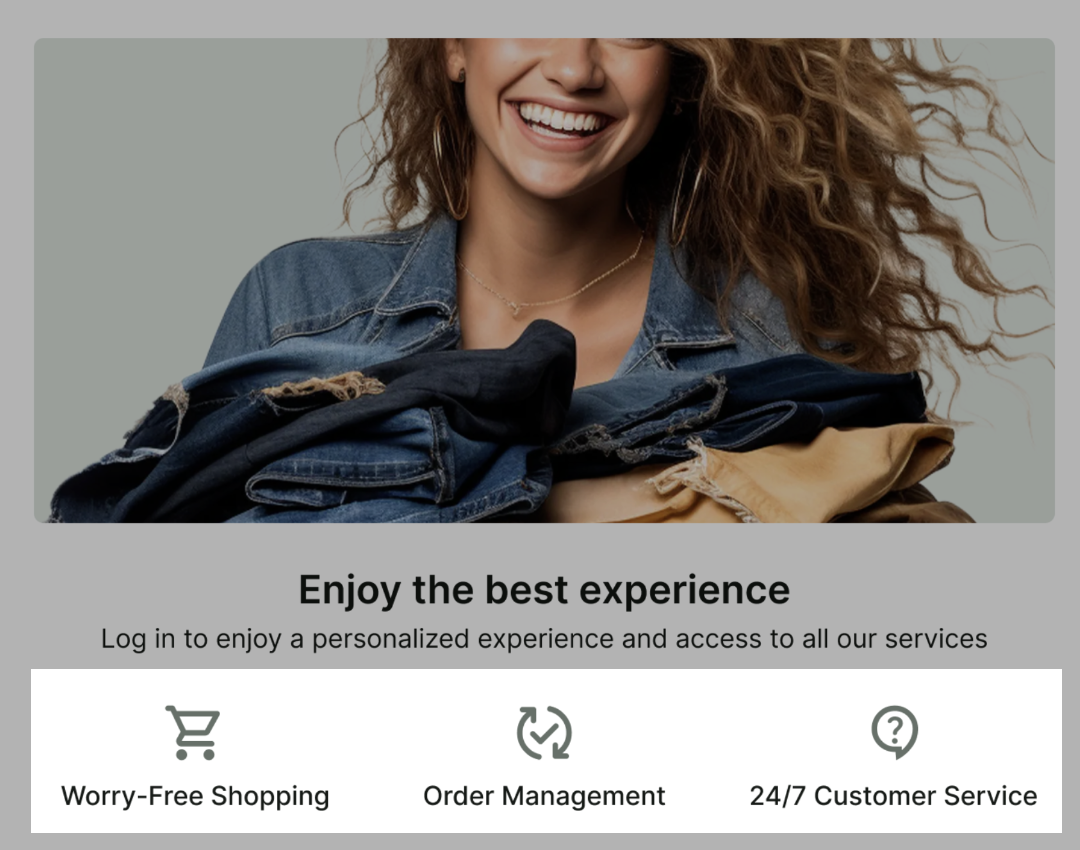
To create the first icon, create a new Picture entry - the same way you did for the main Picture.
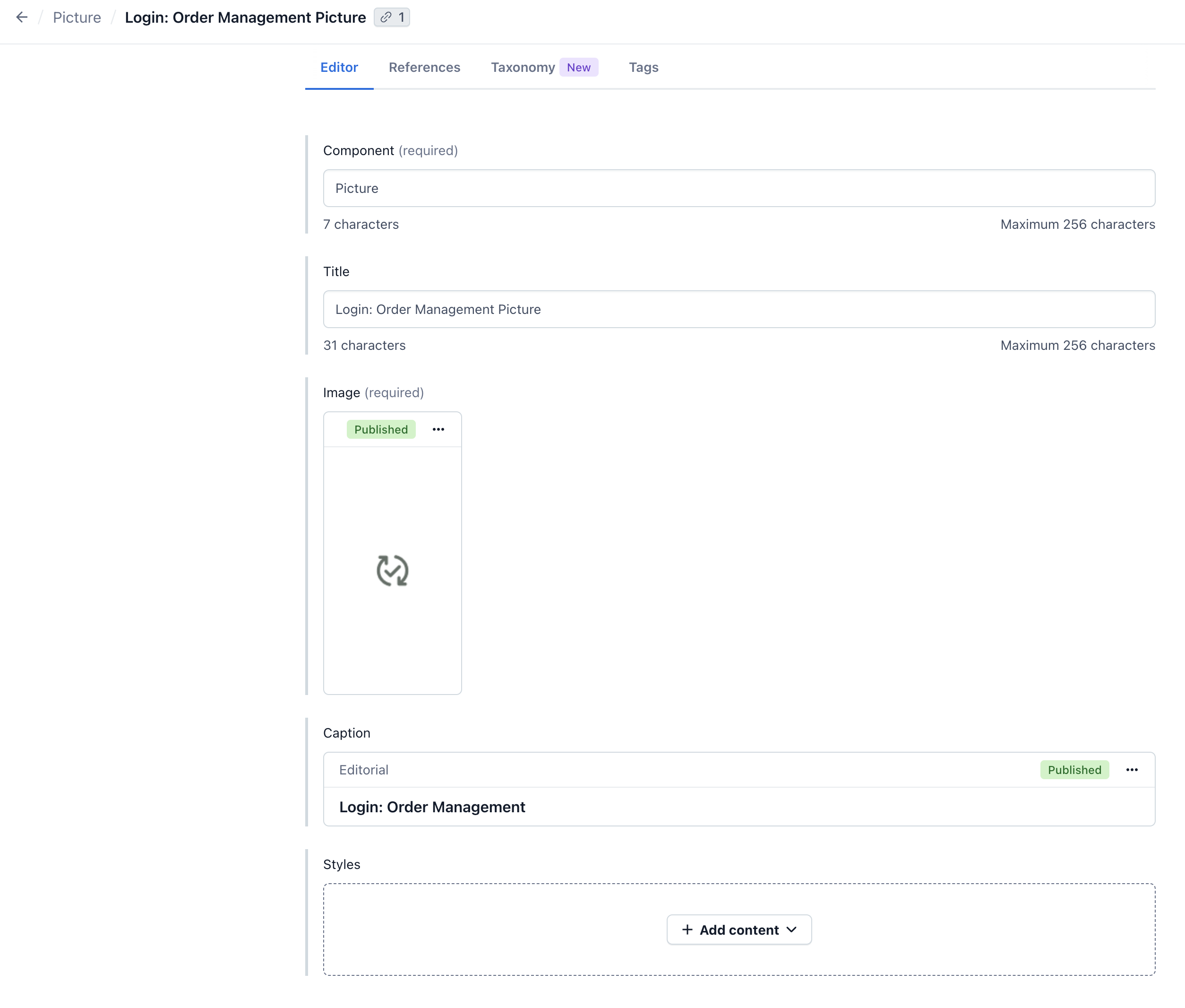
Publish the icon entry and repeat the process for the remaining icons.
Place the icons in a grid
To display the icons in a grid, create a new Grid entry. Add the icons to the grid by clicking on the Add Content button in the Items section.
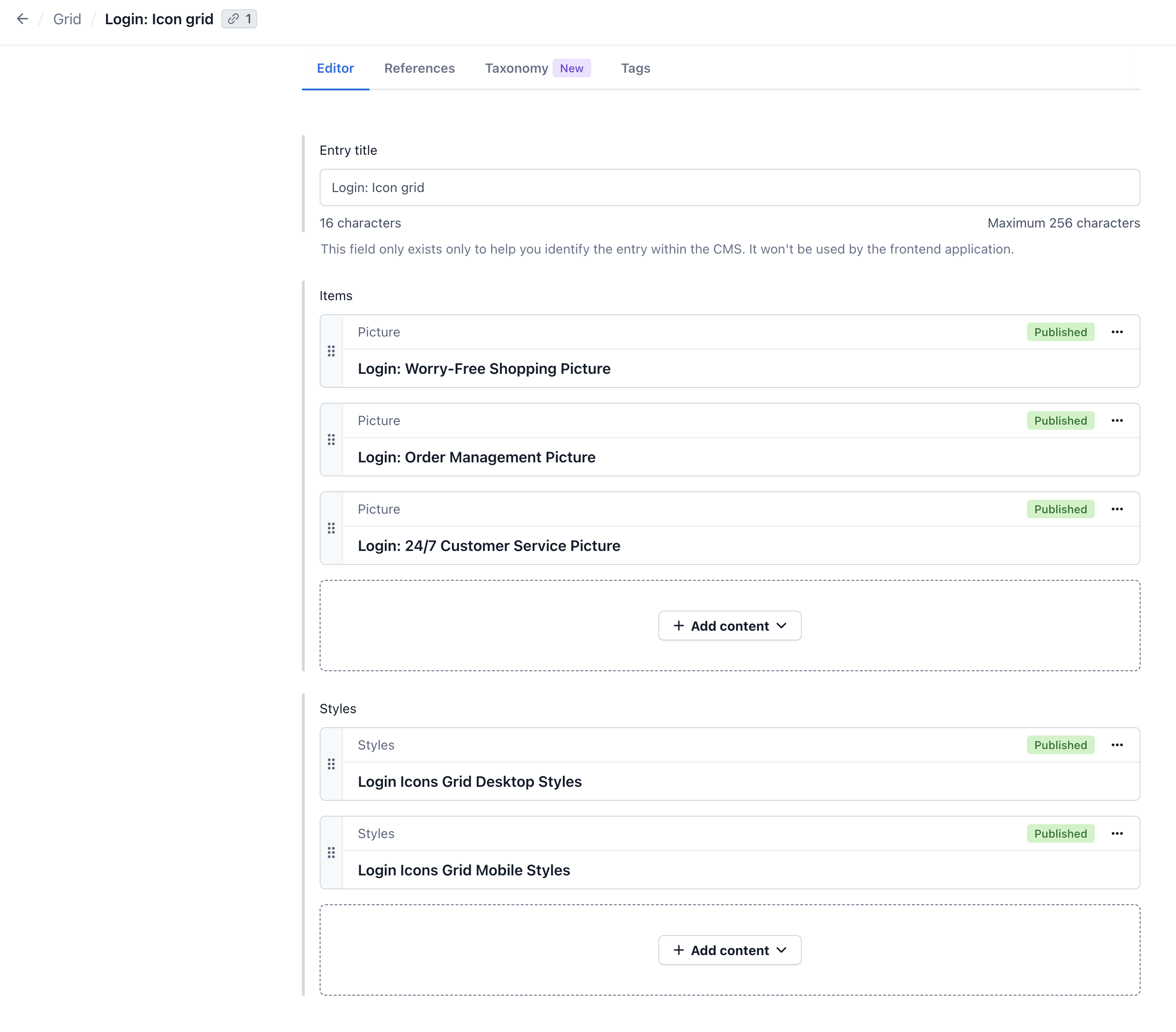
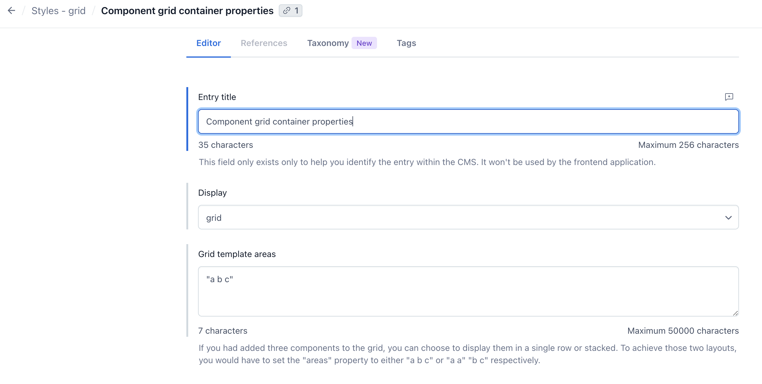
Then add Styles entries. One for the mobile, to display the icons in a column.
And one for the desktop, to display the icons in a row.
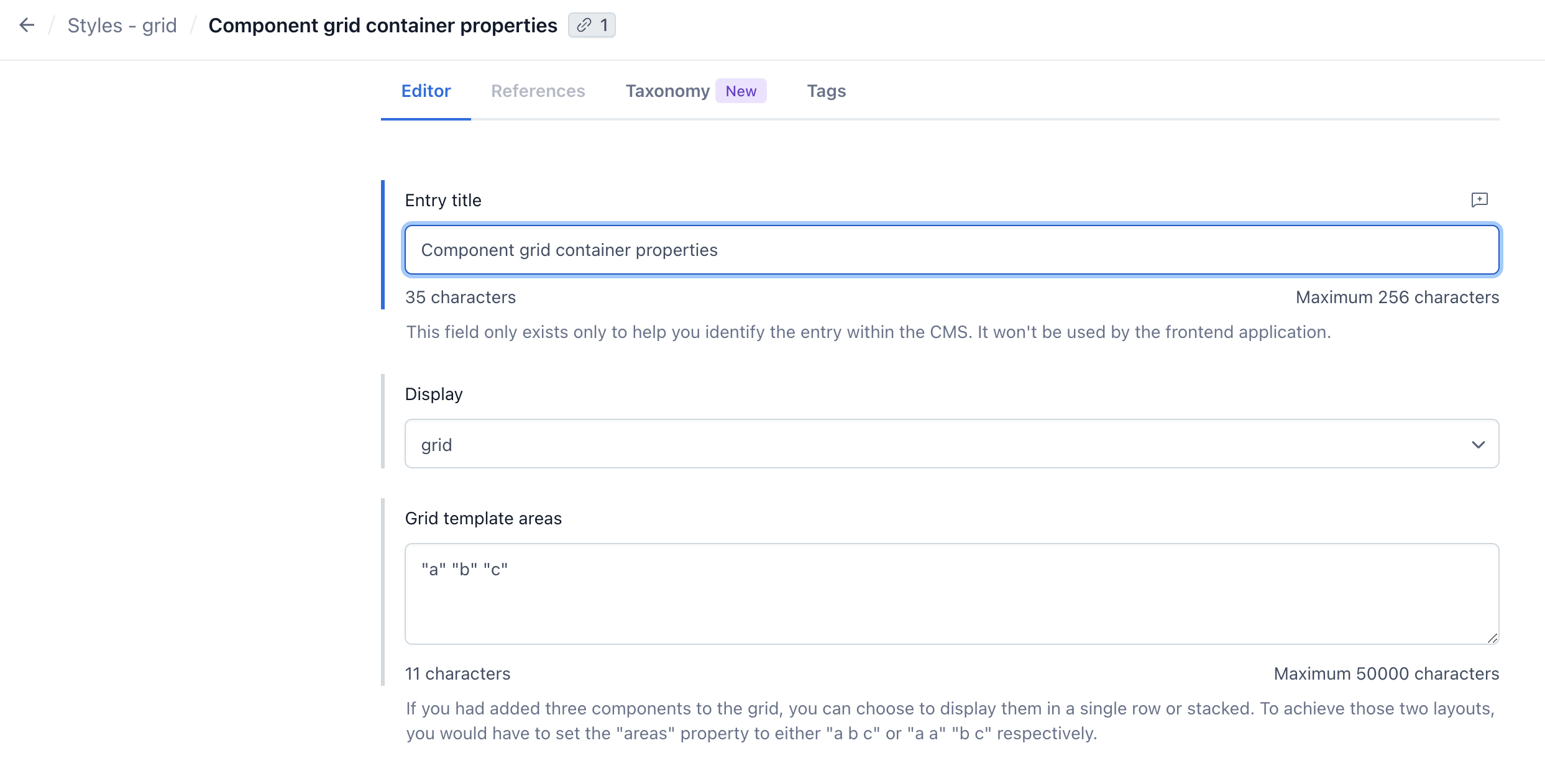
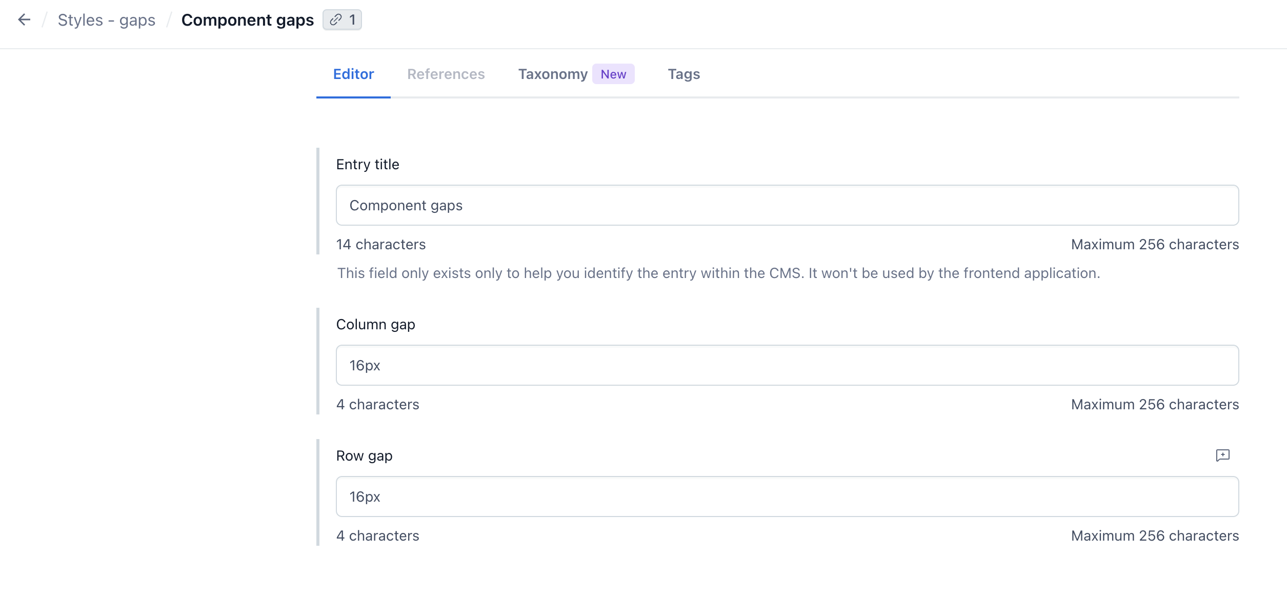
In both cases you can add a 16px Gap to give the icons some space between.
Create a Login Page entry
Finally, create a new Login Page entry. Add the main Picture and the grid of icons to the Components field, and set the URL to /login.
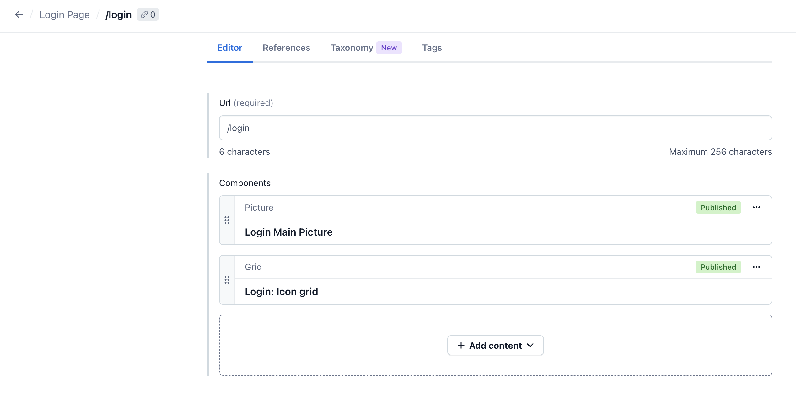
Once done, publish the Login Page entry.
Add a main Picture component
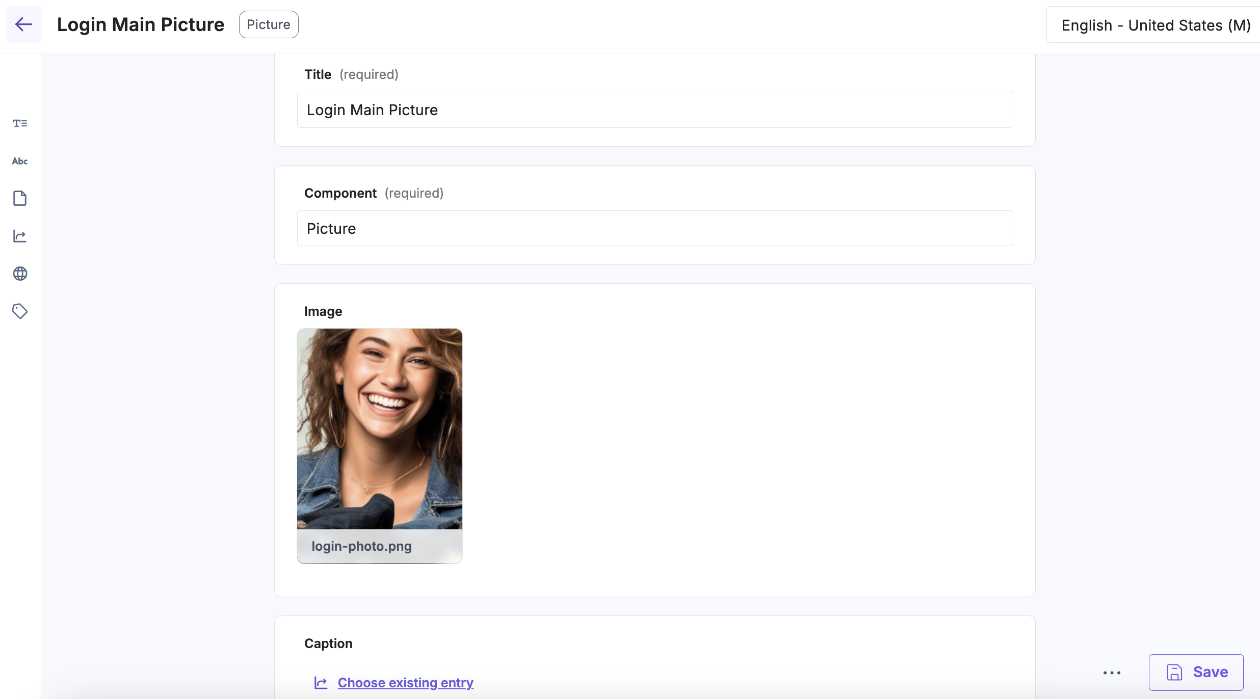
Navigate to the Entries tab and click the + New Entry button in the top right corner. Choose Picture from the list and hit Proceed button. Then fill the Title, upload an image, and click Save.
After clicking Save, in Caption field an option to Create new entry should appear. Choose it and fill the entry.
Additionally, you can add a margin to the caption to make it look better. To do this, add a group entry in the Styles field.
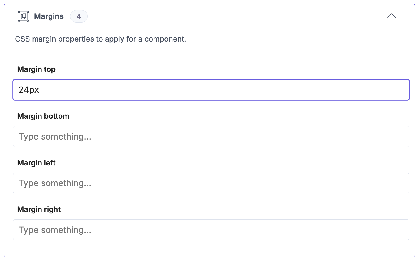
Once done, you can publish the Caption and Picture entries.
Add an icon
Below the main Picture, there is a grid of icons. To create a first icon, create a new Picture entry, in the same way as the main Picture. Fill the Title, upload an image and create a new entry in the Caption field.
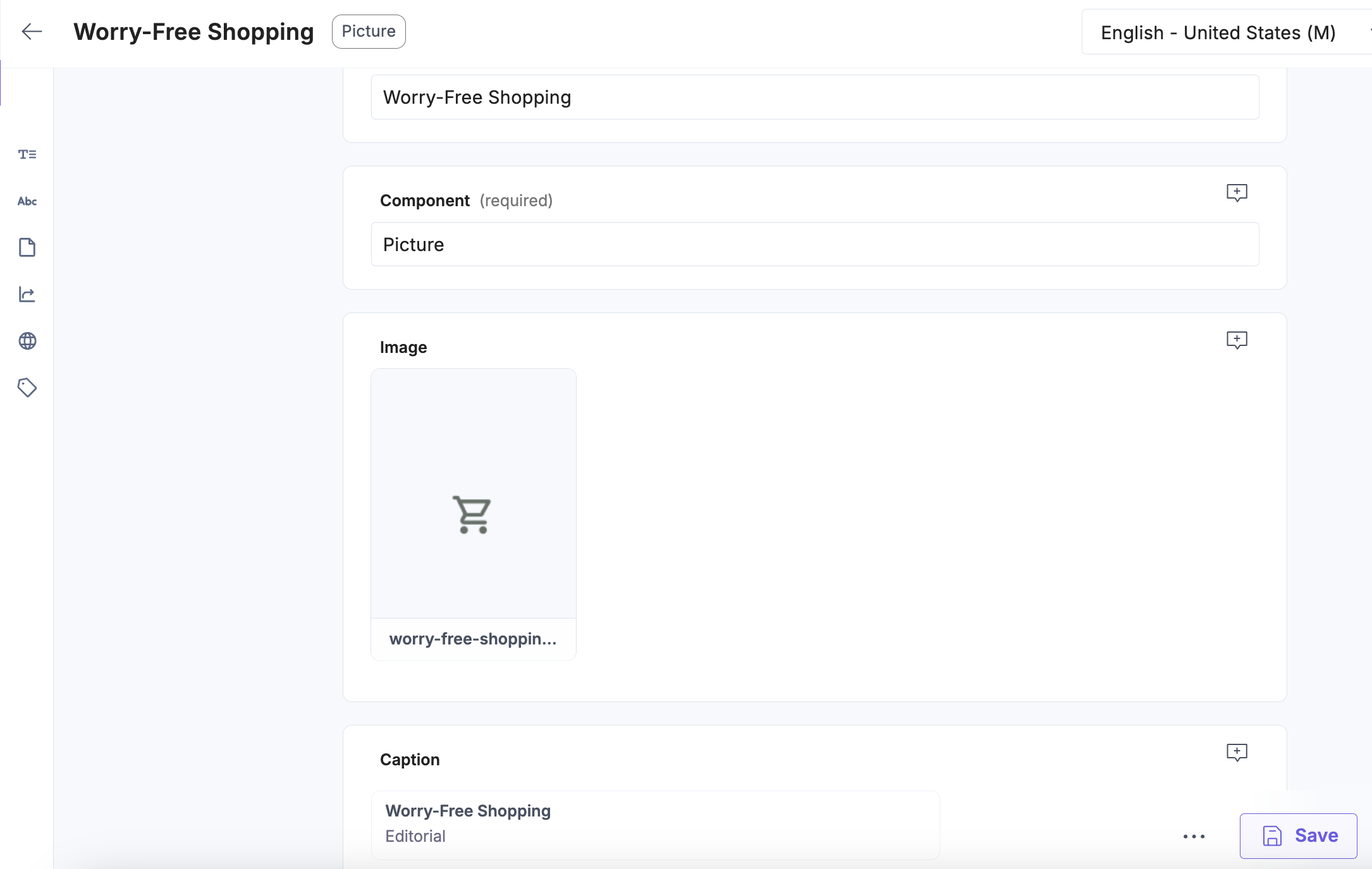
Publish the icon entry and repeat the process for the remaining icons.
Place the icons in a grid
To display the icons in a grid, create a new Grid entry. Add the icons to the grid by clicking on the Choose existing entry button in the Items field.
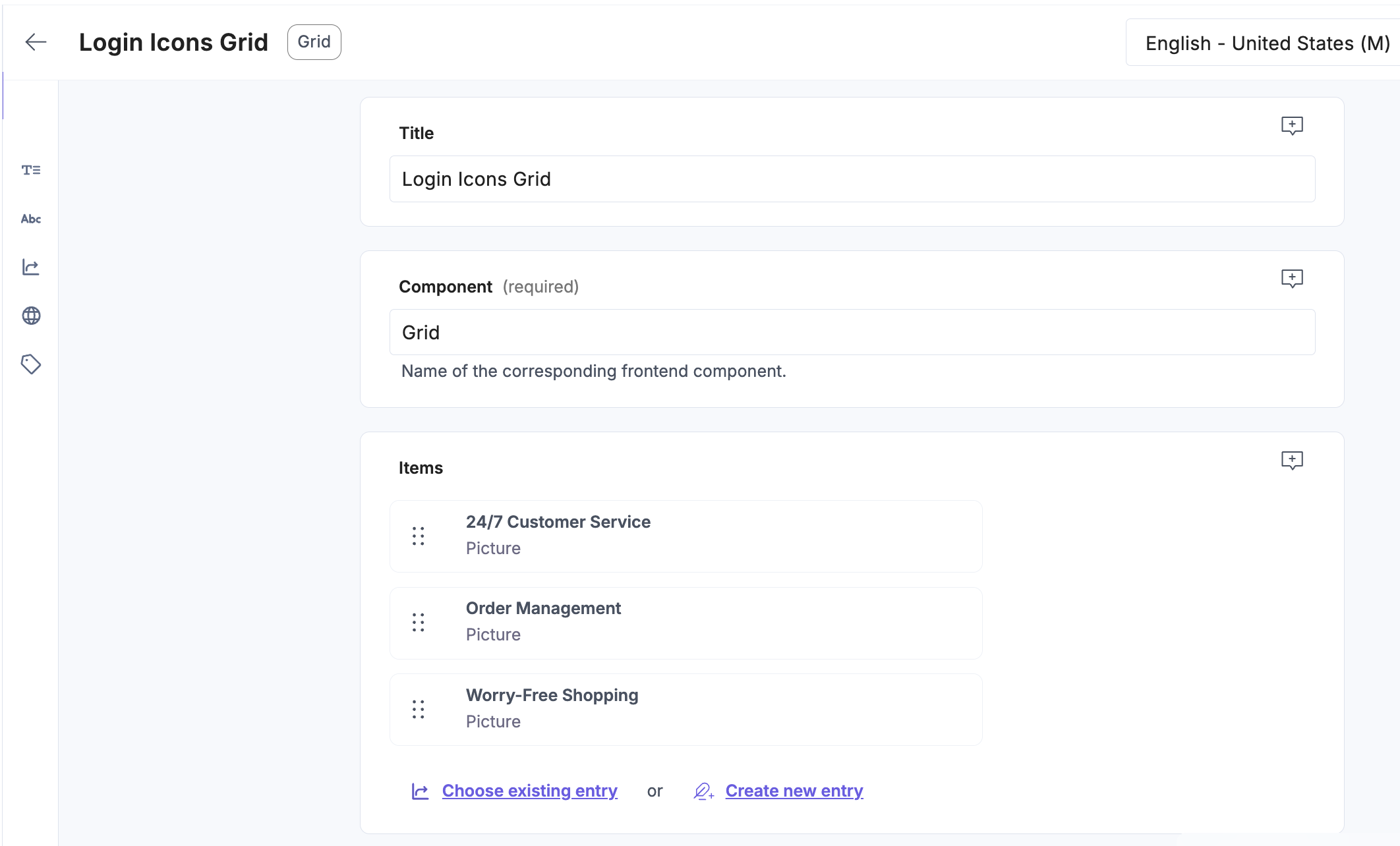
Then add Styles entry. One for the mobile, to display the icons in a column.
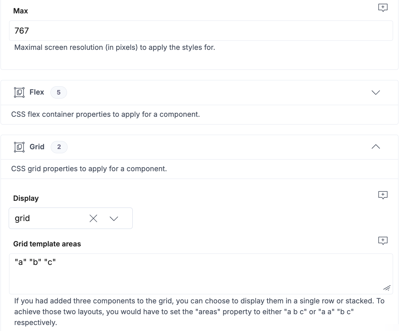
And one for the desktop, to display the icons in a row.
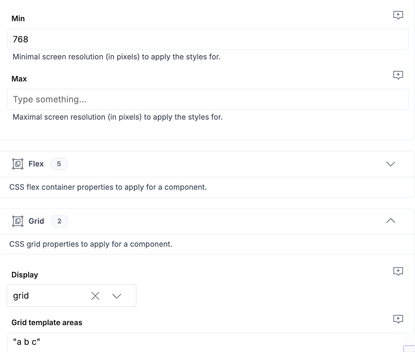
In both cases you can add a 16px Gap to give the icons some space.
Create a Login Page entry
Finally, create a new Login Page entry. Add the main Picture and the grid of icons to the Components field, and set the URL to /login.
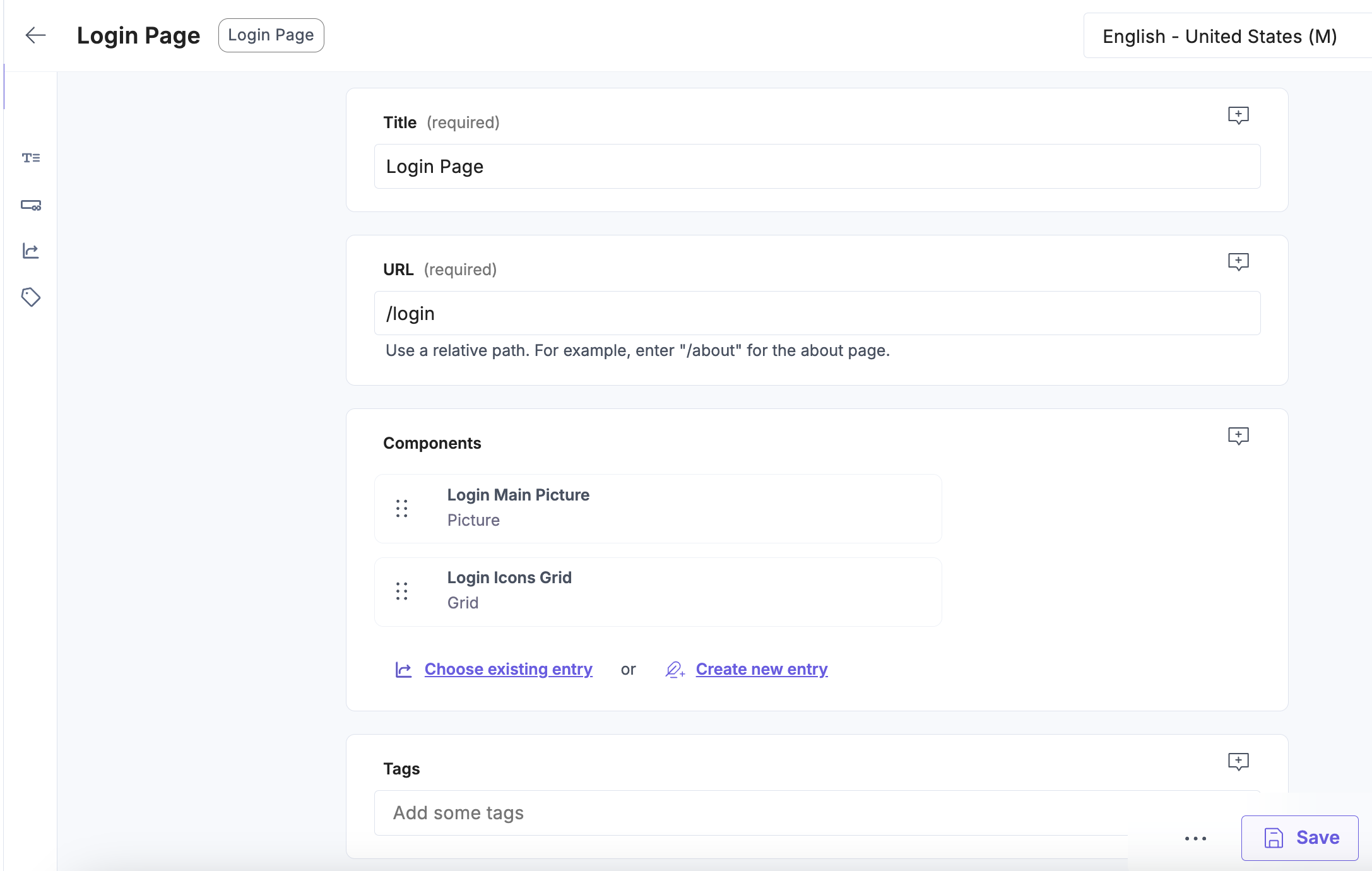
Once done, publish the Login Page entry.
Choose the right content catalog
Go to your SmartEdit dashboard. Click the SAP logo in the top-left corner to navigate to the starting page. In the Site section, select your site from the dropdown. When done, under Content Catalogs > Staged click the Pages link.
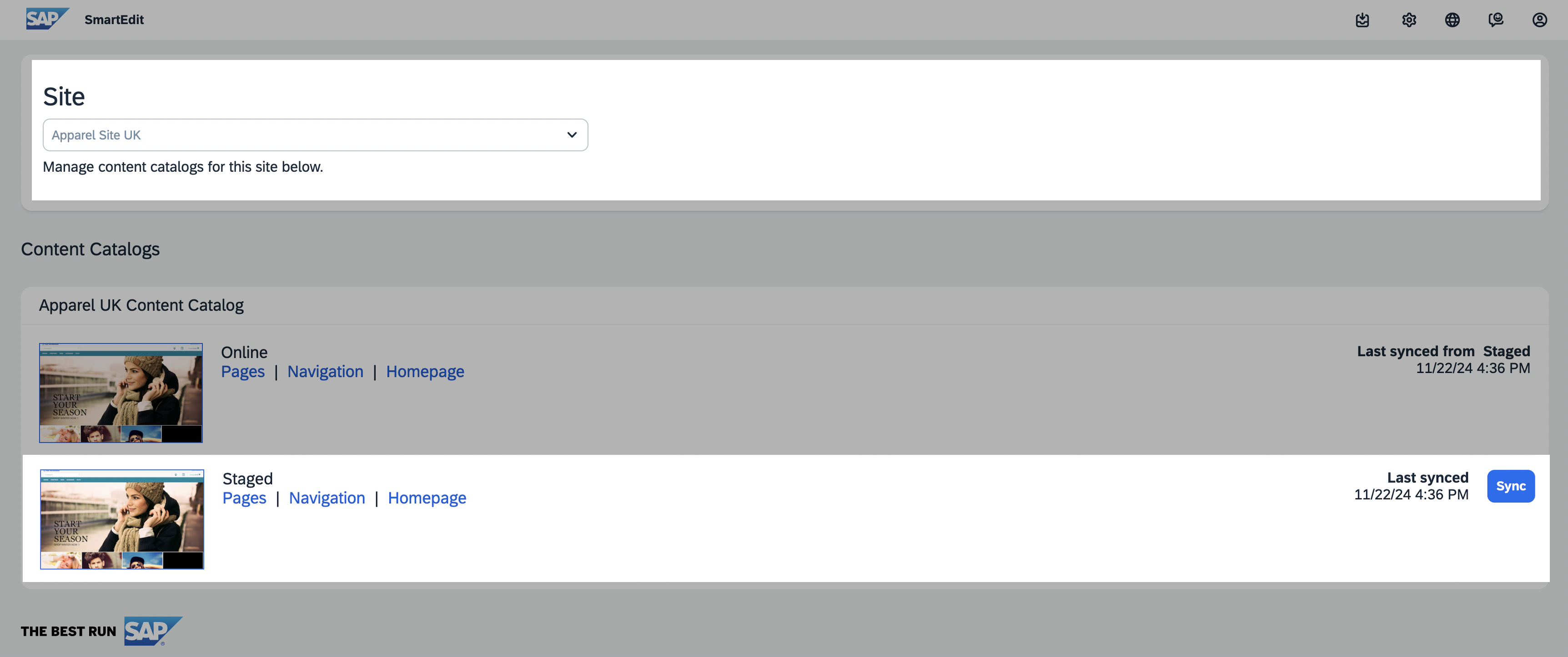
Create a login page
Most likely, there already is another page with the login label in your SmartEdit environment. Before you create a new one, find it and either delete it or change its label value to avoid conflicts.
In the Pages view, click the Create Page button in the top-right corner. When an editor appears:
- set Type to
Content Page, - set Template to
Alokai Login Page Template, - leave the Display Condition settings as-is,
- set Name to
Alokai Login Page Example(or any arbitrary value), - set Page Label to
login, - set Page Title to
Alokai Login Page Example(or any arbitrary value).
Nested page labels (e.g. /example/nested/label) are supported as well.
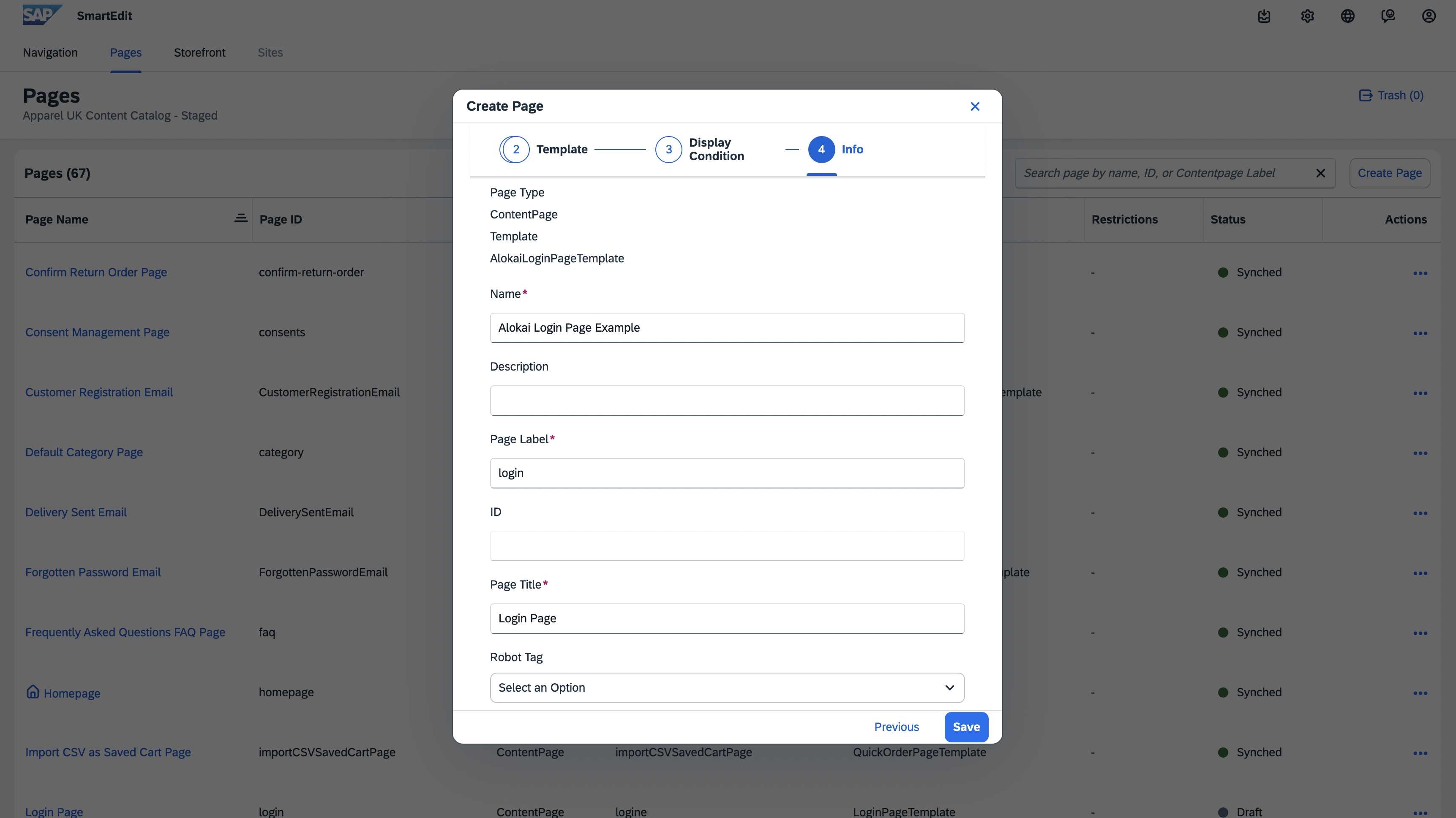
Once done, click Save.
Open the page preview
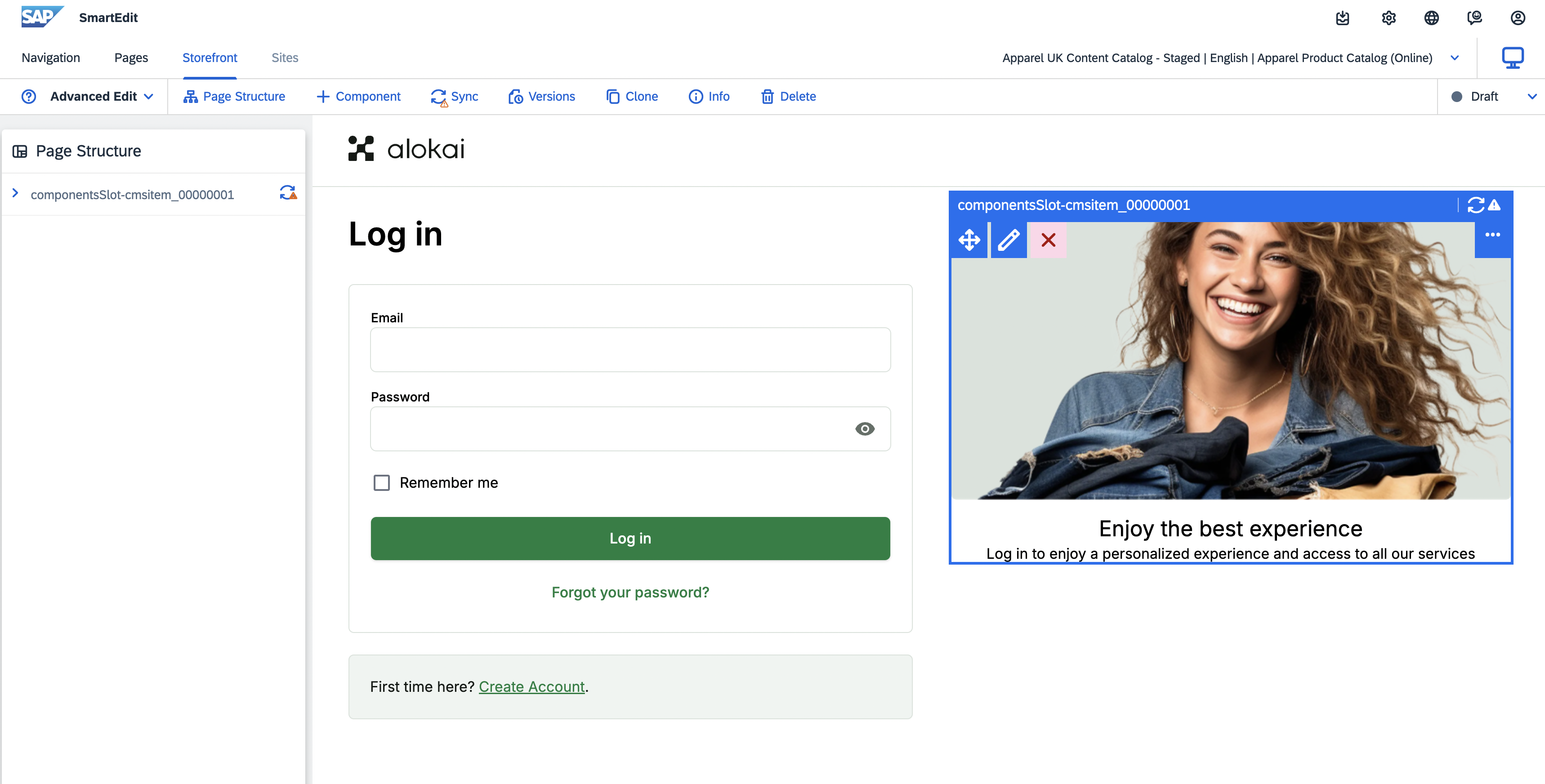
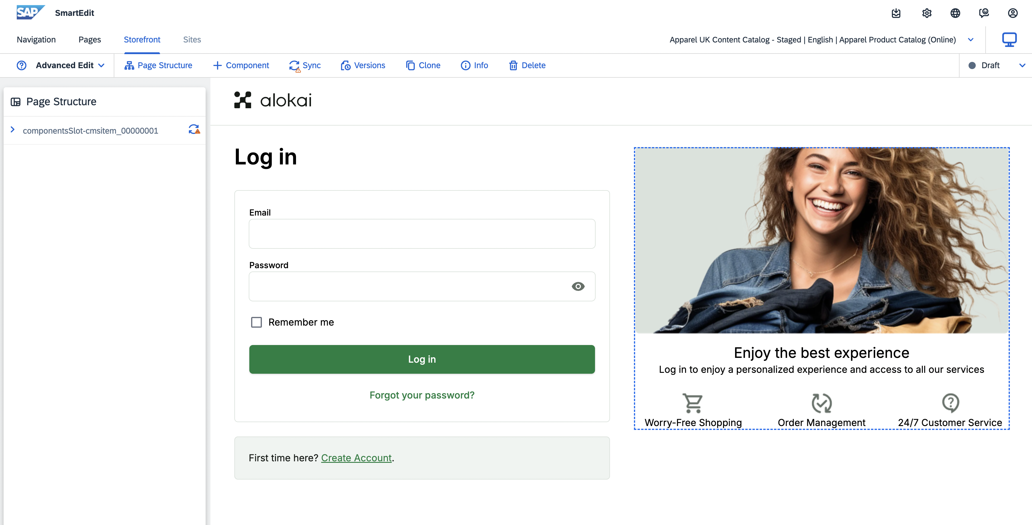
Select the newly-created login page from the list. If you have followed the Prepare the Storefront page chapter, you should see your application rendered within an iframe with the components slot highlighted on the right.
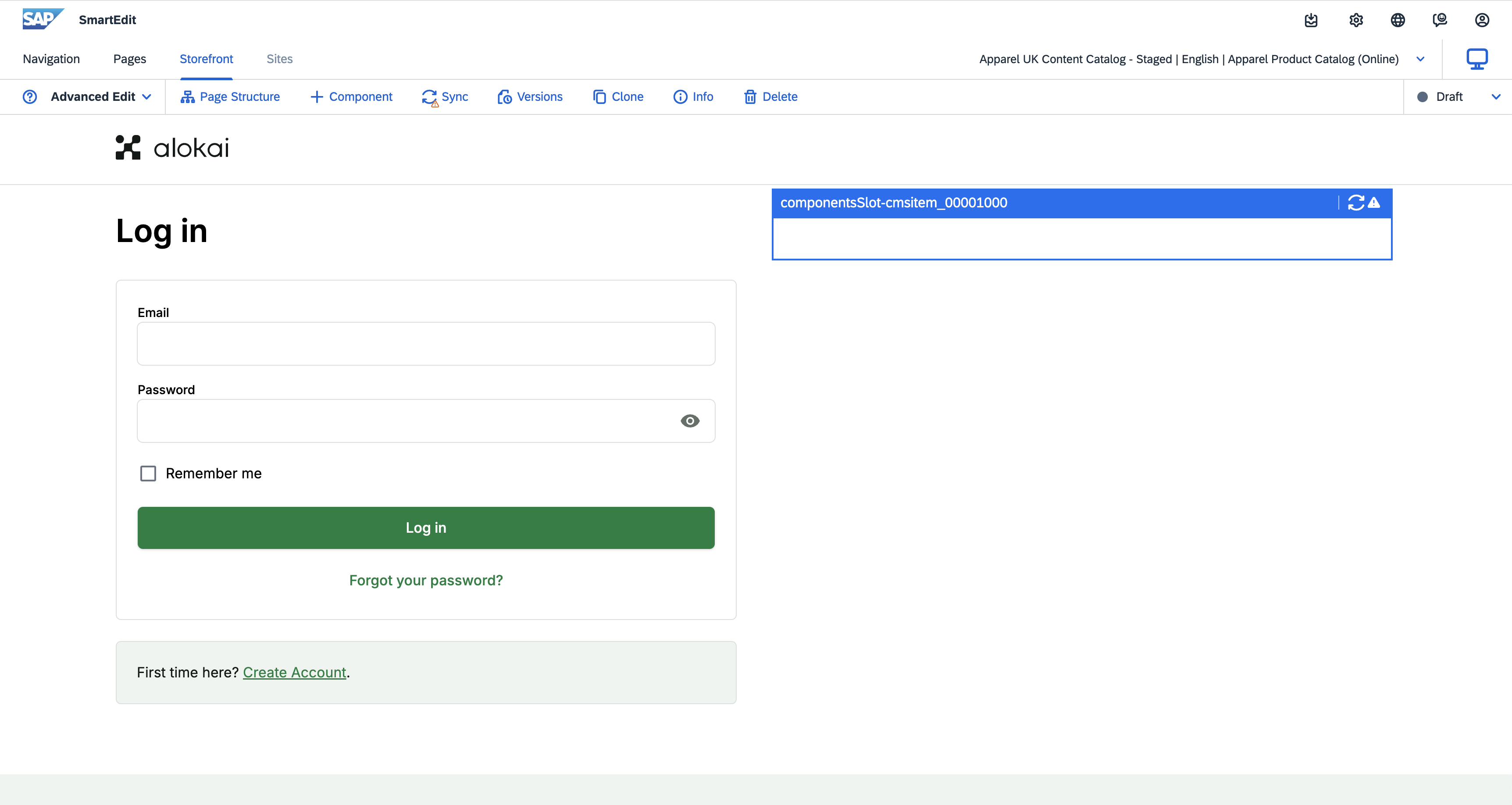
Make sure you are previewing your page either in the Advanced Edit or Basic Edit mode and not Preview.
Create caption for the main Picture component
Click the + Component button in the top navigation. From the displayed list of available components, grab Alokai Editorial Component and drag it onto the highlighted components slot.
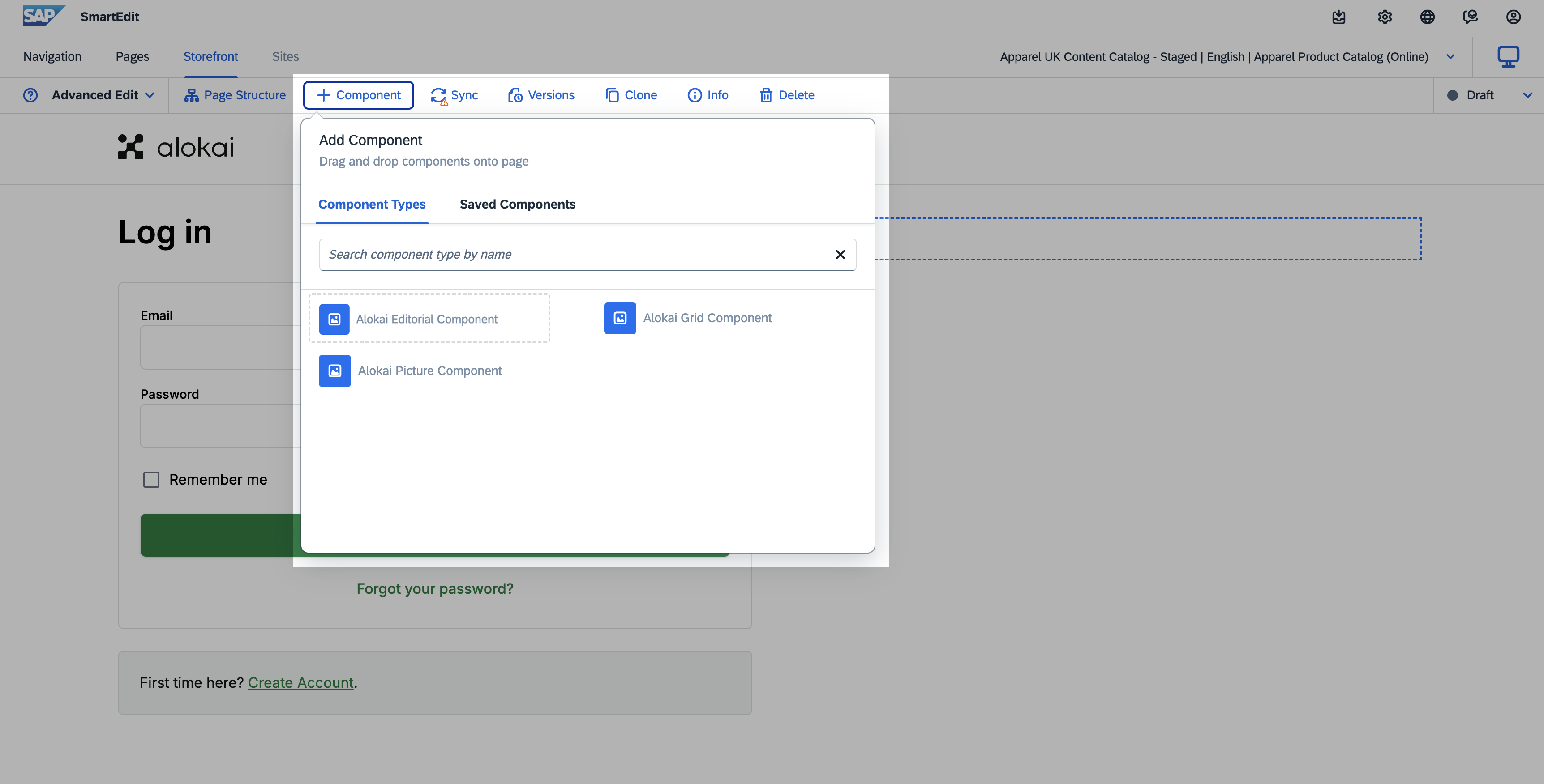
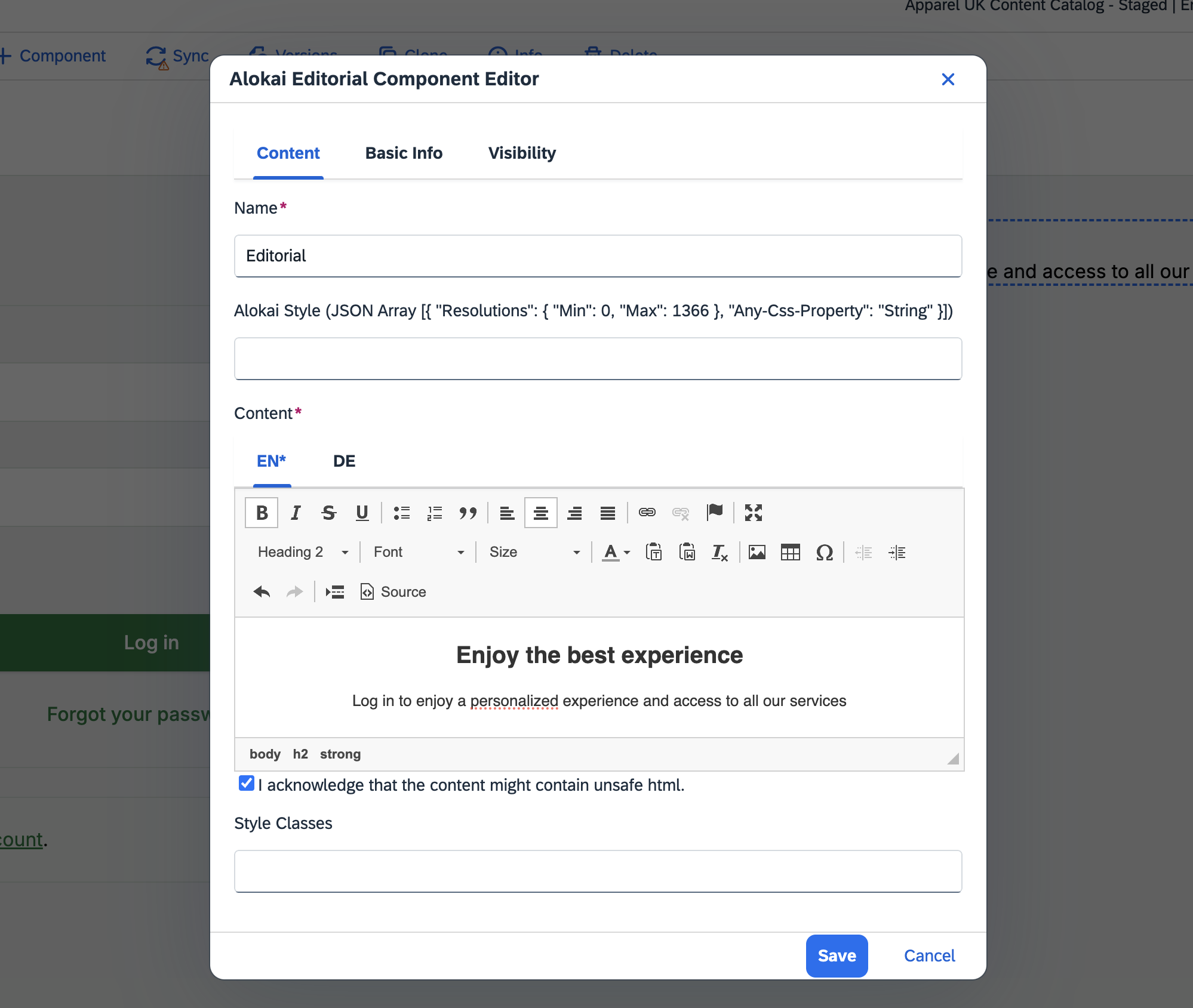
Move your mouse over the component in the slot and click the blue pen icon. In the pop-up editor:
- set Name to
Editorial(or any arbitrary value), - set Content title to
Enjoy the best experienceand make it an h2 header, - set Content subtitle to
Log in to enjoy a personalized experience and access to all our services, - center both title and subtitle in Content.
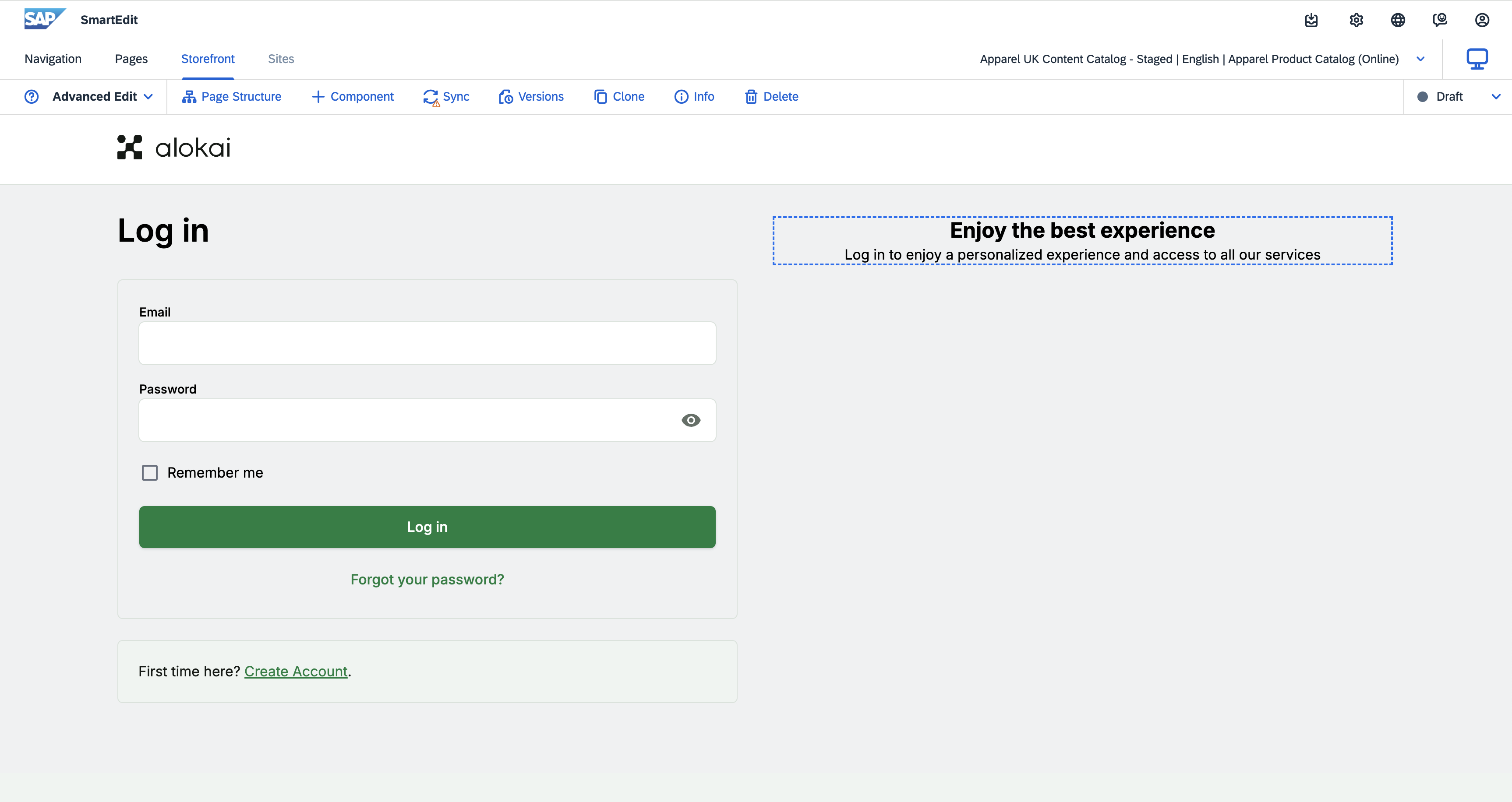
Once done, click Save. The Editorial component should now appear on the page next to the login form.
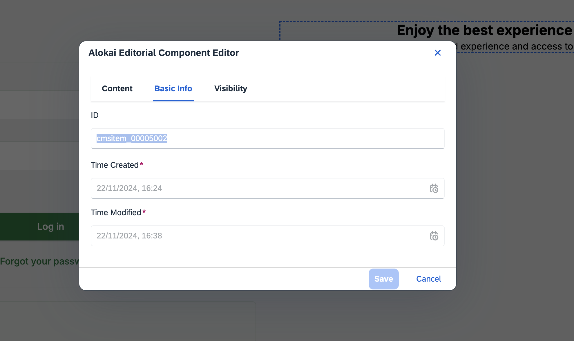
Later in the guide, you are going to add it as a nested component to the main Picture component. For this purpose, you need to retrieve its ID. Move your mouse over the component again and click the blue pen icon. In the pop-up editor, select the Basic Info tab and copy the value of the ID field. You can safely remove the component from the components slot afterwards.
Create the main Picture component
Click the + Component button in the top navigation and drag Alokai Picture Component onto the components slot. Open the component's editor and set:
- Name to
Login Main Picture(or any arbitrary value), - Caption to the ID of the Editorial component created in the previous step,
- Image to any arbitrary image,
- Styles to:
[{ "row_gap": "16px", "column_gap": "16px", "margin_bottom": "24px" }]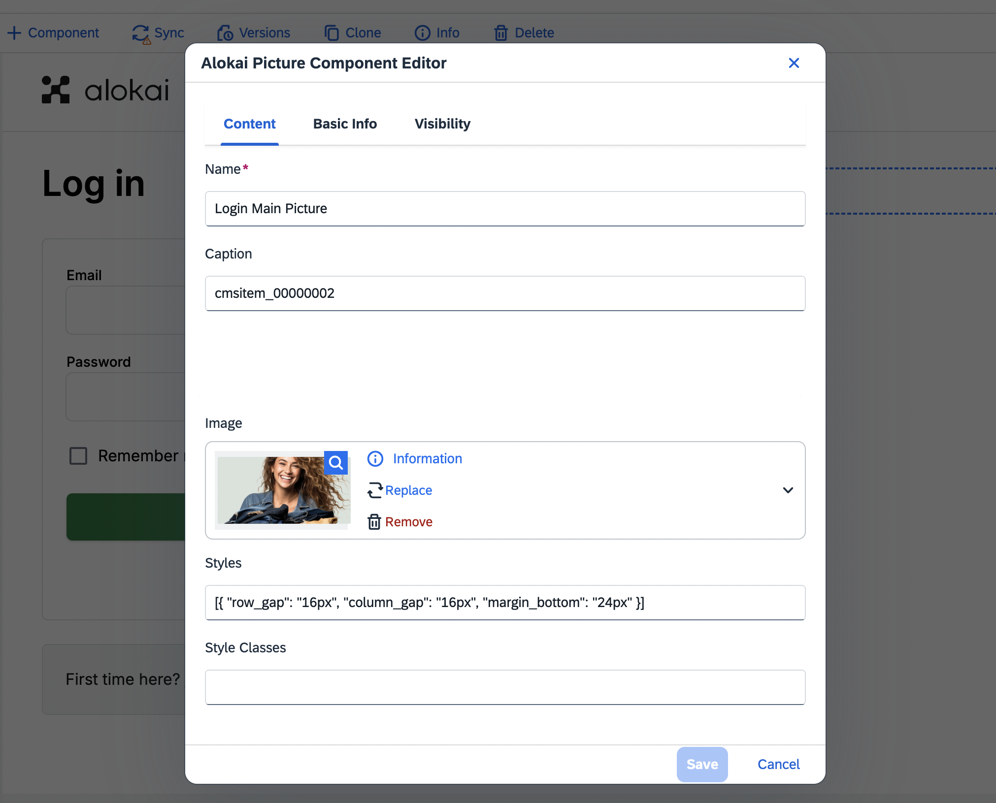
Once done, click Save. The Picture component should now appear on the page next to the login form.
Add an icon
Remember that in our design - below the main Picture - there is a grid of icons? We will add them now.
To create the first icon, use the Picture component again. Repeat the process described in steps 4 and 5.
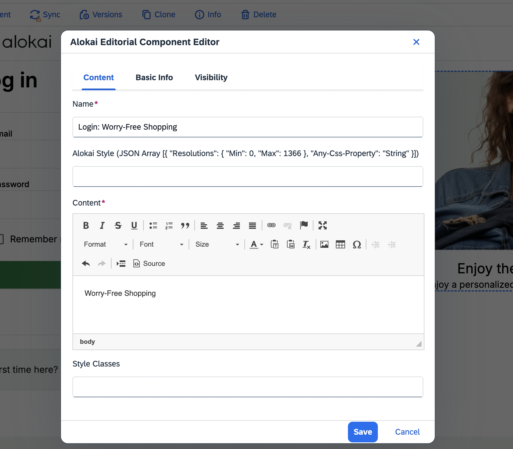
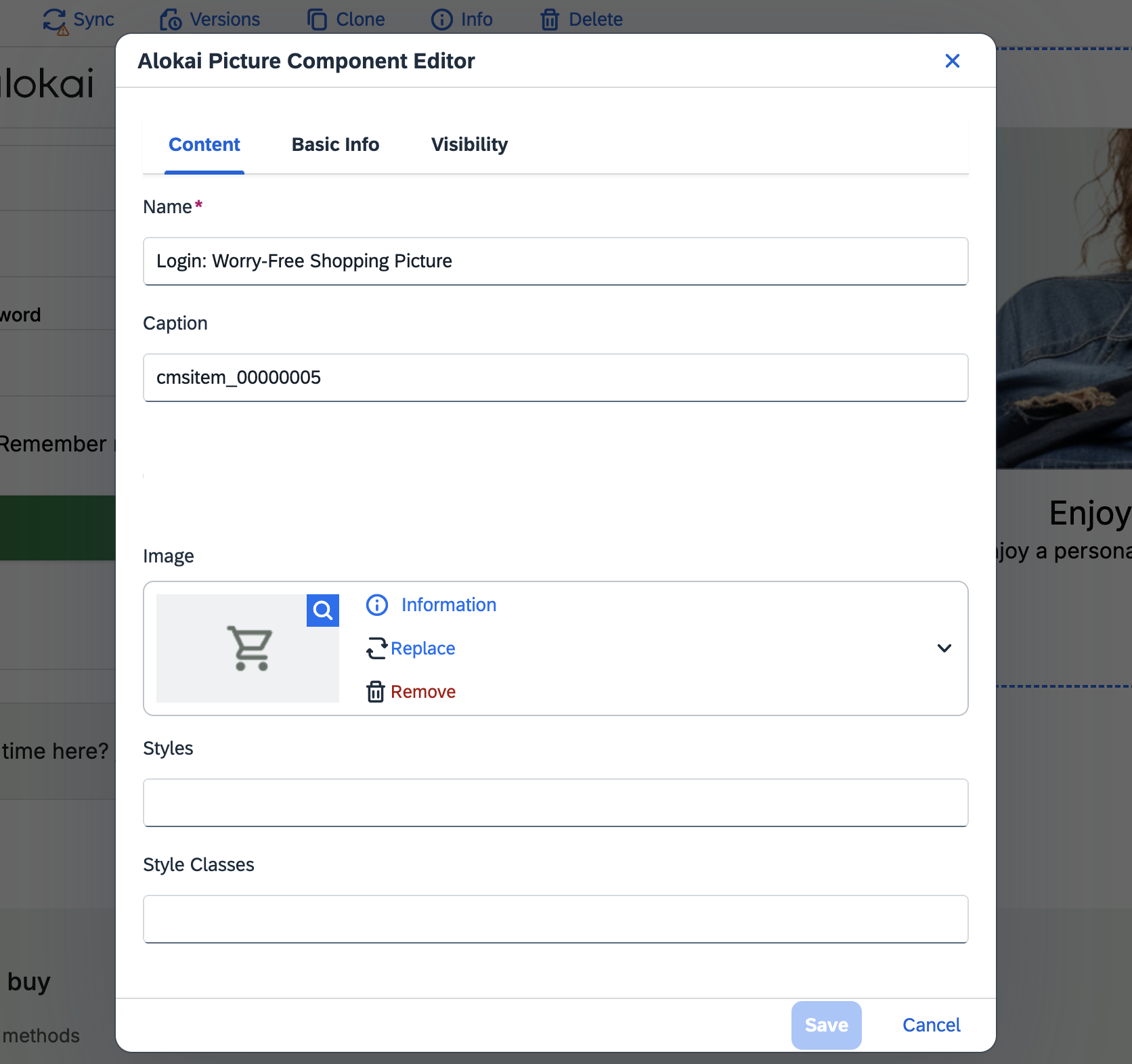
The finshed icon should look like this:
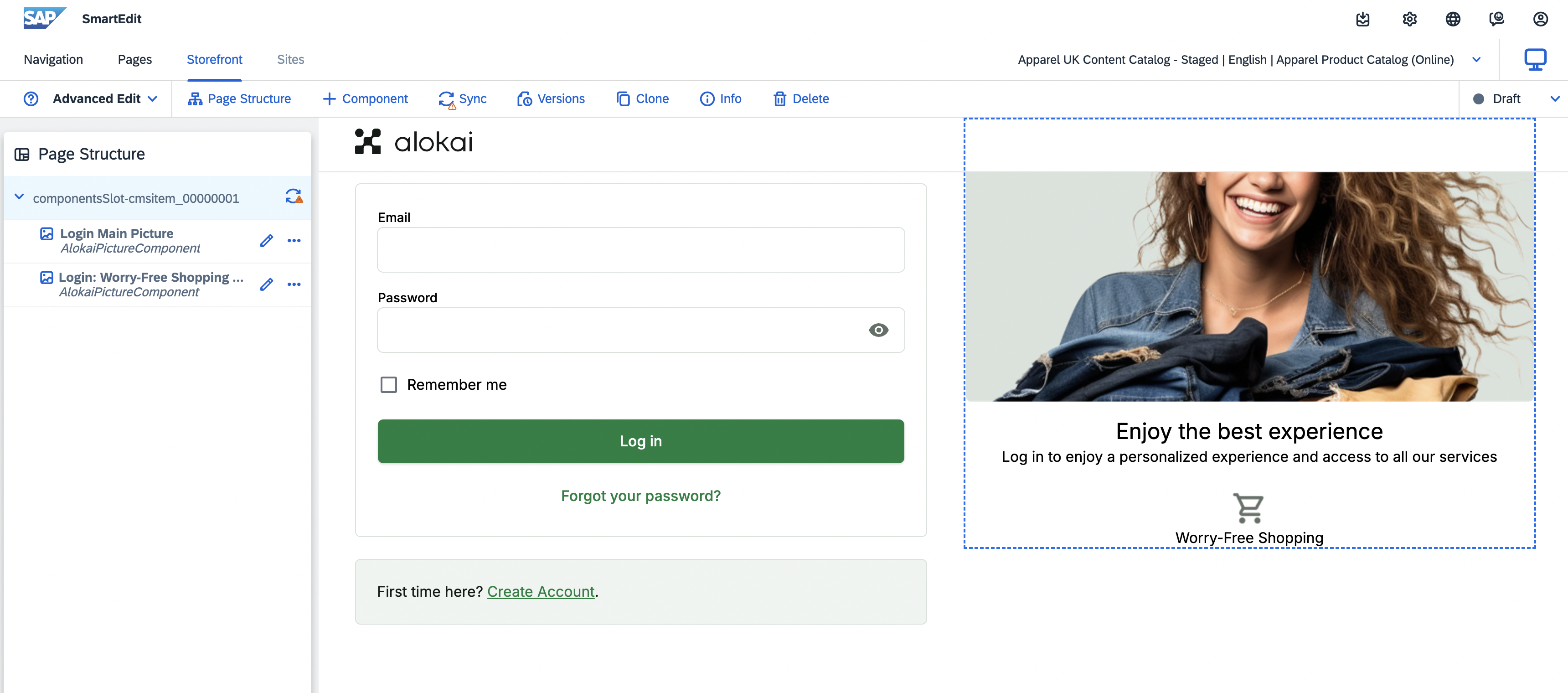
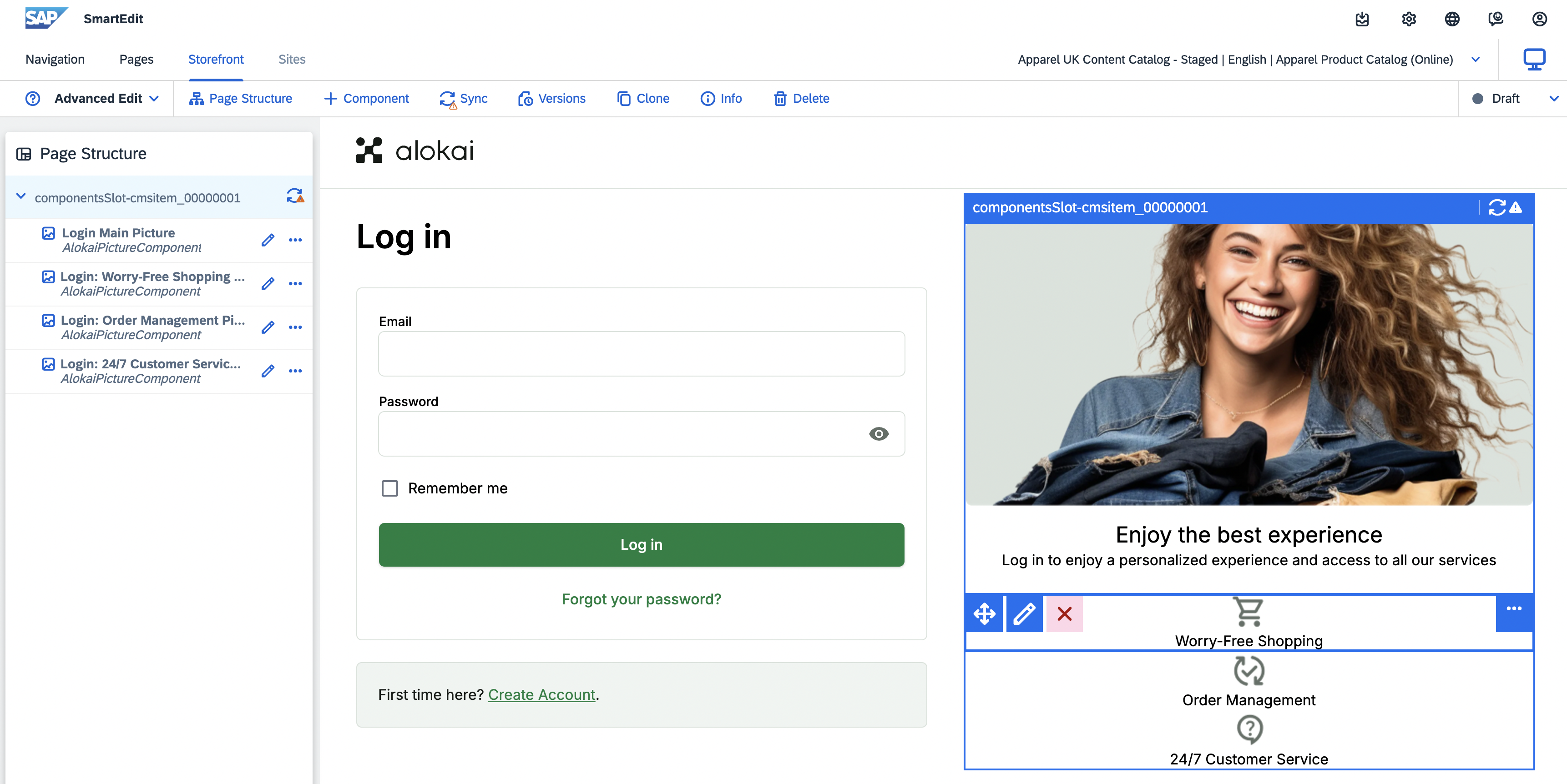
Repeat the process for the remaining icons. When ready, copy their IDs. You can remove them from the components slot afterwards.
Place the icons in a grid
To display the icons in a grid, create a new Grid component. In the pop-up editor:
- set Name to
Login: Icon grid(or any arbitrary value), - set Items to IDs of icons created in the previous step,
- set Alokai Style to:
[{ "resolutions": { "min": "768" }, "column_gap": "16px", "row_gap": "16px", "display": "grid", "grid_template_areas": "a b c" }, { "resolutions": { "max": "767" }, "column_gap": "16px", "row_gap": "16px", "display": "flex", "flex_direction": "column", "align_items": "center" }]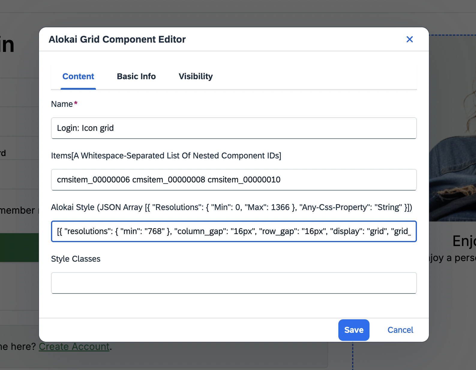
Once done, click Save. Your enhanced login page should now look like this:
Synchronize catalogs
Click the SAP logo in the top-left corner to navigate to the starting page you visited in step one. In the Site section, make sure the right catalog is still selected. In the Content Catalogs section, find the Staged version and click the blue Sync button on the right.
Unless you synchronize Stage and Online catalogs, you won't be able to preview your updated login page outside of SmartEdit's Live Preview window.
Create a new story
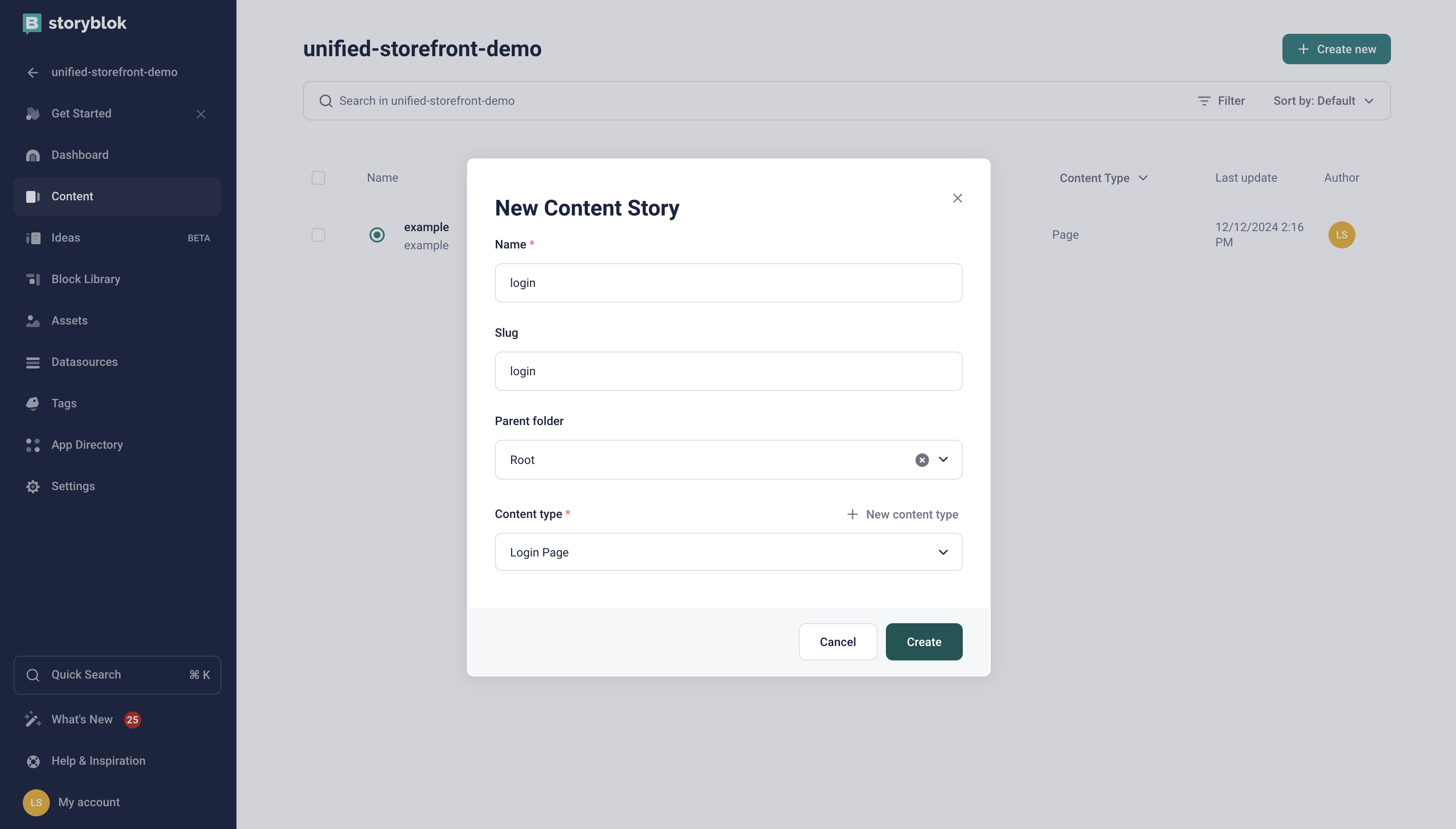
In your Storyblok space dashboard, navigate to the Content section and click the + Create new button in the top right corner. From the displayed dropdown, select Story and in the New Content Story form:
- set your page's Name to login,
- leave the Slug as-is,
- make sure the Content type is set to Login Page,
- confirm by clicking the green Create button.
Add the Picture component
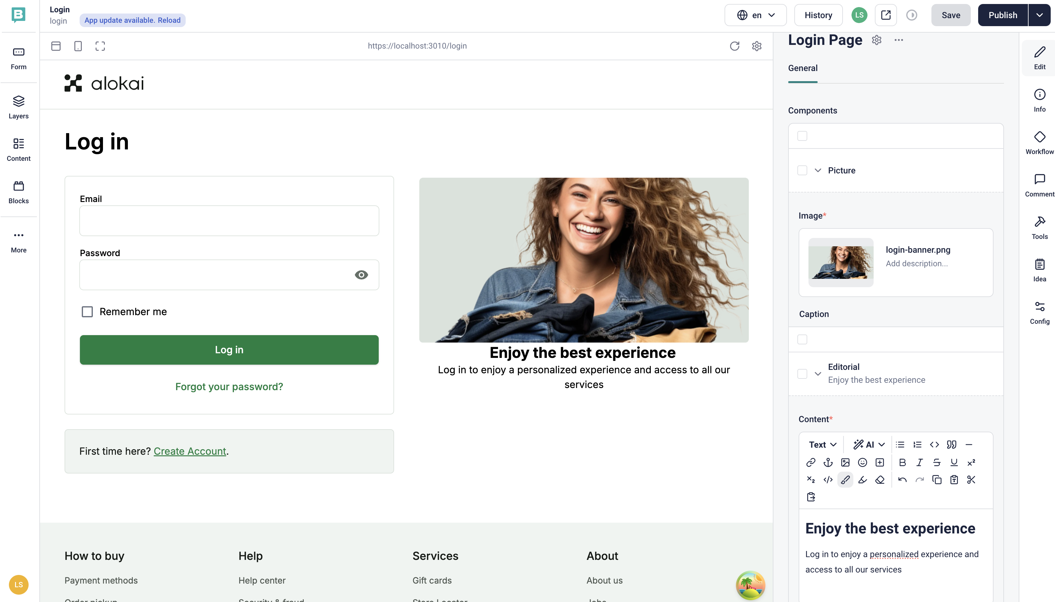
In the right-hand-side pane, find the Components section and click the Add Block button. From the displayed list of blocks, select Picture. When added, expand the Picture's content form by clicking the chevron icon (^). Give your your component an Image and Caption. In the Visual Editor, you should be able to see your component rendered and updated as you type.
Style the Picture component
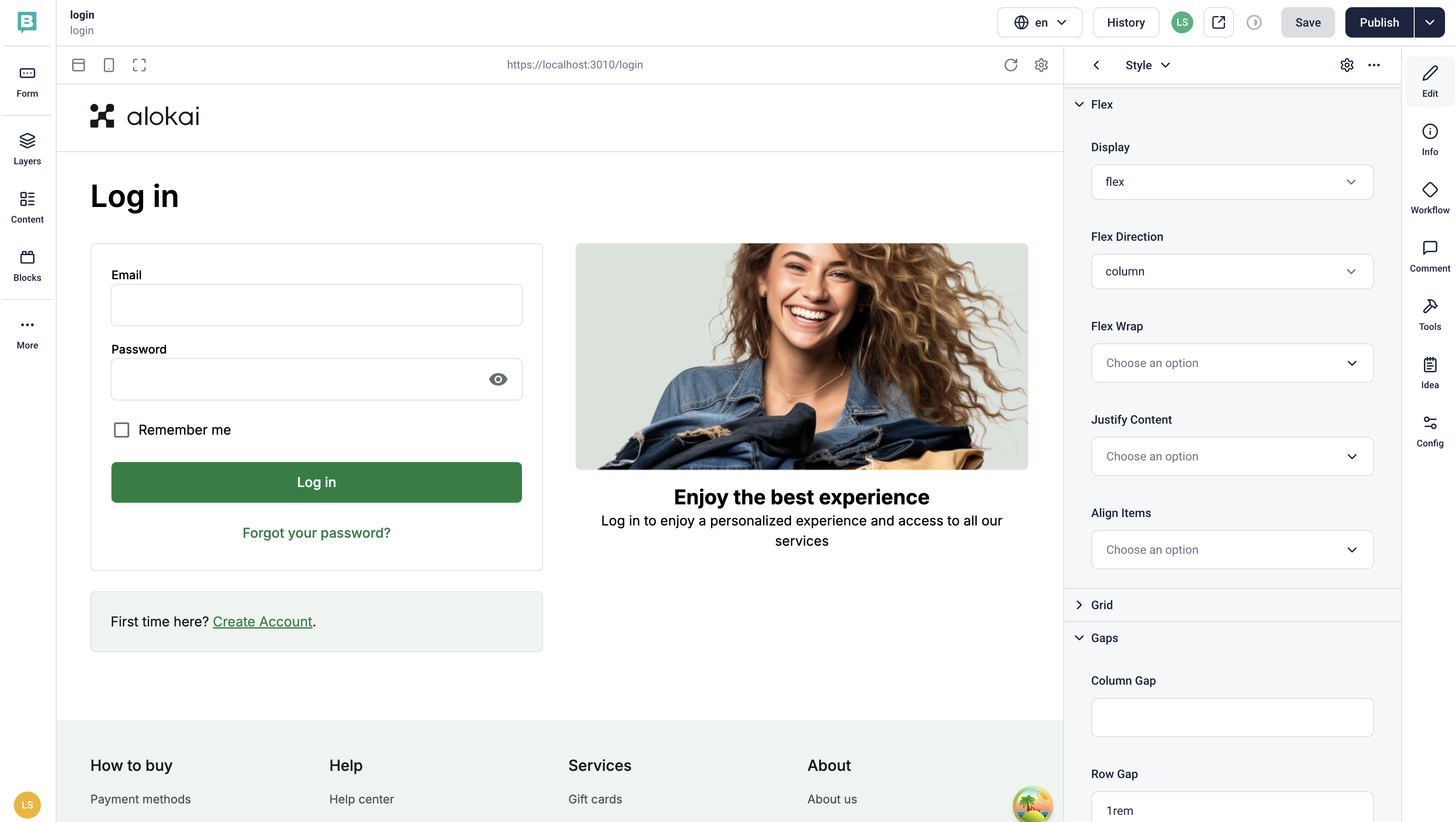
Add a new block in your Picture's Styles field. To introduce more space between the image and the caption:
- in the Flex group, set display: flex, flex-direction: column,
- in the Gaps group, set row-gap: 1rem.
To introduce more space between the entire Picture component and the Grid of icons you will add in subsequent steps:
- in the Margins group, set Margin Bottom: 24px.
Add the Grid component with the first icon
Remember that in our design - below the main Picture - there is a grid of icons? We will add them now.
Go back to your Login Page edit form and find the Components field again. Add a new Grid component. In its Items field, and add a new Picture component. This will be your first "Worry-Free Shopping" icon - fill it with content the same way you did for the main Picture.
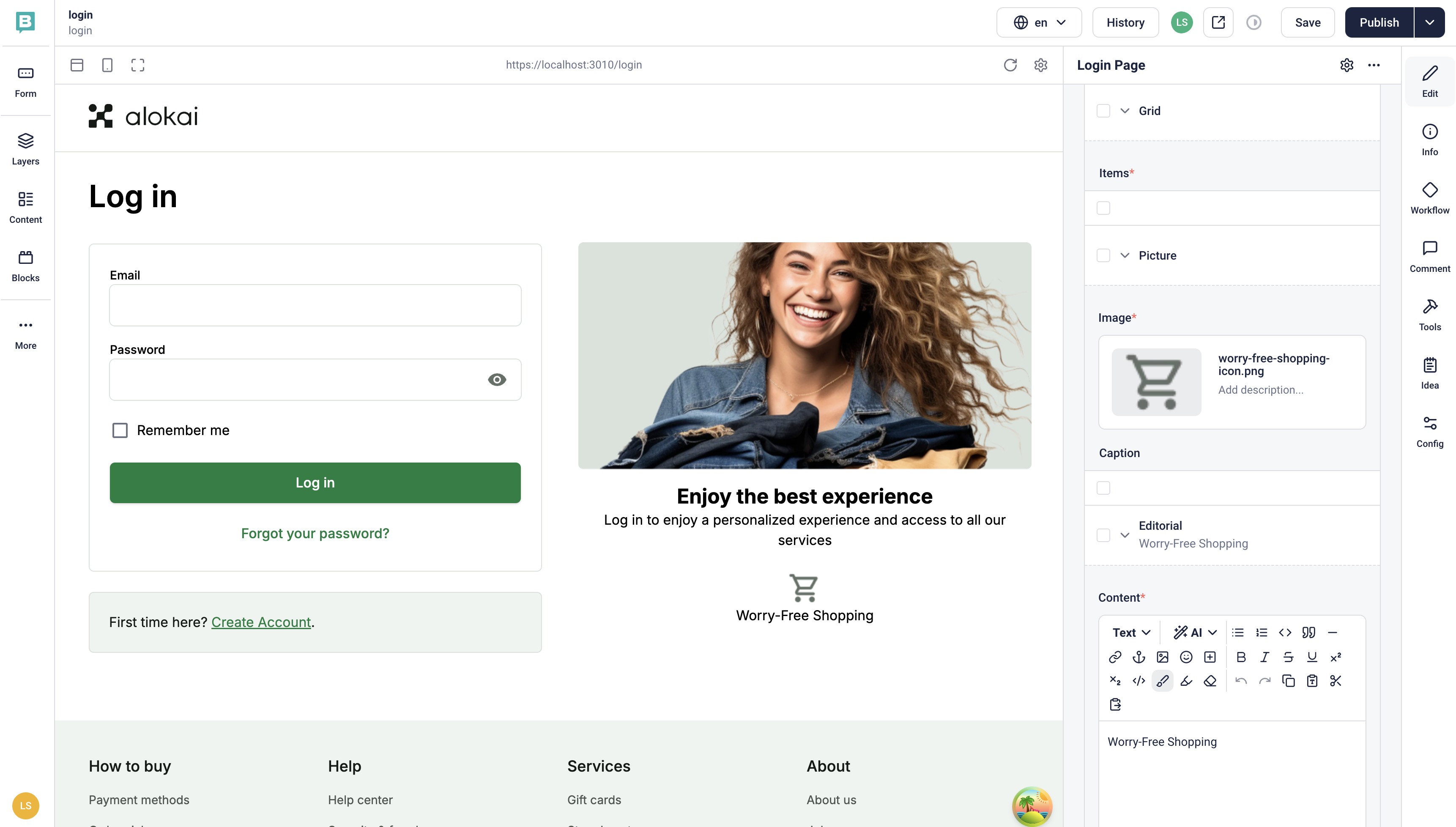
Add the remaining icons
To create the remaining two icons ("Order Management" and "24/7 Customer Service"), add two more Picture components to the Grid - the same way you did for the first icon. As a result, you should receive a column with three icons and their captions.
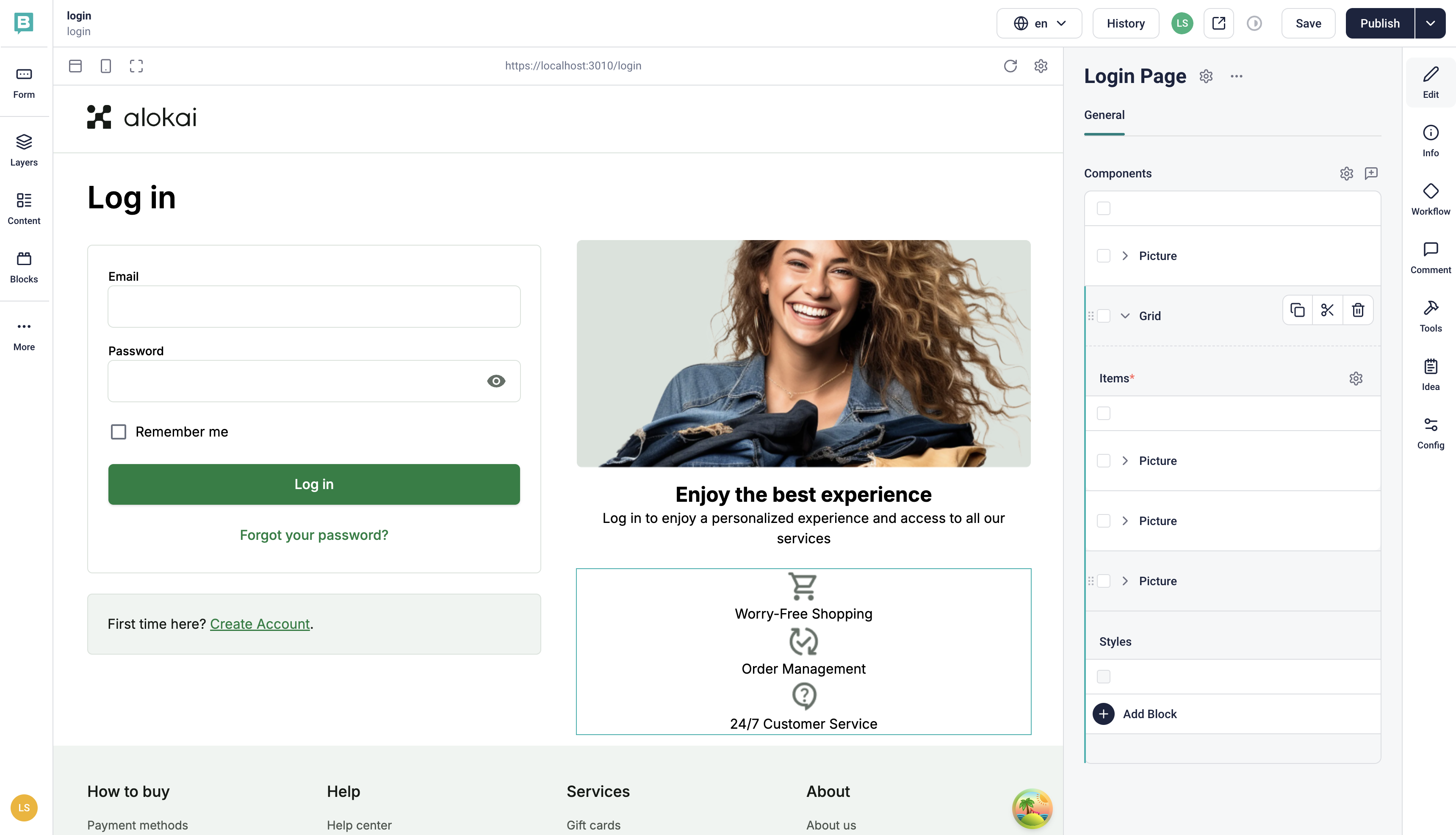
Style the Grid
Add a new block to the Grid's Styles field. To display the icons in a row instead of a column on desktop devices:
- in the Screen Resolutions group, set min: 768,
- in the Flex group, set display: flex and justify-content: space-between.
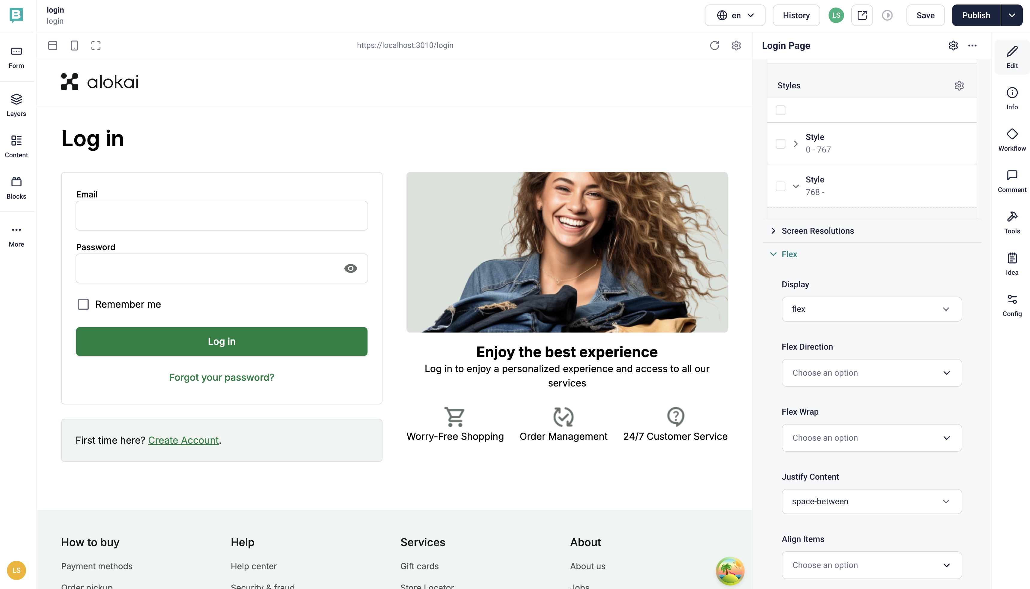
Read also
Congratulations! You’ve successfully integrated CMS content into your Login Page. With this knowledge, you can now enhance other pages in your Storefront to leverage the power of CMS.