



Quick start
The concept of pages lives at the very core of Alokai's CMS modules. They organize your CMS components in structures, allowing you to fetch them with a single request and render in the Storefront. This guide will show you how to quickly create a simple page in your CMS using the readily-available Content Types provided by Alokai.
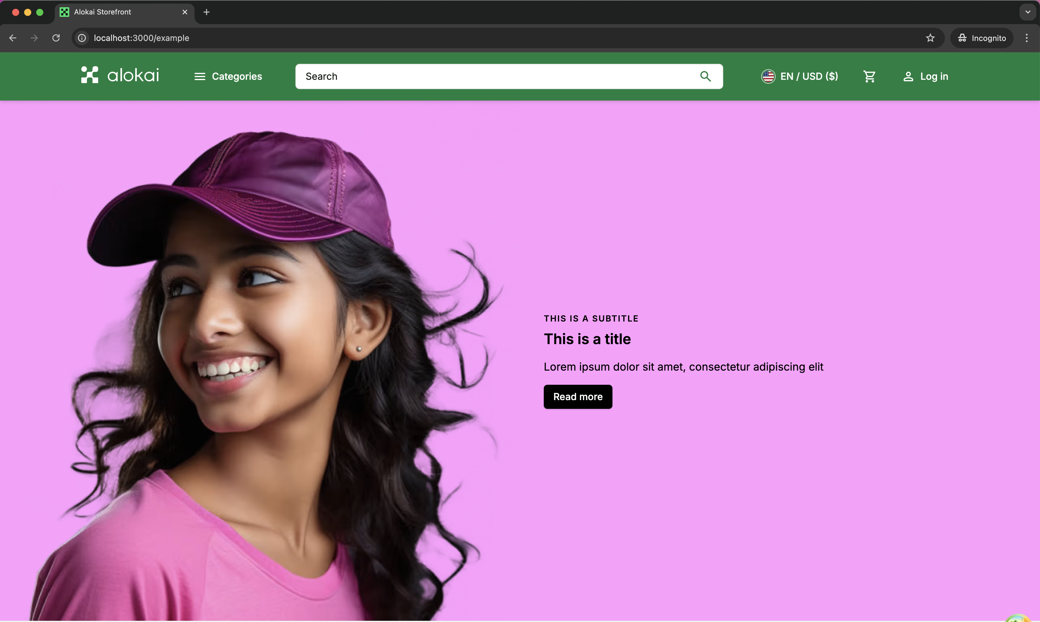
Creating CMS page
The process of creating pages differs in every CMS. Select your platform from the tabs below and follow the associated guide.
To use the Live Preview feature, you need to run your project locally with yarn dev command.
Create a new page entry
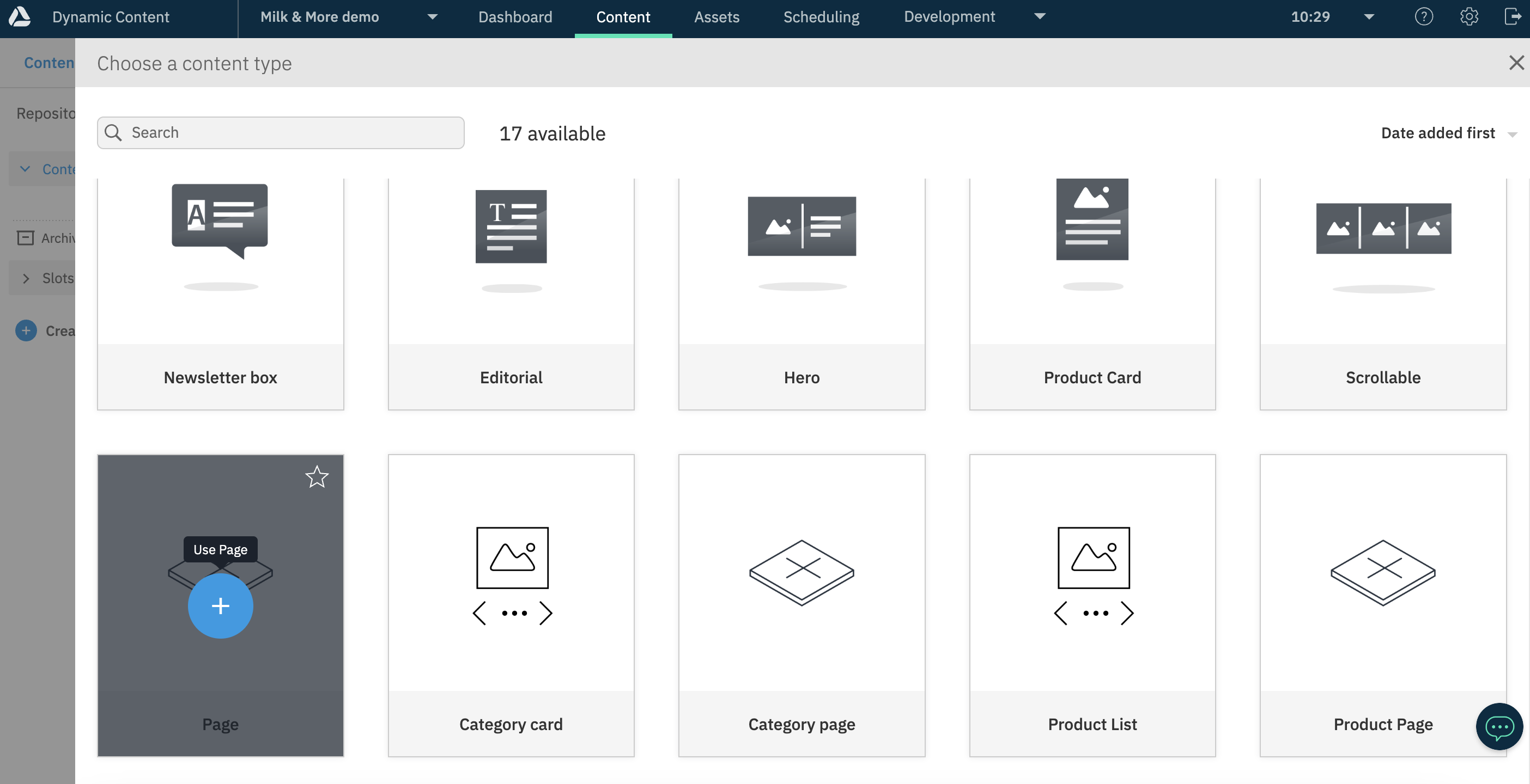
From the top bar of your Amplience dashboard, navigate to the Content tab and click the Create content button in the top right corner. Choose Page from the list of suggested Content Types.
Define the Path of your page
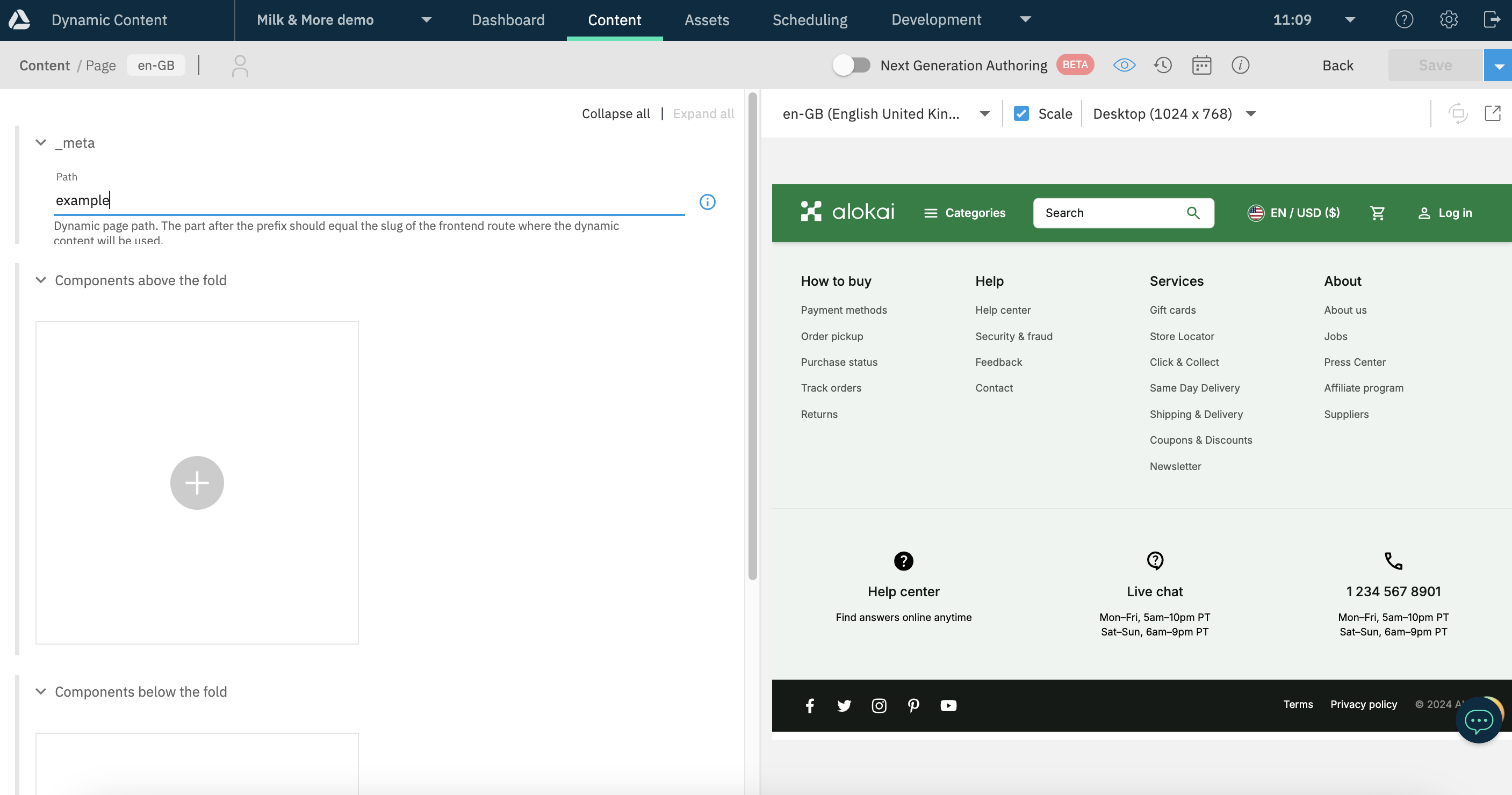
Set your page's Path to pages/example. Amplience will set this value as your entry's deliveryKey automatically. Your Storefront will use it to fetch the page from Amplience. Once done, click the Save button in the top right corner. Saving at this stage is required to enable Visualizations.
Add a component
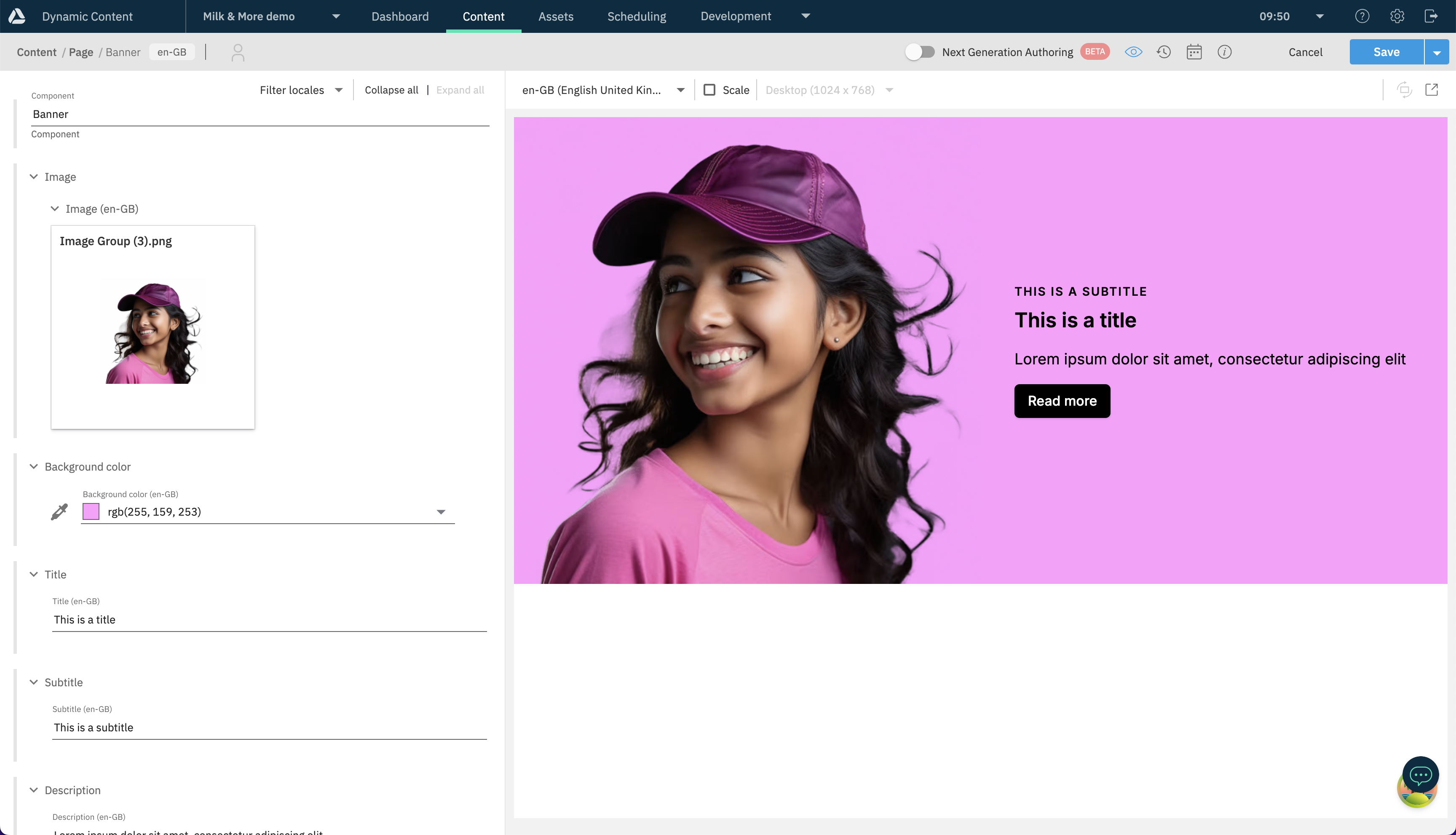
In the Components above the fold field, click on the + button. In the drawer that appears, select + Create new content at the top and - from the displayed list of content items - choose Banner.
Just like for the page entry, Save the Banner entry immediately to enable Visualizations.
Fill your new component with some arbitrary data. Once done, click the blue Save button in the top-right corner.
Publish your page
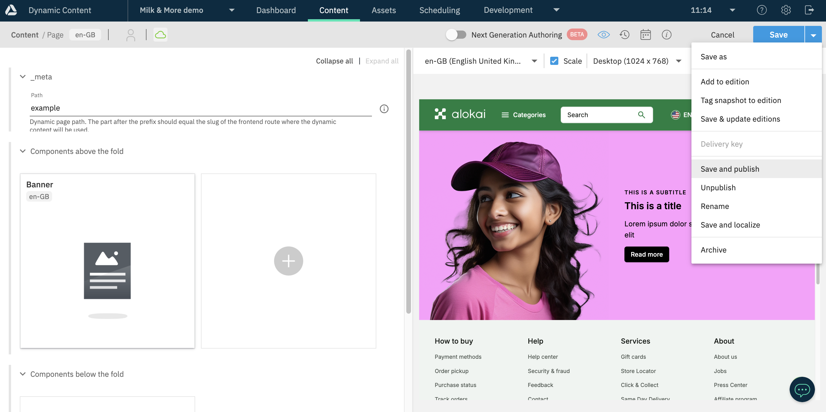
Go back to your page entry. In the top right corner, click the arrow next to the blue Save button and select Save and publish from the list.
Create a new project
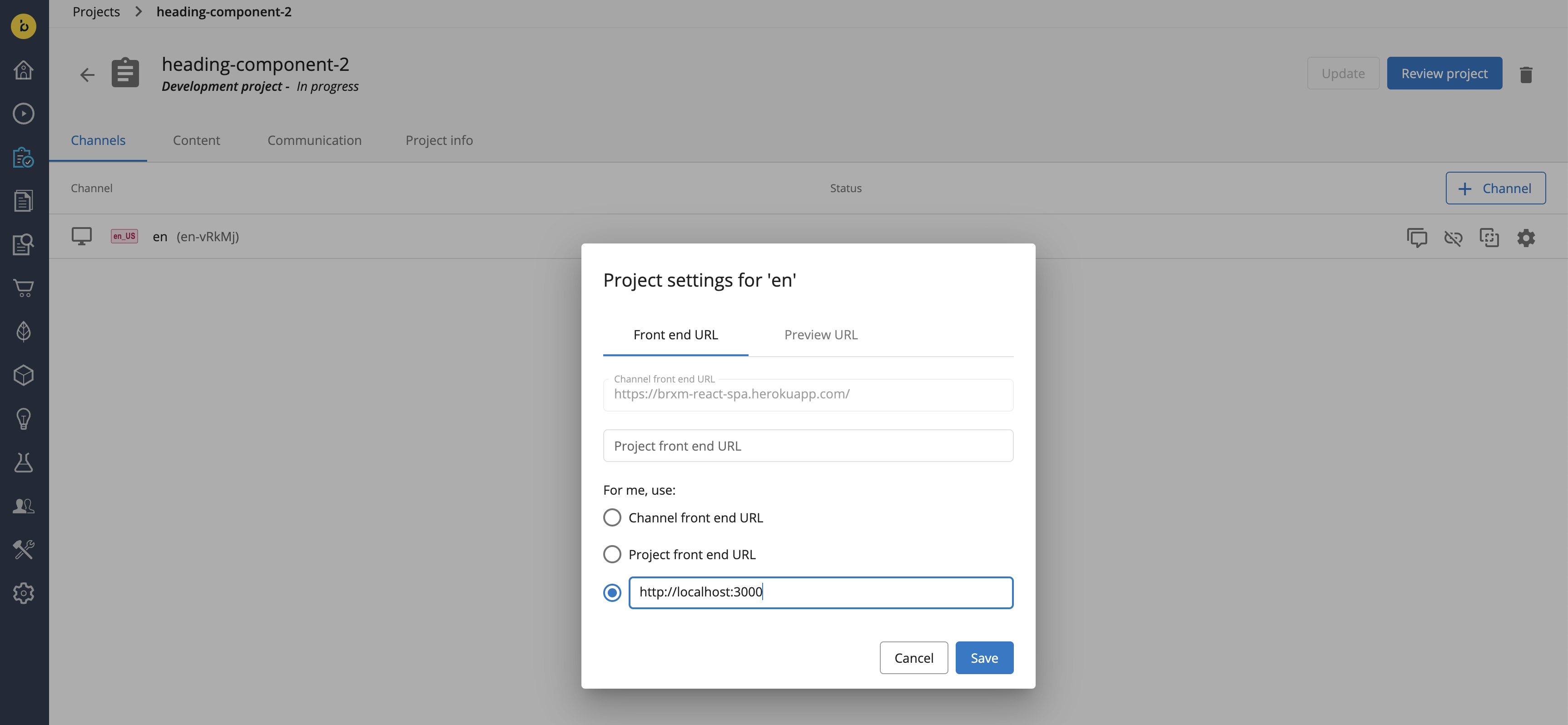
To create a new page in Bloomreach Content, you first have to create a new project. Navigate to the Projects application and click the blue + Project button. Once the project had been created, add a channel to it (e.g. en) and click the cog icon to set the preview URL for the channel. Hit Save to confirm.
Create a new page
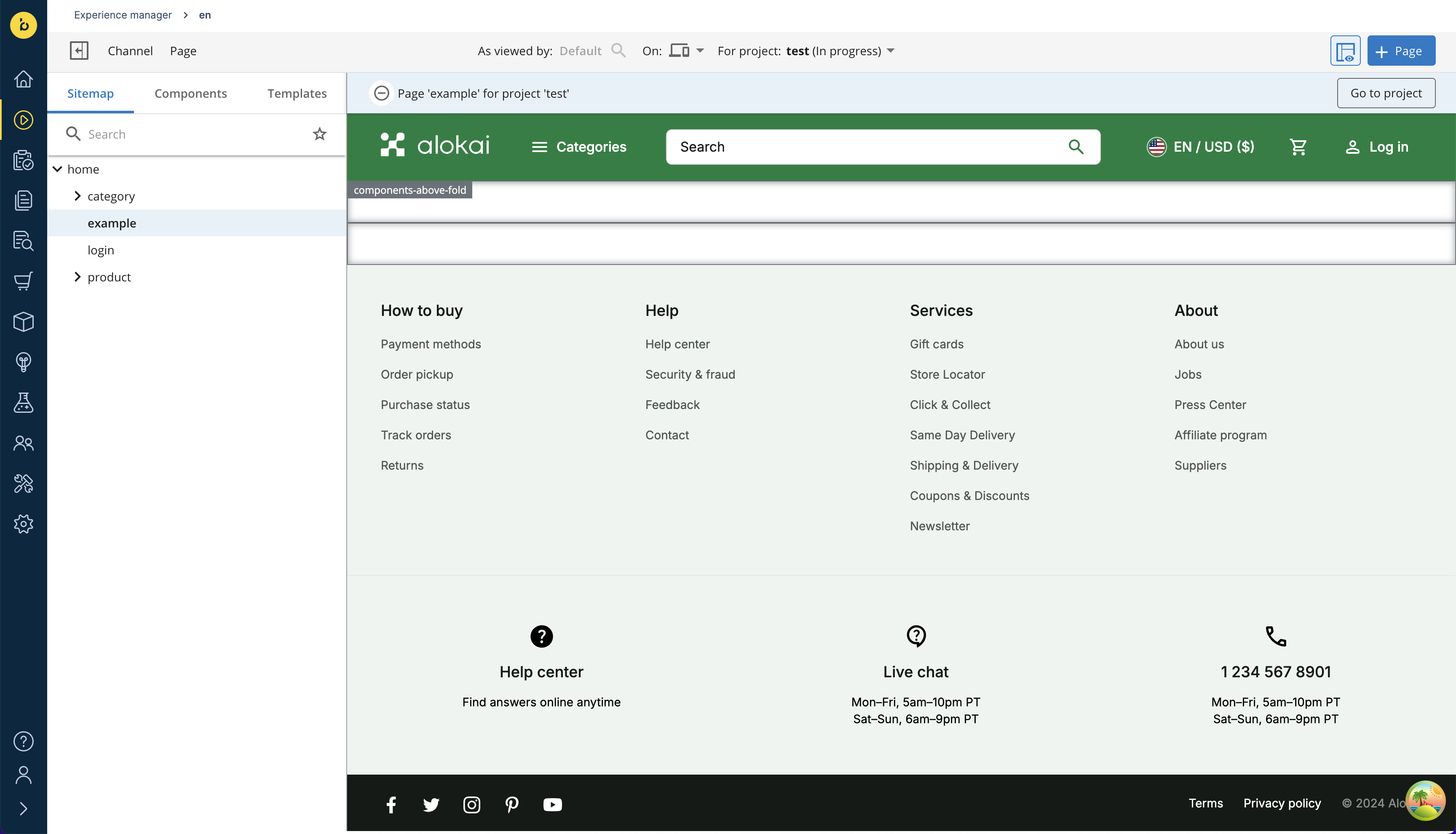
Go to the Experience Manager and locate the blue + Page button. On its left, there is a button which allows you to toggle component & container outlines, making them editable - make sure it is active. Next, further to the left, there is the For project dropdown - make sure your newly-created project is the selected one.
Once ready, add a new page by clicking the + Page button.

Clicking the button will bring up a drawer with a form. In the form, set your page's:
- name to
example, - URL to
example, - document type to
Bloomreach Content, - layout to
hst:pages/dynamic-page, - location to
/content/documents/en/pages
Click Next to confirm. In the next form, leave all fields blank and simply click Create. Your page should now appear in the preview window, featuring two containers for components: components-above-fold and components-below-fold.
Since pages in Bloomreach Content are simply documents, you can as well create them in the Documents section of the Content Application.
Add a component
In the sidebar on the left, go to Components and select Vuestorefront Banner from the list. Move your mouse over the components-above-fold container and click the blue + button.
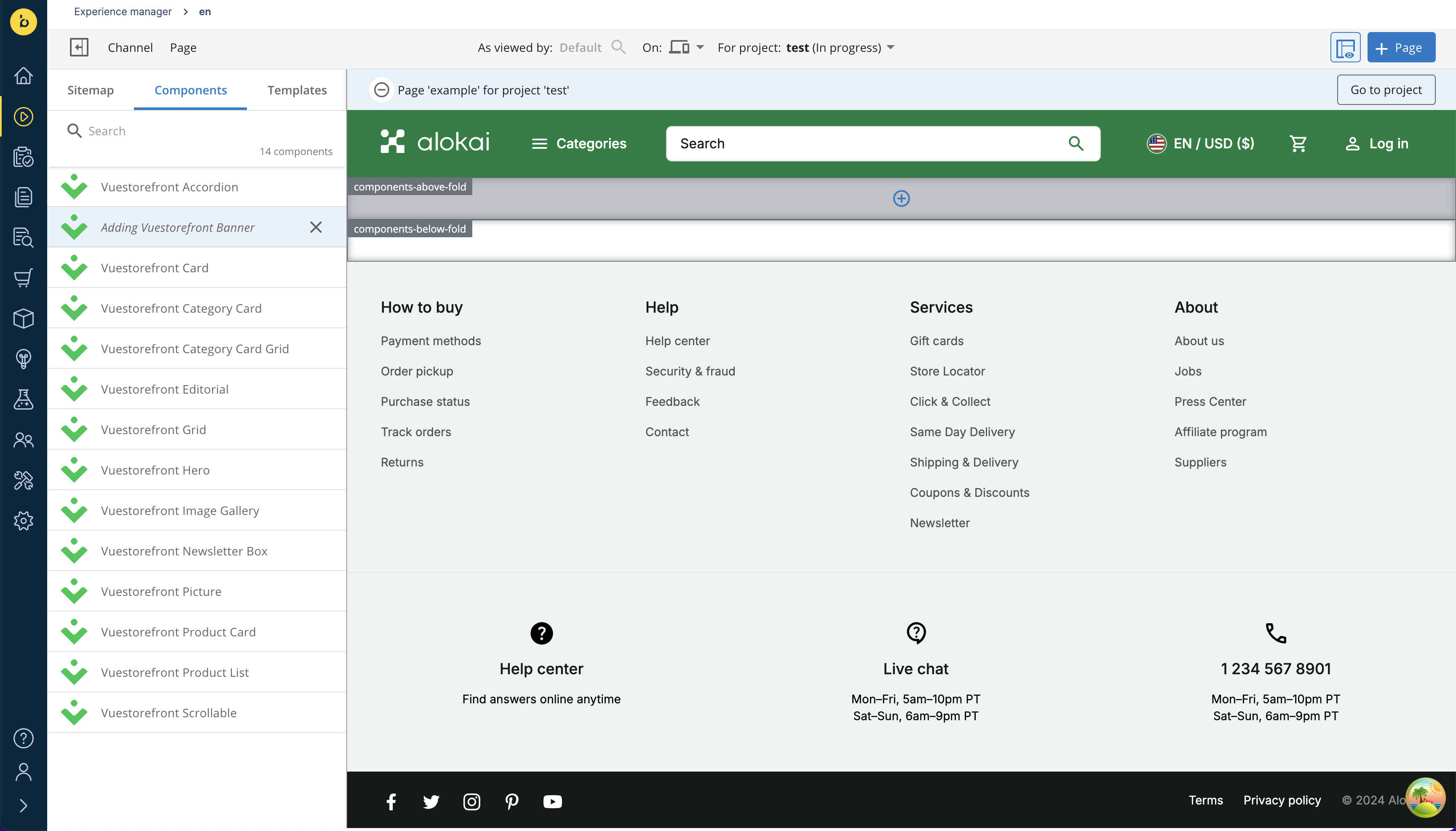
Once the Vuestorefront Banner component is added to the container, hover over the orange magnifying glass icon. A plus button should appear below it. Click it to bring up the form for creating a new document. Give it some arbitrary name and click Next.
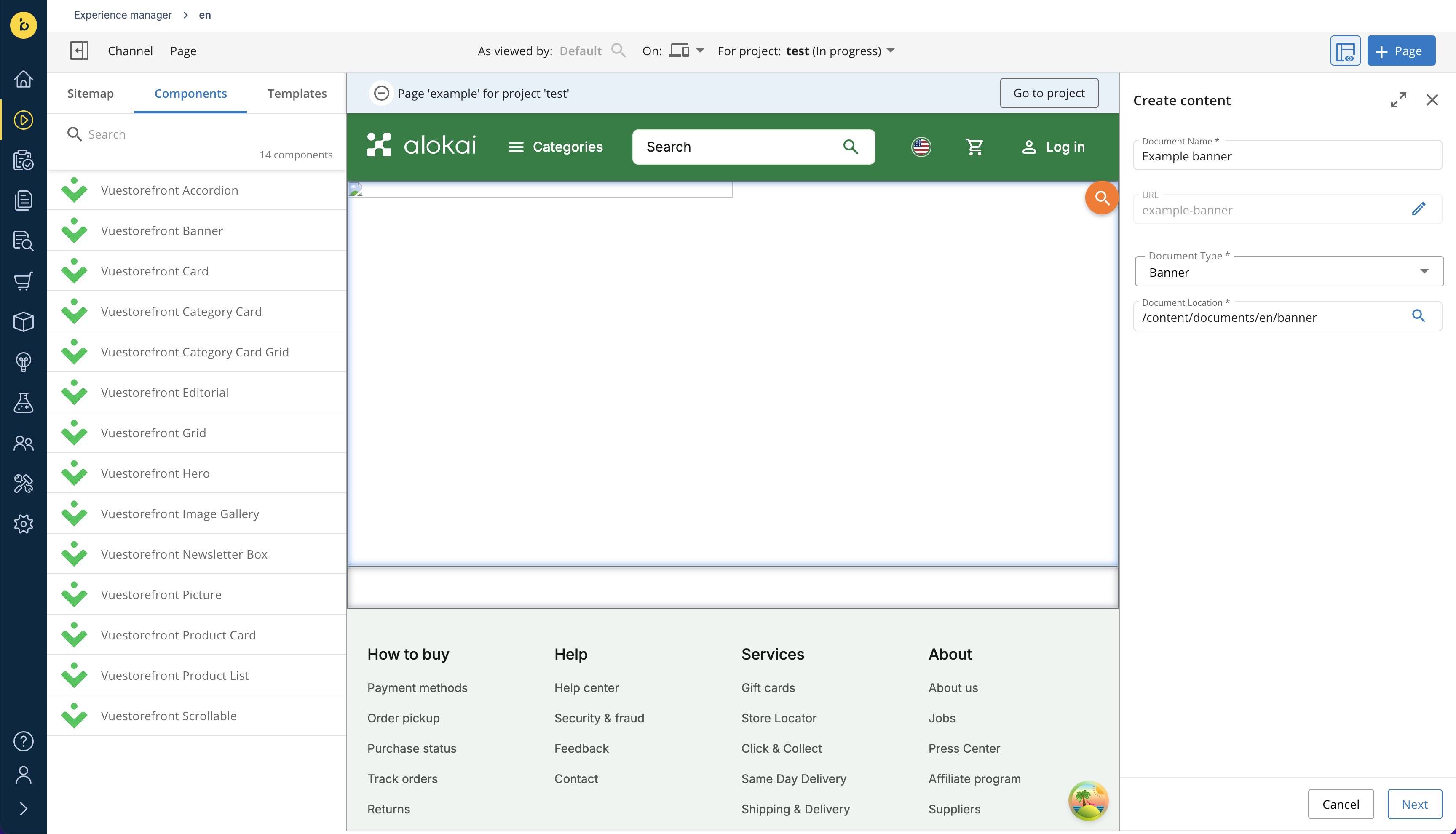
In the next form, fill your new component with some arbitrary data. Once done, click Create to save the new document for your component. In the preview window, you should now see your Banner component.
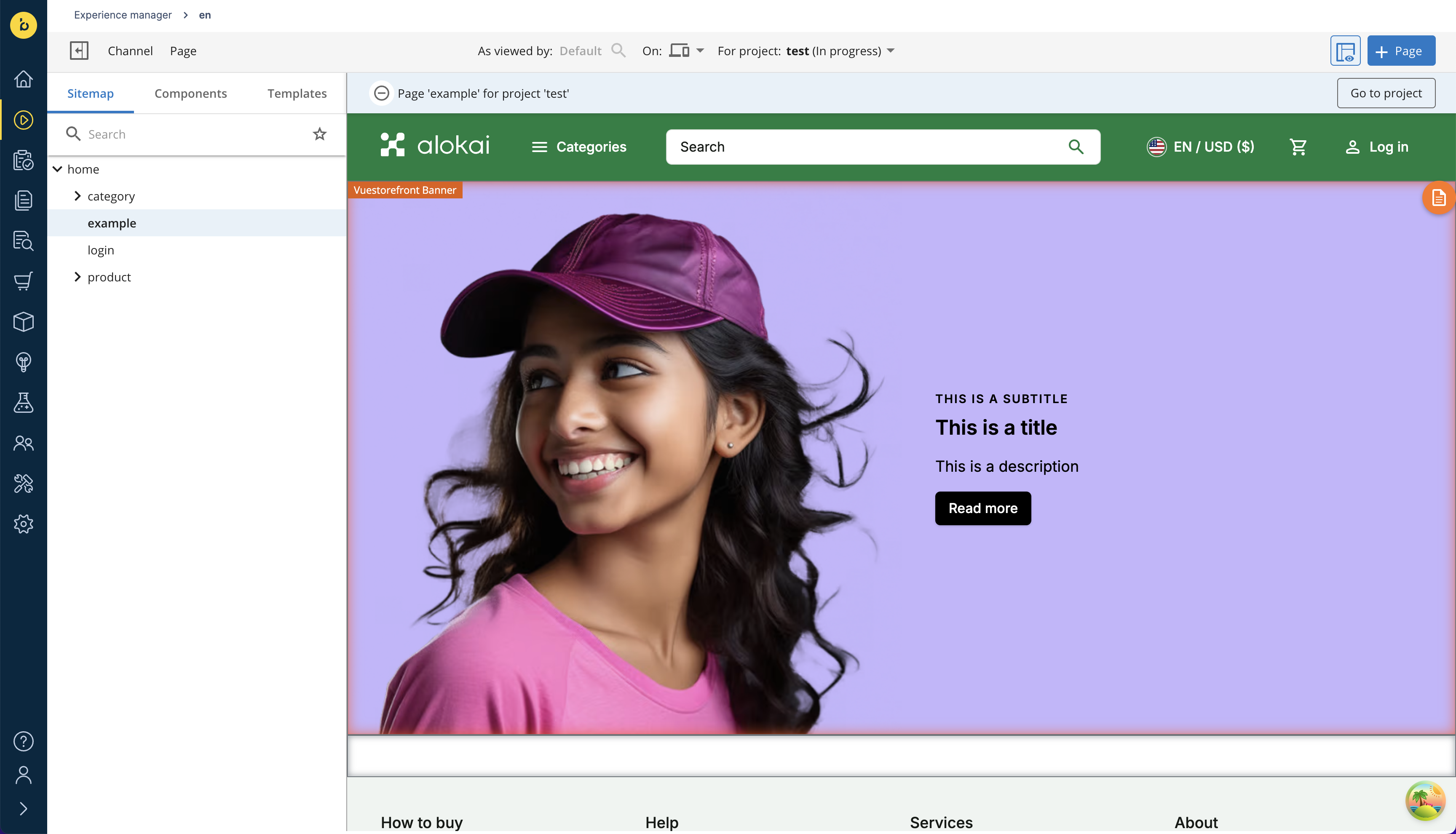
There is a known issue with the Alokai-Bloomreach Content integration where newly added components might not immediately appear in the Experience Manager. As a workaround, you can detach the document from the component, attach it again and refresh the page. We are actively working on a permanent fix.
Merge your project
From the main sidebar on the left, go to Projects application and select your project. Click the blue Review project button in the top-right corner. On the channel list, accept the changes by clicking the tick ✔️ symbol on the right. Confirm by clicking the blue Merge button which should appear in the top-right corner.
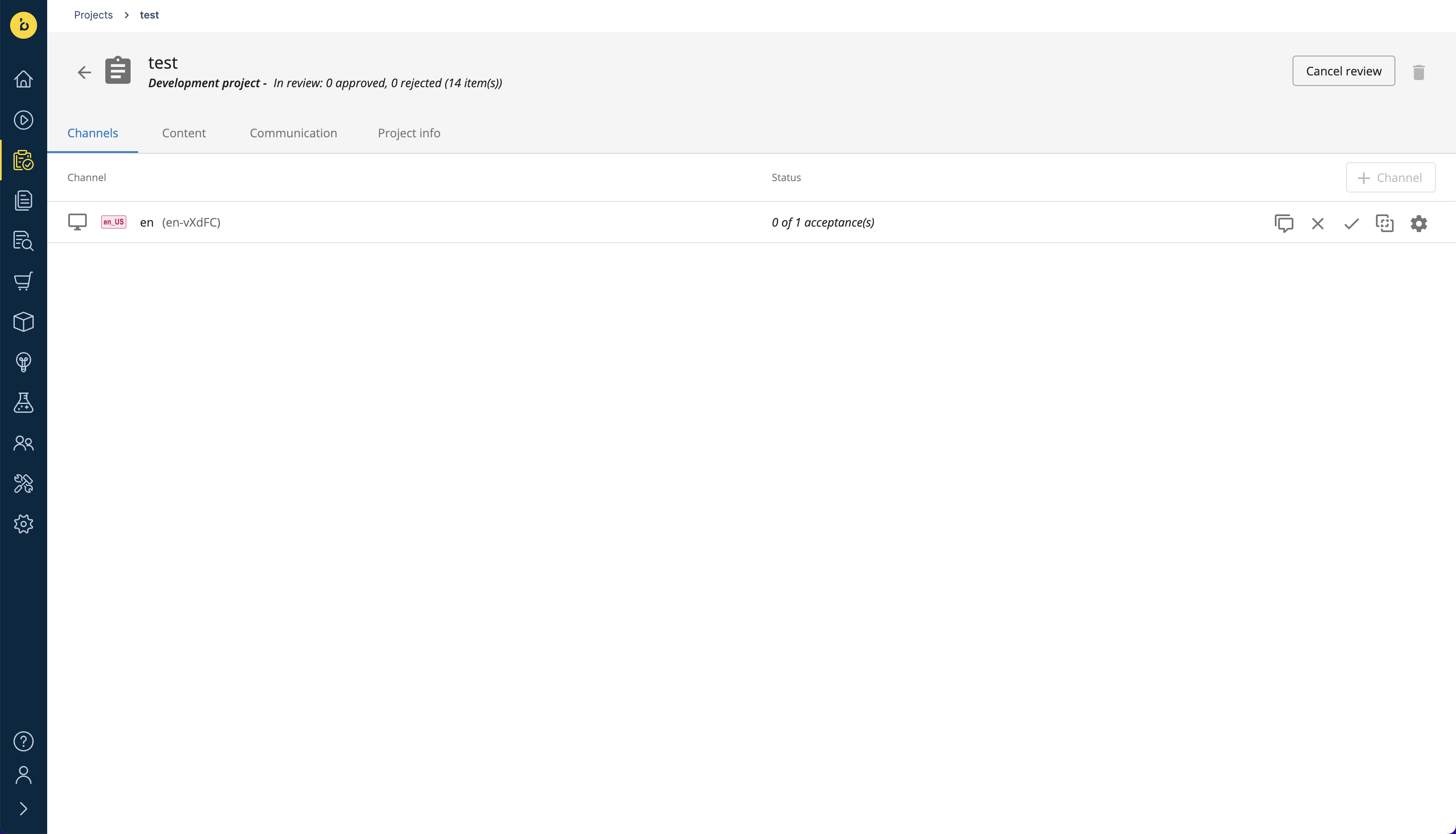
If the Merge button does not appear, it probably means you need more than 1 acceptance to merge your project. You can contact the Bloomreach team to lift the requirement.
Create a new page entry
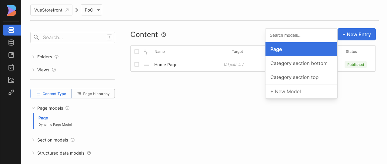
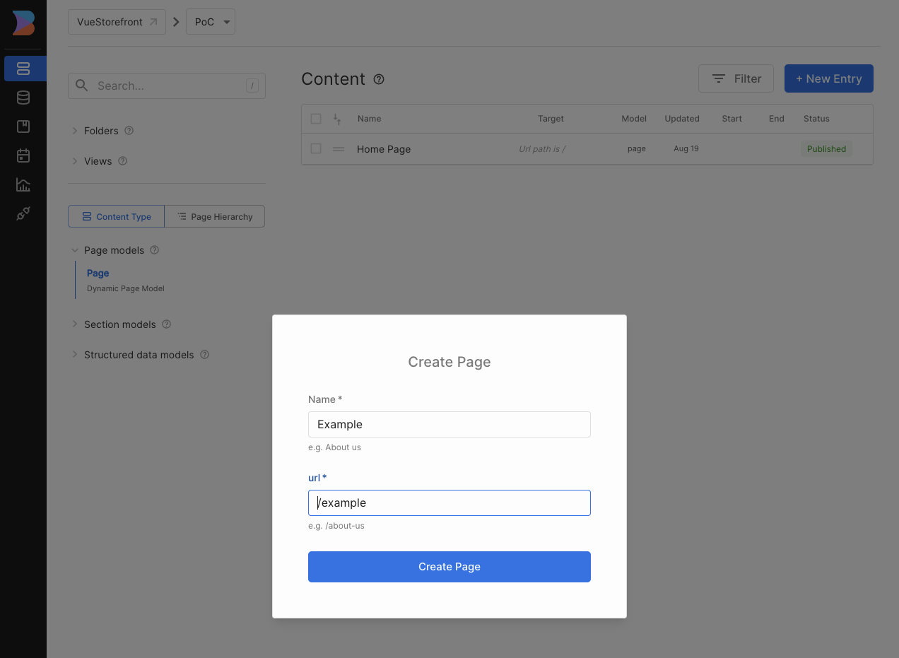
In your Builder.io dashboard, navigate to the Content tab and click the + New Entry button in the top right corner. Choose Page from the list of suggested models.
Define the url of your page
A new modal should pop up. Set your page's URL to /example. Builder.io will use it for content targeting and your Storefront will use it to fetch the entry.
Add a component
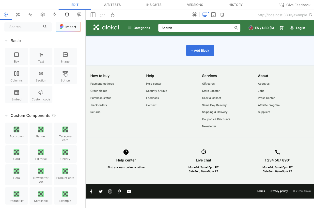
From the left-hand sidebar, select the insert (+) tab. Toggle the Custom Components list and find the Banner component. Drag it onto the blue area on the page and drop.
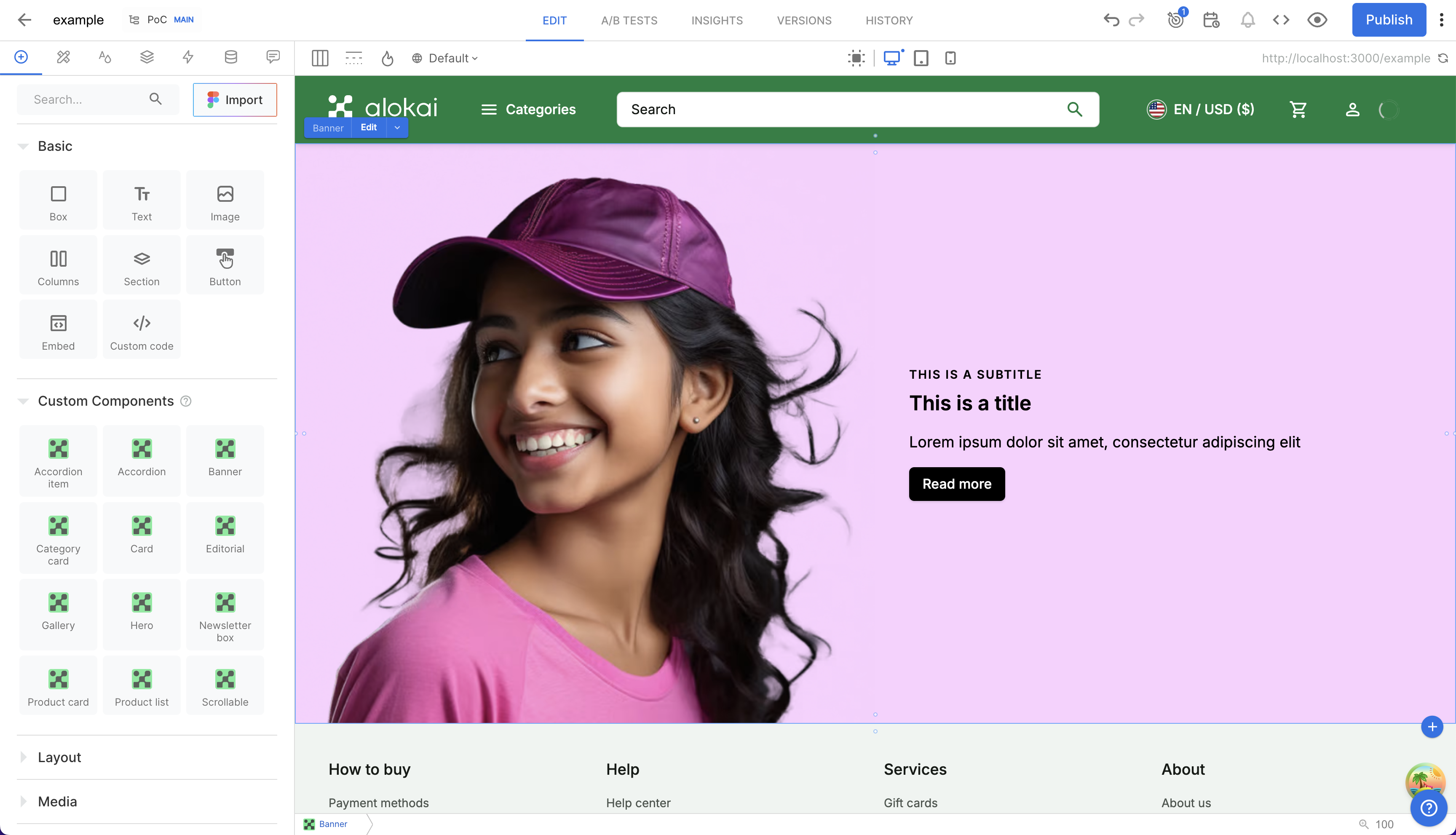
Once your component is there, click the blue Edit button located next to its name. This will open up a modal with a content form. Fill your new component with some arbitrary data. Once done, you should see your component rendered on your page. Finalize the process by clicking the blue Publish button in the top-right corner.
Create a new page entry
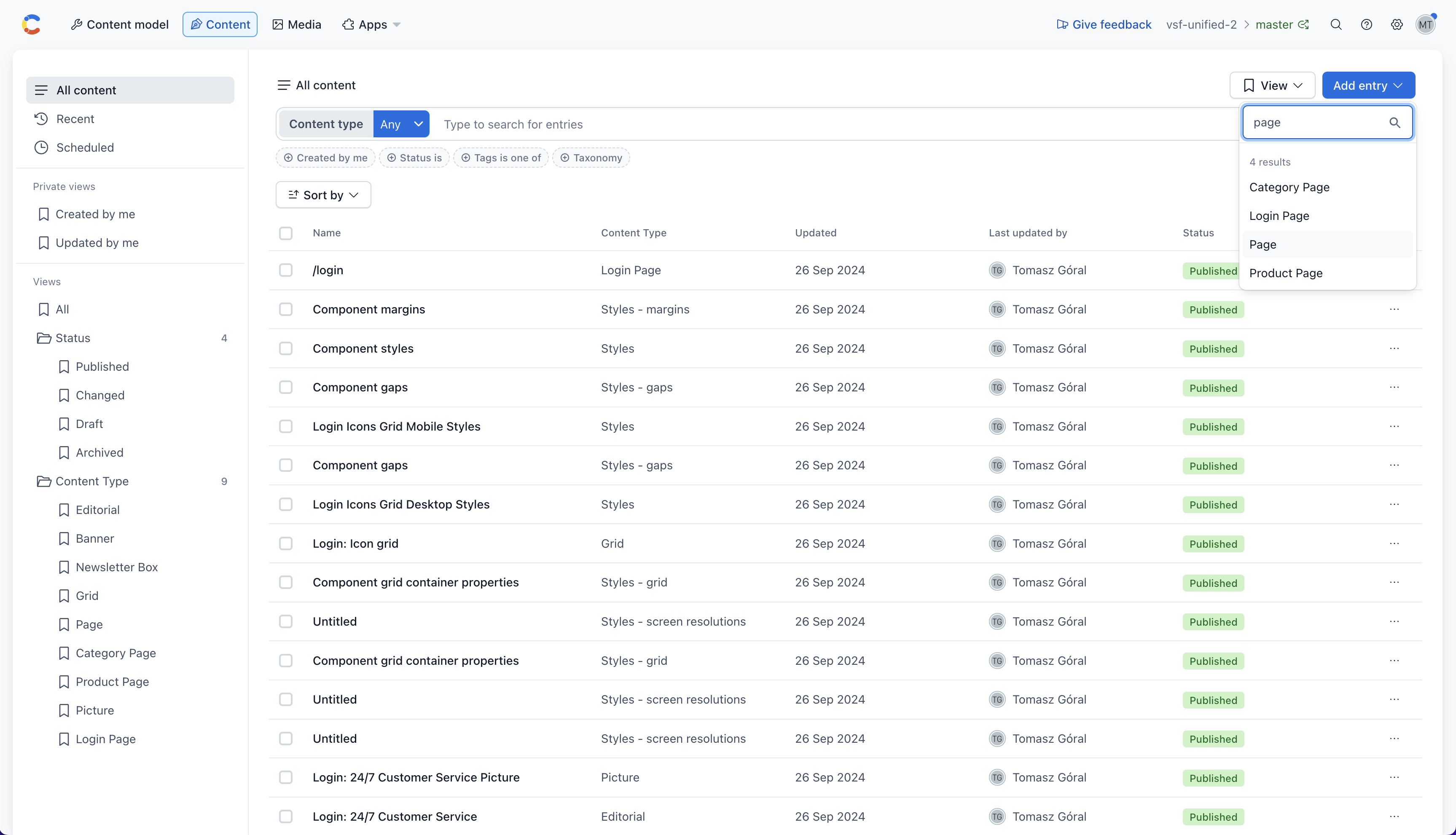
The journey starts in the Contentful Web App. Navigate to the Content tab and click the Add entry button in the top-right corner. Choose Page from the list of suggested content types.
Define the url of your page
A new editor window should pop up. In the right-hand sidebar, click the Open Live Preview button. Set your page's URL to /example. Your Storefront will use it to fetch the page from Contentful.
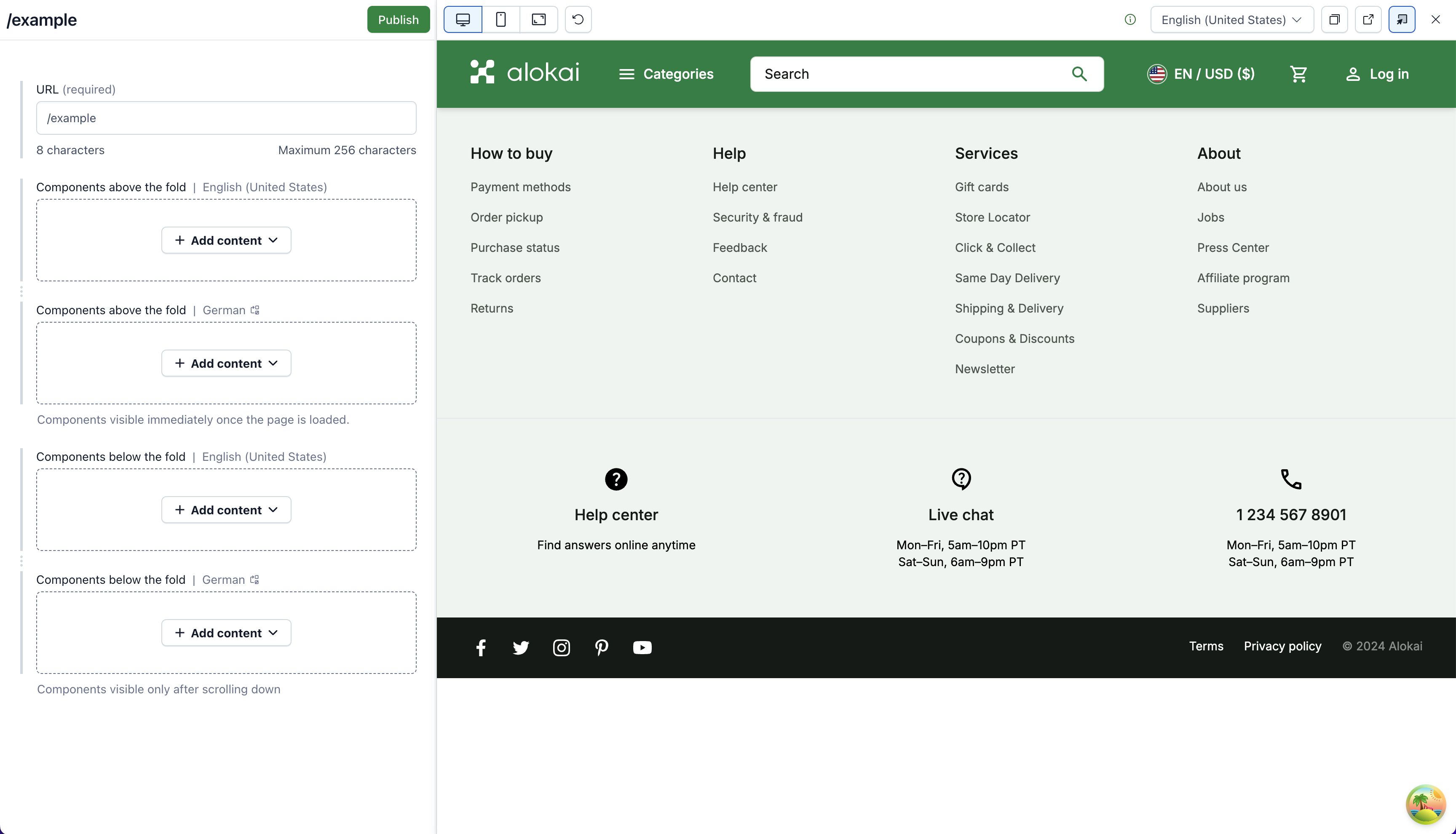
Add a component
In the Components above the fold field, click on the Add content button. From the displayed list of content types, choose Banner. Fill your new component with some arbitrary data. Once done, you should see your component rendered on your page.
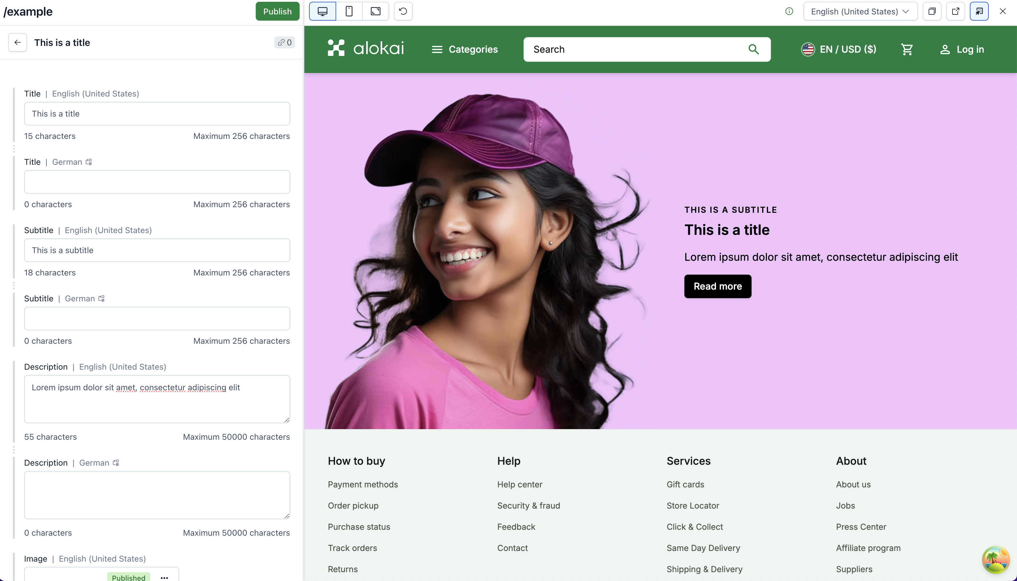
Publish your page
Finalize the process by clicking the green Publish button in the sidebar on the left. When prompted for references to publish together, select all suggested entries and click Publish.
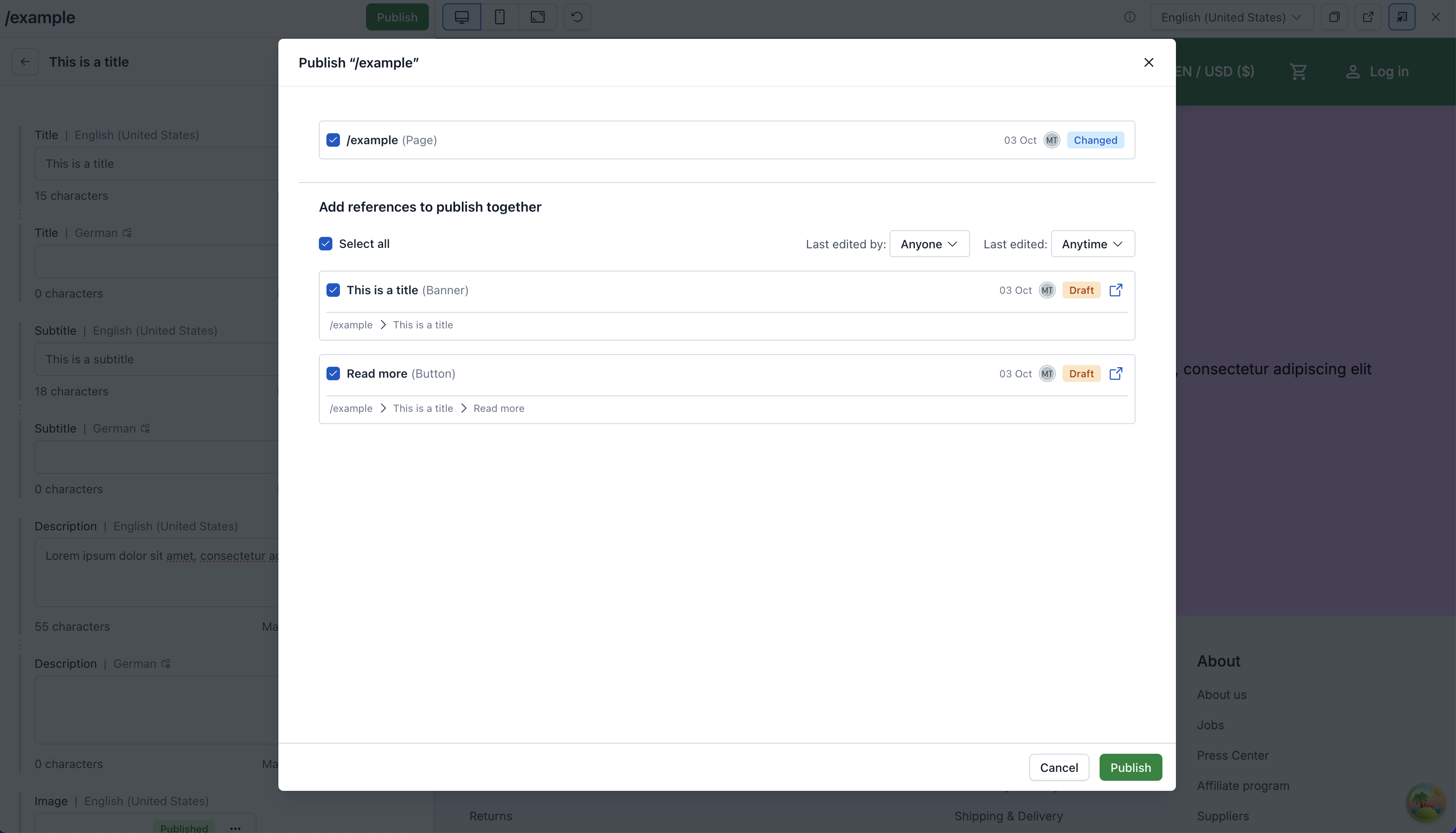
Create a new page entry
In your Contentstack dashboard, navigate to the Entries tab and click the + New Entry button in the top right corner. Choose Page from the list of suggested Content Types and click Proceed.
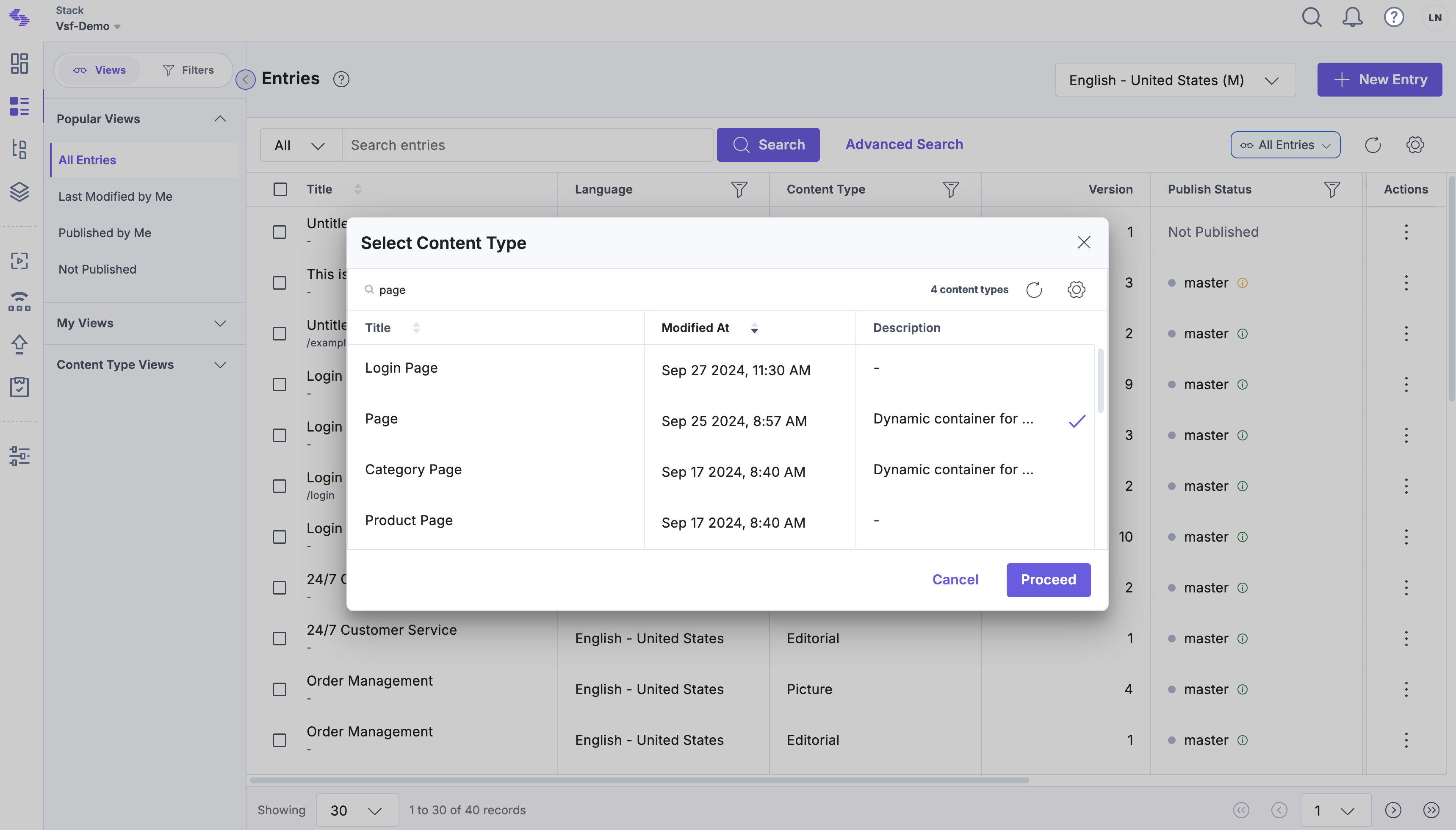
Define the url of your page
A new editor window should pop up. In the right-hand sidebar, click the Live Preview button. Set your page's URL to /example. Your Storefront will use it to fetch the page from Contentstack.
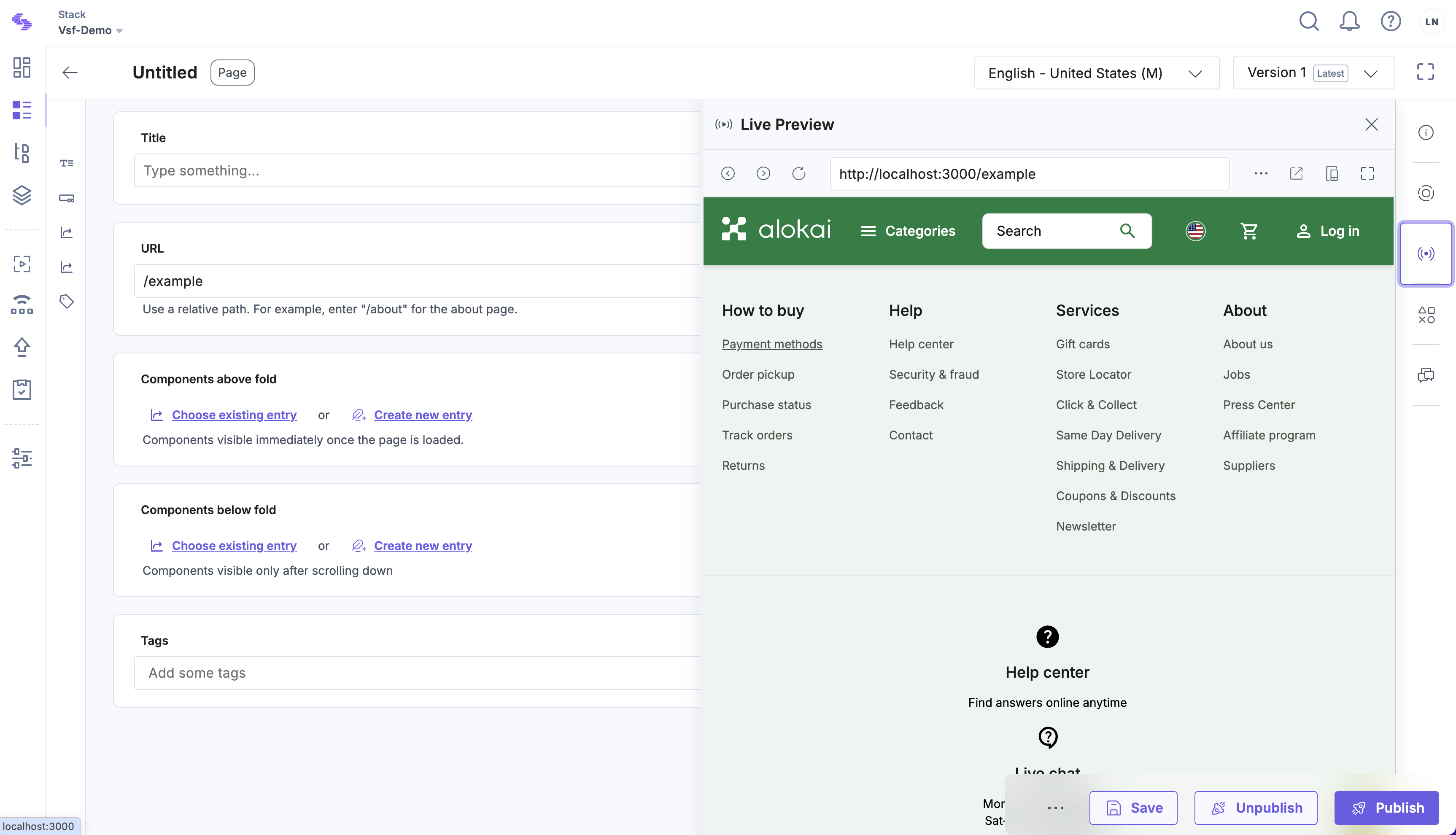
Add a component
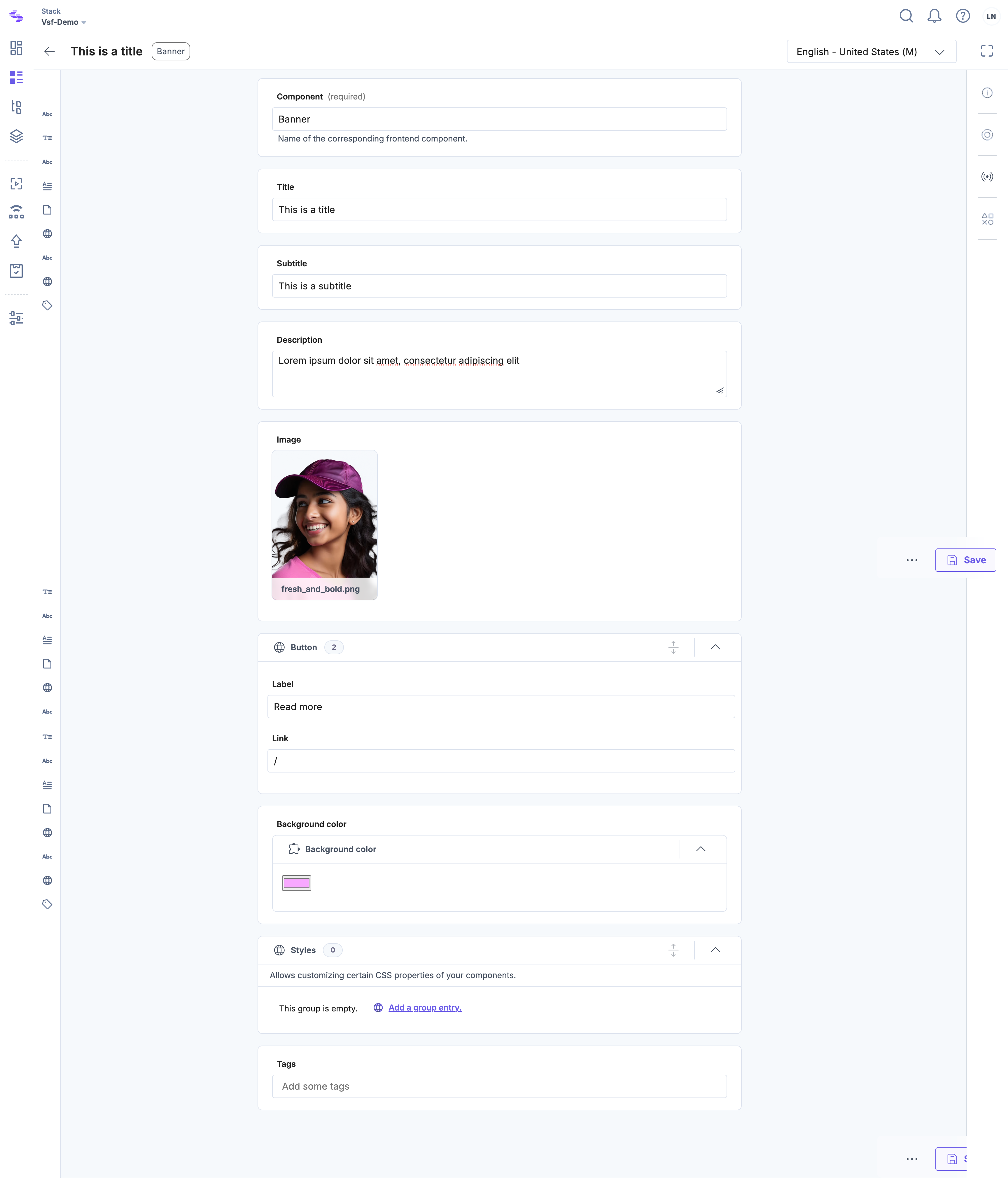
In the Components above fold field, click the Create new entry button. From the displayed list of Content Types, choose Banner and click Create. Fill your new component with some arbitrary data. Once done, click the Save button in the bottom right corner.
Publish your page
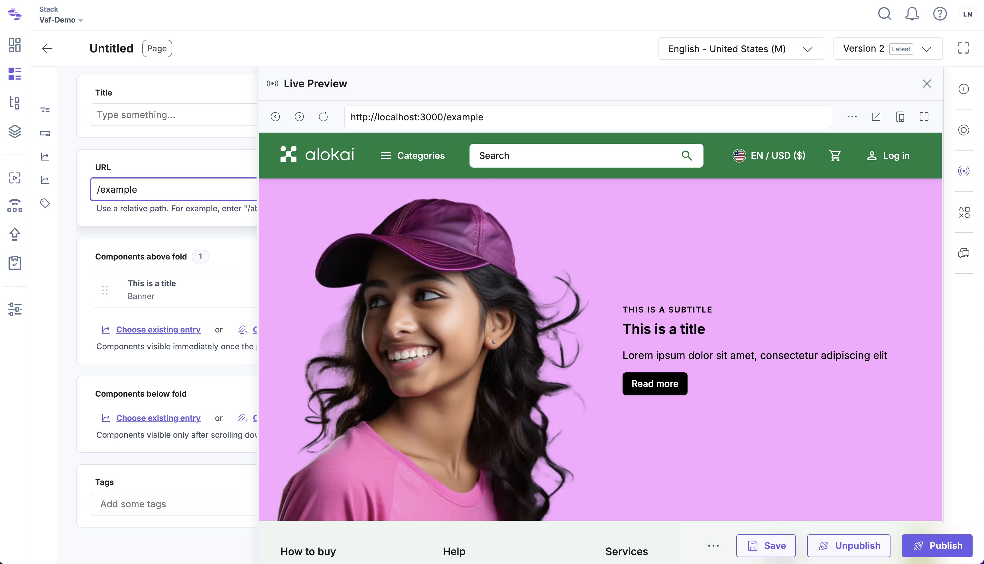
Go back to your page entry. In the Live Preview, you should see the Banner rendered on your page.
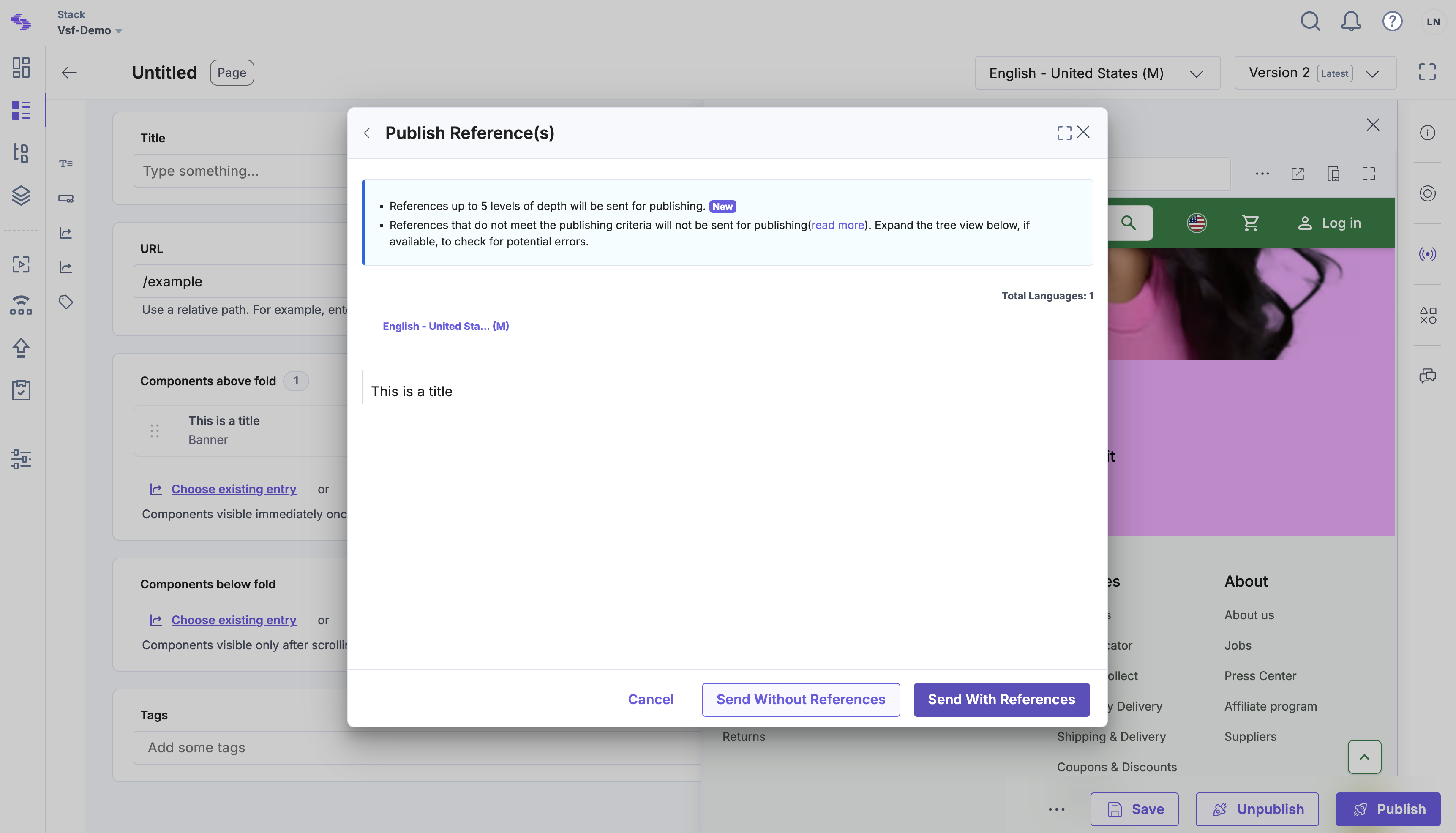
To publish the page, click the purple Publish button. Next, click Send and Publish with references so that your Banner netry is published along with the page entry.
Create a new page
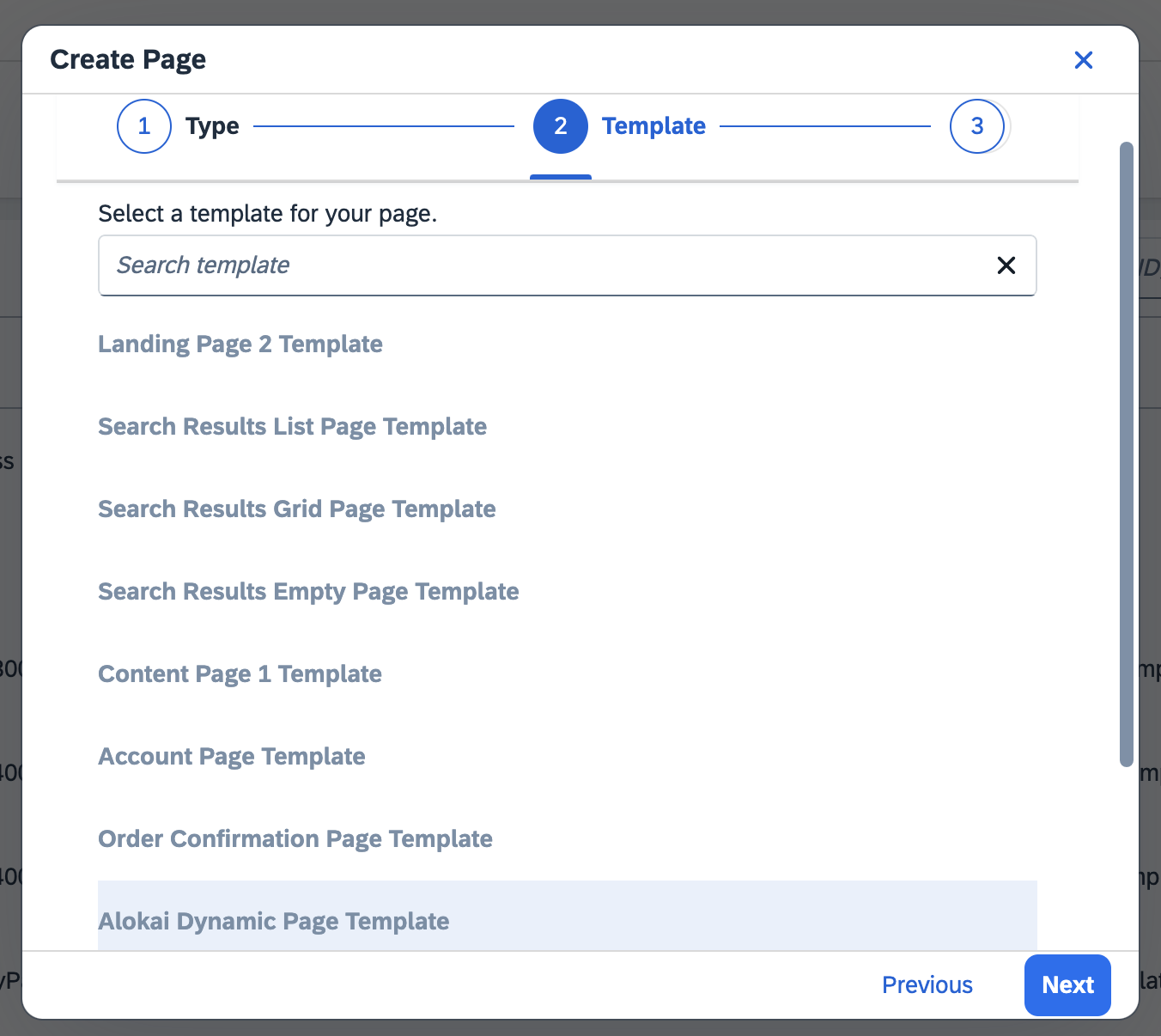
In your SmartEdit dashboard, navigate to the Pages in the desired Content Catalog and click the Create Page button in the top right corner. Choose Content Page from the list and then select Alokai Dynamic Page Template.
Define the path of your page
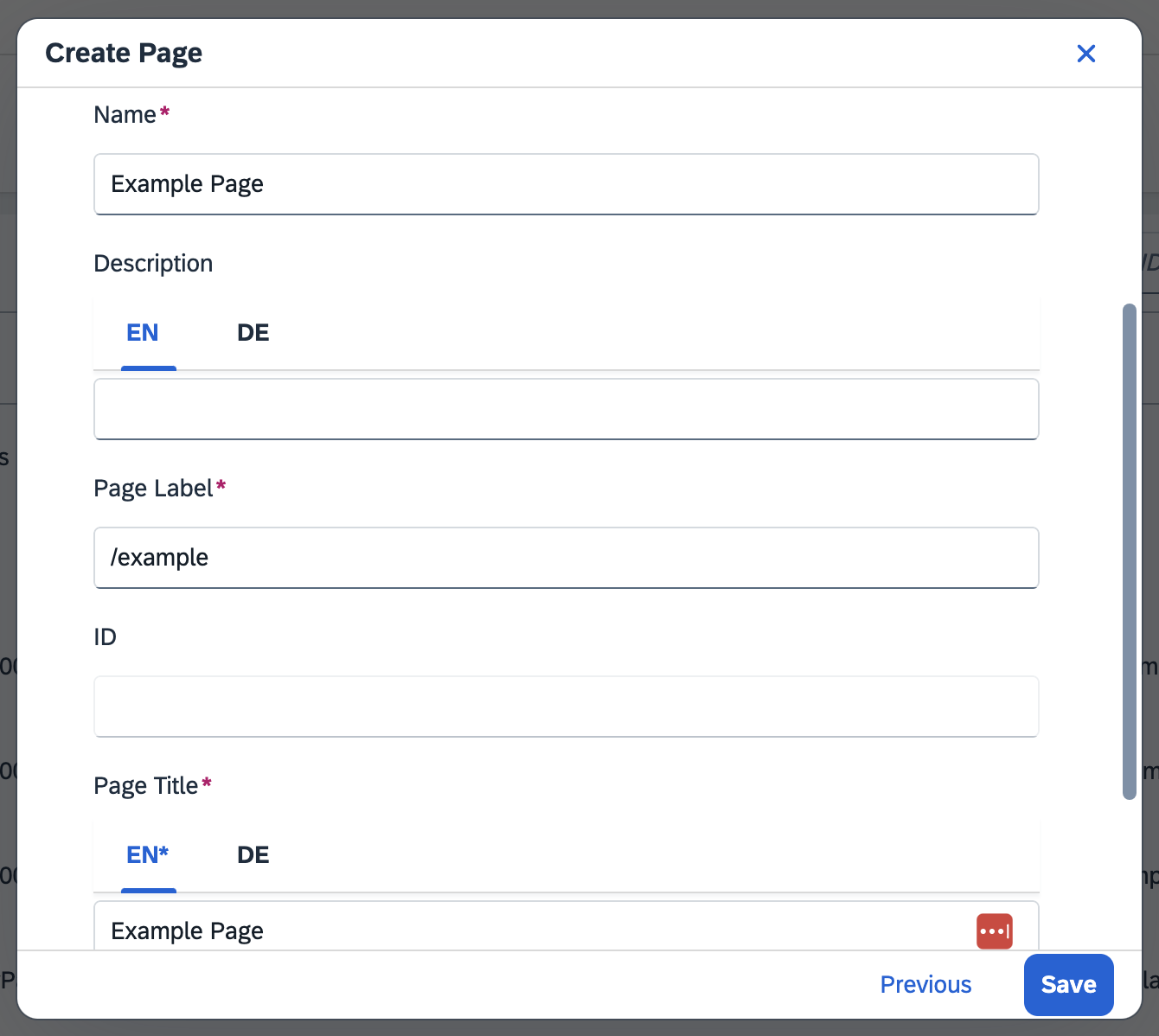
In the form, choose a Page Name and Page Title which will help you identify your page in the future. The Page Label field is treated by Alokai as a path to your page. Fill it with a unique value (such as /example). Click Save.
Nested page labels (e.g. /example/nested/label) are supported as well.
Add a component
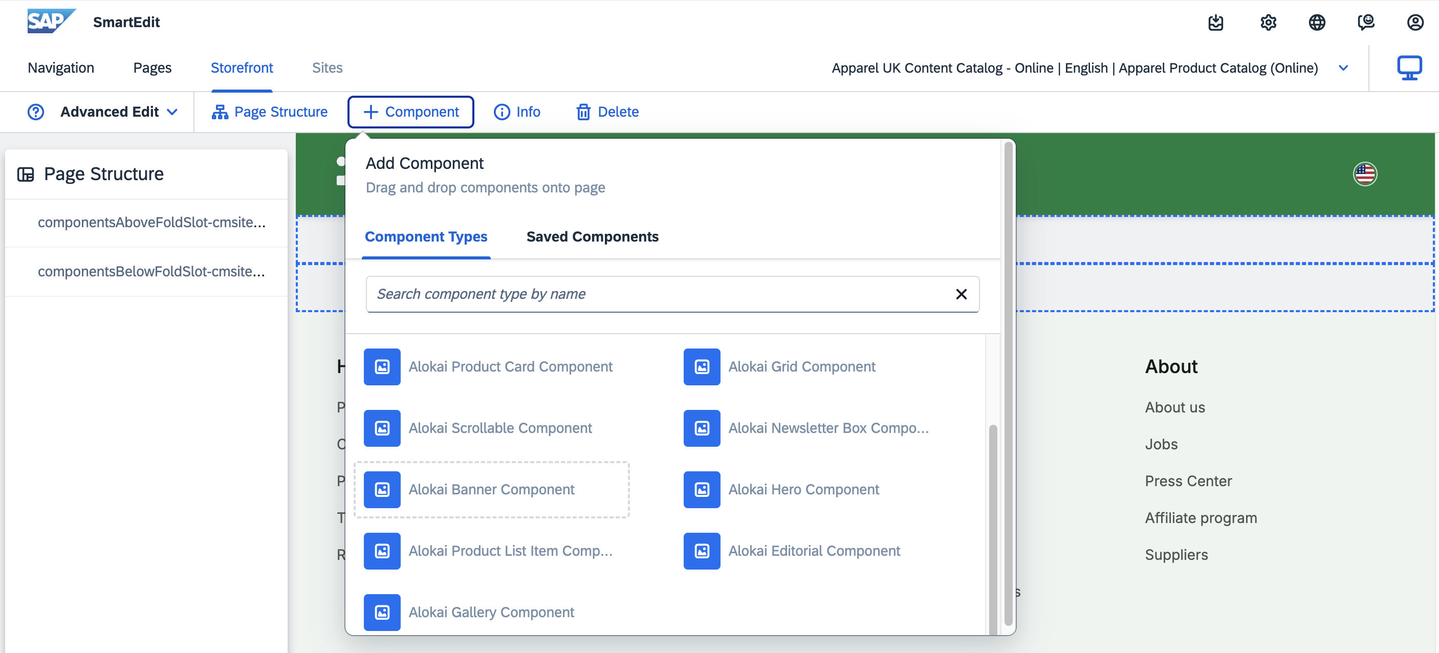
Next a visual editor will open. Make sure that your Storefront is running. In the top left corner, set the Visual Editor mode to Advanced Edit. Click + Component and choose Alokai Banner Component from the list.
Fill the component with data
In the form, fill your component with data. Keep in mind in Alokai components there are fields that expect a JSON object. An example might be the Button field:
{ "label": "Show more", "link": "/category" }or the Alokai Style field:
[{ "background-color": "red", "resolutions": { "max": 768 } }]For Alokai Style you can provide an array of objects where each object contains CSS properties as well as screen resolutions range (from min to max) for which the properties should be applied to the component.
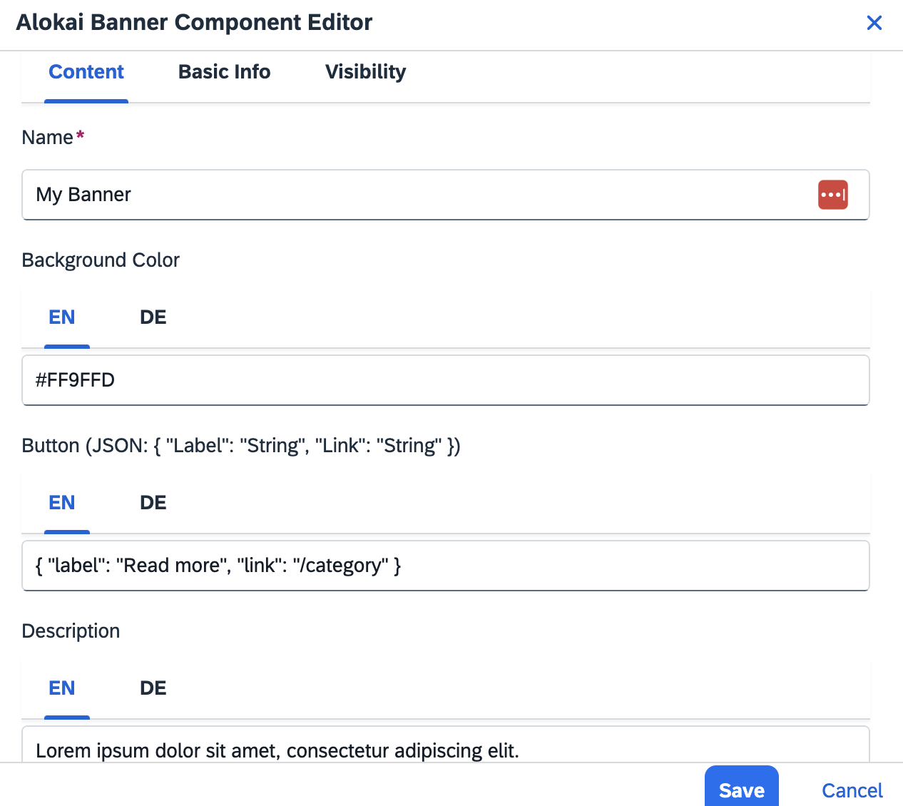
Once done, click Save.
Synchronize catalogs
Click the SAP logo in the top-left corner to navigate to the starting page. In the Site section, make sure the right catalog is selected. In the Content Catalogs section, find the Staged version and click the blue Sync button on the right.
Unless you synchronize Stage and Online catalogs, you won't be able to preview your page outside of SmartEdit's Live Preview window.
Create a new story
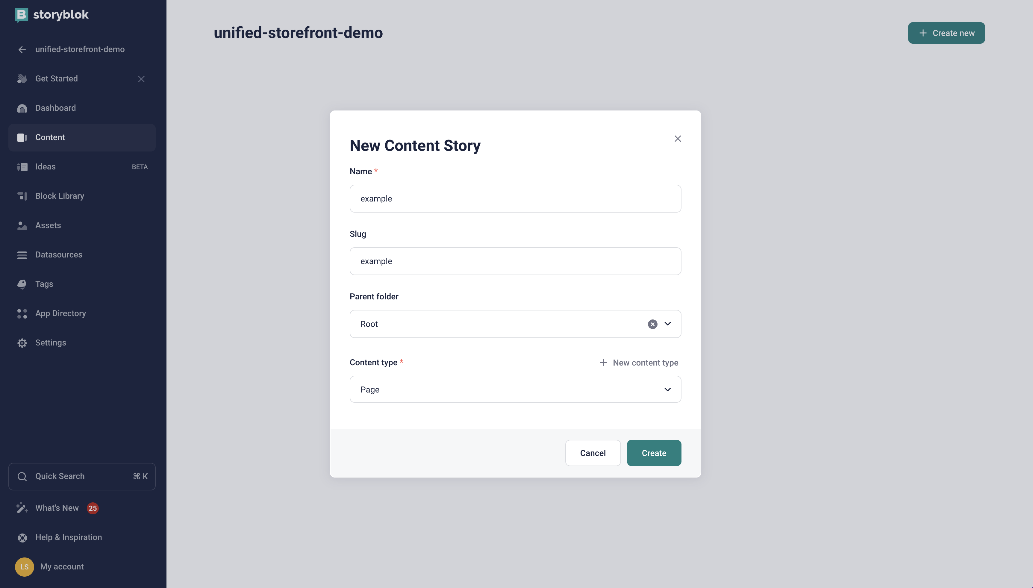
In your Storyblok space dashboard, navigate to the Content section and click the + Create new button in the top right corner. From the displayed dropdown, select Story and in the New Content Story form:
- set your page's Name to example,
- leave the Slug as-is,
- make sure the Content type is set to Page,
- confirm by clicking the green Create button.
Add a component
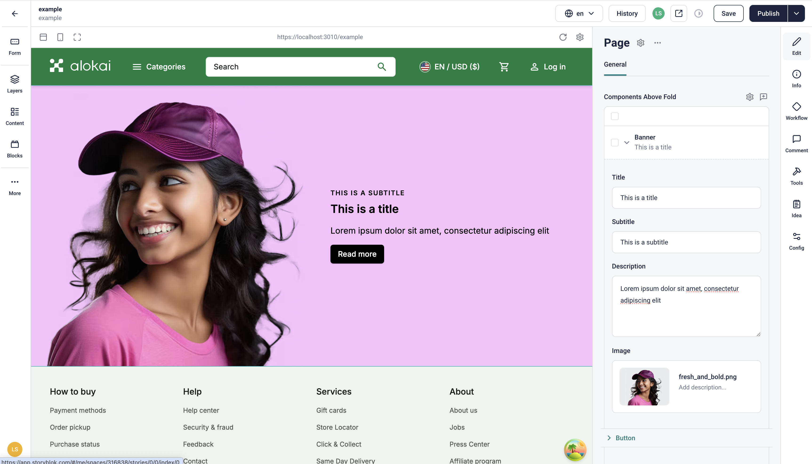
In the right-hand-side pane, find the Components Above Fold section and click the Add Block button. From the displayed list of blocks, select Banner. When added, expand the Banner's content form by clicking the chevron icon (^) and fill your component with some arbitrary data. In the Visual Editor, you should be able to see your component rendered and updated as you type.
Publish your story
Finalize the process by clicking the Publish button in the top-right corner.
Unless you publish your story, you won't be able to preview it outside of Storyblok's Visual Editor.
How it works
Alokai Storefront includes the ConnectCmsPage wrapper component, which serves two key functions: it fetches CMS content based on the current Storefront path (e.g., /example) and enables live-preview capabilities. The fetched content is then passed to the RenderCmsContent wrapper for component rendering.
import { connectCmsPage, RenderCmsContent } from '@/components/cms/wrappers';

export default connectCmsPage(({ page }) => {
  const { componentsAboveFold = [], componentsBelowFold = [] } = page;

  return (
    <>
      <RenderCmsContent item={componentsAboveFold} />
      <RenderCmsContent item={componentsBelowFold} />
    </>
  );
}, {
  async getCmsPagePath(props) {
    const params = await props.params;
    return params.slug?.join('/') ?? '/';
  },
});<template>
<ConnectCmsPage v-slot={ page }>
<RenderCmsContent v-if="page" :item="page.componentsAboveFold" />
<RenderCmsContent v-if="page" :item="page.componentsBelowFold" hidden />
</ConnectCmsPage>
</template>
<script lang="ts" setup>
import { ConnectCmsPage, RenderCmsContent } from '@/components/cms/wrappers';
</script>In the examples, the dynamic page is split into two containers:
- componentsAboveFold
- componentsBelowFold
This setup optimizes performance by loading essential components immediately while lazy-loading others as users scroll. All CMS modules (except Builder.io) use this approach by default for CMS-only pages. You can define additional containers in your CMS if needed.
No further Storefront configuration is required as all necessary components are pre-configured.
Read also?
Congratulations! You've just created your first CMS page. Read the other guides to learn even more about building amazing things with our CMS modules.